


 Arguments


Temperature tantrums on the campaign trail
Posted on 24 March 2016 by Andy Skuce
Originally published at Corporate Knights on March 17, 2016.
Sorry Ted Cruz. There's no conspiracy among scientists to exaggerate global warming by fudging the numbers.
Last year was the warmest year recorded since the measurement of global surface temperatures began in the nineteenth century. The second-warmest year ever was 2014. Moreover, because of the persisting effects of the equatorial Pacific Ocean phenomenon known as El Niño, many experts are predicting that 2016 could set a new annual record. January and February have already set new monthly records, with February half a degree Celsius warmer than any February in history.
This news is deeply unsettling for those who care about the future of the planet. But it is even more upsetting for people opposed to climate mitigation, since it refutes their favourite talking point – that global warming has stalled in recent years.
U.S. Congressman Lamar Smith claims there has been a conspiracy among scientists to fudge the surface temperature records upwards and has demanded, by subpoena, to have scientists’ emails released.
Senator and presidential candidate Ted Cruz recently organized a Senate hearing on the temperature record in which he called upon carefully selected witnesses to testify that calculations of temperature made by satellite observations of the upper atmosphere are superior to measurements made by thermometers at the Earth’s surface.
It’s easy to cherry-pick data in order to bamboozle people. The process of making consistent temperature records from surface measurements and satellite observations is complicated and is easy to misrepresent.
But the fact remains that there are no conspiracies afoot. Here’s why.
On solid ground
Thermometers that measure daily maximum and minimum temperatures are usually housed in Stevenson screens – the familiar white-painted, louvered boxes placed a few feet above the ground. The boxes are ideally positioned away from trees and buildings. Over the years, urbanization may encroach on some weather stations, forcing them to be relocated.
Other times, observation protocols need to be tweaked. For example, afternoon temperature readings in the U.S. have been replaced by morning readings. This change can produce small variations in the average daily temperatures measured. For the sake of consistency, corrections need to be made for these and other effects.
Different approaches can be taken to correcting the temperature records. Some methods look for discontinuities in temperature changes at sites that are not observed by nearby stations. Other methods resample the dataset and consider only the best-sited and most consistent readings. Diverse statistical techniques are applied to estimate temperature trends in areas where there is sparse data, such as the Arctic.
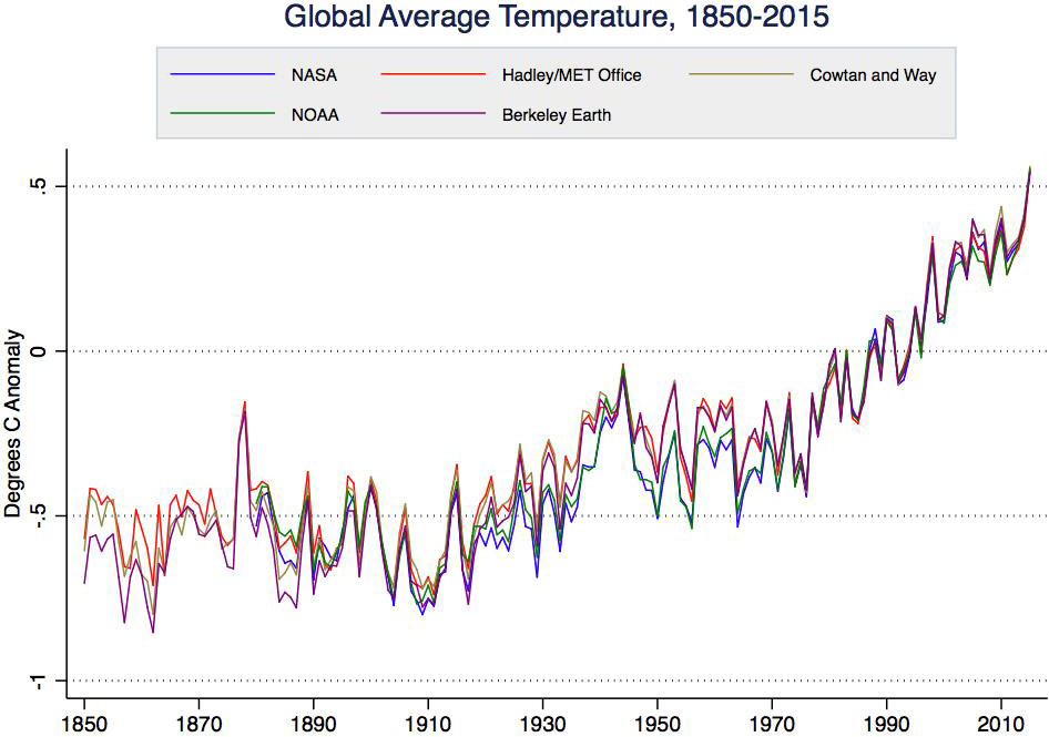
These adjustments, however they are made, tend to slightly increase the warming trends of global land temperatures compared to the raw data. For certain small regions, like the contiguous United States, the corrections can be quite large. Nevertheless, once the corrections are made, the global (land and sea) average temperature records prepared by independent research groups, using different methods, produce remarkably similar results overall.
Sea change
Over the twentieth century, the methods used to measure the temperature at the surface of the ocean have changed. At first, the seawater was sampled using a bucket, hauling it onto the ship’s deck and measuring the water temperature with a thermometer. Because water cools by evaporation during the process, measurements made this way tend to be low. Later on, starting in the 1940s, temperatures were measured at engine-room cooling-water intakes. More recently, a worldwide system of buoys has been deployed. These tend to measure temperatures a little lower than the engine-room intakes do.
The change from bucket to engine-room intake sampling means that the temperatures measured before 1940 need to be adjusted upwards by about half a degree Celsius. This is the largest correction made to any temperature record and, because the oceans cover two-thirds of the Earth’s surface, it decreases the global warming trend observed over the post-industrial period. It’s worth noting here that congressional hearings on climate science have been confined to examining cases where adjustments to the surface temperature measurements increase global warming trends.
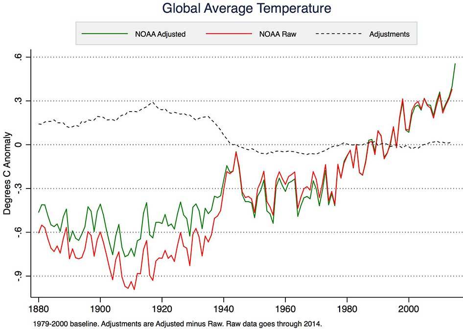
The more recent changeover from engine-room intake to buoy measurements requires ocean temperatures recorded over the past 20 years or so to be adjusted slightly to match the earlier measurements. This adjustment was outlined in a 2015 peer-reviewed publication by National Oceanic and Atmospheric Administration (NOAA) scientists led by Thomas Karl.
Although much smaller than the bucket corrections, these adjustments have led Congressman Lamar Smith to subpoena NOAA scientists demanding access to their emails. Needless to say, all methodologies and measurements supporting the study are already in the public domain, consistent with normal scientific disclosure and transparency practices.
The adjustments made to surface temperature measurements are necessary and well documented. The combined effect of all these changes is actually to reduce the rate of surface warming over the past 100 years compared to what we see in the raw temperature data.
Up in the air
Since 1979, it has been possible to calculate a global temperature record of the atmosphere from satellite observations. The satellites do not measure temperature directly, but instead observe the intensity of microwave radiation from gas molecules in the atmosphere. It is possible to tune the observations to focus on a certain depth range below the satellite and then to process the data to improve the resolution. The calculated temperatures that are most commonly cited – the lower troposphere or TLT data – sample a broad band from about 10 km altitude to just above the surface.
Not only is the vertical resolution of satellite measurements not very good, but the process of going from measuring microwave glow and converting those observations to temperatures is complicated, dependent on modelling assumptions and prone to error. The orbits of the satellites decay, resulting in changes to the altitude from which the measurements are taken, as well as changes to the time of day that they are above a particular spot on the Earth.
Significant adjustments have had to be made to the satellite temperature records. Several years ago, the satellite-derived temperatures showed a global cooling trend. However, this was later shown to be an artifact due to changes in satellite orbits that had not been properly corrected. Once the error was noted, the satellite temperature trend showed global warming consistent with the surface temperature observations.
Using satellites to measure temperatures is a little like using an infrared camera to measure a clothed person’s body temperature at a distance. Although a technique like that might be useful for screening, no doctor would rely on it for diagnostic purposes. Instead, they would stick to tried-and-true measurements using well-calibrated thermometers in direct contact with the patient’s body.
Satellites do, however, provide valuable estimates of the temperature in the upper atmosphere and they deliver global coverage, with only small gaps at the poles. They track the surface measurements quite well on the short-term ups and downs and they reveal a clear upward trend since observations began in 1979. However, starting around 2005, the trends of the satellites and surface measurements have begun to drift apart, with the satellites (RSS in the graph below) calculating anomalies that are a little cooler. Whether this is a real effect of the upper atmosphere warming more slowly than the surface over the past 10 years or if it is a problem with the satellite methodology remains to be seen.
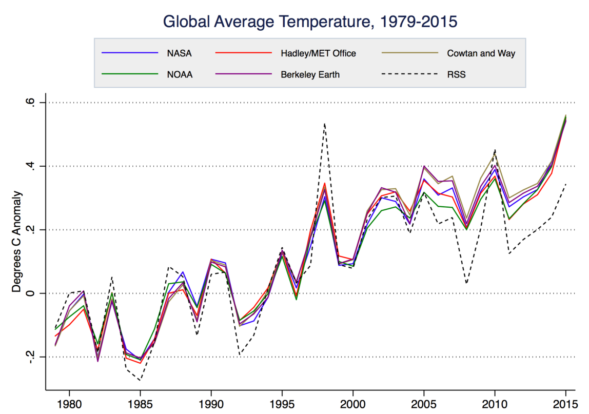
The uncertainty of temperature trends calculated from satellites is about five times as large as the surface temperature measurements. Carl Mears, the lead scientist for Remote Sensing Systems, one of the main groups that process the satellite data, has written:
“A similar, but stronger case can be made using surface temperature datasets, which I consider to be more reliable than satellite datasets (they certainly agree with each other better than the various satellite datasets do!).”
Nevertheless, global warming deniers like to refer to the satellite data as the gold standard. The frequent refrain “no warming since 1998” relies on a double cherry-pick: First off, by choosing 1998, the hottest year ever in the satellite record, as a starting point and, secondly, by disregarding the more reliable measurements of the temperature at the Earth’s surface where we actually live.
In February 2016, Carl Mears and colleague Frank Wentz published a peer-reviewed paper that adjusted upwards the satellite-derived temperatures for the upper atmosphere since 1998 by as much as 0.2 of a degree Celsius. This will remove much of the discrepancy between satellite and surface temperature trends.
Senator Ted Cruz’s recent Senate hearing on the temperature record called carefully selected witnesses who extolled satellite data as the most reliable. Carl Mears was not invited.
Natural thermometers
Canadians may not be inclined to listen to American politicians when it comes to the climate record. But neither do we have to rely exclusively on what the mainstream scientists are telling us: there are natural thermometers that show us what is going on.
Gardeners will be aware that plant hardiness zones have been shifting northwards. Over a 50-year period, there has been a change in three plant-hardiness zones in western Canada and a change of one zone or more in central and eastern Canada.
Amateur hockey players may have noticed that the season for outdoor rinks is shrinking. Fifty years ago, the outdoor hockey season was, on average, 15 days longer than it is today.
Hikers and tourists in western Canada’s mountains can see that the glaciers are in retreat. A 2015 study led by scientists from B.C. universities, published in Nature Geoscience, predicts that by 2100, 70 per cent of the mass of the glaciers in B.C. and Alberta will be gone.
Mythbusting
There’s no doubt that surface temperatures are rising in Canada and almost everywhere else on the globe. The evidence of the instruments and our own observations is clear and consistent. Even as measurements fluctuate a little from year to year because of natural cycles like El Niño, the rising trend of temperatures is unmistakeable.
Denying the existence of a warming planet may be an effective short-term strategy for some politicians, but their interference is hurting the planet long-term.
Thanks to Zeke Hausfather for providing the graphs and to Peter Sinclair for the video.


Thanks Andy,
Interesting and informative.
One small thing...
On the second graph where the red line shows raw, the green adjusted and the dashed the adjustments, I presume that the adjustments are the corrections needed to raw data in order to derive the adjusted temperature recorded. Until ~2014 that presumption seems to match the graph. However in the very last part of the graph the green adjusted record seems to surge above the unadjusted raw data red line. For me this might give the impression that in 2014 the adjusted data set is higher than the raw data set, yet the adjustment needed to the data plot (dashed line) at the same time seems to be basically running at zero. Therefore it seems in order to give the true picture that the 2014 warmth is real and definitely not part of the complex adjustment process, that the red line should overwrite the green line as per the rest of the zero adjustment period?
Just seems strange to plot such a sudden departure at the end of the graph between the red (raw) and green (adjusted) lines, when the adjustment needed is zero?
Anyway as you say a primary message is that the adjustments needed have actually meant that the amount of global warming that has been experienced is less than the raw would suggest.
Be interesting to see where 2015 to date would lie of the graphic, suspect they would be off the scale as it is, especially this January and February.
It is also going to be interesting to see how much the Arctic sea loss albedo flip accelerates things soon, keeping in mind, in summer the Arctic gets more solar energy input than the tropics so the ice melt should be adding some warming push soon, and Arctic temperatures are racing well away already and the Arctic air mass does spread south to dissipate the heat gathered further.
I do wonder sometimes if a chaotic system coming into adjustment from a major increase in heating input might experience jumps into higher temperature states at times rather than always following a linear climb, especially if the input is rapid and leads to a sudden large energy imbalance for the earth's systems to have to adjust to.
I also do wonder what the quickest way to get heat from the tropics to the poles to realign the energy balances as quickly as possible is?
The laws of thermodynamics do mean that any energy imbalance has to return to equilibrium as quickly as possible and that is why heat always finds the fastest way to travel when going from hot to cold.
Or more to the point what convective heat transfer system will move heart from the tropics to the poles in the quickest way possible I wonder and how will affect world weather systems?
The Hadley system’s dynamics (that create the world’s weather patterns) can change apparently and even becomes a large unicellular system from the tropics to poles if the temperature differential between the two is shallow enough.
Now that would change the weather.
Interesting times...
ranyl
Thanks.
The record, adjusted temperature value for 2015 (the last point on the graph) was available at the time that figure was put together, but the "raw" data were not. I would expect the "raw" data for 2015 to be very close to the adjusted values for 2015.
Thanks Andy,
Thought it must have been something like that.
Makes 2015 very warm indeed.
2015 is akin to 1997 in EL Nino development, therefore if similiar follows like, 2016 will be ~0.3C hotter.
On the graph thats put 2016 at the height of the graph title and if similiar follows like again the next 12 years or so after 2016, will be ~that much hotter, getting a little hotter as time goes by until the next El NIno push, 1998, 2005, 2010, 2014, 2015 jump.
Unless of course the El Nino this time follows a different path, although it does seem to be decaying on time at present.
Looking at the GISS data set:
http://data.giss.nasa.gov/gistemp/tabledata_v3/GLB.Ts.txt
The 1950-1980 monthly temperature anomally mean as expected is ~0, as 1950-1980 is climate period that the temperature anomalies reported by GISS are referenced to.
Taking the 30yr monthly anomalies for that period produces a normally distrubuted pattern of values with a standard deviation of ~0.18C.
The monthly anomally in Feb 2016 is 1.69C.
That is a positive shift of just 9 standard deviations.
Wonder what the odds of that are if the world isn't warming?
The adjusted value for 2015 should be left off the graph until the raw datum is available. What do you think?
...sorry, that should be 2014...which makes me wonder why the raw datum is still not available 15 months later!
...sorry, double take...seems it is 2015 after all. Now it seems strange to add in the adjusted datum for 2015 when the graph footnotes says it covers the period "through to 2014".
Also, I'm confused about how the adjusted datum for 2015 can be available when the raw datum isn't. Isn't the adjusted data adjusted off the raw data?
It's easy: all we have to do is convince Donald Trump that solving Climate Change gets him the win over Hillary!
...what could he sell,.. what could he sell?
Andy. While understanding the possible reasons for the warm bias of the engine inlet readings (conduction from the ship's structure plus the kinetic energy/friction from the incoming stream in the pipes) would it be true to say that the ARGO floats have an in built cool bias? As far as I know, the temperature readings are taken as the ARGO floats up to the surface from the deep, which is much colder, thus the bodies of the ARGOs would be colder than the surrounding waters. I expect this is taken into account, but is there a recognised cool bias to the sensors becasue of this?
Nick,
The buoys used to measure ocean surface temperatures are not the ARGO floats. For a detailed account, I would recommend Zeke Hausfather and Kevin Cowtan's article
Especially if the campaign trail goes through Kansas or Oklahoma, extra heat and restricted visibility.
from Associated Press https://www.youtube.com/watch?v=39djTxLynjo
http://climatecrocks.com/2016/03/25/kansas-youre-not-in-oklahoma-anymore/
Thanks Andy. I got fooled by a persistent denialist I was arguing with who was quoting a post Lubos Motl did about the Karl et al paper. The denialist was arguing that it was "typical alarmist bad science" to use "biased" ship's intake data and splice it on to the "much more accurate ARGO data". Motl himself did not make that mistake.