Climate Science Glossary

Term Lookup

Enter a term in the search box to find its definition.

Settings

Use the controls in the far right panel to increase or decrease the number of terms automatically displayed (or to completely turn that feature off).

Term Lookup

Settings


All IPCC definitions taken from Climate Change 2007: The Physical Science Basis. Working Group I Contribution to the Fourth Assessment Report of the Intergovernmental Panel on Climate Change, Annex I, Glossary, pp. 941-954. Cambridge University Press.

Home Arguments Software Resources Comments The Consensus Project Translations About Support

Bluesky Facebook LinkedIn Mastodon MeWe

Twitter YouTube RSS Posts RSS Comments Email Subscribe


Climate's changed before
It's the sun
It's not bad
There is no consensus
It's cooling
Models are unreliable
Temp record is unreliable
Animals and plants can adapt
It hasn't warmed since 1998
Antarctica is gaining ice
View All Arguments...


Username
Password
New? Register here
Forgot your password?

Latest Posts

Archives

Michaels Mischief #1: Continued Warming and Aerosols

Posted on 26 July 2011 by dana1981

Patrick Michaels is not known for his tendency to present a full accurate picture of climate science evidence (see for example his distortion of Hansen's famous 1988 study in testimony before US Congress).  Nevertheless, Forbes business magazine has decided to give Michaels a blog on their website.  We had hoped that when given the opportunity to write for such a high-profile media outlet, Michaels would strive for a more honest and complete representation of the scientific evidence for his newfound audience.  Unfortunately, as we will see below, Michaels' Forbes blog appears to continue his problem with leaving out the inconvenient bits of data, in addition to the now familiar "skeptic" pattern of self-contradiction.

Michaels vs. Michaels

In a recent blog post, between his title and second sentence, Michaels managed to contradict himself twice:

As Michaels undoubtedly knows, 'no statistically significant [at a 95% confidence level] warming' is not even remotely equivalent to 'no warming'; this is a Fox News and Daily Mail-level lie.  According to the University of East Anglia (UEA) data (HadCRUT), the average surface temperature has warmed 0.12°C since 1996 - it may not be statistically significant, but that's the trend Michaels references in his quote.  So he effectively goes from saying 'no warming' to '0.12°C warming' back to 'no warming' in the span of two sentences!

Ironically, in making this argument, Michaels relies exclusively on the HadCRUT surface temperature data set compiled by the Met Office Hadley Centre and UEA Climatic Research Unit (CRU).  But Michaels has previously severely criticized the CRU data set:

So why is Michaels now relying exclusively on a data set which he has previously criticized so harshly?  Most likely it's because HadCRUT shows the smallest warming trend over the past 10 to 15 years, in which case Michaels is not only contradicting himself, but cherrypicking.

The Warming Continues

Michaels also engaged in some rather blatant cherrypicking by choosing November of 1996 as his starting point.  "Skeptics" used to claim that there has been no [statistically significant] warming since 1995, but as we previously reported, the global warming trend since 1995 in the HadCRUT data set is now statistically significant at the 95% confidence level.  So Michaels has moved the goalposts and selected the earliest date at which the HadCRUT trend fails this statistical significance test, and then deceived his audience by claiming that lacking stastistical significance means "no warming."

But HadCRUT isn't the only game in town, and as noted above, Michaels supposedly doesn't trust their data.  The global warming trend in the NASA GISS data set, for example, is statistically significant over the cherrypicked period in question.

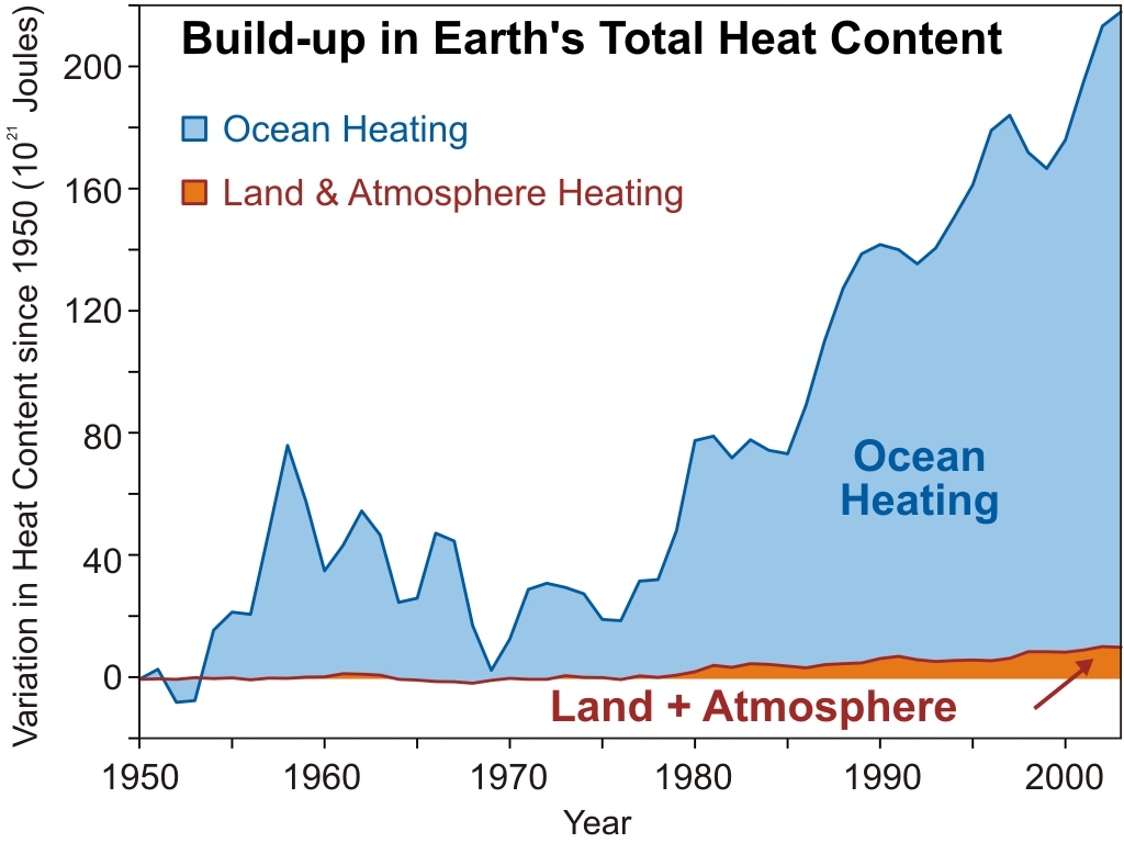
And of course surface temperatures are only a small part of the global picture.  The vast majority of heat is going into the oceans:

ocean heating

Thus we see that Michaels' titular claim of no warming for 15 years is wrong on many, many levels.  The error-riddled introduction to the post leads to a discussion of a paper we recently reviewed: Kaufmann (2011).

Kaufmann (2011)

As Rob Painting discussed in his analysis of the paper, Kaufmann et al. examined the slowed rate of global warming between 1998 and 2008 (note that we're no longer looking at November 1996 to June 2011, so Michaels' error-riddled introduction is also irrelevant to the rest of his post).  Kaufmann et al. concluded that the slowed rate of warming could be explained by a combination of factors: changes in the El Niño Southern Oscillation (ENSO; 1998 was the strongest El Niño in a century, and 2008 was a strong La Niña year), declining solar activity (the end of this period saw the longest solar minimum in a century), and increased human aerosol emissions primarily from China's expansion of coal combustion as a power source. 

Unfortunately, Michaels' description of the study's results isn't very accurate:

"Kaufmann’s team looked into how sulfate uncertainty impacted its results and decided that it was relatively minor."

Here are Kaufmann's actual results (emphasis added):

"Declining solar insolation as part of a normal eleven-year cycle, and a cyclical change from an El Nino to a La Nina dominate our measure of anthropogenic effects because rapid growth in short-lived sulfur emissions partially offsets rising greenhouse gas concentrations."

"The increase in sulfur emissions slows the increase in radiative forcing due to rising greenhouse gas concentrations (Fig. 1).  Net anthropogenic forcing rises 0.13 W?m2 between 2002 and 2007, which is smaller than the 0.24 W?m2 rise between 1997 and 2002."

Even though human CO2 emissions accelerated between 2002 and 2007, the anthropogenic forcing increase actually slowed by 46% as compared to 1997 to 2002, due to the increase in aerosol emissions.  This is hardly a "relatively minor" impact.  In fact, Solomon (2011) concluded that aerosol cooling has offset one-third of the CO2 warming since 2000.  Wild (2011) also found that the amount of solar radiation reaching the Earth's surface has declined significantly since 2000 over east Asia:

Wild figure 2

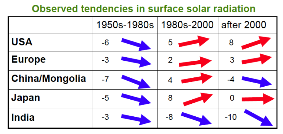
Changes in surface solar radiation observed in regions with good station coverage during three periods. The 1950s-1980s show predominant declines (“dimming”, left column), the 1980s-2000 indicate partial recoveries (“brightening”, middle column) at many locations, except India, while recent developments after 2000 show mixed tendencies (right column). Numbers denote typical literature estimates for the specified region and period in W/m2 per decade (Wild 2011).

More Aerosol Research

Michaels makes the valid point that the effects of aerosols on global temperatures remains a significant uncertainty in climate science.  He claims that since aerosols have a short atmospheric lifetime, they aren't well-mixed throughout the atmosphere (unlike greenhouse gases).  Thus if they have a significant cooling effect, it should be observed primarily in the northern hemisphere, where China is located. 

However, China is located relatively close to the equator.  As Rob Painting noted in his Kaufmann post, according to Rasch (2000), emissions from Asia are able to reach the upper atmosphere and spread out over both hemispheres.  Hatzianastassiou (2011) actually found that solar dimming has been greater in the southern than northern hemisphere, because the aerosol cooling effect is largest in pristine areas where there is little pollution to begin with.  This research directly contradicts Michaels' assumptions.  Furthermore, there could be other effects (like ENSO) affecting the warming trends in the southern vs. northern hemisphere.

Nevertheless, Michaels proceeds with his faulty premise by plotting hemispheric data from HadCRUT (for which he appears to have discovered a newfound appreciation), and notes that since 1998, the northern hemisphere shows a slight warming trend while the southern shows a slight cooling trend.  Michaels then declares that he has debunked Kaufmann's research, and proven that climate sensitivity is low.

The Rest of the Picture

It should go without saying that it's unwise to declare that virtually all previous climate sensitivity studies are wrong, based on little more than a superficial analysis of 10 to 12 years of surface temperature data.  But the real flaw in Michaels' argument is that he only looks at the hemispheric temperature trends since 1998, but fails to compare them to the pre-1998 trends.

We know that over the past century, the southern hemisphere has warmed more slowly than the northern hemisphere (primarily because it contains less land and more oceans, and water takes a lot of time and energy to heat up).  So the fact that the southern hemisphere is still warming less quickly than the northern hemisphere doesn't tell us anything by itself.  We need more data to see the whole picture. 

According to HadCRUT northern hemisphere data, the warming trends for 1975-1998 and 1998-Present were from 0.18°C/decade and 0.055°C/decade, respectively.  In the southern hemisphere, the trends were 0.13°C/decade to -0.046°C/decade.  So this data does support Michaels' premise: the southern hemisphere trend decreased more than the nothern hemisphere.

However, the data from NASA GISS shows a different picture.  The figure below shows the  surface temperature and linear warming trends according to GISTEMP from 1975 to 1998, and 1998 to 2010.

NH vs. SH

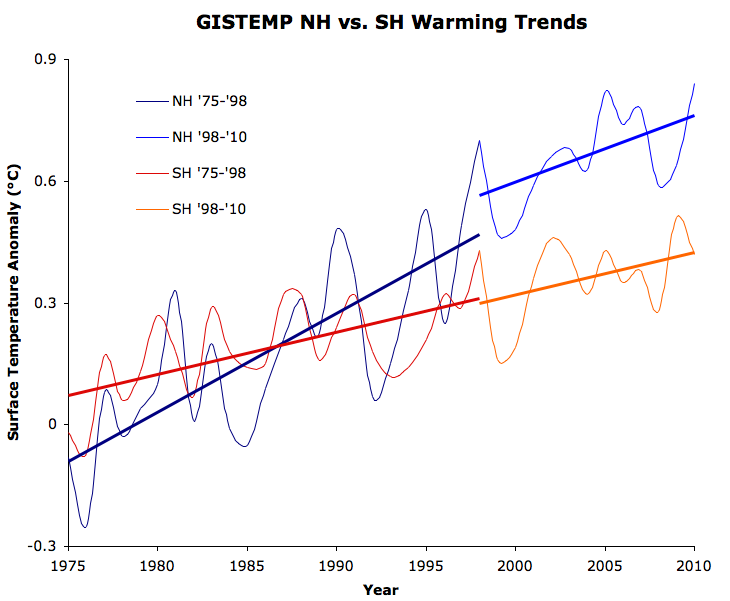
As you can see, the southern hemisphere warming trend is almost identical during the two periods (~0.1°C per decade), whereas the northern hemisphere warming trend has declined 32%, from 0.24°C per decade to 0.17°C per decade. 

Thus we see that contrary to Michaels' argument, it's neither necessarily true that aersols cooling should have had a larger effect in the northern hemisphere, nor that the southern hemisphere warming necessarily slowed more than the northern since 1998.  The effects of aerosols (both geographic and global) remain a significant uncertainty, and Michaels is grossly oversimplifying the situation, which leads him to the wrong conclusion.

Summary

Michaels committed the dishonest act of equating 'no statistically significant warming' with 'no warming'.  He relied exclusively on CRU temperature data to make his arguments, even though he has previously criticized this same data, because the other temperature data sets do not support the arguments Michaels makes.  On top of cherrypicking data sets, Michaels cherrypicks the exact earliest month to make the deceptive 'no statistically significant warming' argument.

Michaels' portrayal of Kaufmann's study was not very accurate, nor were his assumptions about the geographic distribution and effects of aerosols.  Overall, other than noting that the effects of aerosols remain a significant uncertainty, there is little accurate scientific content in Michaels' blog post, and he draws the wrong conclusion by grossly oversimplifies the picture.

Unfortunately we can undoubtedly expect to see much more of the same inaccurate representation of climate science from Michaels and Forbes in future blog posts, which will likely be the subjects of future Michaels Mischiefs.

0 0

Printable Version  |  Link to this page

Comments

1  2  Next

Comments 1 to 50 out of 90:

  1. "the average surface temperature has warmed 0.12°C since 1996" Shouldn't that be .12C/decade?
    0 0
  2. Forbes is well know for its anti GW bias. Is it owned by Murdoch?
    0 0
  3. Robert - no, according to HadCRUT the trend is 0.08°C per decade since 1996 (0.12°C total). It's nearly twice that (0.15°C per decade) according to GISTEMP though. Paul - the Forbes family (specifically Steve Forbes, I believe) own the magazine.
    0 0
  4. An aerosol spreading confusion? Sounds like Michaels.
    0 0
  5. "Robert - no, according to HadCRUT the trend is 0.08°C per decade since 1996" OK. I was thinking of Phil Jones who said the trend was .12C/decade from 1995 thru 2009, so I assumed the trend didn't change much from 1996 through present. Just another example of how changing the start year can make a big difference when dealing with small sample sizes.
    0 0
  6. If Michaels weren't so disingenuous, he'd acknowledge that you don't need *any* of the CRU's supposedly "destroyed" raw data to confirm that the global-warming trend is very real and is quite in line with the CRU's (and NASA's, and NOAA's) results. I know that I've put up a number of posts here pounding on this basic theme, but it's important enough for new visitors/lurkers to see this that I don't think that the "old timers" here will mind too much if I pound on it yet again. 1) All of the publicly-available *raw* temperature data needed to do perform your own verification of the NASA/NOAA/CRU global-average temperature results are available at the NOAA/GHCN data repository. 2) The basic algorithm used to compute global-average anomalies is straightforward and well-documented. There are many variations on this basic procedure, but just the basic procedure (without any of the extra fancy stuff that the NASA/NOAA/CRU folks do) will still produce global-average temperature estimates very much in-line with the pros' results. 3) All of the software-development tools needed to put together your own "hand rolled" global-average anomaly program are freely available for anyone to download and use. Some time ago, I wrote up a program that implements the simplest, most basic version of the global-average temperature anomaly algorithm, and then ran GHCN *raw* data through it. And once again (for those who haven't already seen this), here is a plot showing how my results compare with NASA's official "Meteorological Stations" results. The bottom line is, it does not matter how you slice and dice the global temperature data -- if you don't completely screw things up, you'll get results very similar to the results that the "pros" get, whether or not you have access to the CRU's supposedly "destroyed" raw data. The deniers who have been attacking the climate-science community's global-temperature work know (or should know) this. The fact that they have continued with attacks like this indicates to me that they are incompetent or dishonest (that's an inclusive "or" btw...).
    0 0
    Moderator Response: [RH] Readjusted width. Please keep images down to 450 so that it doesn't break the page formatting. Thx.
  7. When you use such short time frames, all sorts of crazy statistics can appear. Adjust your starting date forwards or backwards one year, and the CRU trend changes from 0.11C / decade to 0.00C / decade. Selective use of statistics to bolster ones view is not a good scientific approach. Best is to use a long term trend (with good statistics), and then compare the most recent data to that trend.
    0 0
  8. Eric... You still get into trouble comparing recent data with the long term trend because the variation in the data exceeds the trend by such a large amount. Even just look at UAH monthly variation. Just in the past couple of years it's ranged from -0.4 to +0.5 (approx) while the long term trend is still in the range of 0.15C/decade. Variation exceeds the trend by a factor of something like 6 (rough guess). What I always find more compelling is the fact that we have still yet to see any statistically significant cooling. The skeptics go on and on about no apparent warming but neglect to point out that they also don't see any cooling anywhere even at the end of a long 30 year warming trend.
    0 0
  9. "When you use such short time frames, all sorts of crazy statistics can appear." - Yes! Using of too-short time frames with noisy data can lead to misleading conclusions. "Selective use of statistics to bolster ones view is not a good scientific approach." - Yes! Absolutely correct! The light has been seen! "Best is to use a long term trend (with good statistics), and then compare the most recent data to that trend." - Oh...oh, never mind. Eric the Red, your whole comment up until the last half of the last sentence demonstrates the problem with what you advocate in the last half of the last sentence. Try to "compare the most recent data to the trend," and unless your "most recent data" includes enough for a test of statistical significance, you have EXACTLY the problem of "all sorts of crazy statistics can appear" with "such short time frames."
    0 0
  10. It looks like Rob Honeycutt already made this point using UAH monthly data, but here's a simple illustration that anyone can check out for themselves: Take a look at a graph of a good global temperature record--I used the GISS land/ocean index, but any good record should work. While looking at the graph, imagine using the "compare the most recent data to the trend" method in various years. For example, imagine it's 1986, and you want to compare the past few years of data--let's say five--to the trend. Did that give you any useful information about the future? Do the same exercise again, only pretend it's 1999, so your "most recent data" is 1993-1998. Did that give you any useful information about the future? I think that the only thing you get from comparing a short segment of noisy data to the statistically significant trend...is a first-hand appreciation of how useless it is to do such a thing. That's more obvious when you use it on archival data--where you can see right away that the fluctuations turned out to be noise--than it is when you're doing it on current data, hot off the presses. But it's every bit as true regarding the current data, and even more important to be aware of, lest you get carried away with all sorts of wrong ideas.
    0 0
  11. Kevin, exactly. One can go back in the the recent historical data and find many periods of "flatness" comparable to what is claimed now. Yet, mysteriously (not so mysteriously) the longer term trend is stili inexorably upwards.
    0 0
  12. Dave and Kevin, I think we are in agreement about the long term trend. There are periods of higher trends, lower trends, and flatness. However, long term, the trend has not deviated significantly. When you compare the most recent years, you will see that they do not deviate. My point earlier, was than if there was a deviation, then it should be evident when compared to the long term trend.
    0 0
  13. Eric the Red @7, and following, the correct way to compare recent short trends to the long term trend is to use the procedure Tamino illustrates here with GISS data: The solid line is the trend from the given year to the present (June 2011). The two dashed lines show the bounds of statistical significance (95% confidence). If neither bound crosses the long term trend line (red dashed), speculation about a change in the long term trend is just that, speculation, and is not based on substantive evidence.
    0 0
  14. Paul @#2
    Forbes is well know for its anti GW bias. Is it owned by Murdoch?
    No, it's owned by Bono.
    Roger McNamee, an Elevation partner who signed the deal last Friday, said Bono was drawn to Forbes because it "has a point of view"
    0 0
  15. Tom, Tamino's analysis works for the time period and trend indicated indicated. However, if one uses a longer term trend (50 years or more), then the bounds fall outside the trend line. I am not arguing that a change has occurred in the long term trend, but that shorter term trends fall above and below his bounds.
    0 0
  16. Eric the Red @15, I am not sure what you are saying here. You may be considering an extension of Tamino's graph back to 1961, such that the longest trend and hence the red dotted line is drawn from the 1961-1911 trend. In that case, you claim (and I well believe) that at some point the bounds of statistical significance for some shorter term trends, presumably in the range 1975 to 1993 do not intersect the long term trend. That is an unsurprising result (if it is what you are claiming) and represents significant evidence that there has been a genuine (ie, long lasting) change in trend between 1961 and the present. Alternatively (and unlikely) you mean that the short term trends at the end of the figure fall outside the bounds of statistical significance for the long term (50 year) trend. Well, yes. They also fall outside those bounds for the 1975 trend. And that is entirely inconsequential, as it represents an incorrect use of the technique. In either event, I don't see any problem for the method of analysis.
    0 0
  17. Tom, The former. The actual range would be determined by how far back the graph is extented. I suspect that if one were to go back to the late 19th century and start the trend at this time that there would be periods whereby the bounds fall above and below the trend line. The period you describe would be one of them. The short-term trends changed during these periods, but did not last, as it returned to the long term trend. The implication is that the long term trend is not static, but fluctuates above and below. Using Tamino's analysis, the fluctuations are not noise, but are real. Since the fluctuations occur about the long-term trend, and have always (so far) returned to the trend, there appears to be no reason to believe that it has changed recently.
    0 0
  18. Eric, the supposition you are making that there is one privileged long term trend to which the trend always returns is not warranted. You can generate a least squares linear trend for any set of data. It does not follow that it means anything. The data may be random, or quadratic, or logarithmic, or a succession of distinct trends. Consequently, the only thing you can conclude if the long term trend falls outside the 95% confidence interval of shorter trends in the series is that a single long term linear trend does not adequately characterize the data. If you then want to fit a linear trend plus long term cycle to the data, you can certainly attempt to do so, but no amount of analyses of graphs such as that in 13 will justify that attempt. As it happens, a single long term trend does reasonably characterize the data from 1975 to present, but it does not do so for the entire 20th century.
    0 0
  19. I agree that a single long-term trend does not reasonably characterize the data for the entire century. The data would best be described as a sine wave about a linear trend. The data from ~1975-2005 falls on the increasing portion of the sine wave, and hence, appears linear. Using Tamino's analysis on a sine wave superimposed upon a linear increase yields results wherein the bounds remain within the trend line for 130 years of data.
    0 0
  20. Eric the Red however that does not mean that the observed temperature is the result of a periodic physical process. Computing a linear trend over a period where the changes in forcings have been fairly simple is a sensible thing to do. Curve fitting without taking into account what we do know about the underlying physics is pretty pointless. You comment "The data from ~1975-2005 falls on the increasing portion of the sine wave, and hence, appears linear." implicitly assumes that there actually is a sine wave in the data, rather than the observed temperatures being due to multiple changes in a range of different forcings.
    0 0
  21. #19, Tamino has a not very polite word for that kind of unsupported analysis, and has written about that kind of thing several times. I would describe it as climastrology, and not based on any mechanism or forcing factor. It fails miserably as you go further back in time, and has no predictive value. With enough degrees of freedom you can fit anything, but it does not mean you have found anything useful! There are good reasons to think the long-term trend is of different gradients at different times, as it follows from the sum of forcings, including CO2, aerosols and solar elements. On a shorter timescale, such as within an individual decade, forcings such the slight nudge from an individual solar cycle, or a series of El-Ninos transitioning into La Ninas over about a decade, will cause smaller wobbles in the larger trend. It happens that the past 40 years has an approximately linear trend. In fact it appears steeper-than-linear, as the temperature difference between the 2000s and the 1990s is larger than the temperature difference between the 1990s and 1980s, or 1980s and 1970s.
    0 0
  22. Sky, I am not sure exactly what you mean by steeper than linear, but assume that you are implying that the linear trend is increasing. That is simply not occurring, as the greatest increase in the past 40 years was observed in the 1990s, with the smallest occurring in the past decade.
    0 0
  23. Eric the Red - The differences in decadal temperatures are increasing since the 1970's: see the plot here. That's a faster than linear increase, contrary to your post here. Secondly: "The data would best be described as a sine wave about a linear trend." Actually, no. The data would best be described as the response of the climate to multiple changing forcing factors. "A sine wave about a linear trend" is a descriptive term, but absolutely not an explanatory statement, as it has no ties to climate physics whatsoever. That's an eyeball judgement (eyecrometer?), not an understanding of the processes involved. Tamino's term for this, having actually analyzed whether there are periodic behaviors in climate from unknown sources, is Mathturbation. I find that quite accurate. Fitting arbitrary periodic functions to the data shows really poor statistical agreement, and has roughly zero predictive power. Unlike considering the physics involved...
    0 0
  24. Loehle and Scafetta would benefit from reading Dikran's comment #20. The physically baseless curve fitting we're discussing here, and which was done in Loehle and Scafetta's paper, will be the subject of a future post.
    0 0
  25. KR, You may want to look at this. http://www.cru.uea.ac.uk/cru/info/warming/ or this. http://data.giss.nasa.gov/gistemp/graphs/Fig.A2.gif or maybe this one. http://www.woodfortrees.org/plot/wti/from:1975/to:2011/plot/wti/mean:60 In every one of these plots, the increase is significantly less in the past decade, and approaching zero.
    0 0
  26. Eric the Red the human eye is very good at finding what it wants to see in noisy datasets, which is why we have statistics. Given the level of noise in the dataset I suspect the decrease in the slope of the trendline is unlikely to be statistically significant. I can't believe that people are still using variants of the "no warming since 1998" canard. Short term trends are not robust, so you can't reliably detect a genuine decrease in slope from one decadal trend to the next.
    0 0
    Response:

    [DB] ETR has tried to pull this wool over SkS eyeballs several dozen times now, without success.  It grows tiresome.

  27. Eric the Red, This is a broken record. Stop eyeballing a few pixels and crunch the numbers. We went round and round on this topic back on the Why Wasn't The Hottest Decade Hotter? article. The 2000s were warmer than the 1990s by a larger margin than the 1990s were warmer than the 1980s. Using a 10-year moving average with annual frequency, the last 10 decadal-periods have been the hottest ten with 8 of those 10 having an above average (of the past top 28) temperature change. As Dikran points out, short term trends are not robust. Temperature charts are not Rorschach tests.
    0 0
    Moderator Response: [Dikran Marsupial] Link fixed
  28. Eric the Red - "the increase is significantly less in the past decade, and approaching zero." From the GISSTEMP data: Temp. anomaly from 1951–1980 mean: 1980–1989 0.176 °C (0.317 °F) 1990–1999 0.313 °C (0.563 °F) [ +0.137 °C ] 2000–2009 0.513 °C (0.923 °F) [ +0.200 °C ] The decade by decade numbers say otherwise - temperatures are increasing at an increasing (higher than linear) rate for the last 30+ years. The year by year slope isn't meaningful - decadal averages are better, 30 year trends are statistically useful. You are incorrect, again, on this subject.
    0 0
  29. Bibliovermis, I agree with the statement that greater warmer was observed in the 1990s. That is exactly what you are protraying with your 10-year moving average. The 10-year moving average peaked in July 2002, with the greatest increase occurring from 1/1995 - 1/2000. You can play with statistics all you want until you arrive at your desired conclusion. [-Snip-]
    0 0
    Response:

    [DB] Inflammatory snipped.

  30. EricRed, "In every one of these plots, the increase is significantly less in the past decade, and approaching zero." Ah, there is the rub Eric-- "the last decade". I know that you know better than now. Please do not insult us here with such tired old games and canards. You need to up your game. Now are you here to defend (or distract from) the mendacious acts and distortions of Pat Michaels? It certainly seems so. In fact it appears that you are very much in agreement with him. If not, please state clearly which of his statements/claims you agree or disagree with and why. I'll help, Dana found that: 1) "Michaels committed the dishonest act of equating 'no statistically significant warming' with 'no warming'." 2) "He relied exclusively on CRU temperature data to make his arguments, even though he has previously criticized this same data, because the other temperature data sets do not support the arguments Michaels makes." 3)"Michaels' portrayal of Kaufmann's study was not very accurate, nor were his assumptions about the geographic distribution and effects of aerosols." Number 2 is priceless. After all the claims of fraud etc. made by "skeptics" against CRU by "skeptics", the CRUT data has suddenly become the darling of the "skeptics". Could it have anything to do with the fact that it is known to run cool....nah ;) But then again, recall how the "skeptics" were big fans of the UAH data until it started showing warming.
    0 0
  31. Eric, "Taking long average may suffice to convince the naive, but do not try to sell the snake oil to the rest of us." Sigh, now you are engaging in slander and innuendo. Please try and focus on the science. I look forward to your answers to the questions that I posed to you at #30.
    0 0
  32. Eric the Red It is sheer hypocrisy for you to comment "You can play with statistics all you want until you arrive at your desired conclusion" when that is exactly what you are doing. Go and formulate a test of statistical significance for your hypothesis and see if the evidence actually does support it. P.S. I should avoid the tone you have taken in your most recent post. Were I not taking an active part in the discussion I would have deleted it as being inflamatory.
    0 0
  33. KR, Once again, you are showing the increase that occurred in the 1990s. I agree with the numbers. When you calculate the decade by decade difference you are exemplifying the rise that occurred in the 1990s. [inflamatory deleted]
    0 0
    Moderator Response: [Dikran Marsupial] O.K., I will have to drop out of this discussion. Eric, enough of the inflamatory tone. It has been pointed out to you more than once that decadal trends are not robust, if you want to draw a conclusion from them you have a responsibility to detemine if there is statistically significant evidence for your hypothesis.

    Please note that posting comments here at SkS is a privilege, not a right. This privilege can be rescinded if the posting individual treats adherence to the Comments Policy as optional, rather than the mandatory condition of participating in this online forum. Please take the time to review the policy and ensure future comments are in full compliance with it. Thanks for your understanding and compliance in this matter.
  34. Eric @29, "Taking long average may suffice to convince the naive,..." I cannot believe that you elected to post that, especially after people in the know have counseled you and why it is necessary to look at long-term averages to discern statistically significant trends in noisy datasets such at the GAT record. Wow, just wow.
    0 0
    Moderator Response: [Dikran Marsupial] Please can everybody refrain from responding to Eric's inflamatory posts. I have had to drop out of active discussion on this thread as moderation has become necessary.
  35. Guys, When you average a 10-year period and compare it to the previous 10-year period, and an increase occurs, your data is too limited to tell if the increase occurred predominately in one 10-year period, the other, or was dispersed equally. A 10-year moving average cannot tell whether temperatures increased through the 2000s until the entire decade can be analyzed, which would require data out to 2015. A 5-year moving average would at least get to the end of 2008. The GISS 5-year moving average is similar to where it stood in the summer of 2002, while CRU is slightly lower. Not what one would expect is if temperatures were "rising faster than linerar." People are going to great length to "prove" that warming has increased during the 2000s. The data does not show it. When looking at the moving averages, the greatest increased occurred between 1993-7 for UAH and RSS, 1993-98 for GISS, and 1993-9 for CRU. In all four datasets, the greatest decadal increase occurred from 1993-2002. I am not making the claim that no warming has occurred since 1995, as that is obviously not the case. But I will disagree those who claim that warming has increased above the long term trend.
    0 0
    Moderator Response: [Dikran Marsupial] The data doesn't show that warming has not increased either; see Tamino's analysis shown in this post. Note that Tamino uses tests of statistical significance. As you have been told repeatedly, decadal trends are not robust and it is a mistake to draw any firm conclusions from them in either direction. Decadal averages on the other hand are much more robust.
  36. Back to the topic - Patrick Michaels statements on "no rise in temperature" are indeed statistically meaningless. Short term data is far too noisy to draw such conclusions from, as we've discussed here. I have to say that the discussion has only emphasized how deceptive these unsupported "no warming since..." claims are. But then, Michaels runs New Hope Environmental Services, described as "an advocacy science consulting firm", as well as being associated with the Cato Institute, the George Marshall Institute, and other advocacy/lobbying groups. He's focused on advocacy, not science.
    0 0
  37. Eric the Red, The 5-year moving average was also discussed back on the "Why Wasn't The Hottest Decade Hotter?" article. Stop eyeballing the charts and moving the goalposts.
    0 0
  38. Eric @35, "People are going to great length to "prove" that warming has increased during the 2000s. The data does not show it." Perhaps I missed something, but this looks like a strawman argument to me. Who is going to great lengths to prove that the warming has increased during the naughts? You seem intent on entirely missing the point of the OP and turning a blind eye to Pat's transgressions. And I would very much appreciate an answer to my questions. Thanks.
    0 0
  39. Albatross, If you look at some of the previous posts, KR @28 stated, "temperatures are increasing at an increasing (higher than linear) rate." Skywatcher at @21 also referred to the temperature increase as "steeper-than-linear." Bibliovermos @27 is also using 10-year averages to make a similar statement. I have stated my disagreement with them about the manner in which they are using statistics to make their claims. Am I alone here in stating that the temperature increase of the naughts was less than the nineties? This does not equate to a temperature decrease, short term changes aside. I do not agree with Michael's claim about no warming since 1996. However, I will place someone claiming accelerated warming in the past decade, by choosing a particular set of statistics, in the same club as Michael's. I understand that many people here do not like Patrick Michaels. Fine, I do not care for him either. But how can people tolerate someone who is making a claim that is just as bad in the opposite direction?
    0 0
  40. Eric @39, Thanks, but you still did not answer all my questions. Please don't cherry pick which answers you elect to answer. I am (more) concerned with Michaels and the content of the OP post. As for the rate of increase, perhaps folks were thinking of this: [Source]
    0 0
  41. Once more, I remind SS readers that being right it one thing, being persuasive with the public and the powers that be is quite another. It is not enough to refuse Michael's nonsense here in this blog, useful though that is: it must be taken to the readership of Forbes, so that they themselves protest to the editor being sold such a pig in a poke. That alone will get Michaels and his disinformation campaign out of Forbes.
    0 0
  42. 39, Eric the Red,
    Am I alone here in stating that the temperature increase of the naughts was less than the nineties?
    It's a joke to pick the last ten years and to say warming has slowed/stopped/not accelerated. You can pick almost any ten year span and get the exact same result. Just look at the graph Albatross included. I can do it almost anywhere. But if you go to Dr. Roy Spencer's site, and look at current temps, you see that we are well on the way the second or third warmest July ever, despite the fact that all previous contenders were El Niño years. Albatross is probably being gracious and conservative by not bending that red line up to meet the peak of the end, which is where I personally think global temperatures now sit, and with the exception of La Niña years you won't ever see anything less again in your lifetime. Ten years from today I have no doubt that you will be saying "well, yeah, warming was fast in the naughts, but it's slowed down in the tens" and then "well, yeah, warming was fast in the tens, but it's slowed down in the twenties." It's a complete joke of a game to be playing, and if you really believe it, then the only one you're fooling is yourself (and lots of other people who want to be fooled, because making subtle, immediate changes now to solve the problem is abhorrent to them).
    0 0
  43. Sphaerica, I fall to see the analogy in your last post, and I believe Albatross is correct in not bending a line to meet a particular point. That is like saying July is hot, therefore we are warming. The La Nina for the first six months of the year will preclude approaching that high. The graph also includes several decades before CO2 levels starting rising, so I would not expect to see a similar trend during those years. No, I do not think you would get the same result choosing any 10-year period. Is it a joke, that people are claiming accelerated warming past on the past ten years, when the 5-year moving average has not increased since 2002? Albatross, what is OP?
    0 0
  44. Sphaerica @42, While I appreciate the point you are trying to make. It would best to conduct such an exercise objectively. Use the point can be made using the neat Java tool embedded in this link. And just to be clear that graph is not mine but from a post by Robert Way, see link below graphic @40.
    0 0
  45. Eric, OP = original poster = Dana.
    0 0
  46. 43, Eric the Red, You are exemplifying my point. Albatross provided a wonderful visualization tool which properly uses statistics incorrectly (i.e. it uses the right techniques to show how one can get a wrong answer by using too short a trend). My eyecrometer method was more intended to show how you can do even better than that, by using bad technique with too short a trend to get anything you want. Any "the last five years" statement is a cherry pick. Look at the amount of noise in the system, and yet how neatly the entire ensemble fits into the curve.
    That is like saying July is hot, therefore we are warming. The La Nina for the first six months of the year will preclude approaching that high.
    Um, no, I said this July as compared to any other July is shaping up to be the 2nd or 3rd warmest July ever, to be exceeded only by (potentially) 1998, 2009 and/or 2010 -- all under El Niño influence, and two of those three are in the last 3 years! What does that tell you? Coming right off the heels of a La Niña, without an El Niño to fuel it, the global mean temperature may approach those of previous recent El Niño summer temperatures. But you'll still be able to wait for the next La Niña, then draw a straight or even descending line through the past five or ten years and say "look, it stopped warming!" Any "last five/ten years" comment is a joke.
    0 0
  47. Bibliovermis @27 & KR @28, the 2000's where hotter than the 19990's to a greater extent than the 1990's where hotter than the 2000's as you say, but most of that increase in temperature occurred in the interval 1995 to 2005, and since 2005 temperatures have leveled out. That is, of course, of no consequence for interpreting the long term trend, as is amply illustrated by Sphaerica @42. However, your claim does not contradict Eric the Red's claim @25.
    0 0
  48. Eric the Red @19:
    "Using Tamino's analysis on a sine wave superimposed upon a linear increase yields results wherein the bounds remain within the trend line for 130 years of data."
    Have you actually done that analysis, or are you merely asserting it based on the eyecrometer?
    0 0
  49. Tom Curtis - "...your claim does not contradict Eric the Red's claim @25." I would agree, except I would note that @25 was a move of goalposts. Skywatcher and I had both noted that decadal averages were increasing faster than a linear rate, which EtR objected to with 5 year averages. Eric the Red - Take a look at the link Albatross pointed you to, try the tool, and look at the nonsense produced by 5 year averages. 15 year trends approach significance, 30 year trends are significant for the raw data. Your 5-year claim is completely true and simultaneously statistically meaningless.
    0 0
  50. Eric the Red @39:
    "Am I alone here in stating that the temperature increase of the naughts was less than the nineties? "
    I repeat my point of 47 that you are talking past KR and Bibliovermis in that your respective claims do not contradict each other. However, this claim is fraught with the possibility of misinterpretation. Using Gisstemp, and taking a five year average, the most rapid increase in temperature in the last 20 years occurred in the early 90's. But that is obviously the product of the the 97/98 El Nino following so closely on the reduction in temperature due to the Mount Pinatubo eruption. Clearly a five year moving average is two short to meaningfully discuss long term trends rather than short term effects. Taking a 10 year average, the most rapid increase is in the period 1995 to 2000, but that is followed by two shorter increases of nearly the same slope in the 2000's. While I agree with you that comparing successive, non overlapping ten year averages is not the best way to analyze the data, clearly you are pushing two hard to find significance in short term trends.
    0 0

1  2  Next

You need to be logged in to post a comment. Login via the left margin or if you're new, register here.


The Consensus Project Website

THE ESCALATOR

(free to republish)


© Copyright 2024 John Cook
Home | Translations | About Us | Privacy | Contact Us