


 Arguments


No climate conspiracy: NOAA temperature adjustments bring data closer to pristine
Posted on 8 February 2016 by dana1981
Congressman Lamar Smith (R-TX) has embarked upon a witch-hunt against climate scientists at NOAA, accusing them of conspiring to fudge global temperature data. However, a new study has found that the adjustments NOAA makes to the raw temperature data bring them closer to measurements from a reference network of pristinely-located temperature stations.
The adjustments are scientifically necessary
Before delving into the new study, it’s worthwhile to revisit the temperature adjustments that Lamar Smith disputes. Volunteers have been logging measurements from weather stations around the world for over 150 years, and climate scientists use that data to estimate the Earth’s average surface temperature. But over a 150-year period, things change, as the authors of this study explain.
Stations have moved to different locations over the past 150 years, most more than once. They have changed instruments from mercury thermometers to electronic sensors, and have changed the time they take temperature measurements from afternoon to morning. Cities have grown up around stations, and some weather stations are not ideally located. All of these issues introduce inconsistencies into the temperature record.
To find out how much actual temperatures have changed, scientists have to filter out these changes in the way the measurements were taken. Those are the adjustments under attack from Lamar Smith. They’re important, scientifically justified, and documented in the peer-reviewed literature.
So what’s the controversy about?
Scientists make adjustments to account for changes in the way both land and ocean temperature measurements have been made over the past 150 years. The ocean adjustments make the biggest difference, and in fact they actually reduce the measured amount of global surface warming over the past century, as compared to the raw data. Thus you would think contrarians like Lamar Smith would appreciate these adjustments; however, over the past couple of decades, they act to very slightly increase the overall global surface warming trend.
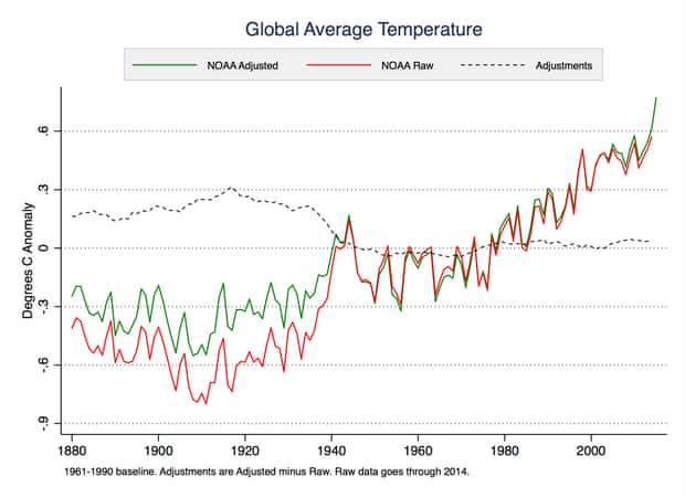
NOAA adjusted (green) and raw data (red). The dashed black line shows the difference created by the adjustments. Illustration: Zeke Hausfather
Climate contrarians who oppose taking action to slow global warming have focused their arguments on the past 18 years, during which time the warming of surface temperatures temporarily slowed down (it’s now speeding back up). The latest version of the NOAA method to adjust the temperatures made the slowdown a little smaller, and that didn’t sit well with those contrarians.
Lamar Smith soon began making conspiratorial accusations and demanding NOAA scientists’ emails. Last week, he convened a hearing in the House Science Committee and claimed, with no supporting evidence or basis in reality,
An example of how this administration promotes its suspect climate agenda can be seen at the National Oceanographic [sic] and Atmospheric Administration. Its employees altered historical climate data to get politically correct results in an attempt to disprove the eighteen year lack of global temperature increases.
NOAA conveniently issued its news release that promotes this report just as the administration announced its extensive climate change regulations.
Study shows the adjustments work well
The new study published in Geophysical Research Letters by Zeke Hausfather of Berkeley Earth, Kevin Cowtan at the University of York, and Matthew Menne and Claude Williams Jr. at NOAA, set out to test how well the adjustments are working. Contrarians’ biggest complaints focus on urban heat sources near land temperature stations, and scientists’ adjustments to remove that urban heat contamination.
To check how well those particular adjustments work, NOAA set up a network of pristinely located temperature stations across the USA that they could use as a reference. The authors of the study explain:
To help resolve uncertainties caused by reliance on the historical network, NOAA began setting up a U.S. Climate Reference Network starting in 2001. The Climate Reference Network includes 114 stations spaced throughout the U.S. that are well sited and away from cities. They have three temperature sensors that measure every two seconds and automatically send in data via satellite uplink. The reference network is intended to give us a good sense of changes in temperatures going forward, largely free from the issues that plagued the historical network.
With more than a decade’s worth of this pristine reference data available, the study authors were able to compare it to the raw and adjusted data. The US land temperature adjustments have the biggest impact on the trend from the 1950s to 1990s, because that’s when there were changes in the time of day at which the measurements were recorded, and in the technology used to take the temperatures.
The authors found the adjustments don’t have any significant effect on the average temperature or warming trend since 2004. Lead author Zeke Hausfather explained,
Over the last decade there are plenty of issues with the raw data, but they tend to roughly cancel out in their trend effects.
The study showed that the averaged raw and adjusted US land temperature data are both very close to the pristine reference data during that period of 2004–2015.
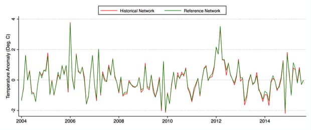
Comparison of monthly average adjusted USHCN (historical network of adjusted data) and USCRN (reference network) temperatures between January 2004 and October 2015. Illustration: Hausfather et al. (2016), Geophysical Research Letters
However, while they don’t have much effect on the average US land temperature trend since 2004, the authors found that the adjustments bring the data from individual stations closer to their nearby pristine reference measurements.
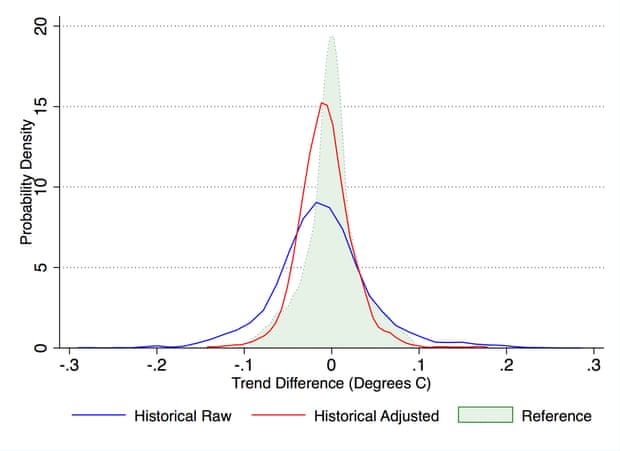
Comparison of the distribution of temperature trend differences between proximate raw (blue), adjusted (red), and reference network (green) station pairs. If the raw or adjusted data had identical trends to the reference network, they would match the green shaded area perfectly. Illustration: Hausfather et al. (2016), Geophysical Research Letters
In short, NOAA’s adjustments are doing what they’re supposed to do – removing biases in the raw data to make it more accurately reflect the true temperature changes at each measurement station. As lead author Zeke Hausfather told me,


The first graph (and similar figures published in the Karl 2015 paper) really tell the story. Looking at the difference in raw vs. adjusted data after 1945, it is hard to imagine someone arguing that they would draw a different conclusion based on use of one vs. the other. Deniers don't want the public to see these graphs because they destroy the mental image of massive data manipulation (fraud) that they are trying to sell to the casual reader.
Is there a particular cause to the step in the adjustment around 1940? It looks as if there was some specific artifact in the measurements around then?
The years between 1940 and 1945 are IMO not well-calibrated. The group responsible for taking measurements shifted from civilian to military resonsibility, and there was also a transition in the approach to measurements, from trailing canvas buckets to engine intake compartments.
I personally don't think it will ever get resolved. Is that global hot temperature spike centered at 1942 real, or is it a miscalibration?
I agree with Rocketeer. The graphical data for the strong warming phase after 1970 show no significant difference between adjusted and unadjusted data, so the issue should end there. The climate contrarians simply have no case.
But only this website and one or two others holds the contrarians to account. Other media are not asking the tough questions of contrarians, and are letting the whole of humanity down very badly.
suckfish @2, WebHubTelescope answered your question indirectly. Durring WW2 there was a large introduction of new, military ships that measured SST in the intakes to the engine room rather than by the traditional bucket method. At the end of WW2, a lot of those ships were decomissioned. The result is a large artificial spike in the raw SST data:
Kevin C discusses this in greater detail here.
nigelj @4, this bears repeating, "Other media are not asking the tough questions of contrarians, and are letting the whole of humanity down very badly."
The whole model of news reporting as necessary to democracy, and which thereby justifies certain privileges for those news organizations (protection of sources, privileged access to government officials) is shown to be badly flawed by the global warming debate. News organizations in general have modelled their activities as primarilly commercial - and in consequence attrociously fail the trust placed in them. Increasingly they report not, what is consequential, but only what is controversial (because that sells newspapers). That the AGW contrarians are repeatedly, comedically and tragically wrong is no surprise. It is a "dog bites man" story. As a result, any error by the IPCC, or any challenge to IPCC science is reported - but the massive errors by the challengers to IPCC science are passed by without comment.
To that, unfortunately, is added the pattern by some media to try to influence politics, and to shape the news they report accordingly. This was an acceptable practise (just) when media was widely diversified, and multiple independent newspapers served each town. With the modern levels of concentration in media ownership, it is as pernicious as the propaganda in monopolistic state controlled media, such as in the former Soviet Union.
WebHubTelescope @3, the pattern of unusal warmth in SST in the 1940s is matched by warmth measured by land stations in adjecent regions. While it would be astonishing if so abrupt a change in relative proportions of SST measuring practise as happened over the period of WW2 left no artifact in the data, the concurrent warming in land areas suggest a significant part of the unusual warmth in the 1940s was real.
Okay. If the first graph were correct there might be a point. However, this is clearly NOT the correct graph. This graph does not remove all adjustments. You can simply go to woodfortrees and look at unadjusted data and adjusted data and it shows the difference is considerably different than the above graph shows. The unadjusted data like the 14 satellites, the radiosondes and the ocean buoy data show for instance the 2015 WAS NOT the hottest year on record. The entire graph for all these other datasets is TOTALLY different than the land adjusted record by GISS. That's simply an indisputable scientific fact. The data clearly show that for whatever reason the sensible sounding adjustments created by climate scientists who are clearly biased to produce adjustments that don't make them look like idiots make the temperature record into something that the vast majority of people who are say > 40 years old and experienced 1998 or know the history of the 1930 and 40s know that the record adjustments being proposed seriously change history. You can find my position on this from my blog at : https://logiclogiclogic.wordpress.com/2016/01/21/48-inconvenient-truth-nytimes-lies-2015-wasnt-the-hottest-year-on-record/
I personally believe the case is closed. The preponderance of the evidence of 14 satellites, radiosonde data, unadjusted climate data, ocean buoys and a new study that shows that 411 perfect stations produce a climate record nearly identical and confirm each other while the GISS adjustments produce massive changes that spike the temperature ever upward in the current years and depress temperatures drastically in the past making the 1930s and 40s which were demonstrably EXTREMELY hot years look like FREEZING years. The 30s and 40s which set duration of times over 100 records, dustbowls, showed arctic melting that allowed ships to pass the northern passage. Every record you look at shows the 30s and 40s were or had to be CLOSE to as hot as anything today. 1998 had 15,000 people die in france from a heatwave. If 2015 was so hot, where are the record heat waves that killed or set records? The data is clear. all the data when you don't include the adjustments makes 2015 look rather unimpressive. The only way you get the flattish line going up from 1880 to 2015 is by applying the apparently craftily constructed adjustments that have been modified 30+ times all to enhance global warming. A Duke university professor calculated the chances that 30+ adjustments would all be to increase global warming is 1 in more than 1 billion chance of occuring randomly. That is essentially proof again that it is simply impossible that the GISS adjustments are correct or even close to being correct. If you remove this post as you have done in the past to squelch perfectly valid scientific doubt you will have succeeded in wasting a few minutes of my time again but you won't at all convince anybody.
[JH] The use of all-caps constitutes shouting and is prohibited by the SkS Comments Policy.
Please note that posting comments here at SkS is a privilege, not a right. This privilege can be rescinded if the posting individual treats adherence to the Comments Policy as optional, rather than the mandatory condition of participating in this online forum.
Please take the time to review the policy and ensure future comments are in full compliance with it. Thanks for your understanding and compliance in this matter.
My thank you for another great post that does an amazing job of more thoroughly explaining the legitimacy of the developing and constantly proving case against the acceptability of burning fossil fuels.
This post really helps justify the surface temperature record as the most relevant measure of the effect of the added CO2 from the burning of fossil fuels.
Other SkS posts point out the major inaccuracies and uncertainties related to the satellite data manipulations to create temperature values of the atmosphere in the 25,000 to 50,000 foot elevation range, way up in the atmosphere, not under all of the CO2 in the atmosphere.
However, there will always be some who could actually better understand this issue but desire to believe that burning fossil fuels must be OK and as a result will prefer to believe whatever sounds like it suits their interests.
jmath, check out this record heat wave in India that killed 2,500 people https://en.wikipedia.org/wiki/2015_Indian_heat_wave. Or maybe this one that killed 2,000 in Pakistan https://en.wikipedia.org/wiki/2015_Pakistan_heat_wave. Or then there is always this record heat wave in Europe in 2015 https://weather.com/forecast/news/europe-heat-wave-record-highs-june-july-2015. Maybe you prefer this record breaking California heat wave http://www.theguardian.com/us-news/2015/mar/29/california-drought-heat-wave-climate-change. This last article also mentions the severe drought causing dustbowl conditions in the southwest. Of course there was also this one http://ecowatch.com/2015/06/05/heat-wave-alaska/, and all of the deadly heat waves mentioned here http://ecowatch.com/2015/08/13/deadly-heat-waves-sweep-globe/.
I understand that it's hard to find this information, it took me multiple seconds. The idea that a cabal of scientists from around the world are manipulating data is paranoid, but I understand that it's all that climate deniers have left. Climate scientists have already heard, studied, and refuted all scientific claims that AGW is not occurring. They have also heard all the arguments about why it's not dangerous or that it's too expensive to fix, and they are still unwavering in their support for decarbonisation. Therefore, in order to be a denier, you have to believe in a conspiracy.
[JH] Moderator Comment:
jmath: Your most recent lengthy and rambling post constituted sloganeering and was laced with words in "all caps." Both are in violation of the SkS Comments Policy and therefore your post was deleted in its entirity.
Please note that posting comments here at SkS is a privilege, not a right. This privilege can and will be rescinded if the posting individual continues to treat adherence to the Comments Policy as optional, rather than the mandatory condition of participating in this online forum.
Moderating this site is a tiresome chore, particularly when commentators repeatedly submit offensive or off-topic posts. We really appreciate people's cooperation in abiding by the Comments Policy, which is largely responsible for the quality of this site.
Finally, please understand that moderation policies are not open for discussion. If you find yourself incapable of abiding by these common set of rules that everyone else observes, then a change of venues is in the offing.
Please take the time to review the policy and ensure future comments are in full compliance with it. Thanks for your understanding and compliance in this matter.
jmath: I wonder if you could help me by providing some evidence for a couple of your claims, in particular:
This claim is puzzling. I'm not aware of Woodfortrees providing a buoy-only dataset. So I went to the raw ICOADS data here and calculated my own, using just the WMO buoys and no adjustments.
Of course I may have made a mistake, so then I went to the University of Hawaii here, and downloaded their data. This is based on a different and independent set of buoys - the ARGO profiling buoys.
The results are plotted below:

As you can see, the results from two different sets of buoys calculated by different methods show remarkable agreement. Given that I used the raw WMO buoy data and my own code you can check for yourself that no adjustments were involved.
Secondly, from the same sentence:
You seem to be claiming that Woodfortrees includes unadjusted satellite records. However the series up on Woodfortrees are heavily adjusted. The adjustments are documented in the publications of both the UAH and RSS groups, for example here.
I cannot find any radiosonde data at all on Woodfortrees, however RATPAC-A shows 2015 as the hottest year on record at the surface by a wide margin.
jmath @8... Sorry, but you're incorrect about woodfortrees data. All the data sets are adjusted data. All the satellite data is very definitely adjusted, more so that the surface data sets.
Satellites are also not measuring the same thing as surface stations. They measure the troposphere from the surface up to around 10,000 km, as can be seen here. Surface stations are measuring the air at about 2m on land, and the sea surface of the oceans.
As far as the satellites not showing the hottest year on record: Well, that's not unexpected since satellite temps lag El Nino by about 6 months. I would wait until around April before making major proclamations on this one.
I took jmath's challenge and went to woodfortrees. The only unadjusted data available is HadCrut3.
Wood For Trees, HadCrut3 Unadjusted Global
From this we can see that, yes the period from about 1937 to 1945 were very warm years, however they do not challenge the years from 1998 to present.
Also, while 14 satellites worth of data sounds great, these are not separate independent sources, but for the rather a series of satellites that measured atmospheric properties since 1979 to produce a single set of data.
None of this, certainly not the satellite data, and likely not ocean bouys, supports the claim that 1940 challenges anything so far as record warm temperatures is concerned.
knaugle... You're right. I missed the unadjusted HadCRU3. It's interesting to look at the adjusted, unadjusted and HadCRU4 all together.
jmath should also note that there are specific differences in the coverage of each of the data sets as well. RSS goes from 70S to 82.5N. UAH is I think about the same, but may go down to 82.5S. The surface station data sets also have specific challenges to capturing the poles due to the lack of actual weather stations. So, the regions where we get the most warming are also the places that are hardest to capture the data.
jmath, the RATPAC-A balloon radiosonde dataset (that Kevin C told you is the hottest year on record) is the only one I've been able to find that is global (i.e., gridded globally) and is up to date through 2015. If you can tell us all what other radiosonde dataset has those necessary characteristics, we'd all be grateful. I've asked in multiple forums, including ones that Christy and Spencer watch and comment on, but so far nobody--nobody--has suggested any other datasets.
So the years 1940 to 1945 are very difficult to reconcile with any kind of model. An El Nino ENSO doesn't come close to being able to compensate for it. The ocean accounts for 70% of the contribution to the signal, and land 30%. Obviously a correction factor was put into place, but the error bars on this correction have to be significant.
Rob, knaugle:
I'm afraid the 'HadCRUT3 unadjusted' dataset at WfT is not an unadjusted dataset, despite the name. 'Unadjusted' in this context is in contrast with 'variance adjusted', and describes the method used for blending land and sea temperatures in coastal cells weighting together different observations.
CRU collect homogenized temperatures from the national weather services so they don't have an unadjusted dataset, unlike NOAA, Berkeley or ISTI. In contrast to NOAA and Berkeley however, that means that the stations are generally manually remediated using local metadata, giving an independent check against the automated methods of NOAA and Berkeley.
Supplemental reading:
New Study: Yup, Thermometers Do Show Global Warming Is Real by Phil Plait, Bad Astronomy, Slate, Feb 9, 2016
I am not a sceptic and I accept what the climate scientists are saying. But it appears the last year of the first graph shows a pretty substantial difference between the adjusted and raw data whereas everything else past around 1950 looks pretty close. In fact it looks like around 0.4 degrees. Also the dashed line showing the adjustments doesn’t seem to reflect this. Can someone explain what I am missing?
Hank @20, the difference you note is an artifact of the fact that the raw data only extends to 2014, while the adjusted data is shown to 2015. On the last year on which both can be directly compared, the difference between raw and adjusted is not noticably different from other recent years.
For the lay people => Understanding Adjustments to Temperature Data | Berkeley Earth
Histogram of all PHA changepoint adjustments for versions 3.1 and 3.2 of the PHA for minimum (left) and maximum (right) temperatures.
Denier 1: 'You are not accounting for urban heat island effects on the temperature data! It is all a fraud!'
Denier 2: 'You are adjusting the temperature data! It is all a fraud!'
What's really sad... all too often the 'Denier 1' and 'Denier 2' comments are coming from a single person.
According to the denier's logic, the left of these two images of Uranus is the correct one because it's based on raw data while the right is a fraud because the Keck telescope on Hawaii used adaptive optics to counter the turbulence in the Earth's atmosphere!
HK - A lovely example. As I stated on WUWT sime time back [archived link]:
Needless to say, this was not received well in deniersville.
Thank you Tom. I assumed there was a good reason I didn't know about.
@ 23
yes often in the same post, quickly followed by the old "trace" gas and still responible for all biotic life
Heads they win tails you loose - it's denier logic 101
Adjustment is not allowed, ever. Nothing vibrates and stagnation is not close to death.... the industrial revolution just happened mannnnnnnnnnnnnnn!! Yay, i can do i-phone graphic design and am not standing on the shoulders of any giants: no mum, promise etc.....
~;^>',,,,<
@27, I have found the most fun to be making deniers refuse to acknowledge the term 'multi-year sea-ice'.... they keep trying to dismiss you with a time series of sea ice!
I love spilling coffee....what can I say!
@23,
What is despicable is all the smart fortunate people willing to develop and pitch the deliberately misleading marketing.
The misuse of the powerful science of marketing has been far more damaging than the misuse of nuclear science to make weapons (misleading marketing can even be seen to have contribted to the efforts to justify the 'live testing' of the two different types of nuclear bombs the US had developed).
Misleading marketing creating and appealing to personal desires, winning over thoughtful conscientious responsible thinking, is the reason for the growth and prolonging of every pursuit of profit that was able to be made popular in spite of it not having been proven to be providing a lasting benefit for all of humanity. It is also the (lack of ) reason behind almost every violent conflict (most of which can clearly be seen to be illigitimate grabs at wealth and power for the benefit of only a portion of humanity, sold as things like "Defense of Freedom, or Defense of Religion" ... when in reality the promoters of the conflicts are fully aware that they are Offensive).
The greatest threat to humanity is "Misleading Marketing".
The graph below shows two interesting things:
Færder is a lighthouse located in the outer Oslofjord, about 100 km south of Oslo. Nesbyen is a village in the Hallingdalen valley, about 120 km northwest of Oslo. It’s known for its high summer temperatures, but has much colder winters than Oslo and Færder.
I considered including Stockholm in Sweden too (about 400 km east of Oslo), but it would make the graph seem quite cluttered since Stockholm’s absolute temperature and trend is almost identical to Oslo’s.
OPOF:
OPOF has identified the fundamental reason why AGW is an existential threat. Scientists are constrained to let facts speak for themselves, or they are subject to severe professional sanction. The people who stand to lose the most if the world stops burning fossil carbon are, OTOH, not subject to penalty for misleading the public by the clever use of language. They are willing to pay top dollar for skilled professional disinformers, because it takes money to make money Hence, the doom of the world.
Supplemental reading:
Lamar Smith: Still Fishing With Dynamite by Phil Plait, Bad Astonomy, Mar 7, 2016
Hi,
an argument that appears on many climate skeptic blogs (ex: https://stevengoddard.wordpress.com/2014/10/02/co2-drives-ncdc-data-tampering/) to justify the claim that there is deliberate tampering going on is to plot the NOAA temperature adjustments against measurements of atmospheric c02 and finding that there is an almost perfect fit. While a close correlation imo can be expected, that close of a fit appears surprising to me too. As I'm neither a climate scientist nor a statistician I was wondering whether someone could provide an explanation for this?
Spassapparat @34, Tony Heller (aka Steven Goddard) shows the following graph of USHCN adjustments:
You will notice that there is not a lot of scatter in the individual points from year to year, a necessary feature for the high correlation with CO2 given the very limited scatter found in the CO2 record (at least from Mauna Loa). That being said, the graph comes as a surprise to me, for I have typically seen a much larger year to year scatter in the graphs, such as shown here:
The author of this second graph is in obvious, and fundamental disagreement with Tony Heller about the size and nature of the adjustments in the USHCN temperature record. Importantly, if Heller is correct, there is a significant correlation between CO2 concentrations and temperature adjustments, but if the author of the second graph is correct, there is not. That is odd, because the author of the second graph is Tony Heller.
It turns out that when Heller is not trying to argue that there is a high correlation between CO2 concentration and temperature adjustments, he thinks the adjustments are very different from what he takes them to be when he trying to make that argument. It might make one think that Heller has adjusted his calculation of the adjustments to fit is CO2 correlation argument.
In any event, the basis of the adjustments is in fact well known. NOAA publishes the algorithms used to make the adjustments. The publish the raw and final data as well. Consequently anybody with the appropriate skills and determination can calculate the adjustments independently of NOAA. Several people have, and they have come up with the same result. Needless to say, none of NOAA's algorithms make any reference to CO2 concentration, as can be seen for the step wise adjustments as calculated by Judith Curry:
Heller knows this, so he knows that any correlation between the adjustments and CO2 concentration (whether assisted by adjusting the adjustments or not) is coincidental. His failure to discuss the known basis of the adjustments in his post must therefore be considered a calculated deceit.
"The adjustments are scientifically necessary"
But are they actually science?
When the hypothesis is not supported by the data you change the hypothesis NOT the data.
So lets look at the 34 (yes 34) "official" Nasa/Giss temperature records issued between 1998-2011. In this "unbiased" purely "scientific" process of "correcting" temp data you might expect near 50/50 distribution of +/- adjustments? Well, not so much, of the 34 adjustments 33 raised current temps and lowered historical temps. The odds of 33 to 1 distribution? A most reeasonable and unbiased 1 in 505,300,000 or 20x worse than hitting the super lotto..
[DB] Please limit image displayed with to 450.
Please note that posting comments here at SkS is a privilege, not a right. This privilege can be rescinded if the posting individual treats adherence to the Comments Policy as optional, rather than the mandatory condition of participating in this online forum.
Please take the time to review the policy and ensure future comments are in full compliance with it. Thanks for your understanding and compliance in this matter.
Corrupting good data with bad for the sake of "science"
[DB] Please limit image displayed width to 450.
Scottfree1 @36 and @37 ,
. . . your cherrypicking is a laugh.
Please read the article above and its following comments.
Then ask yourself, if there is no real global warming — then why is the ice melting and the sea-level rising, and plants & animals changing their habits as well.
Could it be that the plants & animals are smarter than the average denier?