Let's take a step back and have a look at what the data say about the warming of the Earth's climate.
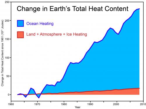
The most relevant figure when talking about global warming is the Earth's total heat content. Data from Church et al. (2011) recently updated this picture, showing that total global heat content continues its steady climb upwards. As Figure 1 shows, most of this heat (about 90%) has gone into the oceans, and the continuing rise of both global and ocean heat content is probably the best indicator that global warming hasn't even slowed down.
Figure 1: Total global heat content. Data from Church et al. (2011).
Although the rate of warming of surface air and lower troposphere temperatures appear to have slowed over the past few years, the same could be said at any virtually any point in time by cherrypicking short-term noise and ignoring the long-term trend (Figure 2).
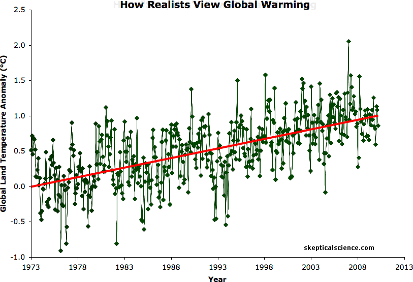
Figure 2: BEST land-only surface temperature data (green) with linear trends applied to the timeframes 1973 to 1980, 1980 to 1988, 1988 to 1995, 1995 to 2001, 1998 to 2005, 2002 to 2010 (blue), and 1973 to 2010 (red). Hat-tip to Skeptical Science contributor Sphaerica for identifying all of these "cooling trends."
However, Foster and Rahmstorf (2011) found that when we filter out the short-term effects of the El Niño Southern Oscillation (ENSO) and volcanic and solar activity, the underlying global warming signal has remained remarkably steady. Kaufmann (2011) similarly found that virtually every short-term effect has been in the cooling direction over the past decade.
Some question remains as to how much of the temporary slowdown in surface warming is due to human aerosol emissions, how much due to ENSO, how much due to heat being transferred to the deep oceans, and so forth. Although these questions still need to be resolved through future research, the underlying global warming trend remains, and the short-term dampening won't last forever.
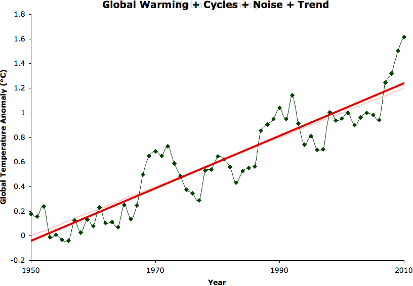
Some climate denialists continue to try and argue that rather than with a steady man-made warming signal, the data are better fit with abrupt step changes caused by El Niño events, followed by flat periods. This is a physically incorrect argument which is easily refuted with one simple question - if El Niños cause abrupt temperature step changes upward, why wouldn't La Niñas cause equivalent abrupt temperature step changes downward? However, as long as we don't mind disregarding physical reality, it's easy to pretend global warming just boils down to these El Niño step changes by playing the denialists' favorite game - curve fitting.
Some of the increase in global heat content has gone into melting ice, particularly in the Arctic, where the rate of warming is the largest on the planet. Although Antarctic sea ice extent has modestly increased for various complex reasons, the loss of Arctic sea ice extent has been far more rapid, resulting in a net decrease in global sea ice extent (Figure 3).
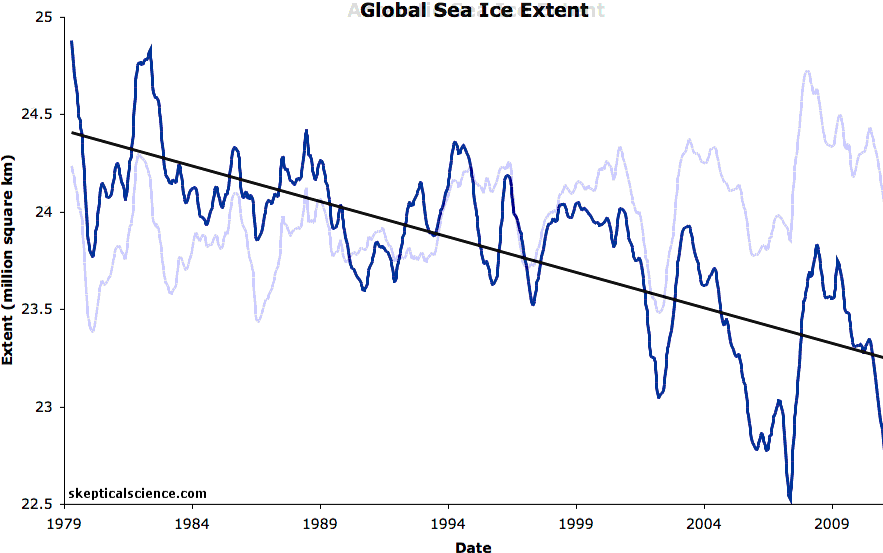
Figure 3: National Snow and Ice Data Center (NSIDC) Antarctic, Arctic, and global (sum of the two) sea ice extents with linear trends. The data is smoothed with a 12-month running average.
Moreover, ice is a three-dimensional quantity, and Arctic sea ice volume has been declining even more rapidly than its extent. Antarctic ice mass has also declined.
Snow extent has fallen as well, though climate denialists argue otherwise by focusing on the winter months, while ignoring the spring and summer months. A warming planet will not necessarily result in less winter snowfall, as more atmospheric water vapor will tend to lead to more precipitation, and in the winter that precipitation will often fall in the form of snow. However, in a warming world, that snow will tend to melt earlier in the year, and thus we expect to see spring and summer snow cover extent decline. That is indeed what we have observed. As a result, annual northern hemisphere snow cover extent is declining at a rate of 325,000 square kilometers (km) per decade (Figure 4).
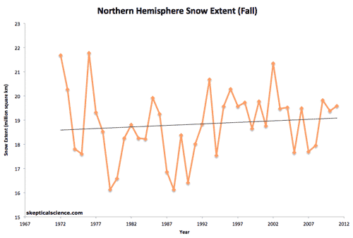
Figure 4: Seasonal and annual (with a 12-month running average) northern hemisphere snow cover extent (data from Rutgers University Global Snow Lab)
Certain climate denialists have also recently tried very hard to argue that the planet is not "rapidly warming," although "rapid" is a highly subjective term, which they have failed to define.
We can use paleoclimate data to create an objective gauge of what may be considered "rapid warming." For example, transitions between glacial and interglacial periods are among the most rapid warming/cooling events in the paleoclimate record, and occur over several thousand years. During these transitions, the Earth's average surface temperature changes by approximately 5°C. Thus the average rate of warming during a glacial-interglacial transition is approximately 1°C per millenium, or 0.01°C per decade. Our current rate of warming is approximately 0.08°C per decade over the past 100 years, 0.17°C per decade over the past 30 years, and is expected to increase in upcoming decades unless we get our greenhouse gas emissions under control. Thus by an objective measure, the planet is indeed warming rapidly.
The bottom line is that no matter how hard we might try to convince ourselves otherwise, every line of observational evidence shows that the planet is warming, and from an objective geological perspective, it's warming at a rapid rate.
Posted by dana1981 on Thursday, 5 January, 2012
 |
The Skeptical Science website by Skeptical Science is licensed under a Creative Commons Attribution 3.0 Unported License. |