If you've ever wondered how much global warming has raised local temperatures in your area or elsewhere on the globe, the University of East Anglia Climatic Research Unit (UEA CRU) has just released a new interactive Google Earth layer that will let you answer this question with ease. UEA CRU is one of the scientific organizations that compile temperature data from around the world. Their temperature dataset over land is called CRUTEM4, and is one of the most widely used records of the climate system.
The new Google Earth format allows users to scroll around the world, zoom in on 6,000 weather stations, and view monthly, seasonal and annual temperature data more easily than ever before. Users can drill down to see some 20,000 graphs – some of which show temperature records dating back to 1850.
The move is part of an ongoing effort to make data about past climate and climate change as accessible and transparent as possible. Dr. Tim Osborn from UEA CRU said,
"The beauty of using Google Earth is that you can instantly see where the weather stations are, zoom in on specific countries, and see station datasets much more clearly.
The data itself comes from the latest CRUTEM4 figures, which have been freely available on our website and via the Met Office. But we wanted to make this key temperature dataset as interactive and user-friendly as possible."
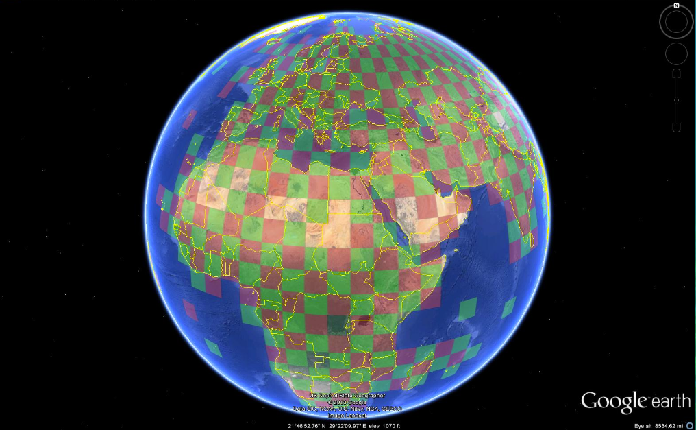
The Google Earth interface shows how the globe has been split into 5° latitude and longitude grid boxes. The boxes are about 550 kilometers wide along the Equator, narrowing towards the North and South poles. The red and green checkerboard covers most of the Earth and indicates areas of land where station data are available. Clicking on a grid box reveals the area's annual temperatures, as well as links to more detailed downloadable station data.
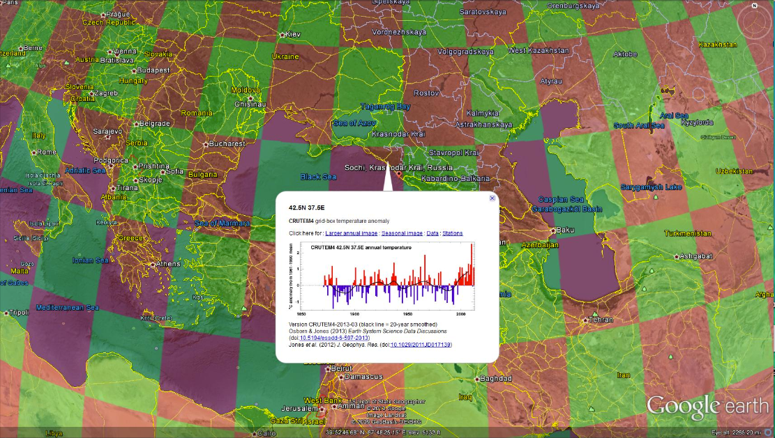
Curious about how much global warming has caused temperatures around the winter Olympics venues near Sochi, Russia to rise? Just click on the grid in Google Earth and a graph pops up showing flat temperatures from 1900 to 1990 followed by a nearly 1°C rise over the past 25 years.
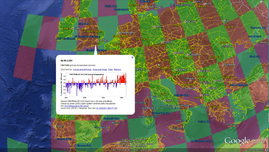
Wondering how much the area around London has warmed in recent decades? The answer again is just a click away, and shows a similar rate of warming to that near Sochi.
This new initiative is described in a new research paper published in the journal Earth System Science Data. Scientists at UEA hope that making the temperature data easily accessible to the public will add another level of quality control. Dr. Osborn said,
