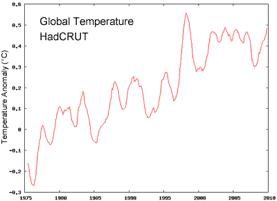
Figure 1: 12 month average of global temperature anomaly from the Hadley Centre (HadCRUT).
To properly understand what's happening to our climate, you have to consider the full body of evidence. Most arguments that support climate skepticism have one thing in common - they neglect the full body of evidence and cherry pick just the select pieces of data that support a particular point of view. There is one argument that is so misleading - it requires 3 separate levels of cherry picking. This argument is "global warming stopped in 1998". Let's look at the 3 ways it cherry picks the data:
This argument is based on a temperature record from the Hadley Centre in

Figure 1: 12 month average of global temperature anomaly from the Hadley Centre (HadCRUT).
The important point to realise is that the HadCRUT record is not a truly global temperature record. Their record doesn’t include many regions, some of which happen to be the regions where the fastest warming is occurring. An analysis by the European Centre for Medium-Range Weather Forecasts (ECMWF) calculated global temperature, utilising a range of sources including surface temperature measurements, satellites, radiosondes, ships and buoys. They found recent warming has been higher than that shown by HadCRUT as the HadCRUT record misses out on the parts of the world of greatest warming.
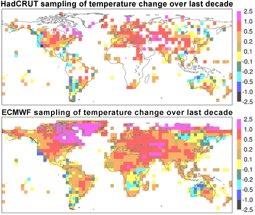
Figure 2: Increase in mean near-surface temperature (°C) from (1989-98) to (1999-2008). Top figure shows HadCRUT sampling regions, lower figure shows ECMWF analysis (ECMWF 2009).
This is confirmed by NASA GISS who found a major contributor to recent warming is extreme Arctic warming (Hansen 2006). As there are few meterological stations in the
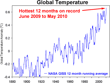
Figure 3: 12 month average of global temperature anomaly from NASA GISS.
Even NASA's global temperature record doesn’t give you the full picture. The surface temperature record tells us about air temperature at the Earth’s surface. However, this is only a small part of global warming. Because of increased greenhouse gases, the planet is building up heat. More energy is coming in than going out. Did this energy imbalance stop in 1998? To determine this, one study measured the Earth’s total heat content since 1950. The authors used measurements of ocean heat content down to 3000 metres depth. The amount of heat in the atmosphere was calculated using the surface temperature record and the heat capacity of the lower atmosphere. Warming land and the energy required to melt ice were also included.
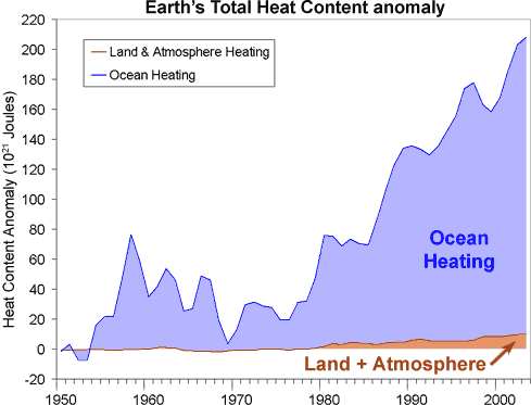
Figure 4: Total Earth Heat Content from 1950 to 2003 (Murphy 2009).
What they find is the planet has clearly continued to build up heat past 1998. Global warming has not stopped. It also shows that most of global warming is going into the oceans. This is because the heat capacity of the land and atmosphere is small compared to the ocean. This leads us to our third cherry pick.
The ocean holds significantly more heat than the atmosphere. Consequently, relatively small exchanges of heat between the atmosphere and ocean can cause large changes in surface temperature. In 1998, we experienced the strongest El Niño on record. This moved massive amounts of heat from the
This internal variation where heat shuffles around our climate is the main reason why surface temperature is such a noisy signal. With so much internal variability, it can be misleading to make conclusions about climate trends merely by comparing one point of a noisy signal (eg – 1998) to other years. This is why scientists employ statistical methods to discern long-term trends – this is a way of including all the data rather than a few cherry picked years. A common method to remove short-term variations, revealing any underlying trend, is to plot a moving average.
Figure 5 shows the 11 year moving average - the average temperature anomaly calculated over the year itself and five years either side. Three temperature records are examined: the Hadley Centre at the
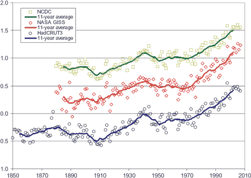
Figure 5: Yearly global temperature anomalies, together with 11-year moving averages (solid lines). Blue circles from the Hadley Centre. Red diamonds from NASA GISS. Green squares from NOAA NCDC. NASA GISS and NOAA NCDC are offset in vertical direction by increments of 0.5°C for visual clarity (Fawcett & Jones 2008).
Note: a short version of this post was used as the debunk of the week in the Irregular Climate Podcast #8. Here's a transcript of the debunk showing how all the above information was boiled down into 4 short paragraphs.
Posted by John Cook on Wednesday, 21 July, 2010
 |
The Skeptical Science website by Skeptical Science is licensed under a Creative Commons Attribution 3.0 Unported License. |