This is a re-post from Tamino's Open Mind blog
A certain blogger decided to inform us all that Bob Carter does the Business, referring to the this presentation to the Sydney Mining Club. Others have praised Carter’s presentation at the Heartland conference. There’s a lot of similarity between two presentations. And what, you wonder, does Bob Carter have to say about global warming?
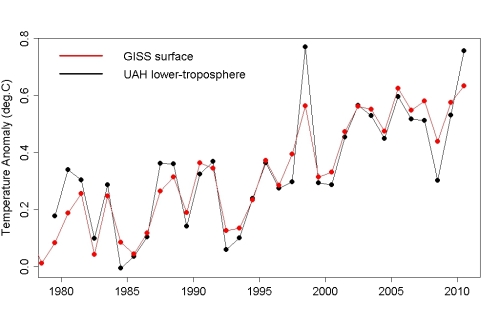
For one thing, Carter goes to some length to claim that the surface temperature record (according to institutions like NASA GISS) is unreliable. In fact he implies that it’s downright useless. Yet he also states that the satellite record is reliable (and he uses the version from UAH). Which makes me wonder — if the satellite record is so reliable but the surface record is so useless, why do they agree so closely?
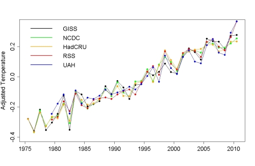
One also wonders — why is it that when the influence of exogenous factors (like el Nino, volcanic eruptions, the solar cycle) is accounted for, the match is even better, not just between NASA GISS and UAH satellite data, but among all five best-known global temperature data sets?

It looks like Carter’s characterization of the surface temperature record is just fake criticism from a fake skeptic.
Carter also repeats his common claim that we’ve seen cooling over the last decade. Which makes me wonder — has he actually looked at the data? Because both the surface temperature record from NASA GISS and the satellite data from UAH show positive trend rates up to the present for all start years from 1990 through 2004 — no matter how you define “the last decade,” it hasn’t shown global cooling; Carter’s claim is a fake trend from a fake skeptic.
Carter makes much of the satellite record, taking advantage of the fact that when he gave his presentation to the Sydney Mining Club the most recent data point was March 2011, a low point due to the La Nina:
He doesn’t just focus on that one point. He focuses on three:
Two can play at that game — I can pick three points too:
I’ve got to credit Carter for his ability to plumb the depths of fakery — it’s hard to imagine a more fake portrayal of the data than Carter’s 3 dots. All he has shown is that because the data show noise in addition to trend, it’s easy to find an extra-high point early and an extra-low point late, put big red dots on them, and imply that there’s been no real change. It’s called “cherry picking,” and it’s yet another fake trend from a fake skeptic. We should pity those who lap it up, because being an idiot is not enough to make you to fall for this — you have to be a complete idiot.
Carter does pay lip service to the idea of a trend. But he disdains the trend for the entire data set — in fact he seems to disdain trends altogether — instead showing these two straight lines, one ending at 1997, the other beginning at 1999:
He then tells a fable about the 1998 el Nino causing some kind of “shift” in the fundamental state of the climate system, after which it “settled in” to a different basic temperature level. There’s a name for his kind of theory.
More to the point, the two lines he draws aren’t trend lines. He just drew two flat lines to give the impression of no change. There’s a name for that too.
Here are actual trend lines up to 1997, and after 1999:
Incidentally that post-1999 trend line is even steeper than the trend line through the entire data set:
In case you suspect that the reason for the uptrend since 1999 is that I’ve included data after March 2011, I’ll add the trend line using just data from 1999 through March 2011 (in blue):
Carter’s flat lines are nothing but fake lines from a fake skeptic.
Having insulted the surface temperature record and tormented the satellite data, Carter moves on to the radiosonde record from HadAT2. But he didn’t bother to go get the data. Instead he shows this graph, which leaves out the last 9 years:
It’s a reproduction of this graph from Thorne et al. (2005, JGR, 110, D18105):
This data set is for the 500 hPa level of the atmosphere (about 5.5 km altitude). Carter again plays with dots to imply there’s been no warming, starting with two dots in his Sydney Mining Club presentation:
In his Heartland presentation he used three dots, and claimed that there’s been no global warming for 52 years, since 1958.
I can play with dots too. I can also go get the actual data:
I can even play with smoothing functions and show how fake Carter’s claim of “no global warming for 52 years” is:
The most surprising thing about Bob Carter’s presentations, both at the Sydney Mining Club and at the Heartland conference, is that his chicanery is so amateurish. He’s so transparent that you really have to bury your head in the sand (or perhaps somewhere else) not to see right through it.
Posted by Tamino on Sunday, 17 July, 2011
 |
The Skeptical Science website by Skeptical Science is licensed under a Creative Commons Attribution 3.0 Unported License. |