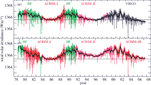
Figure 2: PMOD TSI composite (top) versus the ACRIM TSI composite (bottom). Coloured lines give the daily values with the black solid lines giving the 81 day mean.
What The Science Says:
Various independent measurements of solar activity all confirm the sun has shown a slight cooling trend since 1978.
Climate Myth: The sun is getting hotter
There is no single continuous satellite measurement of Total Solar Irradiance (TSI). Instead, the data is composited from various satellite measurements. The two most cited composites are PMOD and ACRIM. According to Nicola Scafetta, ACRIM more faithfully reproduces the observations whereas PMOD assumes the published TSI satellite data are wrong and need additional corrections. In particular, PMOD alters the data from the Nimbus7/ERB record from 1989 to 1991. Nimbus7/ERB data during such a short period show a clear upward trend while PMOD during the same period is almost constant. The alteration of the Nimbus7/ERB data is responsible for the different shape between the ACRIM and PMOD TSI composites (Shining More Light on the Solar Factor).
The ACRIM composite shows a slight increase in TSI - the PMOD composite shows a slight decrease. Regardless of which dataset you use, the trend is so slight, solar variations can at most have contributed only a fraction of the current global warming. Scafetta & West 2006 uses the ACRIM composite and finds 50% of warming since 1900 is due to solar variations. However, the warming from solar influence occured primarily in the early 20th century when the sun showed significant warming. As for the global warming trend that began around 1975, Scafetta concludes "since 1975 global warming has occurred much faster than could be reasonably expected from the sun alone."
While the argument over ACRIM vs PMOD has minimal bearing on the global warming debate, determining the more accurate TSI reconstruction is a significant piece in the climate puzzle. The major difference between the two composites is the handling of data between 1989 and 1991. There is a 2 year gap between ACRIM-I and ACRIM-II (tragically due to the Challenger space shuttle explosion). To fill the gap, both composites use the HF data but in dramatically different ways.
Figure 2: PMOD TSI composite (top) versus the ACRIM TSI composite (bottom). Coloured lines give the daily values with the black solid lines giving the 81 day mean.
PMOD applies corrections to the HF data, which has many sudden jumps due to changes in the orientation of the spacecraft and to switch-offs. Figure 2 demonstrates how the HF corrections are responsible for virtually all of the difference between the long-term drifts of the composites.

Figure 3: The difference between the ACRIM and PMOD composites. The grey line gives the daily values, the black line the 81 day running mean. The step in the ACRIM gap during 1989 is clearly seen and is about half the amplitude of the solar cycle variation.
So which composite correctly handled the HF data? Does TSI dramatically increase during the HF period as ACRIM supposes and the raw HF data indicates? Or did PMOD get their calibrations right when they adjusted the data to show slight solar cooling over the ACRIM gap? There are a number of independent measurements that can confirm the trend in solar activity over this period.
In March 2009, one study claimed the ACRIM composite was independently confirmed by the SATIRE model (Scafetta & Willson 2009). This is a model of TSI created by Krivova and Solanki. In response, Krivova and Solanki published ACRIM-gap and total solar irradiance revisited: Is there a secular trend between 1986 and 1996? (Krivova et al. 2009).
There are several versions of the SATIRE model, each developed from different data and optimised for different time scales. For periods after 1974, they calculate TSI values based on daily measurements of solar magnetograms. For longer periods going back centuries, they used sunspot numbers to reconstruct TSI. When parsing sunspot data, averages over several months must be used. Therefore, the sunspot model is significantly less accurate than the magnetogram model on short time scales.
Scafetta & Willson 2009 used the sunspot model in their analysis. By design, the sunspot model is suitable for decadal to centennial scales but significantly less accurate on time scales of months. The more appropriate model is based on daily measurements of solar magnetograms. Therefore, Krivova and Solanki take the next logical step and analyse the TSI results from the magnetogram model over the ACRIM gap. What they found was TSI does not increase over this period. Thus the SATIRE model is independent confirmation that the PMOD composite is the more accurate representation of solar activity.
To put things into perspective, the ACRIM vs PMOD debate is essentially arguing over whether the sun is showing a slight upwards trend or a slight downwards trend or if there's even a trend at all. This only underscores the sharp breakdown in correlation between sun and climate since temperatures started rising in the mid 1970's.
 |
The Skeptical Science website by Skeptical Science is licensed under a Creative Commons Attribution 3.0 Unported License. |