


 Arguments


Human fingerprints on climate change rule out natural cycles
What the science says...
| Select a level... |
 Basic
Basic
|
 Intermediate
| |||
|
No known natural forcing fits the fingerprints of observed warming except anthropogenic greenhouse gases. |
|||||
Climate Myth...
It's a natural cycle
"Global warming (i.e, the warming since 1977) is over. The minute increase of anthropogenic CO2 in the atmosphere (0.008%) was not the cause of the warming—it was a continuation of natural cycles that occurred over the past 500 years." (Don Easterbrook)
At a glance
The passage of time reveals many things. Consider for a moment the myth in the box above. It is dated 2008 and says, "Global warming (i.e, the warming since 1977) is over." Fifteen years on from that date and we can say, with complete confidence, "utter rubbish" (or words to that effect).
In a temperature record stretching back into the late 19th Century, the ten hottest years have all occurred since 2010. The hottest by a large margin (at the time of writing - early 2024) was 2023, with 2016 in second place. In both cases manmade global warming augmented by El Nino nudged these years into pole position. The opposite to El Nino, La Nina, is a phenomenon that cools the planet. One of the top ten, 2022, was also the warmest La Nina year on record. Starting to see a pattern here?
There are many natural cycles out there that do affect the climate. Consider the Milankovitch orbital cycles that are strong enough to trigger the switches between glacials and interglacials. These cycles operate over tens of thousands of years so their year-to-year effects are barely discernible.Yet they can cause ice-sheets to wax and wane over vast areas of the planet, especially in the Northern Hemisphere where the vast majority of landmasses currently reside. At the other end of the spectrum is the El Nino Southern Oscillation (ENSO) that most folk have heard of because it causes newsworthy weather events. Climate scientists know all about these cycles and their effects. It's part of the job description.
Those of you who click on the myth's link will find a lot about a cycle known as the 'Pacific Decadal Oscillation' (PDO). That's not a regular cycle that turns up on time, as buses and trains ought to. But yes, it does influence climate as it has warm and cool phases, just like ENSO but in a different part of the Pacific Ocean and over longer periods. And yes, climate scientists monitor the PDO, just like everything else. The PDO is expressed as an Index: values above 0 are positive (warm) and those below 0 are negative (cool). And here's the rub. Since autumn 2019, the PDO Index has been negative, often strongly so. Yet the planet's temperature continues to rise unchecked.
The problem is that in climate more than one thing can happen at once. And since 1950, our CO2 emissions have surged ever-upwards and the climate is responding to that, too. In other words, human-caused global warming is now overdubbing the effects of such cycles. They used to count for a lot more than they do now.
The carbon cycle describes the way in which carbon moves around the planetary system comprising the atmosphere, the oceans, the biosphere and the solid Earth. The first and last components are where the problem lies. In burning fossil fuels, we have accessed carbon that by rights should have stayed in the solid Earth for untold millions of years. In doing so, that carbon has been dumped into the atmosphere. It represents a disturbance to the carbon cycle rarely seen in the geological record. And the planet is responding to that by heating up.
There's only one cycle we need to worry about and that's the carbon cycle.
Please use this form to provide feedback about this new "At a glance" section. Read a more technical version below or dig deeper via the tabs above!
Further details
Global warming refers to the long-term increase in global temperature since the 1850s. The only plausible mechanism for global warming is a planetary energy imbalance. In other words, our climate system is accumulating heat. Let's take a look.
Fossil fuel burning is causing recent global warming
Two factors drive any global climate change. One is internal variability and the other is external forcings. Internal variability refers to the processes moving heat around within the climate system. External forcings differ because they cause an energy imbalance, in which heat is either added to or removed from the climate system. They can have both natural and human causes. In the case of the current warming, scientists have long since concluded that the main cause is the increase of atmospheric CO2 due to fossil fuel burning. That's been known since the mid 1950s, following decades of investigations.
Internal variability moves heat around the climate system
Global warming has been likened to the motion of water in a kitchen sink. There's an inflow from the tap and an outflow through the drain. The motion has two components. Firstly, there's the water sloshing around. That's what scientists call 'internal variability'. Secondly, there's the increase or decrease in water volume, depending on the relative amounts of inflow and outflow. That's what scientists call 'external forcings'.
Internal variability includes important oceanic cycles. Examples are the El Niño Southern Oscillation (ENSO) or the Pacific Decadal Oscillation (PDO). These well-understood phenomena move heat around, causing regional climatic fluctuations. Such regional effects occur on timescales ranging from years to decades. But like the water sloshing around in the sink, internal variability doesn't add to or take away the total amount of heat in the climate system.
The single cause fallacy committed by the natural cycle myth
This myth, from Don Easterbrook, contended that recent global warming is caused by natural cycles rather than human activity. The fact that it was put forward in 2008 and ten of the warmest years on record have happened since 2010 rebuts Easterbrook's contention all on its own. Easterbrook fell foul of the 'single cause fallacy', by proposing there is only one driver of climate change (e.g. natural factors) when there may be others (e.g. human activity). In fact, there are always many things going on at once when it comes to climate.
Various variants of this myth are out there in the wild, unsurprisingly. Sometimes a particular cycle is picked but quite often it's just an arm-waving 'natural cycle', hoping the reader/listener/viewer doesn't ask for specifics. The best cycles of all, if you want to pretend to your layperson audience that climate change has nothing to do with us humans, are imaginary ones of medium to long duration. These have the great advantage that, for the denier, they will not repeat during their lifetime - most deniers are men who are past to well-past middle age. Ideally, therefore, they want such a cycle to repeat every 50-100 years, so if they are shown to be 100% wrong, natural processes will have ensured they are not around to face the music.
Easterbrook did focus on a specific cycle, the PDO. The Pacific Decadal Oscillation is an irregular cyclical variation in sea surface temperature anomalies over the North Pacific Ocean. It influences weather patterns, importantly including precipitation, across large parts of Asia and North America. That gives us grist to grind because, as with all known cycles, it has been studied in detail and is monitored. The data gathered mean we can index the state of the PDO and plot negative - or cool - phases and positive - or warm - ones against time, just as we do with temperature and other parameters (fig.1).
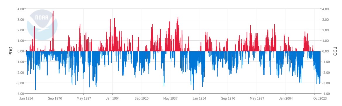
Fig. 1: the Pacific Decadal Oscillation Index from 1864 to October 2023. Even eyeballing this plot suggests the cool and warm phases more or less cancel one another out. Source: NOAA.
In another in-depth Skeptical Science piece purely about the PDO, ironically dating to around the time that Easterbrook made his claim, the truth was revealed when the trends of global temperature and the PDO Index were plotted on the same graph (fig. 2).
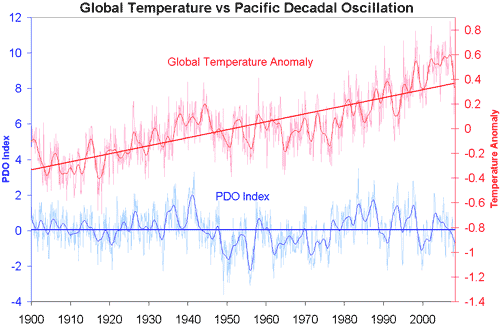
Figure 2: Pacific Decadal Oscillation index (blue - University of Washington) versus Global Temperature Anomaly (Red - GISS Temp). Smoothed data (thicker blue and red lines) and trend lines (thick straight line) are added.
Since then of course, global temperatures have continued to rise with 2023 having been the hottest year on record. Natural oscillations like the PDO don't have the ability to either create or retain heat. They simply move heat around from oceans to air and vice-versa. That means they are not capable of causing a long-term warming trend like the one we are witnessing. When you think about it, if the PDO (or some other internal cycle) was responsible for warming the surface, the oceans would be cooling, which is not the case.
Before the 19th Century, human influence on climate was a fraction of what it is now. Natural cycles were the dominant drivers of global temperature changes. But now, that record has been overwritten. The colossal quantities of carbon released from the solid Earth through fossil fuel burning have made certain of that. Natural cycles can still explain the noise along the upwards curve that is human-caused global warming. However, they utterly fail to explain the continuously upward trend itself. The cause of that is the 50% increase in CO2 in Earth's atmosphere and that's mostly down to us.
Last updated on 17 March 2024 by John Mason. View Archives


Hello,
Have you discussed the alleged 'Atlantic multidecadal oscillation'?
“ we
06:56
talked about the Atlantic multidecadal
06:58
oscillation this is the actual sea
07:01
surface temperatures of the Atlantic and
07:04
it goes into 60 years cycle there's 30
07:06
up 30 down warm and cold phases warm and
07:09
cold warm and cold if you go look at the
07:12
data it matches the Atlantic
07:14
multidecadal oscillation perfectly”
https://www.youtube.com/watch?v=fK03WG4t30U&feature=youtu.be
Thanks.
[JH] Poorly disguised sloganeering snipped.
Please note that posting comments here at SkS is a privilege, not a right. This privilege can be rescinded if the posting individual treats adherence to the Comments Policy as optional, rather than the mandatory condition of participating in this online forum.
Please take the time to review the policy and ensure future comments are in full compliance with it. Thanks for your understanding and compliance in this matter.
Postkey @26 , thanks for the youtube video reference.
It was the best laugh I've had this week !
Spoiler Alert : the video is a complete waste of time. Rubbish from beginning to end. A rant from a crackpot who bases his opinions on the slightly-less-than-truthful info supplied/concocted/doctored by the slightly-less-than-truthful Tony Heller [ aka "Steven Goddard' ]. Plus a large dose of insane Conspiracy Theory.
The ranter also has a bad case of AMO on the brain [Atlantic Multidecadal Oscillation]. And, from his stargazing at the charts, he predicts [on zero scientific basis] that the Earth is just about to plunge into a Grand Solar Minimum which will devastate the planet with a mini-ice-age.
Too many other laughable points to mention here. Yes, the Fall of the Roman Empire; the (European) Black Death Plague; and other grand historical events — all caused by cold weather. And our ranting friend is clueless and self-contradictory about the decline of arctic ice.
Sorry Postkey, but on climate this guy has no science and no sense. ~ A 15-minute video of yawning [seen it all before] rubbish.
This Tony Heller???
BwaHaHaHaHa!!!!!!!
Eclectic @27.
Thanks for your reply, I'm glad you 'enjoyed it'.
Is there a statistical base to the 'Atlantic multidecadal oscillation'?
Postkey @26,
I would concur with the replies so far. I note the oft-repeated word "lie" that features in the YouTube you link to (narrated by "Diamond(?) from the Oppenheimer Ranch Project") which is a pretty good description of the entire video. In the main, the descriptions provided of the data presented is nothing but nonsensical verbal diarrhea, although within this nonsense description, the data presented is mainly genuine. There are however parts of the video where even the data is entirely misrepresented.
Featuring large in the misrepresentated data is the laughable attempt by Tony Heller to graft on satellite Sea Ice Extent data onto Vinnikov et al (1980) Figure 5 (or more exactly Hoffert & Flannery (1985) fig 5.2).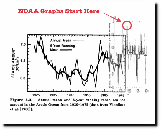 Note H&F(1985)'s fig 5.1 reproduces Vinnikov et al's temperature graph. Heller would have had a more difficult time misrepresenting this temperature data, and also explaining it in light of his fictional ice record. (The image here is the same data as H&F fig 5.1 but presented by Robock 1982.)
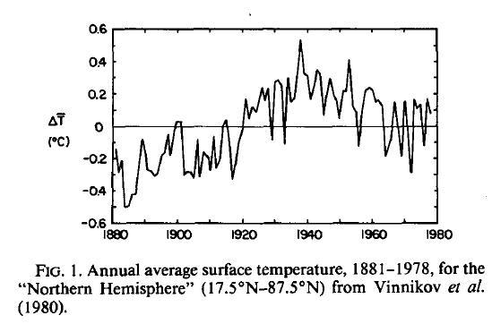
As for Fig 5.2, as presented by H&F(1985), this at first glance reproduces Fig5 of Vinnikov et al (1980) faithfully. (The original was is published in Russian in Soviet Meteorology & Hydrology Vol6.1 and isn't on-line.) But while the caption of Vinnikov et al's Fig5 is roughly reproduced by H&F(1985), the actual data presented has become misrepresented by the caption. As shown within this Vinnikov slide show, V(1980)fig5 is a plot of the annual ice coverage for the months of July, August & September and not the plot of a 12-month annual average. That is how a value of 6-7 million sq km can be plotted for the period 1925-75 and how any grown-up splicing of more recent ice coverage would be plotting levels of 4-5 million sq km over the last ten years.
Which brings us to the AMO. The video attempts to suggest that the Arctic Ice Cover matches the wobbles of the AMO. Frankly, that is risible. Even with Heller's nonsense graph it is risible. So I can quite understand Eclectic @27 saying "It was the best laugh I've had this week !"
MA Rodger @30.
Thank you for your reply.
Postkey @29 , yes that video presentation evoked both laughter & boredom, simultaneously.
Postkey, as you increase and extend your knowledge of climate matters, you will soon discover two things :-
(A) For all their imperfections & uncertainties, the scientists aim to present things as honestly & truthfully as they can.
(B) The anti-science propagandists (such as Mr Heller/Goddard) do not hesitate to mislead and deceive. They will cherrypick / "doctor" / fabricate . . . to whatever extent they think they can get away with. They aim to outright deceive the reader — or at least get him thinking that with so much "controversy" then he might as well put the climate/AGW issue on the backburner 'cos it seems nobody knows what the hell's going on. ~Either of those outcomes will satisfy the propaganda industry, as represented by GWPF, Heartland Institute, and other such "front" organizations. (And you will notice, Postkey, that the more scientifically-ignorant their audience, the more these proagandists extend their lies & deceptions. You will see that in places as diverse as Wall Street Journal op-eds and "lie & spin" websites like WattsUpWithThat or JoNova. They are completely shameless in their disregard for truthful presentation.)
Postkey, as for the AMO — what do you mean by "a statistical base"? There are very short-term trends (e.g. the ENSO) having a short up-or-down effect on the global surface temperature, but which (when you think it through) are incapable of altering the long-term climate trends produced by real drivers of climate change (e.g. long-term solar activity changes / Milankovitch-cycle insolation / Northern Hemisphere ice albedo changes / continental drift positional effects / and of course Greenhouse gas alterations).
But as for long-term (decadal) oceanic events such as the AMO — do they actually exist as some sort of real physical cycle, or are they only a collection of random natural variations that we interpret in our minds as some sort of "real" thing? ~Interpret in a similar way as our minds "see" a Face in the Moon . . . when in reality we are only observing a random asteroidal-bombardment pattern on the Moon's surface.
Still, whatever existence the AMO has or doesn't have — it does not and cannot cause significant climate change in the real way that Greenhouse gasses & other such "drivers" do.
That video presenter was way off into crazy territory. Either from his own ignorance or from his insane Conspiracy Theory beliefs or from some underlying extremist-political ideation. And he was certainly shooting himself in the foot by using the mendacious Mr Heller as his "rock". BTW, the presenter seemed to be "into" some form of agricultural permaculture (which in general I would say is a reasonable thing) but he hints at a Survivalist-type tendency — which is crazy-wrong in regard to apocalyptic "ice-age" threats . . . but which might well make some sense if North Korean nuclear attack occurs! ~Alas, if the ongoing Global Warming gets very bad, then there will be no "hiding out in the mountains" for would-be Survivalists, since the climate change itself and the hordes of climate refugees will render such plans null & void.
MA Rodger @30,
I'm confused by this post, and have probably just misinterpreted it. If, as you say "Vinnikov (1980) fig5 is a plot of the annual ice coverage for the months of July, August & September" that would imply ice coverage was similar in 1935-1960 to what it is now; NSIDC data shows that July, August and September mean Arctic ice cover averages at about 6 million square kilometres in recent years, just as the Vinnikov graph does from 1935-1960. That can't be right. In fact, the idea that there was 6 million square miles of coverage for July-August-September over 1935-1960 is contradicted by the recent study Walsh et al 2016, Carbon Brief story In the study, the month September, which obviously has coverage below the July-August-September average, had an average cover of over 7 million square kilometres from 1935-1960.
And what error has Heller made exactly in his attempt to graft the two graphs together? Has he incorrectly aligned them, or are the data between the two graphs simply showing different things?
[BL] Link activated.
The web software here does not automatically create links. You can do this when posting a comment by selecting the "insert" tab, selecting the text you want to use for the link, and clicking on the icon that looks like a chain link. Add the URL in the dialog box
Long Knoll:
Note that the comment you refer to from MA Rodger was made 5 years ago.
Is this the figure you are referring to from the Carbon Brief article you mention? (I can only link to the image, not embed it here.)
https://www.carbonbrief.org/wp-content/uploads/2016/08/Walsh-et-al.-2016-Fig8.png
Note that the values in that figure are for sea ice extent. That is not the same as sea ice area.
Further explanation is available here.
So, you should not be comparing area and extent numbers. The area number will be much smaller.
As for Heller: yes, he is simply combining two different things: full year vs. late summer.
Long Knoll @33,
If confusion is sought, the early attempts at creating an Arctic Sea Ice Extent/Area record is a good place to start.
The 'splice' of two of these early attempts was probably not the work of Heller but of a Kenneth Richard shiown in this NoTricksZone post from 2016.
The more recent part of the spliced graph is taken from Fig 7.20a in the first IPCC Assessment Report of 1990. A similar graph appears in the second IPCC Assessment Report of 1995 as Fig 3.8a. These Arctic Ice records do not match later records which begin to appear in Chapman & Walsh (1993). I have plotted out these various records (see here the graph posted 16/12/22) but have not had any success finding an explanation for the dip in Arctic Ice levels 1973-76. (The use of US Navy data is not something considered accurate today, but the decision not to use it or to use it differently is not something I have seen explained.)
The earlier part of the 'spliced' graph is from Vinnikov et al (1980) which isn't on-line but note the graphic in this 2013 slide show by Vinnikov from Vinnikov et al (1999) (abstract on-line) presents a record consistent with the current records. And for good measure Walsh is one of the co-authors of Vinnikov et al (1999). So again we see a major reappraisal of the data which hasn't been explained in the literature. And without access to these early papers, the question remains of what the basis for these early records actually is. (And my assertion back in 2017 that Vinnikov et al (1980) was plotting summer ice levels is probably wrong.)
Please note: the new basic version of this rebuttal was published on March 16, 2024 and now includes an "at a glance“ section at the top. To learn more about these updates and how you can help with evaluating their effectiveness, please check out the accompanying blog post @ https://sks.to/at-a-glance
As per the latest observations, nothing is ruled out
https://www.nature.com/articles/d41586-024-00816-z
"Climate models can’t explain 2023’s huge heat anomaly — we could be in uncharted territory" :
By Gavin Schmidt
In Dr Schmidt's commentary, linked by Paul Pukite above, he reviews the possible causes of the high temperatures in 2023. He discusses the global warming trend, El Nino, aerosols and the volcano. He concludes that none offer enough to explain the temperature increase. This is the same conclusion that we reached in a discussion on a thread here at SkS. He suggests that the climate might have switched to a new, unmodeled regime. We will all have to wait for more data to see what the data indicates. If it was El Nino then (I think) we would expect a decrease in temperatures in a few months since that is switching to La Nina. It is interesting , in a macabre way, to see how this scientific question is answered.
NASA apparently finally launched a mission to measure aerosols in the atmosphere. Dr. Hansen has lobbied for such a mission for decades. How will scientists tell if aerosols changed significantly in the past 5 years?
It is very disturbing to me that Dr. Hansen predicted in advance that temperatures would substantially increase this decade due to the decrease in aerosols. It seems like more scientists think that aerosols do not explain the high temperatures in 2023. Dr Hansen has argued for years that the aerosol effect has been underestimated. I hope that Hansen is incorrect.
Re - #38: if you look at heat content graphs with uncertainty range included, it's possible that even more heat went into the oceans this past few years than we thought. For example:
Could it be that being well on the high side of the central estimate is sufficient??
Michael Sweet @ 38:
A ground-based aerosol monitoring network has existed for 25+ years. It uses optical instruments - a sort of "remote sensing looking up" approach. I don't know to what extent it has been analyzed for aerosol trends, but I'm sure someone has been using the data for that purpose.
https://aeronet.gsfc.nasa.gov/
For the context of this thread, the important observation will be whether the anomalous global temperature rise of 2023 will recede back to "normal" levels. If that's the case, it will be categorized as a natural cycle.
So far it appears that there are simultaneous spikes in the temperature of 3 different ocean indices ENSO (Pacific), AMO (Atlantic), IOD (Indian). The last time that happened was in 1878, the year known for a super El Nino. Can see the 2 spikes in AMO for 1878 and 2023 in the following chart.
That holds interest to me in Minnesota in that this year's ice-out date for Lake Minnetonka almost broke the record for earliest date (in 1878 it occurred March 11, this year March 13)
https://www.usatoday.com/story/news/nation/2024/03/12/lake-minnetonka-ice-out/72941498007/