


 Arguments


Monckton misuses IPCC equation
What the science says...
| Select a level... |
 Intermediate
|
 Advanced
| |||
|
The IPCC surface temperature projections have been exceptionally accurate thus far. |
|||||
Climate Myth...
IPCC overestimate temperature rise
"The IPCC’s predicted equilibrium warming path bears no relation to the far lesser rate of “global warming” that has been observed in the 21st century to date." (Christopher Monckton)
1990 IPCC FAR
The Intergovernmental Panel on Climate Change (IPCC) First Assessment Report (FAR)was published in 1990. The FAR used simple global climate models to estimate changes in the global-mean surface air temperature under various CO2 emissions scenarios. Details about the climate models used by the IPCC are provided in Chapter 6.6 of the report.
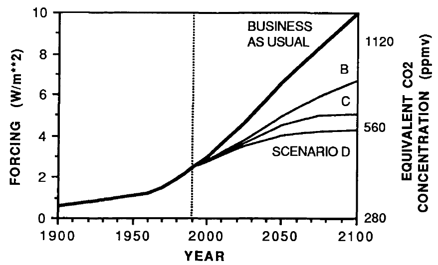
The IPCC FAR ran simulations using various emissions scenarios and climate models. The emissions scenarios included business as usual (BAU) and three other scenarios (B, C, D) in which global human greenhouse gas emissions began slowing in the year 2000. The FAR's projected BAU greenhouse gas (GHG) radiative forcing (global heat imbalance) in 2010 was approximately 3.5 Watts per square meter (W/m2). In the B, C, D scenarios, the projected 2011 forcing was nearly 3 W/m2. The actual GHG radiative forcing in 2011 was approximately 2.8 W/m2, so to this point, we're actually closer to the IPCC FAR's lower emissions scenarios.
The IPCC FAR ran simulations using models with climate sensitivities (the total amount of global surface warming in response to a doubling of atmospheric CO2, including amplifying and dampening feedbacks) of 1.5°C (low), 2.5°C (best), and 4.5°C (high) for doubled CO2 (Figure 1). However, because climate scientists at the time believed a doubling of atmospheric CO2 would cause a larger global heat imbalance than is currently believed, the actual climate sensitivities were approximatly 18% lower (for example, the 'Best' model sensitivity was actually closer to 2.1°C for doubled CO2).
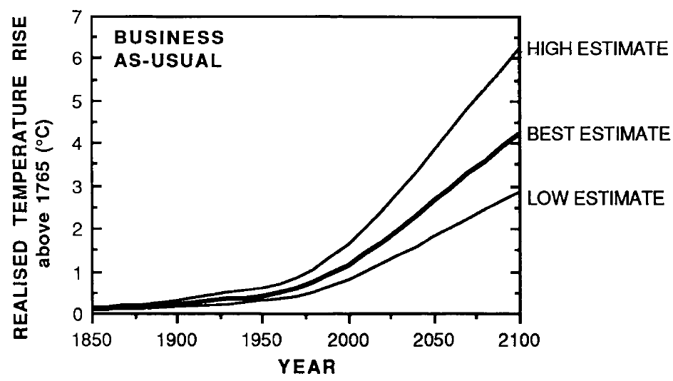
Figure 1: IPCC FAR projected global warming in the BAU emissions scenario using climate models with equilibrium climate sensitivities of 1.3°C (low), 2.1°C (best), and 3.8°C (high) for doubled atmospheric CO2
Figure 2 accounts for the lower observed GHG emissions than in the IPCC BAU projection, and compares its 'Best' adjusted projection with the observed global surface warming since 1990.
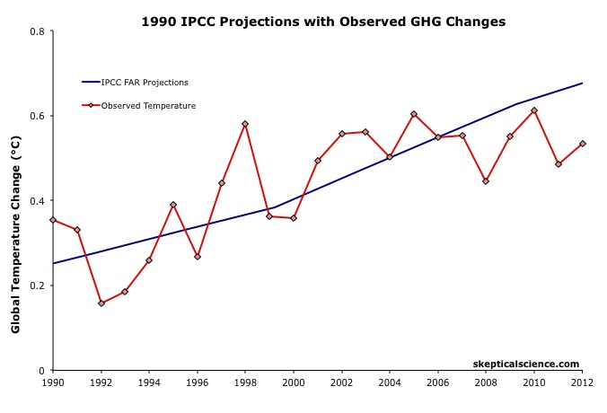
Figure 2: IPCC FAR BAU global surface temperature projection adjusted to reflect observed GHG radiative forcings 1990-2011 (blue) vs. observed surface temperature changes (average of NASA GISS, NOAA NCDC, and HadCRUT4; red) for 1990 through 2012.
The IPCC FAR 'Best' BAU projected rate of warming fro 1990 to 2012 was 0.25°C per decade. However, that was based on a scenario with higher emissions than actually occurred. When accounting for actual GHG emissions, the IPCC average 'Best' model projection of 0.2°C per decade is within the uncertainty range of the observed rate of warming (0.15 ± 0.08°C) per decade since 1990.
1995 IPCC SAR
The IPCC Second Assessment Report (SAR)was published in 1995, and improved on the FAR by estimating the cooling effects of aerosols — particulates which block sunlight. The SAR included various human GHG emissions scenarios, so far its scenarios IS92a and b have been closest to actual emissions.
The SAR also maintained the "best estimate" equilibrium climate sensitivity used in the FAR of 2.5°C for a doubling of atmospheric CO2. However, as in the FAR, because climate scientists at the time believed a doubling of atmospheric CO2 would cause a larger global heat imbalance than is currently believed, the actual "best estimate" model sensitivity was closer to 2.1°C for doubled CO2.
Using that sensitivity, and the various IS92 emissions scenarios, the SAR projected the future average global surface temperature change to 2100 (Figure 3).
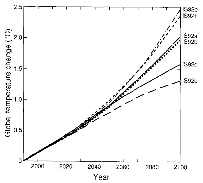
Figure 3: Projected global mean surface temperature changes from 1990 to 2100 for the full set of IS92 emission scenarios. A climate sensitivity of 2.12°C is assumed.
Figure 4 compares the IPCC SAR global surface warming projection for the most accurate emissions scenario (IS92a) to the observed surface warming from 1990 to 2012.
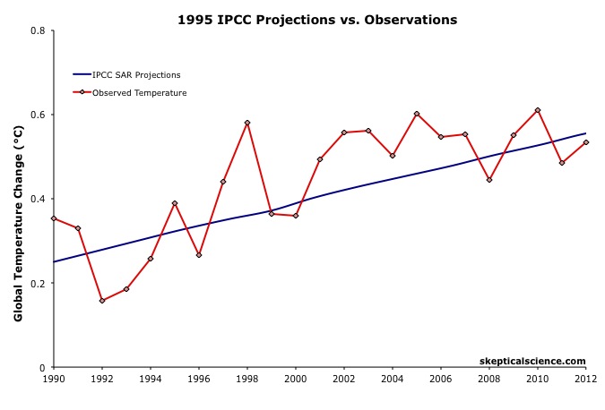
Figure 4: IPCC SAR Scenario IS92a global surface temperature projection (blue) vs. observed surface temperature changes (average of NASA GISS, NOAA NCDC, and HadCRUT4; red) for 1990 through 2012.
Scorecard
The IPCC SAR IS92a projected rate of warming from 1990 to 2012 was 0.14°C per decade. This is within the uncertainty range of the observed rate of warming (0.15 ± 0.08°C) per decade since 1990, and very close to the central estimate.
2001 IPCC TAR
The IPCC Third Assessment Report (TAR) was published in 2001, and included more complex global climate models and more overall model simulations. The IS92 emissions scenarios used in the SAR were replaced by the IPCC Special Report on Emission Scenarios (SRES), which considered various possible future human development storylines.
The IPCC model projections of future warming based on the varios SRES and human emissions only (both GHG warming and aerosol cooling, but no natural influences) are show in Figure 5.
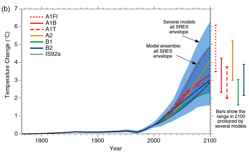
Figure 5: Historical human-caused global mean temperature change and future changes for the six illustrative SRES scenarios using a simple climate model. Also for comparison, following the same method, results are shown for IS92a. The dark blue shading represents the envelope of the full set of 35 SRES scenarios using the simple model ensemble mean results. The bars show the range of simple model results in 2100.
Thus far we are on track with the SRES A2 emissions path. Figure 6 compares the IPCC TAR projections under Scenario A2 with the observed global surface temperature change from 1990 through 2012.
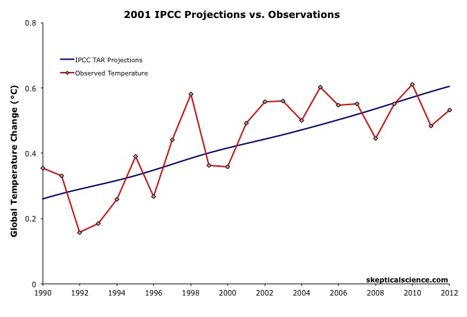
Figure 6: IPCC TAR model projection for emissions Scenario A2 (blue) vs. observed surface temperature changes (average of NASA GISS, NOAA NCDC, and HadCRUT4; red) for 1990 through 2012.
Scorecard
The IPCC TAR Scenario A2 projected rate of warming from 1990 to 2012 was 0.16°C per decade. This is within the uncertainty range of the observed rate of warming (0.15 ± 0.08°C) per decade since 1990, and very close to the central estimate.
2007 IPCC AR4
In 2007, the IPCC published its Fourth Assessment Report (AR4). In the Working Group I (the physical basis) report, Chapter 8 was devoted to climate models and their evaluation. Section 8.2 discusses the advances in modeling between the TAR and AR4. Essentially, the models became more complex and incoporated more climate influences.
As in the TAR, AR4 used the SRES to project future warming under various possible GHG emissions scenarios. Figure 7 shows the projected change in global average surface temperature for the various SRES.

Figure 7: Solid lines are multi-model global averages of surface warming (relative to 1980–1999) for the SRES scenarios A2, A1B, and B1, shown as continuations of the 20th century simulations. Shading denotes the ±1 standard deviation range of individual model annual averages. The orange line is for the experiment where concentrations were held constant at year 2000 values. The grey bars at right indicate the best estimate (solid line within each bar) and the likely range assessed for the six SRES marker scenarios.
We can therefore again compare the Scenario A2 multi-model global surface warming projections to the observed warming, in this case since 2000, when the AR4 model simulations began (Figure 8).
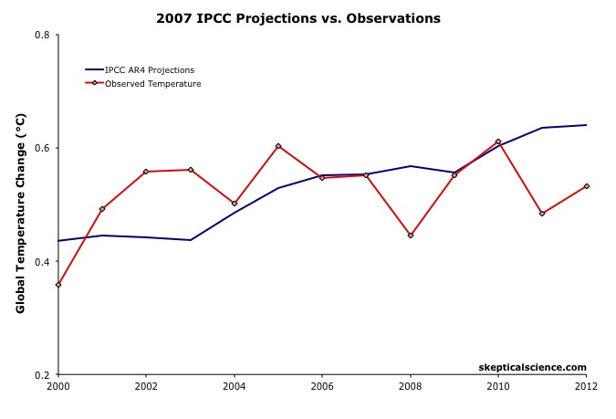 Figure 8: IPCC AR4 multi-model projection for emissions Scenario A2 (blue) vs. observed surface temperature changes (average of NASA GISS, NOAA NCDC, and HadCRUT4; red) for 2000 through 2012.
The IPCC AR4 Scenario A2 projected rate of warming from 2000 to 2012 was 0.18°C per decade. This is within the uncertainty range of the observed rate of warming (0.06 ± 0.16°C) per decade since 2000, though the observed warming has likely been lower than the AR4 projection. As we will show below, this is due to the preponderance of natural temperature influences being in the cooling direction since 2000, while the AR4 projection is consistent with the underlying human-caused warming trend.
IPCC Projections vs. Observed Warming Rates
Tamino at the Open Mind blog has also compared the rates of warming projected by the FAR, SAR, and TAR (estimated by linear regression) to the observed rate of warming in each global surface temperature dataset. The results are shown in Figure 9.
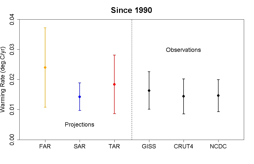
Figure 9: IPCC FAR (yellow) SAR (blue), and TAR (red) projected rates of warming vs. observations (black) from 1990 through 2012.
As this figure shows, even without accounting for the actual GHG emissions since 1990, the warming projections are consistent with the observations, within the margin of uncertainty.
Rahmstorf et al. (2012) Verify TAR and AR4 Accuracy
A paper published in Environmental Research Letters by Rahmstorf, Foster, and Cazenave (2012) applied the methodology of Foster and Rahmstorf (2011), using the statistical technique of multiple regression to filter out the influences of the El Niño Southern Oscillation (ENSO) and solar and volcanic activity from the global surface temperature data to evaluate the underlying long-term human-caused trend. Figure 10 compares their results with (pink) and without (red) the short-tern noise from natural temperature influences to the IPCC TAR (blue) and AR4 (green) projections.
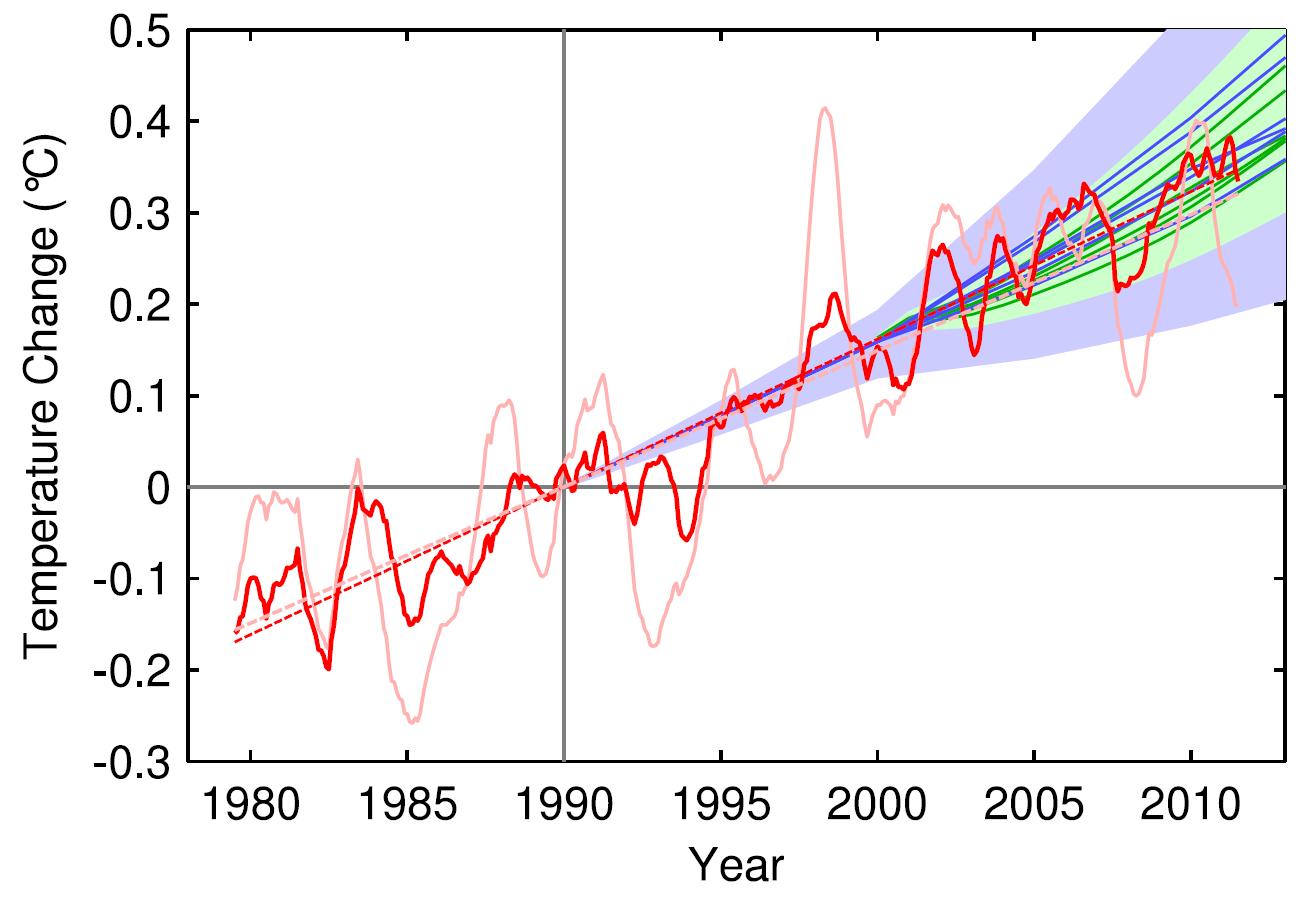
Figure 10: Observed annual global temperature, unadjusted (pink) and adjusted for short-term variations due to solar variability, volcanoes, and ENSO (red) as in Foster and Rahmstorf (2011). 12-month running averages are shown as well as linear trend lines, and compared to the scenarios of the IPCC (blue range and lines from the 2001 report, green from the 2007 report). Projections are aligned in the graph so that they start (in 1990 and 2000, respectively) on the linear trend line of the (adjusted) observational data.
TAR Scorecard
From 1990 through 2011, the Rahmstorf et al. unadjusted and adjusted trends in the observational data are 0.16 and 0.18°C per decade, respectively. Both are consistent with the IPCC TAR Scenario A2 projected rate of warming of approximately 0.16°C per decade.
AR4 Scorecard
From 2000 through 2011, the Rahmstorf et al. unadjusted and adjusted trends in the observational data are 0.06 and 0.16°C per decade, respectively. While the unadjusted trend is rather low as noted above, the adjusted, underlying human-caused global warming trend is consistent with the IPCC AR4 Scenario A2 projected rate of warming of approximately 0.18°C per decade.
Frame and Stone (2012) Verify FAR Accuracy
A paper published in Nature Climate Change, Frame and Stone (2012), sought to evaluate the FAR temperature projection accuracy by using a simple climate model to simulate the warming from 1990 through 2010 based on observed GHG and other global heat imbalance changes. Figure 11 shows their results. Since the FAR only projected temperature changes as a result of GHG changes, the light blue line (model-simuated warming in response to GHGs only) is the most applicable result.

Figure 11: Observed changes in global mean surface temperature over the 1990–2010 period from HadCRUT3 and GISTEMP (red) vs. FAR BAU best estimate (dark blue), vs. projections using a one-dimensional energy balance model (EBM) with the measured GHG radiative forcing since 1990 (light blue) and with the overall radiative forcing since 1990 (green). Natural variability from the ensemble of 587 21-year-long segments of control simulations (with constant external forcings) from 24 Coupled Model Intercomparison Project phase 3 (CMIP3) climate models is shown in black and gray. From Frame and Stone (2012).
Not surprisingly, the Frame and Stone result is very similar to our evaluation of the FAR projections, finding that they accurately simulated the global surface temperature response to the increased greenhouse effect since 1990. The study also shows that the warming since 1990 cannot be explained by the Earth's natural temperature variability alone, because the warming (red) is outside of the range of natural variability (black and gray).
IPCC Trounces Contrarian Predictions
As shown above, the IPCC has thus far done remarkably well at predicting future global surface warming. The same cannot be said for the climate contrarians who criticize the IPCC and mainstream climate science predictions.
One year before the FAR was published, Richard Lindzen gave a talk at MIT in 1989 which we can use to reconstruct what his global temperature prediction might have looked like. In that speech, Lindzen remarked
"I would say, and I don't think I'm going out on a very big limb, that the data as we have it does not support a warming...I personally feel that the likelihood over the next century of greenhouse warming reaching magnitudes comparable to natural variability seems small"
The first statement in this quote referred to past temperatures — Lindzen did not believe the surface temperature record was accurate, and did not believe that the planet had warmed from 1880 to 1989 (in reality, global surface temperatures warmed approximately 0.5°C over that timeframe). The latter statement suggests that the planet's surface would not warm more than 0.2°C over the following century, which is approximately the range of natural variability. In reality, as Frame and Stone showed, the surface warming already exceeded natural variability two decades after Lindzen's MIT comments.
Climate contrarian geologist Don Easterbook has been predicting impending global cooling since 2000, based on expected changes in various oceanic cycles (including ENSO) and solar activity. Easterbrook made two specific temperature projections based on two possible scenarios. As will be shown below, neither has fared well.
In 2009, Syun-Ichi Akasofu (geophysicist and director of the International Arctic Research Center at the University of Alaska-Fairbanks) released a paper which argued that the recent global warming is due to two factors: natural recovery from the Little Ice Age (LIA), and "the multi-decadal oscillation" (oceanic cycles). Based on this hypothesis, Akasofu predicted that global surface temperatures would cool between 2000 and 2035.
John McLean is a data analyst and member of the climate contrarian group Australian Climate Science Coalition. He was lead author on McLean et al. (2009), which grossly overstates the influence of the El Niño Southern Oscillation (ENSO) on global temperatures. Based on the results of that paper, McLean predicted:
"it is likely that 2011 will be the coolest year since 1956 or even earlier"
In 1956, the average global surface temperature anomaly in the three datasets (NASA GISS, NOAA NCDC, and HadCRUT4) was -0.21°C. In 2010, the anomaly was 0.61°C. Therefore, McLean was predicting a greater than 0.8°C global surface cooling between 2010 and 2011. The largest year-to-year average global temperature change on record is less than 0.3°C, so this was a rather remarkable prediction.
IPCC vs. Contrarians Scorecard
Figure 12 compares the four IPCC projections and the four contrarian predictions to the observed global surface temperature changes. We have given Lindzen the benefit of the doubt and not penalized him for denying the accuracy of the global surface temperature record in 1989. Our reconstruction of his prediction takes the natural variability of ENSO, the sun, and volcanic eruptions from Foster and Rahmstorf (2011) (with a 12-month running average) and adds a 0.02°C per decade linear warming trend. All other projections are as discussed above.
Figure 12: IPCC temperature projections (red, pink, orange, green) and contrarian projections (blue and purple) vs. observed surface temperature changes (average of NASA GISS, NOAA NCDC, and HadCRUT4; red) for 1990 through 2012.
Not only has the IPCC done remarkably well in projecting future global surface temperature changes thus far, but it has also performed far better than the few climate contrarians who have put their money where their mouth is with their own predictions.
Intermediate rebuttal written by dana1981
Update July 2015:
Here is a related lecture-video from Denial101x - Making Sense of Climate Science Denial
Last updated on 13 July 2015 by pattimer. View Archives


@MA Rodgers,
Thanks for that and right you are. By all measures effective forcing is currently under all scenarios assessed in the FAR. I had stated CO2 and CO2 equivalent concentrations where within the FAR estimates in Fig 2.1. I dunno if anyone can clarify me as an aside where the FAR CO2 concentration scenarios are within current measurements while effective forcing for CO2 is not? Is it climate sensitivity values used? It'd thought it had been a translation directly based on radiation obsorption which was already well known for the FAR?
@KR
The point on not overly relying on science from nearly 3 decades ago is obvious and important. The point on not judging modelling of processes that take decades on short term trends is obvious and important. Putting the two together too hard though also leads to an easy target for complaint of making claims that can not be disproven.
bcglrofindel - CO2 forcings are on the low side of the FAR projections, CFCs are also lower, and see my previous comment on the updated effective CO2 forcings.
That relationship quite frankly passes testing.
[Source]
Yes, folks can complain about almost anything. But that doesn't mean they have a leg to stand on.
Thanks again KR.
If I can risk being wrong again, I take it you meant that 'prediction' from the GCMs is the relationship between emissions forcings and climate change? Adjusting the FAR forcings for lower observed values makes for the good corrections you provided. The FAR emissions values though radically underestimated actuality in Fig 2.7. Even for 2100 the projections for all scenarios was under 30 Petagrams. For 2013 they are across the board under 10 Petagrams. Observed CO2 emissions though for 2013 are over 35 Petagrams. If we were to go based off of CO2 emissions than the FAR scenarios were universally optimistic, and by that metric aught to have underestimated forcings and warming.
[RH] Corrected 40 Petegrams figure.
bcglrofindel - "Putting the two together too hard though also leads to an easy target for complaint of making claims that can not be disproven."
Come on. If temperatures didnt rise then AGW is instantly disproved.
Models are wrong - any modeller will tell you that. The question to ask about models is do they have skill? (ie do they outperform a naive method). On this they certainly do. It's a pain we can't tie down climate sensitivity better than we do but that is the real world.
But it is a mistake to think AGW hypothesis hangs on model projections. The science makes plenty of other claims that be tested directly (eg LW intensity and spectra both at surface and outgoing, pattern of warming, changes to humidity, etc)
bcglrofindel: "the relationship between emissions forcings and climate change?"
This isn't quite right [the strikeout of emissions and replacement with forcings].
GCM's are not given forcing [radiation changes], they are given CO2 concentrations as a function of time. The forcing is then calculated within the model, based on the principles of radiation transfer and the known radiative properties of CO2.
Although the top-of-atmosphere forcing (change in IR radiation) is a key diagnostic element when it comes to climate response, the change in CO2 concentration has an effect throughout the atmosphere. Thus, there are many "forcings", if one thinks of "forcings" as changes in radiation. Even at the top of the atmosphere, the effect will depend on latitude and longitude - which is why climatologists like to run 3d models.
"Emissions" isn't exactly right, either, because a typical GCM does not accept an input of CO2 at the rate given from anthropogenic output, and then move the CO2 around and aborb some back into the oceans and biosphere. That is the role of carbon cycle models. A carbon cycle model will determine a trajectory of atmospheric CO2 based on emissions scenarios, and that atmospheric CO2 concentration will be used as input to a GCM.
...but "emissions" is a lot closer to correct than "forcings".
bcgirofindel @53.
Adding to other comments here, as you show, recourse to FAR WG3 does easily yield emissions (as per tables 2.8) which for CO2 in all scenarios, project values lower than outcomes so far. Yet, to convert emissions into forcings you require to establish atmospheric concentrations which in FAR for CO2 can be gleaned from WG3 Figure 2.2. My reading of it suggests the 400ppm is passed by Scenario B in 2015, an event that now looks certain to occur.
The different outcome between the emissions comparison and concentrations comparison tells us that 25 years ago FAR were a bit out calculating CO2 absorption rates.
bcglrofindel - As Bob points out determining forcings is part of the modeling process, albeit done for FAR with feed-in models such as line-by-line radiative codes and simplified carbon cycle models (See FAR chapter 3 on modeling). The scenarios for FAR and in fact for current IPCC summaries are based on emissions, not forcings.
As to the latter part of your comment, I'm not certain what you're asking, although that may just be my (mis)reading. I will point out that CO2 isn't the only driver of climate, and there were significant differences in other influences between the FAR scenarios and actual history such as CFC levels.
MA Rodger,
Thanks for that. I'm second guessing my reading of the IPCC CO2 emission numbers for scenarios now though. As per your post I compared the FAR to actual as per prior links and concluded as you that absorption was since adjusted. I went to look what that adjustment looked like and instead find that even the AR5 has nonsensically low CO2 emission numbers per Table AII.2.1a. We are looking at 2010 emission numbers of ~8 Petagrams across all scenarios for 2010 and future projections ranging from below zero but in no circumstances exceeding 29 Petagrams. I'm gonna go out on a limb and assume the IPCC did look at current numbers before picking the 2010 values and would have noticed if the actual human emissions matched the EPA's aparently observed numbers already exceeding 25-30 Petagrams.
So my question is, if the EPA numbers are out, were would one find actual historicial fossil fuel emission numbers to reference correctly? Everything I can google comes up like the EPA numbers, but from the IPCC numbers in their 2013 report that simple can't be the same numbers the IPCC is working from.
@KR in 57,
sorry, still confused. I was understanding that models were based upon concentrations versus emissions or forcings? Concentrations being derived from net expected emissions, and forcings being derived from concentrations?
Alright, found the proble is with units. The EPA is Pg/CO2 and the IPCC is PG/C, so a conversion factor of about 3.7. Mystery solved.
Hi everyone,
I have some questions:
In the intermediate version, observed data is given as 0.15 ± 0.08°C per decade from 1990 to 2012, and 0.06 ± 0.16ºC from 2000 to 2012. Why is the uncertainty so much greater for the 2000 to 2012 observed data?
The data here only goes to 2012. How do the projections compare with data up to 2015?
Looking for more up-to-date information, I found a piece on UAH 6.0 to 2015 on Dr. Roy Spencer's website:
http://www.drroyspencer.com/2015/04/version-6-0-of-the-uah-temperature-dataset-released-new-lt-trend-0-11-cdecade/
Is his figure of 0.114ºC per decade from 1979 to 2015 accurate? It's certainly precise, why no error margin?
In anticipation of the kind of responses I got last time I asked questions on this website, let me be clear that this is a genuine request for information, not an argument.
APT @61:
1) The primary reason for the larger uncertainty for the shorter time period is that there are 43.5% fewer data points.
2) Using the Berkeley Earth global dataset, the trend from 1990 to current is 0.164 +/- 0.066 C per decade. From 2000 to current it is 0.095 +/- 0.129 C per decade. Both are "statistically indistinguishable" from the model projected 0.2 C per decade. Further, the only of the two trends long enough to be significant has a median value at 82% of the model projected trends, showing that at worst the models only mildly overestimate current temperature trends.
3) UAH v6 is very similar to RSS in its values. Using the SkS trend calculator we see that the RSS trend over the period 1979-current is 0.121 +/- 0.064 C per decade. UAH v6 is likely to have a similar error margin. The primary reasons RSS trends are lower than surface trends are, first, a greater reponsiveness to ENSO fluctuations resulting in a greater reduction in the post 1998 trend from the rapid rise in SOI values (ie trend towards more and stronger La Nina events), and second, limited reporting of Arctic values with their very high temperature trends. As to whether the UAH result is accurate, v6 has not yet been reported in peer reviewed literature so that it is not yet possible to determine if the reported values correctly report the values determined by the (as yet not formally described) v6 method. More generally, there is a significant scientific debate as to whether satellite values are more or less accurate than surface values, and as to how exactly they should be related in that they do not strictly report the same thing. For my money, I no with a fairly high degree of confidence that surface values (particularly BEST and GISS) are accurate; but think there is good reason to doubt the accuracy of the satellite values, even for the Lower Troposphere, let alone for the actual surface.
Tom Curtis @62
Thanks Tom, that's very clear.
Needs an update for 2015, if anyone has access to do that.
What about how he debunks this equation here:
"Monckton's Mathematical Proof - Climate Sensitivity is Low"
youtube
What errors does he do in this math there?
Samata @65,
The Monckton YouTube video you link to appears to be the 'work' presented in Monckton et al (Unpublished) which remains unpublised because it is total nonsense. You ask for the mathematical errors. There may be many but the central problem Monckton has is his insistence that climate sensitivity can be calculated on the back of a fag packet in the following manner:-
If the black body temperature of a zero GHG Earth is 255K and there is, according to Monckton, enough forcing pre-industrial to add 8K to that temperature directly from those forcings (giving a temperature without feedback of 263K), then if the actual pre-industrial temperature with feedbacks is 287K, the feedback mechanisms have raised the temperature by 24K. Monckton then calculates the strength of these feedbacks as a portion of the full non-feedback temperature (287/263-1) = 0.09. [This, of course, is a big big error.] Thus ECS(Monckton)= 1.1K x 1.09 = 1.2K.
(See Monckton's explanation of his basic method at Roy Spencer's, a climate denier who refutes Monckton's methods).
The big big error is in attributing pro-rata feedback to all the black body warming. It is also an error to run with these back-of-fag-packet calculations all the way to zero LL-GHG (what Monckton calls NOGS) but not as dreadful a mistake as using them pro rata all the way down to absolute zero.
His back-of-fag-packet calculation should be saying that 8K LL GHG-forced warming results in 33K of warming at equilibrium, thus ECS = 1.1K x 33/8 = 4.5K, a value that is high but not entirely implausable.
A more sensible analysis would not consider that ECS is a constant value over such large temperature ranges. And there will be feedback mechanisms operating without LL GHGs being present. But they will bear no resemblance to the feedback mechanisms facing a world at 288K.
Hello everyone, I am trying to confront scepticals but there is people giving me a hard time. One retired engineer is arguing with Rutger's data set of snow coverage for the northern hemisphere, also the article:
The Influence of IR Absorption and Backscatter Radiation from CO2 on Air Temperature during Heating in a Simulated Earth/Atmosphere Experiment Thorstein O. Seim1, Borgar T. Olsen
and "Observational determination of surface radiative forcing by CO2 from 2000 to 2010" from Nature, because he states that 0.2w/m2 is almost negligible and clouds are order of mangitude more relevant.
Anyone familiar with that data and articles? What is the explantion to a stable snow cover for the last decades? The explanation to Seim's experiment and the relevance of the 0.2w/m2?
Thanks a lot, if you share your arguments with me I will guarantee they are well used in LinkedIn
Pbarcelog @67 ;
Probably best to look to whatever underlying point your engineer friend is trying to make. Just as hurricane statistics vary considerably over decades, so too does snow cover vary ~ but neither of these measurements do "disprove" the major global warming observed.
It seems he is trying to cherry-pick one or other of whatever observations he can find, which . . . what? . . . show there is no warming and therefore no human-caused effect on climate? If that is his game (to convince himself at some emotional level of "no AGW") . . . then he is simply failing to look at the big picture. He is deceiving himself. And he is also failing to look at the paleo evidence of major climate changes produced by alteration in greenhouse gasses.
Does he have Conspiracy-type doubts that the past 170 years of thermometer measurements are all false, and all the climate scientists are wrong? If the planet is not warming, then why is the sea level continuing to rise?
He may feel that 0.2 Watts or 1.0 Watts is a tiny number . . . but the evidence keeps showing that the world is warming ~ whatever his (rather ill-informed) opinion might be about clouds.
The warming effect of increased CO2 level is only denied by the nuttiest of non-scientists ~ and they have zero evidence to back up their ideas of "no greenhouse effect". The effect of CO2 has been known for roughly a century. Basic physics explains it, and decades of observations confirm it.
(Please note that laboratory experiments cannot re-create the necessary full-depth atmosphere that produces "greenhouse" . . . so I have not bothered to review the "Backscatter Radiation" experiment you touched on ~ but if you feel there is something of great note & importance demonstrated in the experiment, then please discuss it in more detail, and preferably with a direct link to the paper.)
pbarcelog @67,
The Rutger snow cover data is not the easiest data to rattle out the impacts of climate change. While the arguments of your "retired engineer" may be something else, the point I would make is that snow cover is not necessarily a good measure of rising tempertures alone as it also requires snowfall which can also be a big variable. And we do have perfectly good instrument for actually measuring temperature, these being called thermometers.
The basics is that it is only the months March to June which show big trends in snow cover. See Rutgers monthly graph webpage and toggle through the months. There are also trends in July and August but through these months snow cover is almost max'ed out. Through the autumn & winter months, the trend is for more snow so more snow cover.
I did a while back write out a few paragraphs on the trend in snow cover and its illusiveness. It's posted about halfway down this webpage.
To follow-up eclectic's comment @ 68:
The Seim and Olsen paper "The Influence of IR Absorption and Backscatter Radiation from CO2 on Air Temperature during Heating in a Simulated Earth/Atmosphere Experiment" appears to be this one:
https://www.scirp.org/journal/paperinformation.aspx?paperid=99608
scirp.org is Scientific Research Publishing, which is on Beall's list of potentially predatory publishers. Not exactly a reputable journal.
The two authors are listed as "former..." affiliations with medical backgrounds.
Google scholar lists two citations, both (self?) published by Hermann Harde (a well-known climate science "contrarian" that never writes anything worth reading).
As eclectic says, trying to refute atmospheric physics with a lab experiment is a fool's errand.
I have not bothered reading the "paper" in detail. All meta-signs point to it being rubbish. In the bits I read, they confuse re-radiation by CO2 as "backscatter", and in the abstract they refer to "temperature ... increased ... about 0.5%". Anyone that uses % to measure temperature change is not worth reading, and they clearly have no understanding of the physics and terminology of radiation transfer.
Additional note:
Scientific Research Publishing (scirp.org) also has a Wikipedia page about it.
...and the Seim and Olsen paper was also discussed in several comments on this recent thread:
SkS_Analogy_01_Speed_Kills_Part3_How_fast_can_we_slow_down.html
pbarcelog @67,
That appears to leave only Feldman et al (2015).
This was always an odd paper. Note on google scholar it is showing with 206 citations but if you look, most of these are not real citations of the paper's findings.
The question is: much extra downward surface IR you would expect from increasing CO2 from 370ppm to 385ppm (which is what Feldman et al attempt to measure)? MODTRAN gives a rise of 0.188Wm^-2 when modelling a mid-latitude winter and 0.314Wm^-2 when modelling mid-latitude summer. That these values are even the same order of magnitude of the climate forcing from such an increase in CO2 (which would be 5.35 x In(385/370) = 0.21Wm^-2) is entirely coincidental.
Your "retired engineer" appears to be dismissing this +0.21Wm^-2 CO2 forcing over the decade 2000-2010 because he says there is some cloud effect that is an "order of mangitude more relevant." So is there an increase in cloud forcing of +2Wm^-2 through that decade? Or is it perhaps a decrease of that size he talks of? Whichever, he does need to demonstrate this massive cloud effect that appeared through that decade to show he is not talking codswallop.
pbarcelog @67
As a retired engineer (chemical) myself, I can address the fundamental problem with Seim & Olsen’s experiment from an engineer’s perspective for the benefit of your friend. The key mistake is neglecting the cold temperature of the tropopause (217K) that is the source of radiant energy loss to space in the range of about 13.5-16.5 microns. This has to be combined with the overall global energy balance.
The experiment is designed to measure radiant energy in conditions similar to the lower atmosphere, near the surface. Much of it sounds technical, so that it might sound convincing to someone with a technical background who does not fully understand how the greenhouse effect really works. The explanation provided in the Introduction is correct, but falls short of being complete because of the key mistake that I mentioned above. Section 3.4 addresses a variety of thermal issues that demonstrates knowledge about energy balances and confounding effects of convection and conduction. But it misses how the atmosphere is thermally balanced within the context of cold temperature at high altitudes, which is a common misunderstanding, and the fundamental fact of radiation that emitted energy from a CO2 molecule depends only on the presence and their temperature.
There is too much to explain in a short note without knowing the specific nature of your friend’s stumbling block in their understanding of global warming and the experiment. The basic, intermediate, and advanced rebuttals in the myth 74 “CO2 effect Is saturated” provide concise explanations for the fundamental misunderstanding underlying the experiment. The last few comments in that thread provide references for detailed explanations (especially Zhong & Haigh, 2013) for the overall global energy balance, fundamentals of radiant energy transfer, and basics of atmospheric physics. I suggest that your friend takes some time to study them. MODTRAN, as MA Rodger just referenced above, is an excellent and fascinating educational tool that should spark the interest of a curious, technically-minded, engineer (see Brown, et al, "Introduction to an Atmospheric Radiation Model" Chemical Engineering Progress, May 2022.)