


 Arguments


How reliable are CO2 measurements?
What the science says...
| Select a level... |
 Basic
Basic
|
 Intermediate
| |||
|
CO2 levels are measured by hundreds of stations across the globe, all reporting the same trend. |
|||||
Climate Myth...
CO2 measurements are suspect
"The Keeling curve, which is widely used to show the increase in CO2 emissions, is based on data from the top of Mount Mauna Loa in Hawaii. Mauna Loa is a volcano and it doesn’t seem to me that a volcano is the best place to be taking CO2 measurements" (disinter)
At a glance
Mauna Loa is an active volcano on 'Big Island', the largest of the chain that makes up the state of Hawaii. It does not erupt that often; the last four times at the time of writing (2023) were in 1950, 1975, 1984 and 2022-23. The summit is 4,169 metres (13,679 feet) above sea level.
The observatory that takes regular CO2 measurements is situated some 6.4 kilometres (4 miles) from the summit, on the volcano's northern slopes. Here, the prevailing winds are the north-easterly Trades, blowing in clean air off the Pacific Ocean. Hour to hour CO2 levels in this airflow vary by no more than 0.3 parts per million (ppm).
Light southerly winds, bringing air from the volcano, can however occur under very specific weather conditions, normally late at night. Such conditions are readily detectable because unlike the steady 'baseline' readings, CO2 levels suddenly start to jump up and down wildly. These highly erratic CO2 levels are so different from the baseline data that they can easily be filtered out with mathematics. During the 2022-23 eruption, measurements from Mauna Loa Observatory had to be suspended from Nov. 29, 2022 and observations from then until July 4, 2023 were from the Mauna Kea Observatories, approximately 21 miles north of Mauna Loa.
Measurements of CO2 at Mauna Loa commenced in 1958. NOAA’s Earth Science Research Laboratory program also measures CO2 in over 60 locations around the world, taking air samples in flasks. Flask measurements and the Mauna Loa data show excellent agreement. This confirms that occasional detections of volcanic CO2 at Mauna Loa do not affect the final results. The data-filtering process paints a true picture of the situation.
The upward-sloping trend in CO2 concentrations at Mauna Loa is a reflection of human activity. It represents our burning of fossil fuels and other types of carbon emissions. Superimposed on that upward trend is an annual wiggle. The wiggle represents the Fast Carbon Cycle, involving photosynthetic plants in the Northern Hemisphere. That's where most of the planet's landmasses happen to be. Every spring the plants become more active as the growing season starts and CO2 levels start to drop. But autumn comes along, the leaves shrivel and fall and CO2 rises again. It's like the heartbeat of the planet, superimposed on the upwards slope that very definitely represents us.
In conclusion, scientists know all about the volcanic activity at Mauna Loa and the specific conditions in which volcanogenic gas emissions will be and are detected. To suggest otherwise is an example of the misrepresentation often required in order to promote the talking-points of science-denial.
Please use this form to provide feedback about this new "At a glance" section. Read a more technical version below or dig deeper via the tabs above!
Further details
This myth is a classic example of ignoring critically relevant evidence in order to state a conclusion. Misrepresentation is the technical term. The fact that Mauna Loa is a volcano is of course well-known among Earth scientists. Mauna Loa observatory is, however, situated some 6.4 kilometres (4 miles) from the crater, on the volcano's northern slopes. Here, the prevailing north-easterly Trade Winds blow in clean air off the Pacific Ocean. Hourly measured CO2 levels in this airflow vary by no more than 0.3 parts per million (ppm) (fig. 1).
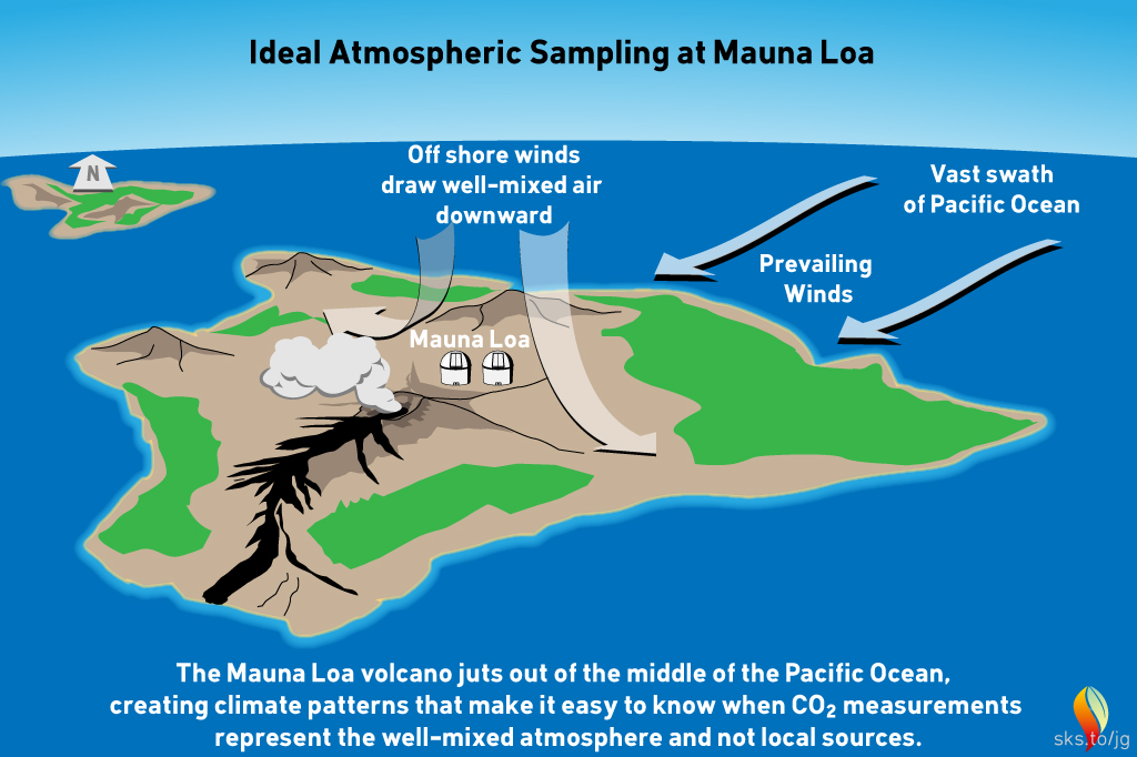
Fig 1: geography and typical meteorology of the Mauna Loa district. Graphic: jg.
Light southerly winds, bringing air from the volcanic vents, can however occur under specific weather-conditions. In such circumstances, a temperature inversion can form over the fumaroles around the summit. The inversion traps volcanic CO2 emissions that drift northwards on that southerly breeze. Such conditions only occur late at night. Their effect is readily detected. Unlike the steady 'baseline' readings from the trade winds, when the southerly wind is blowing, CO2 levels start to fluctuate wildly. These highly erratic CO2 levels differ so much from the baseline measurements that they are easy to spot. They can be removed by mathematical data-filtering. Essentially they represent sporadic outbreaks of 'noise'.
The following graph (fig. 2) shows atmospheric CO2 levels over the last 10,000 years. It includes ice core data for CO2 levels before 1950. For values after 1958, direct measurements from the Mauna Loa Observatory on Hawaii were used.
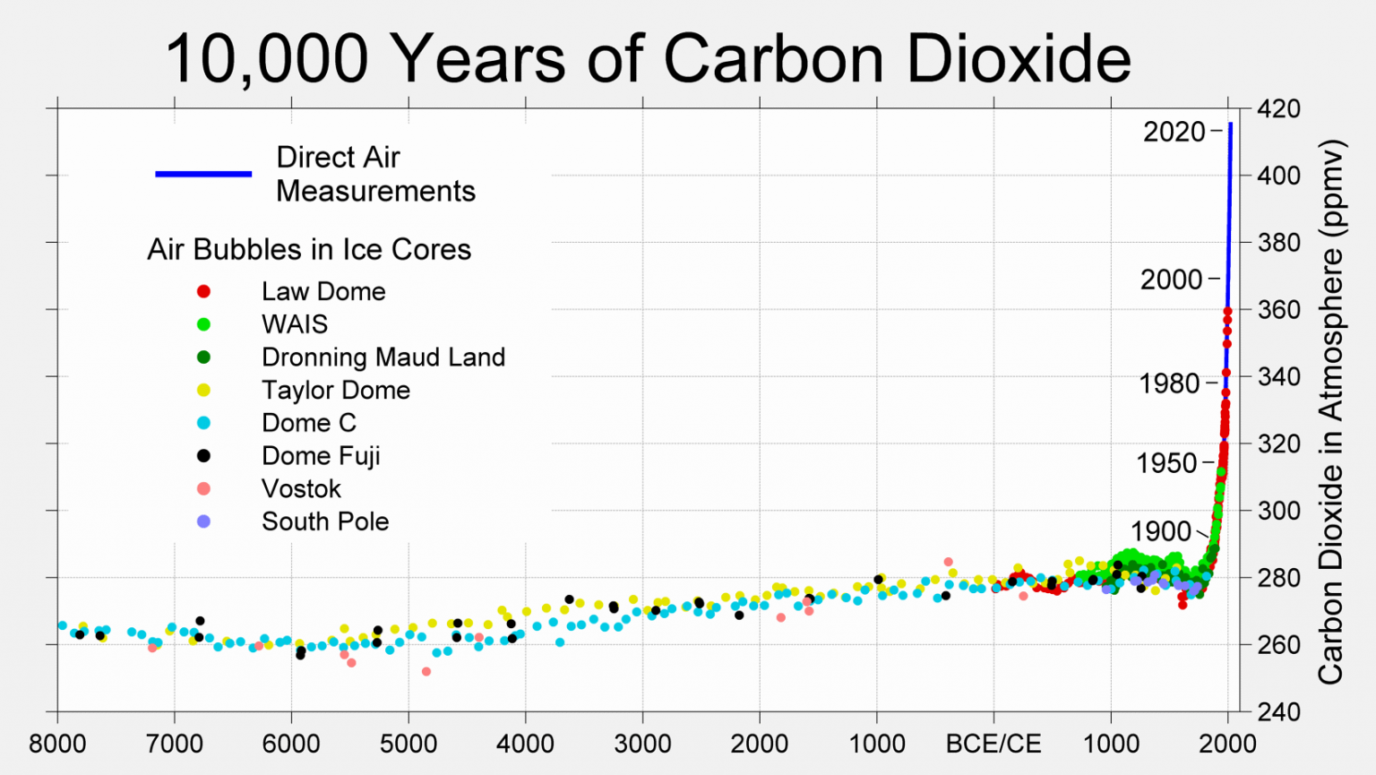
Figure 2: CO2 levels (parts per million) over the past 10,000 years. Source: Berkeley Earth
Mauna Loa is often used as an example of rising carbon dioxide levels (fig. 3) because it is the longest, continuous series of directly measured atmospheric CO2, the so-called 'Keeling Curve', that we have. The reason why it's acceptable to use Mauna Loa as a proxy for global CO2 levels is because CO2 mixes well throughout the atmosphere. Consequently, the trend in Mauna Loa CO2 (1.64 ppm per year when this rebuttal was first written in 2010, now 2.69 ppm, July 2022-2023) is statistically indistinguishable from the trend in global CO2 levels (fig. 4). If global CO2 was used in figure 2 above, the resulting "hockey stick" shape would be identical.
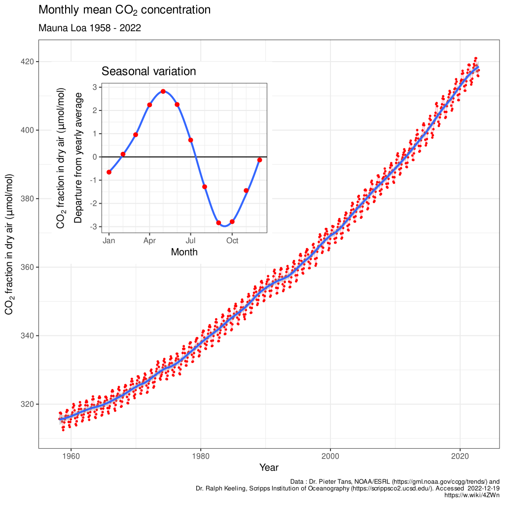
Figure 3: The Keeling Curve - monthly mean CO2 concentration data (with the occasional volcanic anomaly filtered out), Mauna Loa Observatory, 1958-2022. Inset shows the annual 'wiggle' caused by seasonal plant-growth and dieback in the Northern Hemisphere. Image licensed under the Creative Commons Attribution-Share Alike 4.0 International licence.
This video is an excellent graphic example of where our data for CO2 levels come from and how the wiggles vary. It shows surface measurements of CO2 varying over different latitudes from 1979 to 2006. The graph is created by Andy Jacobson from NOAA and includes a global map displaying where the measurements are coming from, a comparison of Mauna Loa CO2 to South Pole CO2 and the graph expands at the end to include ice core measurements back to the 19th Century. The key point is that the wiggles are of low magnitude near the equator but are bigger in the north, as might be expected because seasonality is more pronounced at higher latitudes.
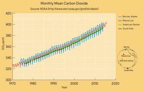
Figure 4: CO2 measurements from Mauna Loa and some other global sampling stations over recent decades. The trends are identical as are the positions of the wiggles that vary in magnitude according to seasonality in the Northern Hemisphere. Data from NASA; graphic by jg.
Satellite data is also consistent with surface measurements. This video shows the global distribution of mid-tropospheric carbon dioxide. The data comes from the Atmospheric Infrared Sounder (AIRS) on the NASA Aqua spacecraft. Superimposed over the global map is a graph of carbon dioxide observed at the Mauna Loa observatory. However CO2 levels are measured, the same trend is observed. Upwards and upwards and upwards.
Last updated on 1 October 2023 by John Mason. View Archives


Thanks again for your help. These are the relevant links to the papers referenced above.
http://eprints.lib.hokudai.ac.jp/dspace/bitstream/2115/32477/1/P393-421.pdf
http://mail.geocraft.com/WVFossils/Reference_Docs/CO2_diffusion_in_polar_ice_2008.pdf
It seems to me that these papers conclude that diffusion probably doesn't have a very significant effect on ice core CO2 measurements, at least over longer timescales, but I'd appreciate it if someone with deeper knowledge and understanding of the topic could confirm that.
I also found a couple more relevant papers which I hope will be useful if anyone comes across arguments about ice core reliability or stomata records disgreeing with ice core data:
The first is a discussion of uncertainties in ice core measurements and how to deal with them:
ftp://ftp.ncdc.noaa.gov/pub/data/paleo/icecore/ice-cores.pdf
The second is a reconstruction using stomata data which in fact agrees with the ice core data and suggests that climate sensitivity to CO2 concentration is greater than previously thought:
http://droyer.web.wesleyan.edu/Franks_et_al_2014_GRL_new_stomatal-CO2_proxy.pdf
APT @75/76.
The two papers you link to are actually referenced by Steinthorsdottir et al., (2014) - 'Response to: Comment on “Synchronous records of pCO2 and D14C suggest rapid, ocean-derived pCO2 fluctuations at the onset of Younger Dryas”'
@MA Rodger
Do you mean the first 2 papers or the last 2 papers in post 76?
I mentioned in post 75 that the the first 2 were referenced by Steinthorsdottir, although I appreciate that without the full reference I didn't make it clear that it was from the "Response to: Comment..." paper and not from the original article.
I can't see references to the second 2 papers in either of the Steinthorsdottir papers.
APT @78, Kohler et al reference Marcott et al 2014 as being a high resolution ice core CO2 concentration record. Marcott et al in turn say:
What that means in practise is seen by considering Figure 3, where temporal resolution is indicated to be +/- 20 to 40 years at various time intervals:
Even at +/- 40 years, that is too good a time resolution to not have captured Steinthorsdottir's peak in CO2 at the Younger Dryas if it in fact existed. More importantly, the the +/- 1 ppm resolution of CO2 concentration at all ages shows the fluctuations in CO2 content to not be measurement error. They are fluctuations in the CO2 concentration in the ice. That is significant because the sharp variations in CO2 concentration shown are inconsistent with the record being more heavilly smoothed than shown. Smoothing through diffusion will reduces peaks, fill troughs, and turn "cliffs" into slopes. If the peaks, troughs and cliffs persist in the ice, the CO2 has not significantly diffused after the firn has closed.
In fact, it is definitely below par for Steinthorsdottir to simply wave her hand at possible high diffusion rates as an "explanation" of discrepancy between ice core and stomatal records. If diffusion is a problem, she ought to be able to (and ought to have) created a smoothed model of the stomatal record that reproduces the ice core record. Marcott et al did exactly that when comparing the higher reolution West Antarctic Divide data (WDC) with the lower resolution East Antarctic Divide data (EDC) in extended data figure 5:
Given this, it appears to me that the stomata data Steinthorsdottir uses is an inaccurate proxy of CO2 concentrationin the Younger Dryas.
Tom Curtis @79
Thanks for the reference and explanation. Interesting and useful.
The Keeling Curve seems almost uniquely consistent to me, compared to almost every other type of measurement in the natural world, which tends to be highly variable, regardless of long-term trends. The Keeling Curve, by comparison, is almost eerily rigid in trajectory, especially compared to variability of total carbon releases over time. It's like it's got some kind of governor that simply keeps the increase and accelleration from going any faster, no matter how much more carbon we pump into the atmosphere.
Can anyone help me understand how the Keeling Curve is so "tight", while so many other measurements have so much higher variability? Is it just because the other sinks - ocean, land, and plants - have so much more capacity that they can absorb whatever else the atmosphere can't? Even if that's a reasonable simple explanation, I still feel like I'm missing something from the 'limiter' aspect of the phenomenon.
I mean don't get me wrong, I'm figuratively poop-my-pants scared about climate change, particularly that "unprecidented rate" part. I've just recently been struck by the relatively tight natural regulation of the Keeling Curve, compared to a much greater variability I observe in almost every other aspect of nature.
Appreciate anything that might help a mostly layman level understanding of things dude wrap his head around that. Thanks!
Regarding the issue of accuracy or agreement of various sampling methods or ice cores: Dendrochronology (tree rings) provide another surprisingly rich, near continuous data source that includes decipherable clues about CO2 levels. Data from dendrochronology agrees, very strongly, with data from the ice cores.
h4x354xOr @82, the 'eerily rigid' trajectory is effectively explained by this graph:
The ratio between cumulative emissions and cumulative atmospheric increase in CO2 is explained by the equilibrium of partial pressure of CO2 in the oceans relative to the atmosphere, ie, Henry's Law (with a couple or nuances relating to the biosphere and the deep ocean).
The variation in actual atmospheric concentration from that predicted by that curve from year to year is almost entirely explained by variation in GMST and to a lesser extent precipitation, ie, by the temperature dependance in Henry's Law and by increase or decrease of global vegetation driven by changes in precipitation.
That is the bare bones explanation. Scientists specializing in the CO2 cycle have modelled the various exchanges in detail and are able to reproduce the increase in CO2 given anthropogenic emissions and GMST changes with surprising accuracy.
Thank you for the explanation, Tom Curtis. I had to get into my wayback machine and go visit my high school physics class, but the pointer towards Henry's Law helped break my metal logam, there. The annual variability is between 6-7 PPM; the annual increase is now a solid 3 PPM, and of course growing. It would be nice not to find out what will happen when the annual increase overtakes annual variability.
Again, thank you!
From the comments above, I feel that the current capability for measuring atmospheric CO2 is grossly inadequate. For example, I would think that if the Governor of California wished to concentrate on levels of CO2 in his state that might be problematic then he should have access to CO2 measurements at a number of surface CO2 measuring sites scattered across the state. He could then better determine if actions to reduce human induced CO2 emissions would have any significant impact on the overall CO2 levels in the state. He might well discover that the CO2 output from the states areas of intense vegetation could not be significantly countered by reducing the level of human induced CO2 emissions. Then again, he could receive evidence that such measures might well reduce the CO2 level to an acceptable amount.
My previous comment is based upon the idea that the current CO2 level in the atmosphere has an effect on global warming. In fact it is more likely an effect of global warming rather than a cause of it.
@Billev (86). I'm not quite sure what you are suggesting. Are you saying that gloal warming is causing a rise in CO2 and not the reason for global warming?
Billev @85 and 85,
In addition to RickG's question I am curious about why you mention that the Governor of California would care about the atmospheric CO2 levels in that State.
Identifying sources of CO2 emissions or other GHGs by satellite survey could be helpful. But other than identifying concentrated human production sources of GHGs, the level of CO2 in a region is rather 'beside the point'.
Increased CO2 is happening globally (it is seen at every location that measures CO2 levels).
The Global Warming and resulting Global Climate Changes are the problem.
Please provide more detail regarding exactly what you are suggesting or asking about.
My point is this. The Governor of California is attempting to install laws to limit the use of fossil fuels in order to reduce GHG emissions. This may prove to be costly to the citizens of California in terms of higher operating costs and the departure of manufacturers and jobs. If a better understanding of the sources of GHG (particularly CO2) can demonstrate that the laws limiting human consumption of fossil fuels will not significantly diminish the growth of CO2 levels then unnecessary costs caused by those laws can be avoided. In other words if it is found that increasing vegetation due to a warming Earth is the only significant source of increased atmospheric CO2 then the futility of costly policies to limit fossil fuel use might be avoided. To this end it would be valuable to political leaders to have much more detailed measurement and analysis of the sources of atmospheric CO2 than is now available.
Billev @ 85/89 , if you are talking about science ~ then the sources of atmospheric CO2 are already well-known (and have been, for decades).
If you are talking about politics (the best policies for abating the global warming problem, and the most speedy but economical & socially-advantageous ways of achieving zero nett carbon emission) ~ then this is not the right thread for such discussion [perhaps try one of the Weekly Digests?]. As always, you would need to give consideration to jobs lost versus jobs gained in advancing renewable-type industries & services . . . and put everything in perspective wrt past & present out-sourcing of jobs to China, Mexico, etcetera, in both the short term and longer term.
B. Your comment at #86 is bizarre. Please read Climate Myths 12 and 91.
billev @89,
Your clarifying of what you are suggesting or asking about has been helpful.
As Eclectic has pointed out, politics related to climate science can be discussed on Weekly Digests.
I can add more science related points to what Eclectic mentioned.
All global leaders, in business and politics, have been increasingly informed about the constantly improving awareness and understanding of climate science through the collective global expertise evaluating the science and consolidating summaries of scientific understanding (with regular updates - because science by its nature is constantly increasing and improving awareness and understanding).
The IPCC is the global body that does that. Many IPCC Reports have been produced, starting with the AR1 series of reports that were published in 1990. The IPCC is currently working on the AR6 series of reports planned for publication starting in 2021 with the last document of the series planned to be published in 2022.
So there is very little 'climate science' awareness and understanding that the Governor of any state (or elected official at a Federal level) would be 'unaware of'.
Consider that understanding of history of availability of awareness and understanding of climate science the next time you read about some elected official questioning how much is really understood about climate science. You should seriously question, be skeptical of, the motives of such a questioner.
Climate science has confirmed that future negative climate change consequences are being caused by the continued increase of CO2 in the atmosphere due to human activity, mainly the burning of fossil fuels. And the scientifically understood solution is to stop increasing the CO2 in the atmosphere. So every regional leadership is tasked with the responsibility of figuring out how to get their portion of the global population to stop contributing in any way to the increase of CO2 or other human activity created GHGs.
That is as far as the science goes. And that understanding is not going to be changed by new research. All evidence indicates that the urgency to stop the creation of new CO2 is only going to increase as business and political leadership fail to effectively correct the problem that has been developed.
I hope that helps you understand this issue.
billev - perhaps you are unaware of this satellite and its mission? There are several ways to determine what the increase in CO2 can be attributed to from carbon mass balance (we know pretty accurately how much FF is burned), O2 depletion, changing carbon isotope composition (FF has no C14), ocean pH. In fact nature is so far mopping up about half our emissions. More here.
alonerock from elsewhere,
Articles describing the measurement of the vertical profile of CO2 through the atmosphere include Abshire et al (2010) 'Pulsed airborne lidar measurements of CO 2 column absorption' who measured CO2 levels to 6km (their fig 10 below),
and Foucher et al (2011) 'Carbon dioxide atmospheric vertical profiles retrieved from spaceobservation using ACE-FTS solar occultation instrument' who measured from 5km to 25km (their fig 7 below).
When should we expect to see the global downturn in carbon emissions register on the Keeling Curve?
Ken the Bear @94,
I don't think the drop in emissions from Covid will be anyway near enough to register a change that will be noticed in the Keeling Curve.
Recent annual CO2 increases measured at MLO as measured by ESRL run 2010-19 +2.32ppm, +1.91ppm, +2.61ppm, +2.01ppm, +2.20ppm, +2.95ppm, +3.01ppm, +1.90ppm, +2.86ppm, +2.46ppm. Those numbers have a 90% range of +/-0.8ppm. It seems most folk are still awaiting better understanding of the effect of Covid on emissions before making an assessment on the matter but one estimate of the drop in rising CO2 levels due to Covid has been given as between 0.08ppm & 0.23ppm. So not enough to make a noticeable dent.
I'm interested in CO2 levels during the 1866-present period. Mainly because
1) we have direct observational CO2 measurements from 1866 onwards
2) The period 1866 -present is particulary interesting in terms of human development,the industrial revolution and co2.
Would it be possible to include a graph for this period with direct measurements, rather than proxy ice core data?
Of particular note is W. Kreutz, with 25,000 measurements in the period 1930-39 with a mean concentration of 438ppm.
W. Kreutz,“ Kohlensaure Gehalt der unteren Luftschichten in Abhangigkeit von Witterungsfaktoren,” Angewandte Botanik, vol. 2, 1941, pp. 89-117
orrok @96,
The work of W Kreutz you cite does not appear to have been published in English but the work features prominently within Beck (2007) '180 Years of Atmospheric CO2 Gass Analysis By Chemical Methods' which did attrach comment from Meijer (2007) & Keeling (2007) [PDF of both] who conclude saying "His work, however, contains major flaws, such that the conclusions are wrong, as they are based on poor understanding of the atmosphere," and "Unfortunately for Beck—as well as for humanity—the claims don’t stand up."
Beck's work seems to come up a lot. There are several other (reliable) places you can read about it on the web:
http://www.realclimate.org/index.php/archives/2007/05/beck-to-the-future/
http://rabett.blogspot.com/2006/10/amateur-night.html
http://rabett.blogspot.com/2008/03/beckies-as-tonstant-weader-knows-eli.html
...and an old comment here at SkS by Tom Curtis:
https://skepticalscience.com/argument.php?a=55&p=2#75463
Also note that Beck's paper was published in Energy and Environment. Not the highest quality journal.
https://www.desmogblog.com/energy-and-environment
Note that Toms comment I link to in #98 is further up this page (#53)...
Came across this post today after looking at some statistics that got stuck in my head.
Today the total landmass area of the world is 149 million sq km.
The total forested area of the world in 2016 was 30.7 million sq km, down from 49.8 in 1996.
Up to at least 2013 science had stated that the Amazon rainforest, at 5.5 million sq km, the Canadian Boreal Forest, at 2.7 million sq km, and the Congolese rainforest, at 1.7 million sq km, along with the rest of the boreal zone, were all CO2 sinks. In total it comes up to over 20 million sq km, out of a total of 30.7 million.
Now I am reading that all of these are net CO2 emitters. So up until 2013 they were sucking in CO2, now they are pumping out CO2.
Here's my question for all of you: Why isn't the CO2 level rising exponentially? If these combined forests were sequestering more than they were producing, but are now not able to sequester as much CO2 as they produce, this means that since 2013, with deforestation, and a loss of carbon sinks, we should have had at least a doubling of CO2, should we not have? Yet, when I look at the numbers, it would seem that the CO2 level increases are actually slowing, while emissions are increasing.