


 Arguments


The albedo effect and global warming
What the science says...
| Select a level... |
 Basic
Basic
|
 Intermediate
| |||
|
The long term trend from albedo is of cooling. Recent satellite measurements of albedo show little to no trend. |
|||||
Climate Myth...
It's albedo
"Earth’s Albedo has risen in the past few years, and by doing reconstructions of the past albedo, it appears that there was a significant reduction in Earth’s albedo leading up to a lull in 1997. The most interesting thing here is that the albedo forcings, in watts/sq meter seem to be fairly large. Larger than that of all manmade greenhouse gases combined." (Anthony Watts)
At a glance
What is albedo? It is an expression of how much sunshine is reflected by a surface. The word stems from the Latin for 'whiteness'. Albedo is expressed on a scale from 0 to 1, zero being a surface that absorbs everything and 1 being a surface that reflects everything. Most everyday surfaces lie somewhere in between.
An easy way to think about albedo is the difference between wearing a white or a black shirt on a cloudless summer's day. The white shirt makes you feel more comfortable, whereas in the black one you'll cook. That difference is because paler surfaces reflect more sunshine whereas darker ones absorb a lot of it, heating you up.
Solar energy reaching the top of our atmosphere hardly varies at all. How that energy interacts with the planet, though, does vary. This is because the reflectivity of surfaces can change.
Arctic sea-ice provides an example of albedo-change. A late spring snowstorm covers the ice with a sparkly carpet of new snow. That pristine snow can reflect up to 90% of inbound sunshine. But during the summer it warms up and the new snow melts away. The remaining sea-ice has a tired, mucky look to it and can only reflect some 50% of incoming sunshine. It absorbs the rest and that absorbed energy helps the sea-ice to melt even more. If it melts totally, you are left with the dark surface of the ocean. That can only reflect around 6% of the incoming sunshine.
That example shows that albedo-change is not a forcing. That's the first big mistake in this myth. Instead it is a very good example of a climate feedback process. It is occurring in response to an external climate forcing - the increased greenhouse effect caused by our carbon emissions. Due to that forcing, the Arctic is warming quickly and snow/ice coverage shows a long-term decrease. Less reflective surfaces become uncovered, leading to more absorption of sunshine and more energy goes into the system. It's a self-reinforcing process.
If you look at satellite images of the planet, you will notice the clouds in weather-systems appear bright. Cloud-tops have a high albedo but it varies depending on the type of cloud. Wispy high clouds do not reflect as much incoming sunshine as do dense low-level cloud-decks.
Since the early 2000s we have been able to measure the amount of energy reflected back to space through sophisticated instruments aboard satellites. Recently published data (2021) indicate planetary albedo, although highly variable, is showing an overall slow decrease. The main cause is thought to be warming of parts of the Pacific Ocean leading to less coverage of those reflective low-level cloud-decks, but it's early days yet.
Albedo is an important cog in the climate gearbox. It appears to be in a long-term slow decline but varies a lot over shorter periods. That 'noise' makes it unscientific to cite shorter observation-periods. Conclusive climatological trend-statements are generally based on at least 30 years of observations, not the last half-decade.
Please use this form to provide feedback about this new "At a glance" section. Read a more technical version below or dig deeper via the tabs above!
Further details
"Clouds are very pesky for climate scientists..."
Karen M. Shell, Associate Professor, College of Earth, Ocean and Atmospheric Sciences, Oregon State University, writing about cloud feedback for RealClimate.
Earth's albedo is the fraction of shortwave solar radiation that the planet reflects back out to space. It is one of three key factors that determine Earth's climate, alongside the evolution of both solar irradiance and the greenhouse effect. Back in the 1990's, the evolution of Earth's albedo was by far the least understood of the three key factors. To address that uncertainty, it was proposed to measure Earth's albedo continuously over at least one full solar cycle. The long data series thereby obtained also helped scientists to explore potential correlations between varying solar activity and albedo change.
Thus was born the Earthshine project. It began in the Big Bear Solar Observatory (BBSO) in California in the mid-1990's. Measuring Earth's albedo was done by making observations of the illumination of the dark side of the Moon at night by light reflected off the dayside Earth. This method was pioneered in 1928 by French astronomer Andre-Louis Danjon (1890-1967).
Trial Earthshine observations were made in 1994–1995 and regular, sustained data-collection commenced in 1998. Data-collection continued until the end of 2017, representing some 1,500 nights spread over two decades.
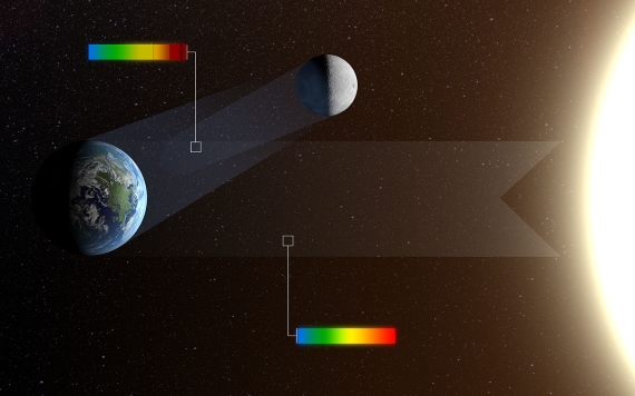
Fig. 1: When the Moon appears as a thin crescent in the twilight skies of Earth it is often possible to see that the rest of the disc is also faintly glowing. This phenomenon is called earthshine. It is due to sunlight reflecting off the Earth and illuminating the lunar surface. After reflection from Earth the colours in the light, shown as a rainbow in this picture, are significantly changed. By observing earthshine astronomers can study the properties of light reflected from Earth as if it were an exoplanet and search for signs of life. The reflected light is also strongly polarised and studying the polarisation as well as the intensity at different colours allows for much more sensitive tests for the presence of life. Image and caption credit: ESO/L. Calçada.
In 2005, a new automated telescope was installed in a small, dedicated dome at the BBSO. The two telescopes, new and old, were then run together from September 2006 through to January 2007, for calibration purposes. Observations made with the more accurate automated telescope were then made through to the end of 2017.
Since the early 2000s, scientists have also been measuring planetary albedo with a series of satellite-based sensors known as Clouds and the Earth’s Radiant Energy System, or CERES. These instruments employ scanning radiometers in order to measure both the shortwave solar energy reflected by the planet - albedo in other words – and the longwave thermal energy emitted by it. The overall aim is to monitor Earth's ongoing energy imbalance caused by our copious greenhouse gas emissions.
The Earthshine project and the CERES satellite-based measurements (2001-present day) both record great variation in albedo. That is as might be expected, because cloudiness is such an important albedo-controlling factor and varies so much. However, a slightly decreasing trend was detected (fig. 1, Goode et al. 2021).
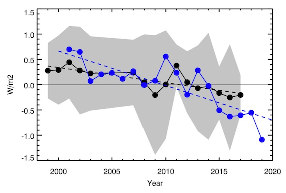
Figure 2: Earthshine annual mean albedo anomalies 1998–2017 expressed as reflected flux in Wm. The error bars are shown as a shaded grey area and the dashed black line shows a linear fit to the Earthshine annual reflected energy flux anomalies. The CERES annual albedo anomalies 2001–2019, also expressed in Wm, are shown in blue. A linear fit to the CERES data (2001–2019) is shown with a blue dashed line. Average error bars for CERES measurements are of the order of 0.2 Wm/2. From Goode et al. 2021.
The data cover two solar maxima, in 2002 and 2014, plus a solar minimum in 2009. Recorded variations in albedo show no correlation with the 11-year solar cycle, the cosmic ray flux or any other solar activity indices. Therefore, the data do not support any argument for detectable effects of solar activity on the Earth's albedo over the past two decades.
In comparison with the CERES data, both show a downturn in recent years, even though they cover slightly different parts of the Earth (Goode et al. 2021 and references therein). To put some numbers on things, in the earthshine data the albedo has decreased by about 0.5 Wm, while for CERES data, 2001–2017, the decrease is about 1.5 Wm. CERES data shows the sharp downturn to have begun in 2015.
The explanation put forward for the difference in albedo decrease between Earthshine and CERES has been further investigated and calibration-drift, a known issue with satellites, has been discounted. Instead, a recent and appreciable increase in sea surface temperatures off the west coasts of North and South America has been cited. The increase has led to reduced overlying low level cloud-deck cover. That would certainly cause significant albedo-decrease. The sea surface warming is attributed to a flip in the Pacific Decadal Oscillation (PDO), beginning in 2014 and peaking during the 2015–2017 period. It began to decline before the end of the decade.
However, a lot of this is very new, as pointed out by Gavin Schmidt at Realclimate in 2022. The role played by, for example, aerosols is not quantified in any great detail yet. But qualitatively, these developments demonstrate how impacts to the long-wave radiation combined with cloud feedbacks can lead to big shifts in short-wave reflectivity. Needless to say, this complex area is the firm focus of much ongoing investigation and will be for the foreseeable future.
Last updated on 3 March 2024 by John Mason. View Archives


I have no idea why the "hot link" problem occurs. When a simple click didn't get me to the graph, I tried copying the URL. When that worked, I thought I'd let others know.
The sum of the trends isn't that far off 0:The balance is ET = Pr - Q - dS/dt, or 2.30 = 1.00 + 1.01 + 0.75 ==> 2.30 = 2.76, so only off by 0.46.
(Pr, Q, and dS/dt are defined in the figure in MAR's comment.)
I was able to download the Pascolini-Campbell et al paper through work. They do discuss the uncertainty in trends. On p 544, they say:
This is getting off-topic for albedo, though.
I was reluctant to look into the values of Cloud Radiative Effect by location as up-thread the idea that added cloud & associated albedo came without added warming from water vapour seemed to be too difficult to accept by an insistent commenter and I wasn't sure how supportiive the result would turn out to be.
However, Calisto et al (2014) does provide in its Fig 7 the positive and negative components of CRE by latitude for both Land & Ocean and they can be easilyare here adapted to show net CRE as in the following graphic (assuming the graphic is visible to others when I link to it). The net CRE by latitude is the gap between the bold red trace & the green/blue trace in the upper panels.
MAR:
The graphs are a bit hard to read, but your link to the paper at ResearchGate provides a way to download the entire paper as a PDF, and the graphs (and others) can be easily read there.
The most interesting aspect of the graphs in that paper (in the context of the horribly over-simplified views of the insistent commenter) is the complexity they show. Both the diagrams such as the ones you point to, where we see zonal averages (function of latitude), and in the maps that they provide (showing two-dimensional variability).
Of course, several people tried to explain some of that complexity to the insistent commenter, to no avail. The insistent commenter's claim of increases in surface evaporation leading directly to proportional increases in cloud cover and changes in radiative forcing (based on a global diagram), remind me of this well-know cartoon. (Hint: the insistent commenter is the one that is trying to foist the miracle as as if it is a proper explanation.)
The data presented earlier in this thread has been updated in document Earth's Albedo 1998–2017 as Measured From Earthshine
[Link]
Figure 3
“Earthshine annual mean albedo anomalies 1998–2017 expressed as reflected flux in . The error bars are shown as a shaded gray area and the dashed black line shows a linear fit to the Earthshine annual reflected energy flux anomalies. The CERES annual albedo anomalies 2001–2019, also expressed in , are shown in blue. A linear fit to the CERES data (2001–2019) is shown with a blue dashed line. Average error bars for CERES measurements are of the order of 0.2 .”
This new data shows a good agreement between earth shine data and CERES satellite data one can also add the earth’s temperature for this time to this graph and fined good agreement with the albedo (+0.4'C or 0.8 W/m^2 in 20 years). The implication is that the earths albedo change can account for all the temperature rise over this time period. The document suggest that this albedo change was possibly due to reduced cloud cover. Leaving the question what caused the reduced cloud cover.
[BL] edited picture for width, and shortened link, to preserve page formatting.
Your posting history here has previously required frequent intervention from moderators. Please read the Comments Policy and make more effort to abide by it.
Your reference to "data presented earlier in this thread" is too vague and meaningless.
Your reference to a title "Earth's Albedo 1998–2017 as Measured From Earthshine" is insufficient to allow readers to easily find the source of your information.
There is a possibly more recent paper here: Radiative Energy Flux Variation from 2001–2020 that covers a similar topic, and this paper has been discussed at another blogs such as the following:
No, it probably isn’t mostly due to changes in clouds!
The implication is that your "implication is that the earths albedo change can account for all the temperature rise over this time period" is lacking evidence and is mostly likely wrong.
blaisct @104,
The paper you obtain the Figure 3 from is Goode et al (2021), the latest in a series of papers (spawned by Flatte et al 1992) which have been trying to establish Earthshine measurements as a useful data source. There is a distinct lack of rigour within the work as well as a worrying denialistic flavour to it. The paper linked in the moderator Response @104, Dübal & Vahrenholt (2014) suffers from similar problems but does use the latest CERES data which Goode et al fails to use.
As for the cause of the reduced cloud cover identified within the CERES data, it is a known feedback from AGW. This Yale E360 article from 2020 explains.
Once again thanks for your comment (MA Rodger and the editor) and the additional papers on the subject. I will try to do better with the links.
The earlier data I was referring to was earthshine 10 years and CERES 10 years which showed that the data for the earths albedo was very noisy and flat. The flat part was what was expected for anthropogenic greenhouse gas , AGH, global warming. My initial understanding of AGH radiative forcing was that AGHs absorbed radiation (got hot) and that the higher the AGH concentration (at constant radiation) the more heat it could hold back thus the temperature would increase but the energy in vs out of the zone where this occurred would be the same (albedo would be flat). My understanding has been expanded to include: AGHs hotter temperature will reduce humidity and thus reduce cloud cover, expose more earth surface to the sun thus reduce earths albedo; therefor, albedo vs time for AGHs may not be flat.
The new (new to me) data I sited Earthshine 20 years showed a decrease albedo from both earthshine and CERES data – my only interest is this report was the agreement with earthshine an CERES data. The editor’s link CERES 20 years 1 and another link CERES 20 years 2 provided a lot more CERES data with different analyses. These three papers are the first time I have seen data showing a decrease in albedo (increase in TOA radiation) vs time. If all climate change was due to AGHs this graph would be flat. Using the CERES 20 years 2 graph for TOA radiation out. (of the three links I chose this one because it has the In Situ data (earth surface temperature)) one can see the good correlation between In Situ data and CERES data
Figure 1
“Comparison of overlapping one-year estimates at 6-month intervals of net top-of-the-atmosphere annual energy flux from the Clouds and the Earth's Radiant Energy System Energy Balanced and Filled Ed4.1 product (solid red line) and an in situ observational estimate of uptake of energy by Earth climate system (solid blue line). Dashed lines correspond to least squares linear regression fits to the data.”
. If there was any AGH global warming mixed In with the TOA (red) data it would have a slope lower than the In Situ data. The report CERES 20 years 1 did look for the AGH flat line signal and found it in the “Clear Sky” LW (long wave) data but nowhere else (1 of four graphs).
Two of these reports put a lot of emphasis on clouds decrease (new to me). (Decrease in cloud cover increased surface exposure to suns radiation and heats the earth more.) The report CERES 20 years 2 also found correlation to Water vapor, trace gases, surface albedo, as well as clouds. Both of these reports express doubts on the current understanding of climate change and make recommendation to further understand what is causing cloud cover to change.
While this new data is interesting and worth following up on it is still very noisy (low R^2) and another 20 years would be better.
I recognize that AGH global warming would promote other forcing including reduce clouds, reduced ice, reduced snow cover all exposing more surface to direct rays of the sun. Other man-made albedo changes can do the same thing. Here are two examples that may relate to the new papers.
Let’s start with the “heat island effect”, UHI. While the global warming from UHI’s lower albedo is small it does have observable effect on cloud formation, CERES 20 years 2.
“Figure 3
Attribution of Clouds and the Earth's Radiant Energy System net top-of-atmosphere flux trends for 2002/09–2020/03. Shown are trends due to changes in (a) clouds, (b) surface, (c) temperature, (d) combined contributions from trace gases and solar irradiance (labeled as “Other”), (e) water vapor, and (f) aerosols. Positive trends correspond to heat gain and negative to loss. Stippled areas fall outside the 5%–95% confidence interval. Numbers in parentheses correspond to global trends and 5%–95% confidence intervals in W m−2 decade−1.”
When air rises from a UHI it is hotter than the incoming air without a source of moisture to saturate it; so, it leaves as dryer air. This air generally rises and moves to the east. Look at figure 3 (a) and see the lower cloud formation change off the coast of east USA, Tokyo, and downwind Europe. With time (1880-2021) the UHI does not get hotter but it gets bigger thus the volume of low moisture air gets bigger. I am not going to argue the significances of the albedo part of UHI other than to recognize it is lower than 1 W/m^2 but not zero. What UHI is not given credit for is what happens downwind to this hotter low humidity air. Does it cool the ocean, reduce the snow line, melt ice, or reduce the cloud cover down wind, since this hot dry air should rise the clouds should be the first target. I can also see a chain of events: Hot low moisture air (from AGHs, UHIs, or other land changes) rises and go downwind, reduces cloud cover, over water the sun heats the ocean, the hotter ocean currents circulate to the poles, and melt some ice.
I’ll leave the quantification of this observable (figure 3 (a)) new (to me) correlation to others. A new UHI contribution to GW will be the albedo effect + the lower cloud effect + any other.
Second, is land use changes such as forest to crop or pasture land or grass land to crop land. Albedo decrease in grass land to crop land change is documented in Grass to Crops. Forest to crop land change increase in albedo is documented in Forest to Crops. Over 205 years the paper Global albedo study calculates that all the pluses and minuses add up to little change in albedo from land use changes. It is assumed (by me) that decreased albedo of a parcel of land means an increase in temperature and vs/vs. The study Amazonia Forest to Crops shows that increasing albedo does not always mean cooler temps. This report shows that when rain forest was replaced with crop land that the temperature increased, the rain decreased, and the cloud cover decreased. The Figure 3 (e) above shows bright red spot for “water vapor” (I assume that is change to lower humidity) in Amazonia. This is not an uncommon effect from replacing forest with crop or pasture land. The report Forest study observes that forests vs crop/pasture conversion gets warmer as the conversion gets south of 35’N latitude.
This unintuitive (to me) observation that an increase in albedo does not always result in a decrease in temperature can be explained by moisture. The resulting temperature depends on a constant enthalpy (total heat in the air= gases + moisture). Enthalpy is usually determined by the albedo (higher albedo lower enthalpy vs/vs); therefore, land exposed to the same albedo (enthalpy) can have a wide range of temperatures depending on the moisture (relative humidity) of the albedo (enthalpy). This relationship has been captured in a psychrometric chart,
(Sorry for the poor quality of this chart)
Example of a rain forest conversion to crop land: Start out with a rain forest at 25’C (bottom scale) go straight up to 90% humidity curve; this is our hot humid rain forest. If we convert this rain forest to crop land with a higher albedo, we move to a lower enthalpy line (anyone will do). The constant enthalpy line run diagonal (upper left to lower right). If the moisture is maintained at 90% the temperature will drop as expected for the higher albedo. Following the same enthalpy line (same albedo) go to a lower humidity curve that may result (and does in Amazonia) and one will see the temperature will increase (even to above the starting rainforest temperature at very low humidity).
A concern is how NASA and the IPCC pair surface temperature data with relative humidity and albedo. The three all connected in enthalpy. A misunderstanding of climate change could occur if Amazonian (rain forest to crop land) high albedo, high temperature, lower humidity type data was included in correlations with Canadian (forest to crop land) lower albedo, cooler temperatures, high humidity, type data. Does anyone know if this has been looked at? The report CERES 20 years 1 has looked at ocean enthalpy correlations. I have not seen any land enthalpy data.
blaisct @108,
I would strongly suggest that you take the assertions regarding the underlying causes of trends in EEI set out in the papers you call "Earthshine 20 years" (aka Goode et al 2021) and "CERES 20 years 1" (aka Dübal & Vahrenholt 2021) with a large pinch of salt. Their speculations about the reasons for the EEI data are entirely unsubstantiated.
The third paper you cite as "CERES 20 years 2" (aka Loeb et al 2021) is a more considered analysis as it uses a modelled analysis (setout in its section 2.3) to derive the underlying causes of recent trends in EEI. Shown in their Fig 2f, Loeb et al find the overall EEI trend is dominated by 4 positive and 1 negative factor. You appear not to grasp that the positive factor "other" is the GHG forcing (with a small negative contribition from solar forcing through the period 2002-20). Also the water vapour factor results from a GHG forcing feedback. Thus your speculation doubting the contribution of "any AGH global warming mixed In with the TOA (red) data" is entirely misplaced. And do note that this is the change in EEI through the period. An EEI had been established by GHG forcing prior to this period while the analysis looks solely at the trends (ie changes) 2002-20.
Simply I do not see Loeb et al (2021) anywhere "express doubts on the current understanding of climate change."
I find most of the latter part of your comment most bizarre. I refrain here from explaining where you appear to be in error as you do run such a long way with your theorising. But if you wish such explanation, do say.
MA Rodger @107
Thanks for your comments. The correlation in figure 2(f) CERES 20 years 2 (aka Loeb et al 2021) to GHG was noted but it is in conflict with the extremely good fit of CERES data to in situ in figure 1 CERES 20 years 2 which should show a smaller slope (of the statical fit) than the in situ data if GHGs were a significant effect. The conflict could be explained by the GHG if their effect on cloud formation is so strong that the GHG effect can not be seen in Figure 1 only the cloud effect can be seen; or that the GHG data in Figure 2(f) is confounded with another variable. With just 20 years of data, we can’t tell yet.
My biggest takeaway from the reports in @106 was finally seeing a correlation to albedo that fit the observed temperature rise over 20 years. You are right in that this is only 20 year and not the 150 years of concern.
The unproven theories at the bottom of @106 are just possible theories of unknown significance that may explain the Figure 1 correlation. I put them there incase someone had someone data on the subject.
blaisct @108,
You talk of a "correlation in figure 2(f) CERES 20 years 2 (aka Loeb et al 2021)" which I find most odd as I see no correlation there. The figure 2(f) simply presents an attribution of the increasing IEE 2005-20, the sum of the attributions presented in figs 2(d) & 2(e). I thus fail to see any "conflict" between Fig 2(f) & fig 1. The total of the attributed components presented in fig 2(f) (+0.41Wm^-2/decade) is also the trend for the data shown in fig 2(c), CERES data which differs from fig1 only in that it covers a slightly extended period. I am thus not seeing any "conflict".
And do be aware that the "in situ" (data which is in the main Ocean Heat Content data) is presented as a check on the CERES net values. If there was not a good fit between the OHC & CERES data, the CERES data would be seen as le robust with its use within the analysis thrown into some doubt. So the view that CERES should show less trend than "situ data if GHGs were a significant effect" doesn't stack up at all.
Loeb et al (2021) is saying that CERES shows an increasing trend in downward radiation of +0.65Wm^-2/decade, part balanced by an increasing trend of +0.24Wm^-2 upward radiation, yielding a net downward EEI trend of +0.41Wm^-2. And a 'Partial Radiative Perturbation Analysis' attributes this net EEI trend almost entlrely to factors directly or indirectly resulting from AGW, these factors being:-
+0.25Wm^-2/decade due to cloud albedo (which will comprise a reduction in cloud fraction and an indirect aerosol effect which presumably will be negative through this period).
+0.31Wm^-2/deacde due to increasing water vapour (this due to global warming).
+0.22Wm^-2/decade due to "other" effects (dominated by increased GH gases as well as a small solar variation which would have been negative through the period).
+0.18Wm^-2/decade due to secreasing surface albedo (this shown in polar and mountain ragions and thus again a product of global warming reducing ice/snow cover.
+0.01Wm^-2/decade due to a reduced direct aerosol effect.
-0.53Wm^-2/decade due to a warmer planet increasing outward radiation.
I do not see any correlation between albedo and global temperature, certainly not in Loeb et al (2021). Perhaps you could explain where you see it.
These EEI trends acting since 2005 have collectively added some 0.7Wm^-2 to the EEI over the period to a start-of-period EEI of 0.4Wm^-2. Finally there is a concern that these 2005-20 trends are perhaps not representitive of the long-term trend. One factor not addressed by the analysis is the potential for significant short-term effects due to the situation prior to the period (thus the start-of-period EEI of 0.4Wm^-2 may be a poor start point). Loeb et al do consider short-term effects acting during the period 2005-20 that may abate long-term, specifically the PDO.
blaisct @ 106:
Although it has been almost two weeks since your post, and others have commented, I wish to respond to one statement you have in your opening paragraph. You state:
The "hotter temperatures will reduce humidity" does not follow. If air temperature increases and absolute humidity does not change, then yes, relative humidity will decrease, but we have no a priori reason to expect this to be the case.
I suggest that you review the use of differnt terms for "humidity", which can get quite confusing at times. Wikipedia has a decent page covering this.
A warmer atmosphere is expected to increase evaporation, which will add water vapour to the atmosphere. This cannot go on indefinitely, and globally we expect a new equilibriium where increased evaporation is matched by increased precipitation. At this new equilibrium, we expect global absolute humidity to be higher, and global relative humidity to be roughly the same as now.
Spatial variation will almost certainly be different, and exactly how cloud cover will respond has uncertainties, but it is not as simple as you describe.
Usually, the incorrect assumption you will see in the comments here goes along the lines of "more evaporation = more cloud". This is also far too simplistic. The balance between temprature, evaporation, cloud formation, and precipitation is a complex and delicate one.
Ref my @104 and @106 replies
Thanks again for the comments. I can see that I need to take smaller bites out of albedo apple in the CERES data. Let me start with Hans-Rolf Dübal et al 2021 graph of CERES data.
Hans-Rolf Dübal et al 2021 does not have an official albedo change graph (change in sun’s energy out -change in sun’s energy in). The graph above needs to be correct for the small (-0.07 W/m^2/20 years) in coming energy (correction is: -1.3W/m^2/20 years). My post @104 has that correction in a graph. The change in global temperature over the CERES time period is about 0.45’C or -0.9 W/m^2/20 years. Over laying that on the graph above one can see an almost perfect fit (slightly higher slope for CERES data) (can’t show that in this format).
First question: Does an almost perfect fit of global temperature to CERES albedo (in W/m^2) mean albedo is the main cause of global warming for the 20 years of CERES data? (Regardless of what caused the albedo change or the short 20 years of data)
Second question: Should the slope of the albedo graph above be different (flatter) than the actual global temperature if CO2 caused radiative forcing was at work; since, CO2 caused radiative forcing does not use albedo change energy to cause global temperature rise?
Any answer to these questions would help me understand the CERES data before exploring what caused the albedo change in CERES data.
blaisct @111,
You say you want to "take smaller bites out of albedo apple" which is probably advisable and presumably it is also advisable to start from the first "small bite."
So we have set out in Dübal & Vahrenholt (2021) for the 19 year period 2001-20 a trend in 'Incoming Solar (TOA)' of -0.0035Wm^-2/yr and a trend of 'Shortwave Out (TOA) ' -0.0704Wm^-2/yr of and thus an inferred trend in 'Absorbed Solar' of +0.0669Wm^-2/yr which would thus equate to +1.27Wm^-2 'Absorbed Solar' over the 19 years. So far so good.
You then assert that the "change in global temperature over the CERES time period is about +0.45ºC" which is a reasonable value for global SAT 2001-20 although its best if its derivation was properly explained. But, so good so far.
You then assert that this temperature increase of +0.45ºC is in some way equivalent to +0.9Wm^-2 per 20 yrs. That step does certainly need explaining.
And if that explanation is convincing (warning - that is very unlikely to happen), when that explanation is provided, it would help why the discrepancy between 0.9 and 1.3 can also allow the two to be considered as "an almost perfect fit."
And when these "small bites out of albedo apple" have been digested, the relevance of your first question may be more evident.
MA Rogres @112
The +0.45'C X 0.5 W/m^2/'C. I copied that conversion factor from other posts on the internet. I have looked for the derivation of it and cannot find it. I have also seen 0.7 W/m^2/'C used. I would love to find the derivation or use the correct one.
As for the slope difference. Put the temperature line I suggested on the same graph and you will see the temp (W/m^2) stays just within the confidence intervals of the graph - close enough, I did not say perfect but almost perfect.
blaisct @113,
Surely 0.45ºC x 0.5Wm^-2/ºC = 0.225Wm^-2. The Dübal & Vahrenholt (2021) numbers put the 2001-20 19-year increase in Absorbed Solar at +1.27Wm^-2 (+/- 0.26, so 1.53 to 1.01). With the 0.5 convertion factor you state you used, that would be 1.27 / 0.5 = 2.54ºC (or 3.06ºC to 2.02ºC). The alternative 0.7 convertion factor you mention would yield 2.19ºC to 1.44ºC.
As for these 0.5 and 0.7 convertion factors, simple physics tells us a planet with 240Wm^-2 solar warming would require a factor of 3.7Wm^-2/ºC. But with the oceans to be warmed, that is a process that would take centuries not 19 years of slowly increased warming, a process which is also complicated by feedback mechanisms.
I would attempt to assist in putting your analysis back on the rails but I'm not entirely sure what it is you are about and also a little conscious that you are referencing Dübal & Vahrenholt (2021) which drinks rather deeply at the well of denialism.
That said, you appear not to be accounting for AGW prior to 2001 and attempting to analyse climate numbers 2001-20 in isolation. But AGW has been running at a pretty constant rate since the 1970s with only recently the first signs of a bit of acceleration. Simply attempting to isolate the period 2001-20 from the on-going AGW is always going to end in tears.
MA Rodger @114
Thanks again. You caught me in one of my dyslexic moments. That conversion factor should have been written as 0.5 ‘C/(W/m^2). Or 0.45’C/(0.5 ‘C/W/m^2) = 0.9 W/m^2. Your note, forced me to look again for the derivation of it: It is not a conversion factor, it is a statistical relationship that can vary according to the author and subject of a paper, that’s why I found a range of 0.5 to 0.7, Wikipedia gives 0.8. In which case, the graph @111 has its own statistical relationship of 0.45’C/1.3 W/m^2 = 0.35 ‘C/(W/m^2) and does look different than other statistical factors, having the lowest observed temperature rise per W/m^2. I am not sure that means anything. It does negate my first question. I will rephrase the second question: If all the global warming, GW, came from CO2 radiative forcing alone would not a graph like @111 be flatter and this “conversion factor” be very high? Indicating the other factors listed above (0.5, 0.7, 0.8 ‘C/W/m^2) may have some effect of CO2 caused GW in them and @111 the lowest?
Small bites of the apple are working.
blaisct @115,
The Wiki reference you cite giving 0.8 is presumably this paragraph which provides a statement of Equilibrium Climate Sensitivity with ΔTs = λ ΔF and λ = 0.8ºC/Wm^-2.
With ECS usually given as the ΔTs for a doubling of CO2 where ΔF = 3.7Wm^-2, ECS = 3ºC. This is the usual 'central' value given for ECS. IPCC AR6 Ch7 calls 3ºC "the best estimate."
But this increase in EEI for the period 2001-20 cannot be used as a value for ΔF in ECS equations.
blaisct @115,
And concerning your second question - "If all the global warming, GW, came from CO2 radiative forcing alone would not a graph like @111 be flatter...?"
The 'graph @111' is Fig 3 of Dübal & Vahrenholt (2021) and specifically shows a quite-dramatic reduction in albedo 2001-20 with a trend of -0.70Wm^-2/decade. Fig 1 shows a reduction in solar of -0.03Wm^-2/d. Thus Figs 1 & 3 matches Loeb et al (2021) Fig 2d with Absorbed Solar 2002-20 given as +0.67Wm^-2/d. Loeb et al Fig 2d also presents an attribution of this increased absorbed solar warming 2002-20, ☻ 60% cloud albedo, ☻ 7% water vapour, ☻ 4% GHGs, ☻ 26% surface albedo, ☻ 3% aerosol. And note also that Loeb et al Fig 2a shows this 'quite-dramatic' effect occurs almost totally 2013-20.
To explain this attribution; if 4%+7% of this increase-in-Absorbed Solar (decrease-in-albedo) is attributed to GHGs, this means additional GHGs+water-vapour is directly preventing solar being otherwise reflected away and instead directly absorbed by the increased GHG+water-vapour. The underlying cause for the water vapour increase is of course AGW.
Your question implies that you consider there is something other than AGW and increased CO2 driving a significant part of this increase-in-Absorbed Solar (decrease-in-albedo) 2002-20. I don't think I could agree.
Loeb et al does identify the geography of the various components of the net EEI, mapping them out in Fig 3 and pointing to the Surface effect being "greatest in areas of snow and sea-ice, where significant declines in coverage have been observed in recent decades." It is, of course, easy to see that the ice-loss is due to AGW.
And for the biggest component, Cloud, Loeb et al says "Regional trends in net radiation attributable to changes in clouds are strongly positive along the east Pacific Ocean, while more modest positive trends occur off of the U.S. east coast and over the Indian, Southern, and central equatorial Pacific Oceans." Is this the finger print of AGW? If it isn't, it would require an alternative causation.
If AGW is the cause, note that the increase-in-Absorbed Solar (decrease-in-albedo) 2002-20 is mainly occuring 2013-20 which matches the global temperature record showing 70% of the 2002-20 warming occurred in the period 2013-20.
So without further explanation, I see no reason to expect a "flatter" slope from CO2-forcing alone, the slope being presumably all down to AGW.
Thank you for your presentation of the Dübal and Vahrenholt 2021-paper blaisct. I think there is a good overall agreement to the CERES data presented by Loeb et al 2021. I have commented this at Science of Doom.
The Dübal and Vahrenholt paper, Radiative Energy Flux Variation from 2001–2020, have got some attention. And for good reason. It is an important discussion. But there are some problems with some of the claims that are made.
«Radiative energy flux data, downloaded from CERES, are evaluated with respect to their variations from 2001 to 2020. We found the declining outgoing shortwave radiation to be the most important contributor for a positive TOA (top of the atmosphere) net flux of 0.8 W/m2 in this time frame.»
According to the CERES data they present (TOA all sky), the trend is LW out 0,28 W/m2/decade (cooling), SW out -0,70 (warming), and solar reduction 0,03 (cooling), wich gives a TOA warming trend of 0,39 W/m2/dec. So far so good. And in good agreement with Loeb et al 2021. EBAF Trends (03/2000-02/2021) 0.37 + 0.15 Wm-2 per decade.
«The declining TOA SW (out) is the major heating cause (+1.42 W/m2 from 2001 to 2020).»
Trend SW out all sky -0,70 W/m2/dec withsolar reduction included (0,70 W/m2/dec TOA warming). Gives 1,40 W/m2 over 20 years. This major heating is composed of SW clear sky heating trend of -0,37 W/m2/dec and a SW cloudy sky heating trend of -0,78 W/m2/dec. In the TOA radiation energy bridge-chart (figure 14) this is shown as SW clear sky increase of 0,15 W/m2 and SW cloudy areas increase of 1,27 W/m2. And the solar change impact is -0,17 W/m2 for 20 years. A great difference between trend and energy bridge-chart.
Loeb et al has a SW TOA heating of 0,63W/m2/dec through albedo change, with clouds increasing absorbed SW Flux 0,44W/m2/dec and surface increased absorption 0,19W/m2/dec. In good agreement with Dübal and Vahrenholt. EBAF Trends (03/2000-02/2021) 0.68 + 0.12 Wm-2 per decade.
«It is almost compensated by the growing chilling TOA LW (out) (−1.1 W/m2).»
But as we have seen, the trend is only 0,28 W/m2/dec. This is composed of LW TOA flux clear sky 0,04W/m2/dec and LW cloudy sky 0,35 W/m2/dec. How can they claim so big «chilling» longwave cooling? It looks like they use the startpoint and endpoint of a graph, and that the «chilling» cooling at TOA was for the year 2020 relative to 2001. In the TOA radiation energy bridge-chart (figure 14) this is shown as LW clear sky increase of 0,46 W/m2 and LW cloudy areas increase of 0,64 W/m2. I think what is presented in the bridge-charts is close to cherrypicking.
Loeb et al EBAF Trends (03/2000-02/2021) -0.31 + 0.12 Wm-2 per decade
The Dübal and Vahrenholt calculations for cloudy areas are clearly showing how thinning of clouds is the greatest component of global warming for the last 20 years, and probably for 40 years when we read the papers of M Wild and other cloud scientists. So when some say that the AGW is the cause of all global brightening or of all increase in water vapor, they are not taking the attribution problem serious. Increasing surface and atmospheric temperatures is contributing a lot, but there is a great complexity behind all this.
nobodysknowledge @118,
I would suggest that Dübal and Vahrenholt (2021) is not a reliable paper due to both its simplistic use of climatological data and its bizarre theorising which has more to do with climate change denial than the science of climatology.
That said, you make criticisms of Dübal and Vahrenholt (2021) of which they are not guilty.
You are correct that their Fig 15 (not Fig 14 as you reference) that Dübal and Vahrenholt call a "bridge-chart" shows values for 'Clear Sky' and 'Cloudy' which are significantly different from the values show elsewhere in the paper (which you call "trend"). This discrepancy is because Fig15 firstly is not using the "trend" values but using the difference between the 2020 values and the 2001 values, (a point you do mention) and secondly and more significant, these end-point values are converted to 'global' values, thus with 'Clear Sky' values being multiplied by the relevant [1 - Cloud Fraction] and 'Cloudy' being multiplied by the relevant [Cloud Fraction]. The Cloud Fraction values CA shown in their Fig 9 suggest CA[2001] = 61.33% & CA[2020] = 61.5%. I assume Dübal and Vahrenholt's arithmetic does not conceal errors.
And I would entirely disagree with your assertion that folk "are not taking the attribution problem serious."
Re. MA Rodger. Cloud Area Fraction calculation, as presented from Dübal and Vahrenholt.
"The terms “cloudiness” and the CERES term “cloud area fraction” have different definition and methodology but both are associated with the cloud cover. The cloudiness is currently ca. 61.3% whereas the cloud area fraction from CERES is ca. 67.5%. Nevertheless, from Figure 8 it follows, that a change of cloud cover by 1% would cause a change of the TOA global net flux of 0.26 W/m2 so that the drop of 1.86% of cloudiness in Figure 9 could have caused an effect of ca. 0.5 W/m2, a large portion of the observed average value for 2001–2020 (0.8 W/m2)." The 61,3% cloudiness is from WHO, and seems not to be quite reliable when taken together with Earth Energy Imbalance. It is a weekness of the paper that measurements of cloud area fraction are not presented.
An exampel of calculation: «“LW Surface Down Cloudy” in Figure 11c changes from 360.07 to 357.88 W/m2 = −2.19 W/m2 . Multiplied by 0.674 (67.4% cloud area fraction) gives a contribution of −1.48 W/m2 from 2001 to 2020. «
MA Rodger @112
Before I answer your question on whether there is something other than AGW causing global warming. Let me clarify that I am not a skeptic on Anthropical Global Warming, AGW, I firmly believe that man’s activities are causing AGW. The paper Dubal & Vahrenholt expressed doubt that the 20 years of CERES data showed significant evidence of GHG caused AGW and that clouds were the significant factor. How is cloud cover related to AGW? The Skeptical web site seems to be committed to evaluating theories. Here is the answer to your question:
The data I have looked at (below) suggest that AGW is not cause by one thing but a series of interactive events starting with land albedo and ending with ocean/land albedo and relative humidity (not specific humidity) in the middle. You will see (below) that this cycle of events is a known cycle in weather and that man’s activities have interfered with the cycle to cause AGW. For lack of a better name, I will call the cycle of events the “Low Humidity Albedo Cycle”, LHAC. The LHAC cycle back in the 1700-1800 (with low man-made albedo change) was:
Event 1: Over land on sunny days the temperature rises and the relative humidity, RH, drops through the day no matter what the albedo of the land is. How much the RH drops depends on availability of water from liquid water evaporation or plant transpiration. If no water is added to this daily event the specific humidity, SH, will remain constant while the RH drops. With water available the RH does not drop as much and the SH increase. The energy fueling this event (sunny days) depends on the albedo and latitude of the land, the lower the albedo and the closer to the equator the stronger this event. Clouds greatly dampen this event.
Event 2: The air above this land is hot and dryer and it rises all day long, creating a plume of rising hot low humidity air. That plume of air moves with the prevailing winds usually to the east in a circling pattern due to the Corellas effect.
Event 3: This hot low RH air is hungry for water. If this air finds clouds it eats away at them until the air is saturated with water, this process cools the air and raises the SH and RH. If this hot low RH air does not find a cloud it can cool as the pressure drops at the higher altitudes or it can serve as a deterrent to cloud formation. In all cases it reaches saturation.
Event 4: With fewer clouds more sun can reach the earth and warm the land and oceans, this is the final albedo decrease event. This last albedo event is the strongest because the change in albedo in the greatest with no clouds in the way of direct sun light. The warmer oceans store some of this energy and evaporate more water - find cold air and make more clouds.
This natural LHAC cycle of event will remain stable if the albedo and moisture availability remain constant. Let’s take each event and look at its contribution to the total AGW since 1880:
Event 1: Since 1700-1880 man has made some small changes in land use albedo but a large change in the land area. Most of these albedo changes came along with a decrease in moisture availability. UHI’s are most noted, with albedo changes between 0 and 0.2 depending on what the city replaced. I don’t have a source for the average, I will assume 0.05 average albedo change. The urban area has increased to about 3% of the earth’s land mass for all cities. I have no trouble doubling that to 6% for all man-made structures, rural + urban, they all have lower albedos and generate heat. Go to any city at Climate data and you can find the daytime data for temperature vs RH, in the morning the RH is high and as the day progress the temperature rises and the RH drops sometimes to 40% RH or lower, this is a normal psychometric thermodynamic process. Figure 1 is an example of daily RH from Beijing and is typical of most cities (just focus on the day time).
Figure 1
The change in albedo flux of all the earth’s cities is estimated at 0.08W/m^2 (assuming 177W/m^2 sun to the city, 50% cloud cover, 0.05 albedo change, 3% of land mass cities). Even if we make larger assumptions, we still can’t get to the 2.2W/m^2 we are looking for to account for all the AGW since 1880 or the 1.3 W/m^2 in Dubal & Vahrenholt . These cities can have daily temperature rise of up to 8’C. A large part of this temperature rise is due to the psychometric rise, PR, in temperature while the RH drops at a constant energy input (albedo). Looking at temperature anomalies, SH, and RH all plotted together vs time, Figure 2, we see they are all correlated (Temp and SH positively, and Temp and RH negatively).
Figure 2
If PR were not occurring on a global basis the RH and SH would both have a positive slope. Using the psychometric chart in @106 we can get the average temperature rise per % RH of -0.15 ‘C/%RH. The slope of the RH data in (2) is 0.16%RH/decade, for the 40 years of the chart this is 0.6% change in RH, giving a PR temp rise of 0.1’C for the 40 years vs the 0.7’C observed, small but not insignificant. This hot low RH air has no W/m^2 flux as it leaves the UHI; but, the hot low RH air has potential energy gain in getting saturated with water. Let’s add the crop/pasture land albedo changes to the UHI's. Globally the change since 1880 from virgin land to crop/pasture was about 6% with little change in albedo (Global albedo change); but, with low moisture change. The most notable of these changes was the deforestation of the Amazonian rain forest to make crop and pasture land Amazonia report (and @106). Amazonia report showed that in despite of an increase in albedo from rain forest to crop/pasture the temperature increased, the RH deceased, the cloud cover decreased, and the rain decreased. Classic example of psychometric temperature and RH behavior. Most likely all of this global 6% increase in crop/pasture land is producing hot low RH air just like the UHI’s. Combining the UHI and crop/pasture land changes we get 9% of the earth’s land mass producing more hot low RH air than 1880.
Event 2: This hot low relative humidity air rises and goes downwind from the UHI or changed crop/pasture land. The picture from (6) shows the extent of the UHI plume from Chicago, Il.
Figure 3
This is a computer model tuned with real data and calculates the extent of the plume to be 2 to 4 time the area of the UHI. The model also predicts the shape of the plume, rising to where some clouds could be. Using 3 times as the average extent of the plume we now get 27% of the land mass (7.8% of the earth) being affected by plumes like the one in Figure 3.
Event 3: Cloud destruction/prevention is the closest target for the hot low RH plume; but, if clouds are not available the lower pressure will saturate it or it will mix with cooler air. When this plume of hot low RH air increases its RH to 80% it is no longer is a threat to clouds or cloud prevention. Clouds and RH observations are that almost no clouds can form below 60% RH and significant reductions will occur below 80% RH.
Figure 4
Data shown in the figure 4 shows a 41%/decade decrease in clouds over 40 years. Dubal & Vahrenholt Figure 9 show about 0.57%/decade decrease, this data can be correlated to Figure 2 RH data and get 2.7% change in cloudiness/change in RH (R^2 =0.63). Not the best correlation but shows there is a relationship.
Event 4: The reduce cloud cover exposes more land and ocean to the sun. This land and ocean are located in the middle 75% of the earth where the cloud cover is about 50% vs about 60% for the whole earth, also assuming albedo of clouds is 50%. The sun’s flux to this exposed area is the cloud free flux of 342 W/m^2 (1367/4). Dubal & Vahrenholt suggest this energy is split 85% over ocean (0.05 albedo) and remainder over land (0.15 albedo). Using 40%/decade cloud cover for 2 decades of CERES data we get -1.6W/m^2 change in incoming SW [ 342W/m^2*0.8% cloud cover change*(85% *(1-0.05)+(1-80%)*(1-0.15))]. A little greater than the -1.3 W/m^2 observed; but close enough to show that the LHAC theory is plausible.
blaist @121
I had the impression the Order of the Day set out @111 was "small bites" but @121 you appear to be serving up a giant five-course meal.
You seem to be proposing a driver of AGW with a mechanism initiated by (1) a decrease in surface albedo due to the spread of urban areas leading to (2) a rise in surface temperature which in turn leads to (3) reduced relative humidity which leads to (4) reduced cloud cover which then amplifies the warming due to (5) a reduction in cloud albedo. Do correct me if I have misunderstood your proposed mechanism.
Yet if this suggestion is to hold water, how does it reconcile with the 'Amazonia report' you cite, Costa et al (2007) which (as you describe) "showed that in despite of an increase in albedo from rain forest to crop/pasture, the temperature increased." And this increase in surface albedo with land-use-change is global and has been on-going since 1700 according to your other citation Ghimire et al (2014) whose Fig 2 is pasted below showing a cooling radiative forcing (inset rising albedo).

So if there is an increase in surface albedo, what is it causing the increasing global temperature and thus kicking-off your proposed mechanism, (1) to (5) above? Why would we be experiencing warming if globally surface albedo has been increasing since 1700?
Rodger @122
Yes, your translation of the LHAC theory is correct. Sorry for the whole apple, it was the only way to answer your question. One point of clarification. The production (flux over time) of hot low humidity air (through the day when the sun is shining) will occur no matter what the albedo of the UHI or cultivated land is, so the change in albedo is not that significant but the change in moisture availability is. The albedo affects how hot, water availability affects how low the RH, and area affects how much is produced over time. The Amazonia study showed this. The psychometric chart in @106 shows the math. In the LHAC theory, hot low RH air has always been a part of weather. Over time, man has changed how hot, how low the RH and how much is produced with UHI’s and new cultivated land. The generation of hot low RH air deals with W-hr/m^3 not W/m^2 and destruction of clouds should be on the same W-hr/m^3 basis.
Correction in @121
At bottom of @121 should read: we get -1.6W/m^2 change in incoming SW [ 342W/m^2*0.8% cloud cover change*(85% *(1-0.05)+(1-85%)*(1-0.15) – (1- 0.31 earth’s albedo)*(1-50% cloud albedo))]
blaisct @123,
It is good we can now see clearly the mechanism (1) to (5) of your LHAC theory in which you propose a driver of increasing global temperatures.
But then we run into a problem or two.
If the driver is step (1), a decrease in surface albedo driven by spreading urban development, how can you now say "the change in albedo is not that significant"? The change in albedo is surely the driver of the process. Or is my "translation of LHAC theory" less than correct?
Perhaps the contradiction I posed @122 (that Costa et al [2007] showed increasing albedo rather than the required decreasing albedo yet still showed warming temperatures) is in some way explained but I do not see it. And identifying the driver of a process is fundamental to such theorising. It appears that has not been achieved.
You also say the chart @106 shows the maths but I would disagree. The chart sinply plots temperature (aka dry-bulb teperature, aka psycometric temperature) against dew-point temperature to allow heating engineers to calculate water content etc. It does no calculating. (A clearer version of the chart may assist.)
And the process concerns changing energy fluxes. While heating engineers may work in W-hr/m^3, in climatology there are a fixed number of hours in a day and of cubic kilometres in the sky. So Wm^-2 is perfectly adequate as a measure of the proposed mechanism at work.
Rodger @122
To show that albedo differences are not that significant, let’s do three examples on the psychometric chart. 1) the land the UHI/cropland was on before. 2) the UHI/cropland with decrease albedo 3) the UHI/land with increased albedo. In event 1 of the LHAC theory we have two things going on: one, the pure albedo effect that is about 0.08W/m^2 for a 0.05 albedo change (not very much), and two the total heat from the sun (about 177 W/m^2) is generating hot low RH air. We will use the psychometric chart to calculate the difference in the “cloud killing” capability of this air in the three cases. You chart at @124 is clearer than mine at @106 but does not show that the yellow lines (wet bulb lines) are constant enthalpy lines (on a dry air basis), constant flux (W/m^2) or the albedo over time transferred to the air (W-hr/m^3 or kJ/kg(dry air)). (if you were an air-conditioner installer this would be related to the HP or tons of your unit, in our case it is the sun’s energy.) We need to get to these units to calculate how much cloud cover this hot low RH air can destroy or prevent, then we can go back to W/m^2.
I will be honest with you; I use a free online calculator for these charts at Online Interactive Psychrometric Chart
The site Tutorial is a good tutorial.
The following is from the interactive site;
1) For virgin land let’s pick 25’C and 80% relative humidity a little after the sun rises on a clear day, that will put us on the constant specific humidity, SH, line of about 16 g/kg(dry air), the web site call this “Humid.Ratio”. To simulate an sensible heat rise over the course of the day, move right on the constant 16g/kg(dry air) SH line for this example we will stop at 52% RH and 32.5’C (this would be the conditions with no water added) (The 52% RH will match the 8.0 kJ/kg(da)(differences between starting conditions and end of day enthalpy conditions needed to match most cities temp vs RH line, I am sorry this is a trial and error procedure). We will also assume that vegetation and other water sources add water to 18 g/kg(dry air)(22% increase in SH, this is equivalent to one example I found- not much data out there on this) results in an adiabatic cooling (follow yellow line back to right) to 29.2’C and 70% RH on the 18g/kg line.
2) For decrease in albedo, we will assume 20% higher energy than case 1, or 9.7kJ/kg(da) (this was in range of city data I found), and we will start at the same RH of 80% and 25’C. The trial-and-error calculation yields 33.4’C and 47% RH.
3) For increase in albedo, we will assume 20% lower energy than case 1, or 6.4kJ/kg(da). The trial-and-error calculation yields 55.5% RH and 31.5’C.
Note: the temp vs RH for most cities I plotted match the no water added lines in the psychrometric chart.
Summary of these cases: all cases start at 25'C and 80% RH.
Base case: 29.2’C and 70% RH water added
Low albedo: 33.4’C and 47% RH
High albedo: 31.5’C and 55.5% RH
The base case is just into the cloud killing/prevention range of 80% and the other two cases are well into the cloud killing/prevention area. This is only an example not a conclusion.
The next question is how much of the hot low RH air is produced and how much makes it to cloud destruction/prevention. We know from the plume described in Figure 3 of @121 that it is 2-4 X the area of the UHI/cropland. This calculation would require more expertise than I have. I have looked at some very rough numbers (without mixing and pressure change) and get a significant percentage (4%-45%) of the atmosphere that could be affected not counting the probability of getting a chance at cloud destruction/prevention.
The IPCC has very good mixing and thermo models that should be able to do this.