


 Arguments


DMI and GISS Arctic Temperatures: Hide the Increase?
Posted on 17 October 2010 by Peter Hogarth
A recent WUWT article by Frank Lansner, August 5th 2010 has the heading “DMI polar data shows cooler Arctic temperature since 1958”. Peter Berenyi also posted a similar chart here on SkS (which sparked my interest). Frank Lansnser goes on to show data from Goddard Institute of Space Science (GISS) July polar views and compares this with graphics of Danish Meteorological Institute (DMI) data for July 2010 to cast doubt on the validity of the GISS gridded values in the Arctic region. This follows on from similar points made by Steve Goddard, and another article by Harold Ambler which tries to show how DMI is based on more data measurements than GISS, again providing a setting to raise questions about the reliability of GISS gridded values in the Arctic.
Similar claims that the DMI data shows Arctic “cooling” or highlights problems with other temperature data sets (eg from GISS, which mostly interpolates over the Arctic ice) appear on other websites. It appears that such sites regard the DMI data as a standard.
This post seeks to correct the public misunderstandings that these articles may cause, primarily about the claim of arctic “cooling” but also about comparisons between the DMI 2m Arctic absolute temperature time series and GISS temperature anomaly data from the Arctic region.
The Danish Meteorological Institute (DMI) Arctic temperature data is the output of the latest operational model as used for weather forecasting by the European Centre for Medium-Range Weather Forecasts (ECMWF). At present this output is an average of all model points at 2m height on a 0.5 degree grid over the most northerly part of the Arctic, above 80N. Because the number of land stations in the World Meteorological Organization (WMO) list above 80 degrees North is very small indeed (a handful), data inputs for the model must be supplemented by other sources for high resolution meteorological work. The models assimilate inputs from weather stations, drifting buoys, radiosondes, aircraft, vessels and since the 1970s, high coverage infra-red and microwave satellite based sensors. The models allow this high resolution satellite data to be used to interpolate between the sparse but very accurate observations from land stations, which form a network of absolute temperature value “tie points” - allowing calibration of the fine scale overall satellite derived relative changes.
DMI recommend that the 2m air temperature data should not be compared with overall Arctic temperature estimates from other data sets, which generally cover a wider area (usually above 65N) where more land station data is available.
We will now examine the claim of cooling “melt season” temperatures. Most of the area above 80N is (currently) still covered in permanent sea ice. In the Arctic Summer when the surface ice is melting, it is known that the air temperature close to the surface is limited by this ice melt temperature to just above zero degrees C, (Rigor 2000). This is why the Summer air temperatures have not varied much over the entire instrumental period. This maximum temperature “clipping” effect is clearly seen on all arctic data sets from Arctic buoy data to individual station data to satellite data.
Clearly high Arctic Summer surface temperatures just above zero are not really an indication of anything except proximity to a melting ice surface. To claim that the Arctic is cooling is misrepresenting the data.
It is also evident from these High Arctic data sets that the average temperatures in the Winter, Spring and Autumn periods have generally increased over the measurement period. It appears that the overall seasonal cycle is riding on a gradually warming average value, but peak positive excursions are being limited by the ice melt temperature in Summer.
It would be intuitive that such seasonal warming patterns would show up clearly in the overall DMI temperature anomaly trend, and this is the case. If we plot the entire daily DMI temperature data, and then a 365 day rolling average, we end with a positive trend of 0.383 degrees C per decade.
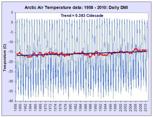 Figure 1: DMI daily temperature values, annual average and linear trend over the entire record period
Thus the reality is that the annual average Arctic surface temperature as indicated by DMI has risen at rates around twice the global average over the past 50 years, which is entirely consistent with other Arctic data sets, including the data from GISS. This annual temperature anomaly trend (red) gives clearer context to the Lansner chart (green).
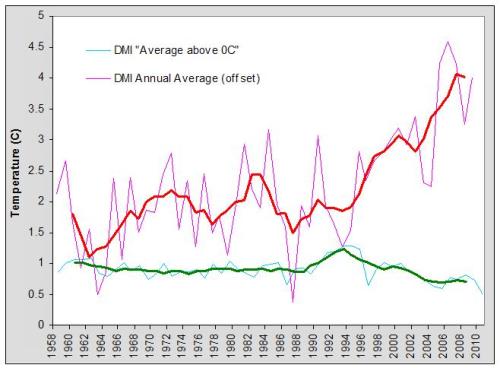 Figure 2: DMI summer melt season temperatures and annual DMI temperature anomaly as well as five year running averages
The Goddard Institute of Space Science (GISS) global surface temperature anomaly time series is based on observations from publicly available observational data sets rather than models. Its primary usefulness is as an indicator of global or large scale regional temperature changes. The measurements used by GISS are gridded at either 1200km or 250km resolution, with appropriate weighting in grid cells containing both land and ocean. The SST data where available is used up to 100km from any coast, but data from any source is extended to a maximum radius of 1200km if no other measured data points are present within this range.
For the high Arctic, we have already noted that there are relatively few land stations, (a handful above 80N), and most of this area is currently still covered by permanent sea ice. A study using data from Polar drifting ice buoys showed that near surface air temperatures over the pack ice are relatively homogenous, with a CLS (correlation length scale) of 900-1000 km, see (Rigor 2000). Obviously SST can not be used in this region, as the sea surface is frozen. In open Ocean SST tracks variations in Air temperature, but this is not the case near the transitional and mobile ice “boundaries”. This is one reason why GISS does not currently use SST data in the seasonal ice region above 75N, even when this data is seasonally available (as is increasingly the case due to diminishing trends in ice extent and better coverage due to satellite data).
This means in the Arctic region, GISS data is relatively coarse grained, as individual grid cells above 80N may include station data interpolated out to as much as 1200km, and are likely to show the higher short term variability which is characteristic of data from individual Polar stations.
However, given all of the above, and the significant differences in horizontal resolution, and methodology, and the caveats and cautions from both DMI and GISS, how do annually averaged time series compare? The DMI data is the official data (not extracted from DMI graphics as Lansner and others have done).
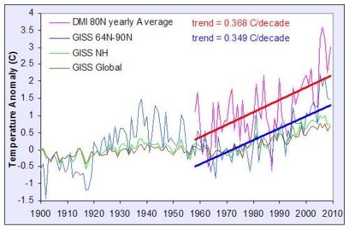 Figure 3: Annual DMI and GISS Arctic temperature anomalies and trends
Here the annual average values for each year have been plotted for both the polar “zonal” GISS data (64-90N) and the DMI Arctic data, and the trends calculated for both data sets for the full DMI period. At this resolution the correlation is reasonable, and the 50 year gradients are statistically indistinguishable. These trend figures also match those from a recent comprehensive surface station based study of the Arctic which gives 0.364 degrees C/decade from 60-90N over this same period (Bekryaev 2010).
The Lansner article is thus misleading. On average relatively strong Arctic warming has occurred (rather than cooling) as indicated both by the GISS and DMI data. The GISS zonal Arctic temperature trends are consistent not only with the DMI Arctic trends but also the trends from other recent Arctic surface temperature studies (see the advanced version for more details).


 0
0  0
0 Lots of red except in the summer, where one would have expected the most red.
Can anyone with a shred of credibility see a cooling Arctic and a simultaneously melting Arctic?
Lots of red except in the summer, where one would have expected the most red.
Can anyone with a shred of credibility see a cooling Arctic and a simultaneously melting Arctic?

 And extent:
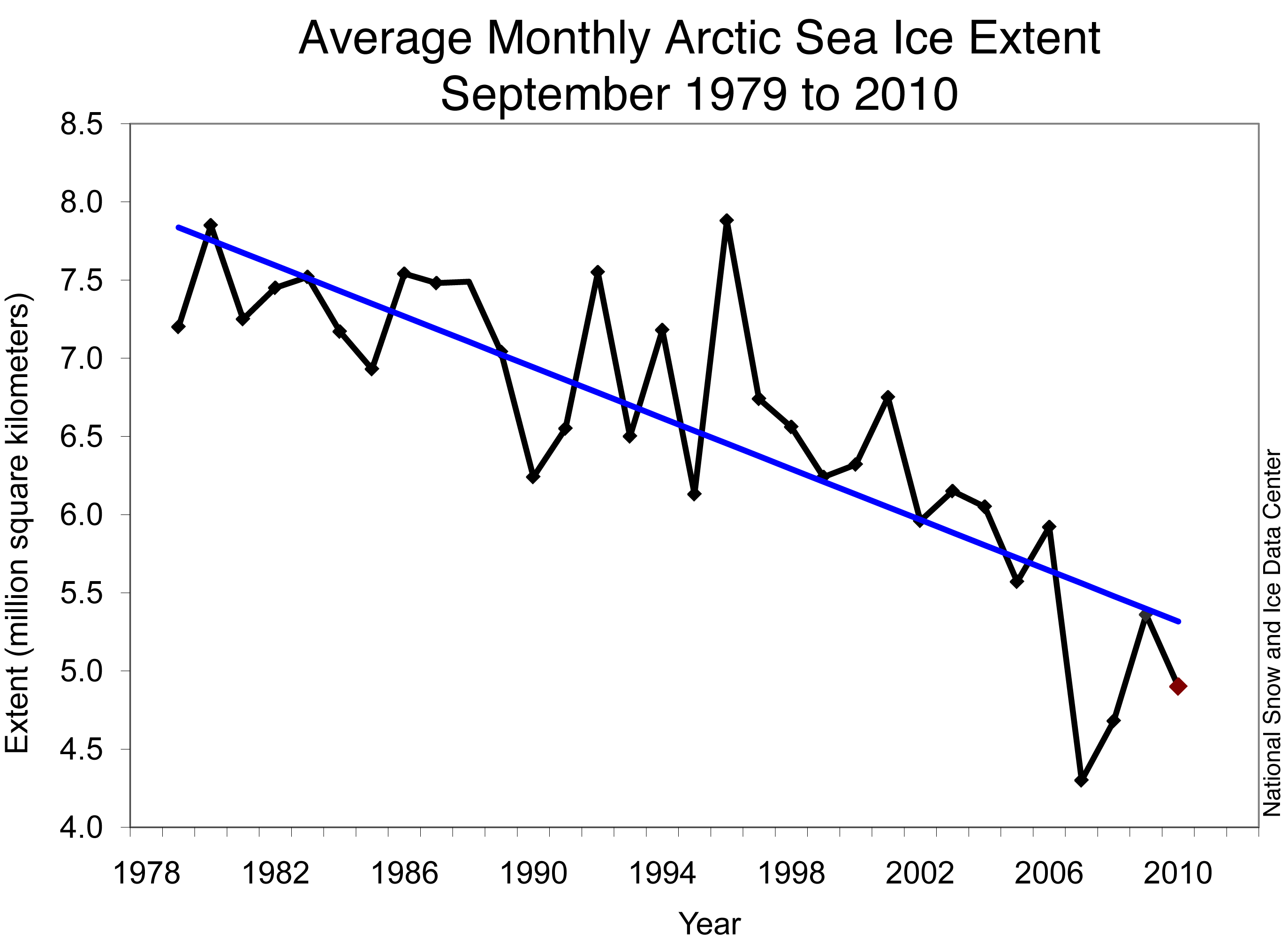
 Figure 3: Annual DMI and GISS Arctic temperature anomalies and trends
So, if you like the DMI data, you ought to conclude that GISS does a good job of estimating Arctic surface temperature trends.
Figure 3: Annual DMI and GISS Arctic temperature anomalies and trends
So, if you like the DMI data, you ought to conclude that GISS does a good job of estimating Arctic surface temperature trends.


Comments