Climate Science Glossary

Term Lookup

Enter a term in the search box to find its definition.

Settings

Use the controls in the far right panel to increase or decrease the number of terms automatically displayed (or to completely turn that feature off).

Term Lookup

Settings


All IPCC definitions taken from Climate Change 2007: The Physical Science Basis. Working Group I Contribution to the Fourth Assessment Report of the Intergovernmental Panel on Climate Change, Annex I, Glossary, pp. 941-954. Cambridge University Press.

Home Arguments Software Resources Comments The Consensus Project Translations About Support

Bluesky Facebook LinkedIn Mastodon MeWe

Twitter YouTube RSS Posts RSS Comments Email Subscribe


Climate's changed before
It's the sun
It's not bad
There is no consensus
It's cooling
Models are unreliable
Temp record is unreliable
Animals and plants can adapt
It hasn't warmed since 1998
Antarctica is gaining ice
View All Arguments...


Username
Password
New? Register here
Forgot your password?

Latest Posts

Archives

Resolving Confusion Over the Met Office Statement and Continued Global Warming

Posted on 10 January 2013 by dana1981

Recently, the British Met Office issued a prediction for global surface temperature changes over the next five years (Figure 1).

Met Office decadal prediction

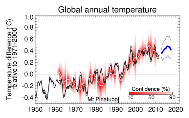
Figure 1: Observed (black, from Hadley Centre, GISS and NCDC) and predicted global average annual surface temperature difference relative to 1971-2000. Previous predictions starting from June 1960, 1965, ..., 2005 are shown as white curves, with red shading representing their probable range, such that the observations are expected to lie within the shading 90% of the time. The most recent forecast (thick blue curve with thin blue curves showing range) starts from November 2012. All data are rolling annual mean values. The gap between the black and blue curves arises because the last observed value represents the period November 2011 to October 2012 whereas the first forecast period is November 2012 to October 2013.

This latest prediction anticipates a bit less global surface warming than the prediction from last year, as the Met Office explained:

"The latest decadal prediction suggests that global temperatures over the next five years are likely to be a little lower than predicted from the previous prediction issued in December 2011.

However, both versions are consistent in predicting that we will continue to see near-record levels of global temperatures in the next few years."

"...changes in ocean surface temperatures in some parts of the world over the past year are understood to have made a key contribution to the difference between the 2011 and 2012 forecasts, but other factors will also have played a role."

In other words, the Met Office anticipates that natural factors which have dampened the global surface warming over the past decade (a preponderance of La Niña events and low solar activity, for example), may continue to have an overall dampening effect over the next 5 years.

Media Confusion About Continued Global Warming

Unfortunately, the Met Office prediction has resulted in quite a few confused articles in the mainstream media.  For example, the Daily Telegraph, Daily Mail, Daily Express, Canada's National Post, the Times, and the Indian Express all incorrectly reported that the Met Office is admitting that global warming has "stalled", or some similar variant.  These headlines are in direct contradiction to the Met Office forecast, which specifically stated:

"The forecast of continued global warming is largely driven by increasing levels of greenhouse gases."

The confusion arises from the fact that the thick blue line in Figure 1 (the central Met Office prediction) does not rise very far above the previous highest global surface temperatures in 2010, 2005, and 1998.  However, by no means does this indicate that global warming has "stalled".

Underlying Human-Caused Surface Warming Continues

As noted above, the Met Office prediction and explanation of their prediction specifically state that while natural short-term influences are dampening the warming of global surface temperatures, the underlying human-caused warming trend nevertheless remains. 

This is beautifully illustrated by a video created by Skeptical Science's Kevin C, with voiceover provided by Daniel Bailey.  The video shows the statistical removal of the short-term warming and cooling influences of volcanic eruptions, solar activity, and El Niño and La Niña events from the global surface temperature record.

The video shows that the global surface temperature record provides no evidence to suggest that human-caused greenhouse warming has slowed.

The Bigger Picture - Ocean Warming

Additionally, global surface temperatures are not an adequate measure of global warming.  In fact, more than 90% of the overall warming of the planet goes into heating the oceans (Figure 2).

where is warming going

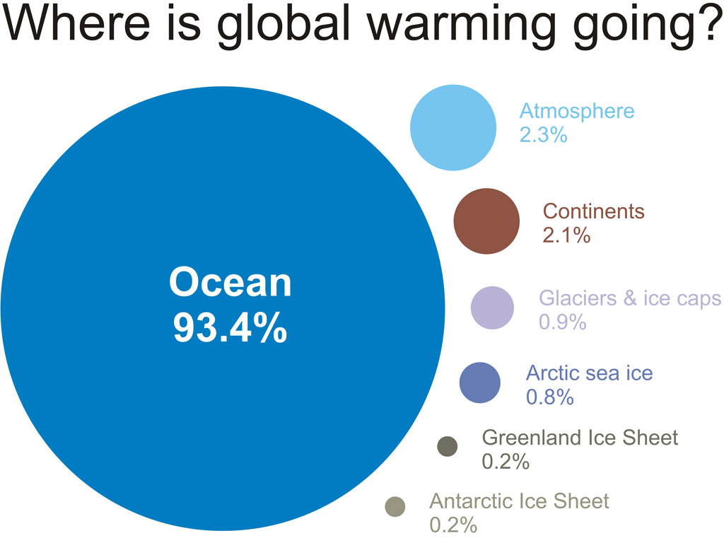
Figure 2: Components of  global warming for the period 1993 to 2003 calculated from IPCC AR4 5.2.2.3.

Nuccitelli et al. (2012) considered the warming of the oceans (both shallow and deep), land, atmosphere, and ice, and showed that global warming has not slowed in recent years despite the dampened surface warming trend (Figure 3).

Fig 1
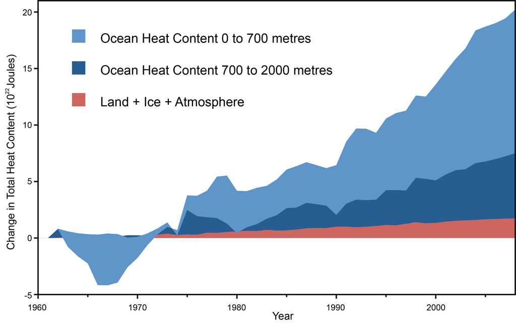
Figure 3: Land, atmosphere, and ice heating (red), 0-700 meter OHC increase (light blue), 700-2,000 meter OHC increase (dark blue).  From Nuccitelli et al. (2012).

Picking Cherries, Vintage 1998

Some of the confused media articles also made the mistake of claiming the Met Office prediction indicates a global warming "stall" from 1998 through 2017, because the average 2012—2017 surface temperatures are predicted to exceed the 1998 peak by a small margin.  This is a classic exampe of one of the 5 characteristics of scientific denialism: cherrypicking.  As Professor Myles Allen, Head of the Climate Dynamics Group at the University Of Oxford, explained to the Science Media Centre,

"Comparing the expected temperature for 2013-2017 with a single exceptionally warm year (1998), as some reports have done, is just daft.  1998 was around 0.2 degrees warmer than the 1996-2000 average, largely thanks to a massive, once-a-century El Niño event.  The IPCC predicted a warming of 0.1-0.2 degrees per decade due to human influence back in 2000.  That means the one-off impact of that El Niño event was equivalent to about 20 years of the expected background warming trend So, unsurprisingly, 20 years later, expected temperatures have risen so that an average year is now as warm as that exceptionally hot year."

In fact, even allowing this cherrypick, the global surface temperature trend since 1998 is likely one of warming, which will likely continue to be the case in 2017 even if the Met Office prediction is correct.  Warming is measured through trends, not by comparing cherrypicked individual data points.

Avoiding a False Sense of Security

Although many natural influences have acted to dampen global surface warming over the past decade, and potentially for the next 5 years if the Met Office prediction is correct, allowing this coincidence to lull us into a false sense of security would be a mistake.  Eventually the preponderance of La Niñas will end, solar activity will rise, and so forth.  If we have not reduced human greenhouse gas emissions in the meantime, we will face the harsh reality that the time wasted will force steeper and more painful emissions cuts in the future if we are to avoid dangerous climate change.

Let's get real.  Global warming is (still) happeningHumans are causing it.  If we don't do something to stop it, the consequences are going to be very bad.  So let's stop looking for distractions and excuses to delay action, and get on with solving the problem, before we run out of time.

0 0

Printable Version  |  Link to this page

Comments

Prev  1  2  3  

Comments 101 to 120 out of 120:

  1. Hi All, thanks again for the feedback and I am learning more each day. I dig the optical illusions but they are much different than a temperature graph showing global surface temperatures for past 130 odd years. At least to me they are. I look at graphed variables for a living and can pick out trends by sight and be pretty confident about it. I also agree that it is just as important to run a statistical analysis. I ran a linear regression for the last 10 years. Other than the UAH showing an insignificant amount of warming, the other data sets clearly show no surface warming for the last 10 years. This supports my first claim but it won't mean a thing if global surface temperatures start trending up again over the next 10 years. Image and video hosting by TinyPic I also did a 10, 20, and 30 year regression of the last 30 years GIS global sfc temperatures and the 20 and 30 showed pronounced warming as expected. Something different has been happening for the past 10 years. What is causing this? Could it be build up of heat in the deeper oceans, the cold PDO buffering El Ninos, aerosols from India and China? Will the lack of global surface warming continue or is it just a temporary bump in the road. What do you all think? Image and video hosting by TinyPic
    0 0
    Moderator Response: [RH] Fixed image width.
  2. Smerby. If you "look at graphed variables for a living" you should be able to understand the magnitude of the noise versus the overall signal, and understand the length of time required for signal to emerge from noise. The decade intervals that you insist on considering are far too short for signal to emerge from noise. This point has been made so frequently on this post and on others that one wonders if you are deliberately ignoring it - the only other explanation is that you don't require any statistical strigency when you "look at graphed variables for a living"...
    0 0
  3. smerby - "...the other data sets clearly show no surface warming for the last 10 years. This supports my first claim but it won't mean a thing..." It doesn't mean anything now. To repeat a portion of previous discussions, until you have sufficient data to separate the observed longer term trend from the null hypothesis of zero trend with statistical significance, you are only looking at noise. And for this data, that hasn't happened, and you're only looking at noise. You are going to need 20-25 years of raw data to make that statistical separation - not 10. "Something different has been happening for the past 10 years." No, there has not. Short term variations can lead one to believe that the underlying trend has changed, but as discussed here, this is demonstrably just a confluence of short term variations, not a change in the underlying warming trend.
    0 0
  4. Seriously Smerby, reconsider your last graph. How many flat ten year intervals do you think could be constructed within its range? All you are doing is demonstrating that one can stay motionless on any step of the up escalator. It's a game beloved of children: one expects more (statistical) decorum from an adult...
    0 0
  5. smerby: I'll re-emphasize KR's comment that "it doesn't mean anything now". To help illustrate, think of the significance of the calculated slope, which is essential to the "is it meaningful?" test. A t-test is one way of looking at the significance of the slope. nearly everyone first thinks that the null hypothesis is a slope of zero, but that is not the only test that you can make. The more general test is comparing "observed minus expected" - see this Wikipedia entry. "Expected" can be zero, but need not be. In this case, it can also be the long-term trend. Sure, a test against an expected value of zero shows "not statistically significant", but so does a test against an expected value that matches the long-term trend. This means that the data can't distinguish between continuing the trend and "no warming".
    0 0
  6. smerby @101 asks: "Something different has been happening for the past 10 years. What is causing this?" Yes, something different has happened. We went from a period dominated by El Ninos (note negative SOI indicates El Nino conditions): to one dominated by La Ninas, including two of the deepest La Ninas on record: We also went from the fifth strongest solar maximum of the last 150 years to the lowest solar minimum since 1910: Given these two natural factors, we should expect global temperature to plummet over that period. Instead temperatures were, as you point out, near constant. It is possible to remove the impact of those factors from the record, as has been done most recently by Kevin C at SkS (where this discussion should continue). When you do so, you see that the underlying trend continues unabated. Even should insolation and ENSO levels not recover, they do no provide an ongoing cooling effect. Consequently the warming must be expected to resume. It is likely, howver, that a new El Nino will come along soon, causing a very rapid rise.
    0 0
  7. smerby, I asked in #91, the following question: Q: Is there a statistically significant change in the warming trend over the past decade? If you think there is, please show your working. You've returned with more short-term plots that show absolutely no assessment of statistical significance. Furthermore, you stubbornly insist that you can identify significant trends with your lying eyes, despite being repeatedly shown how and why your eyes might be lying to you. I am thus led to believe that you do not actually want to apply the normal scientific conventions of mathematically evaluating the significance of given trend lines in surface temperature data. Why is that? From Tamino's Open Mind, where you can really learn about statistical methods.
    0 0
  8. Thanks again for the feedback, I am learning here. Image and video hosting by TinyPic When I observe the graph above I see repeating ~30 year trends and I hope you can see them too. There is a relatively flat period from 1880 through around 1910 followed by a warming trend from 1910 into the early 1940s. There is another flat period from the early 1940s through the mid 1970s followed by a second warming trend from around the mid 1970s through the mid 2000s. When I look at this graph these are the things that jump out at me. I see that the overall trend is up but there are embedded and repeating ~30 year trends. It is not proper, and you all are correct, to just make a claim that global surface temperatures have followed such a path since the late 1880s. I will cross check these repeating trends with linear regressions. Below is the outcome. Image and video hosting by TinyPic The linear regressions support my hunch and even show a bit of cooling in the flatter periods, especially in the 1880-1910 frame, which was pointed out that Krakatoa had something to do with this. A question I have is do these ~30 year trends represent noise or climate signal. Given the length of each trend, they represent climate signals. As Bernard and others have said, the last 10 years of global surface temp trend could only be noise and I have no problem with that. However, based on the past global surface temperature record since the late 1880s, one could also argue that the global surface temperature trend over the past 10 years could continue for another 20 years.
    0 0
    Moderator Response: [RH] Fixed image width. May I ask you to review the methods for limiting image width so as to make sure it doesn't break the page formatting? Thx.
  9. smerby @108 - a global temperature change has to have a cause (or multiple causes). For example, in the early 1900s there was an increase in solar activity, an increase in human GHGs emissions, and low volcanic activity. In the mid century solar activity was flat, human aerosol emissions rose. In the late century, human GHG emissions took over. It's just a coincidence that these events were each roughly 30 years in length. Wait another few years and the last one won't fit that mould.
    0 0
  10. Smerby, what you're doing amounts to saying, "There's a 30-year cycle. I have no physical mechanism to explain it, and I'm going to ignore all the usual components (ENSO, solar variation, various oscillations, aerosols, enhanced GHE, etc.)."
    0 0
  11. Smerby, although you are being somewhat polite about it, your posts are nothing but sloganeering. You hope I see a cycle too? I don't. Show the data analysis yielding the conclusion that a cycle is present and I could change my mind. You've been asked by me and others how many 10 years periods can be found that show a "flatlining" of temps anomalies. You haven't answered that question. You were asked how the past 10 years can show a "trend" that is statistically significant and different from the longer record. You haven't answered that question either. You keep on repeating the same stuff and offer nothing in response to the objections that were posted. You keep on saying that your eyecrometer tells you stuff and you have nothing to back it up. Zilch. You say you're learning but you are not. You haven't even learned the basic comment policy and what sloganering is. I am unimpressed.
    0 0
  12. @smerby, all the regressions show you is that the rate of warming has varied over the last 150. We can see that just by looking at the graph. However it does not tell you why the rate has changed, more specifically, it does not tell you that there is any sort of cycle present (for which you would need an analysis that actually involved a cyclical component of the regression). As I have already pointed out, there are good physical explanations for quite a lot of the observed behaviour (for example aerosols), which you are completely ignoring. For your hypothesis of cyclic behaviour to be correct, climatologists knowledge of aerosols must be wrong, but you have not addressed that point at all. I suspect that you won't.
    0 0
  13. @smerby wrote "one could also argue that the global surface temperature trend over the past 10 years could continue for another 20 years." well one could argue that marsupials will take over as the dominant form of life on Earth, but is there any good physical reason to think that they will? So what is the physical reason that the trend should continue for another 20 years. Include in your explanation the reason why the enhanced greenhouse effect will not result in warming.
    0 0
  14. Smerby wrote: "As Bernard and others have said, the last 10 years of global surface temp trend could only be noise and I have no problem with that. However, based on the past global surface temperature record since the late 1880s, one could also argue that the global surface temperature trend over the past 10 years could continue for another 20 years." So, you have just acknowledged that 10 years is too short a time period from which to draw any conclusion on the global temperature trend. Thereby directly refuting your own central premise that the past 10 years indicates 'warming has stopped'. That said, examination of the factors known to cause temperature changes shows (as others have demonstrated) that natural factors were slanted towards cooling over the past ten years, but offset by continued greenhouse warming from human fossil fuel burning. If we look at statistics alone while ignoring our understanding of the underlying physical processes then the past 10 years is insufficient data to determine anything. On the other hand, if we apply our measurements of those underlying processes and their associated impacts on temperature then we see that AGW has continued as expected.
    0 0
  15. Thanks all for the feedback Smerby
    0 0
  16. Hi all, thanks again for the feedback. Although it may seem otherwise, I really am learning here. I do have a lot of questions and I appreciate all the help. The global surface surface temperature trend of the last 10 years is insignificant when compared to the long term record. Should it not have a little significance when compared to a 30 year trend or a climate cycle, it is 1/3 of that period, just a question. Based on some of your feedback, the global surface temperature record has varied against the back drop of continuous AGW, especially from the middle of last century when production of GHG emissions has accelerated. The multi decadal cooling and warming of the Pacific ocean has also lined up well with these temperature variations, in addition to trends in La Ninas and El Ninos. The slight cooling from the 1880s into the early 1900 hundreds was from the after effects of Krakatoa and a couple of impressive La Ninas. The warming from 1910 through the early 1940s was from an increase in GHG, low solar and low volcanism. In addition, there was a warm phase of the Pacific and increasing El Nino and decreasing La Ninas. The leveling off in the 50s, 60s, into the mid 70s, was from increased aerosol emission along with cooler Pacific and a decrease in El Ninos and an increase in La Ninas. The warming from the late 1970s through the 1990s was from a decrease in aerosol emissions and an increase of GHG. In addition the Pacific was in a warm phase with an increase El Ninos and a decrease in La Ninas. The leveling off of the past 10 years was from low solar and a cooler Pacific with an Increase in La Ninas and a decrease in El Ninos.
    0 0
    Moderator Response: TC: Final sentence corrected by request.
  17. These images may help. The first I've shown before, and is the 2-box+ENSO model fit of forcings to temperatures. Here is the same thing, but with the ENSO contribution subtracted out from both the temperature series and model. And here it is again, this time with ENSO, volcanoes and solar subtracted out. A few comments on the features.
    • The spike right at the beginning is an artifact of the calculation and is meaningless.
    • There is a slight predicted slowdown in warming around the early 90's, related to a slowdown in methane emissions (which have recently picked up again), but also to the regulation of CFCs following Copenhagen. It is probably too small to detect in the temperature data.
    • The largest remaining features are spikes around the second world war. The 1942-45 spike and following dip are at least in part due to the fact that GISTEMP does not yet include corrections for the change in sea surface temperature measurement methods after 1945. The pre-1940 spike is unexplained.
    Any natural cycle has to be squeezed out of the remaining differences in the final graph, preferably after applying the SST corrections. There is just about room for a cycle in there, but it's going to be pretty small.
    0 0
  18. @smerby wrote "The global surface surface temperature trend of the last 10 years is insignificant when compared to the long term record. Should it not have a little significance when compared to a 30 year trend or a climate cycle, it is 1/3 of that period, just a question." I'm afraid this question makes very little sense, largely because your usage of "significance" is unspecified, and at variance with the usual statistical meaning. Perhaps if you are uncomfortable with statistics, it would be better if you avoided terms with statistical meanings, such as "significant"?
    0 0
  19. smerby: To parallel Dikran's answer, the tautological answer to "should it not have a little significance?" is to test the significance - which in statistical terms means doing statistical tests, not using the eyecrometer. ...but let's step back a bit and think about what a trend line is telling us. What does it really mean to "fit a linear trend"? To begin, go even further back in the thought process, and say "what is happening to the data in this period? 1) our first step in an analysis might be to say "what is the mean (average) temperature in this time period?" We can get a number, but we know that not all values will match the mean. So the next step is usually to calculate the variance or standard deviation, which involves looking at each temperature and how it compares to the mean (then square the differences, sum for all T, etc.). These are the residuals - how much each temperature is different from the mean. Note that the value of X (time, in this case) is not used. 2) the next step is the linear regression. Basically, a linear regression is based on the idea that the mean value of Y (temperature) changes with X (time), and that the change is linear with time. So a linear trend line is basically just a "moving average". Just as the simple average leaves residuals, so does a line fit to the data. The significance of the line fit depends on how well is reduces the size of the residuals. This reduction shows up as the r^2 value in a regression result. The actual significance test requires seeing whether this reduction is likely to happen by chance, due to random variation in the data. Note that a linear regression does not require any physical reasoning as to why the trend might be linear - it's just a common first step. There is the "correlation isn't causation" effect to account for. At this point, X and Y are just numbers that don't mean anything (or, rather, could mean a lot of things). 3) let's go one step further. Let's create a different description of how the mean temperature varies with time (or how Y depends on X). Instead of a simple linear relationship, we can make T change over time using any combination of factors - the only catch being that we have to be able to specify those factors at each time, too. Let's assume we can do that - so we end up calculating T over time. Once again, we can compare those calculated values to the actual temperatures (calculated "moving averages", just as we did when we performed our linear trend calculations, or as we did when we just used the simple mean. Once again, we'll end up with residuals (differences between actual observations and our calculated values), and we can see if the residuals are smaller. We can also do significance testing on that reduction. One advantage of approach 3) over 2) is that we can start to make our "moving average" depend on known physics, instead of a simplistic linear fit. We can add different bits of "known physics" and see how much they improve the fit (reduce the residuals). This makes an end run around the "correlation isn't causation" issue, because we are already working with factors that we are fairly sure have at least some cause-effect relationship. We may not know how much the effect is, though, and that is why doing the calculation and comparing to the data is important. How difficult is approach 3)? Harder than doing a linear fit, but not necessarily by much. If approach 3) involves a full-scale 3-d general circulation model, then it's a lot of work. ...but we have an example of a much simpler application of approach 3) in Kevin C's comments and graphs present here - especially in #118. Ask yourself: does the simple, naive linear fit do a good job of following all the bumps and wiggles in the temperature data based on the implicit assumption that something linear is happening (but we don't know what - just that we think it might be linear)? Or does Kevin's 2-box model that incorporates some known physics in a fairly simple way do better? ...and if Kevin's model (yes, it's a model, but so is a linear regression) is doing better, then what does his fit to the data tell you about the "significance" of the temperatures over the past 10-15 years? More importantly, what do you think it tells you about the role of CO2?
    0 0
  20. Thanks for the insight, Smerby
    0 0

Prev  1  2  3  

You need to be logged in to post a comment. Login via the left margin or if you're new, register here.


The Consensus Project Website

THE ESCALATOR

(free to republish)


© Copyright 2024 John Cook
Home | Translations | About Us | Privacy | Contact Us