Climate Science Glossary

Term Lookup

Enter a term in the search box to find its definition.

Settings

Use the controls in the far right panel to increase or decrease the number of terms automatically displayed (or to completely turn that feature off).

Term Lookup

Settings


All IPCC definitions taken from Climate Change 2007: The Physical Science Basis. Working Group I Contribution to the Fourth Assessment Report of the Intergovernmental Panel on Climate Change, Annex I, Glossary, pp. 941-954. Cambridge University Press.

Home Arguments Software Resources Comments The Consensus Project Translations About Support

Bluesky Facebook LinkedIn Mastodon MeWe

Twitter YouTube RSS Posts RSS Comments Email Subscribe


Climate's changed before
It's the sun
It's not bad
There is no consensus
It's cooling
Models are unreliable
Temp record is unreliable
Animals and plants can adapt
It hasn't warmed since 1998
Antarctica is gaining ice
View All Arguments...


Username
Password
New? Register here
Forgot your password?

Latest Posts

Archives

Frauenfeld, Knappenberger, and Michaels 2011: Obsolescence by Design?

Posted on 2 May 2011 by Daniel Bailey

We know the planet is warming from surface temperature stations and satellites measuring the temperature of the Earth's surface and lower atmosphere. We also have various tools which have measured the warming of the Earth's oceans. Satellites have measured an energy imbalance at the top of the Earth's atmosphere. Glaciers, sea ice, and ice sheets are all receding. Sea levels are rising. Spring is arriving sooner each year. There's simply no doubt - the planet is warming.

And yes, the warming is continuing. The 2000s were hotter than the 1990s, which were hotter than the 1980s, which were hotter than the 1970s. In fact, the 12-month running average global temperature broke the record 3 times in 2010; according to NASA GISS data (2010 is tied with 2005 for the hottest year on record for GISS and tied with 1998 using HadCRUT).  Sea levels are still rising, ice is still receding, spring is still coming earlier, there's still a planetary energy imbalance, etc. etc. Contrary to what some would like us to believe, the planet has not magically stopped warming.

Humans are causing this warming

There is overwhelming evidence that humans are the dominant cause of this warming, mainly due to our greenhouse gas emissions. Based on fundamental physics and math, we can quantify the amount of warming human activity is causing, and verify that we're responsible for essentially all of the global warming over the past 3 decades.  In fact we expect human greenhouse gas emissions to cause more warming than we've thus far seen, due to the thermal inertia of the oceans (the time it takes to heat them).  Human aerosol emissions are also offsetting a significant amount of the warming by causing global dimming.

The Original Frozen Tundra

In October of 2010, The National Oceanic and Atmospheric Administration (NOAA) released the Arctic Report Card. The report contains a wealth of information about the state of climate in the Arctic Circle (mostly disturbing).  Especially noteworthy is the news that in 2010, Greenland temperatures were the hottest on record. It also experienced record setting ice loss by melting. This ice loss is reflected in the latest data from the GRACE satellites which measure the change in gravity around the Greenland ice sheet (H/T to Tenney Naumer from Climate Change: The Next Generation and Dr John Wahr for granting permission to repost the latest data). 


Figure 1: Greenland ice mass anomaly - deviation from the average ice mass over the 2002 to 2010 period. Note: this doesn't mean the ice sheet was gaining ice before 2006 but that ice mass was above the 2002 to 2010 average.

Additionally, Tedesco and Fettweiss (2011) show that the mass-loss experienced in southern Greenland in 2010 was the greatest in the past 20 years (Figure 2 below).

Tedesco

Figure 2: Greenland melting index anomaly (Tedesco and Fettweiss (2011))

The figure above shows the standardized melting index anomaly for the period 1979 – 2010. In simple words, each bar tells us by how many standard deviations melting in a particular year was above the average. For example, a value of ~ 2 for 2010 means that melting was above the average by two times the ‘variability’ of the melting signal along the period of observation. Previous record was set in 2007 and a new one was set in 2010. Negative values mean that melting was below the average. Note that highest anomaly values (high melting) occurred over the last 12 years, with the 8 highest values within the period 1998 – 2010. The increasing melting trend over Greenland can be observed from the figure. Over the past 30 years, the area subject to melting in Greenland has been increasing at a rate of ~ 17,000 Km2/year.

This is equivalent to adding a melt-region the size of Washington State every ten years. Or, in alternative, this means that an area of the size of France melted in 2010 which was not melting in 1979.

Selective Science = Pseudo-Science

Into this established landscape comes a new paper which presents a selective Greenland melt reconstruction. During the review process the papers’ authors were urged to, yet chose not to, include record-setting warm year 2010 temperatures. Had the authors considered all available data, their conclusion that ‘Greenland climate has not changed significantly’ would have been simply insupportable.

They write:  

“We find that the recent period of high-melt extent is similar in magnitude but, thus far, shorter in duration, than a period of high melt lasting from the early 1920s through the early 1960s. The greatest melt extent over the last 2 1/4 centuries occurred in 2007; however, this value is not statistically significantly different from the reconstructed melt extent during 20 other melt seasons, primarily during 1923–1961.”

Designed Obsolescence?

Their selective ‘findings’ were obsolete at the time the paper was submitted for publication in December of 2010. In the review process, the authors and journal editors were made aware that important new data were available that would change the conclusions of the study. Unfortunately, the paper represents not only a failure of the review process, but an intentional exclusion of data that would, if included, undermine the paper’s thesis.

Dr. Jason Box has chosen to share for the record a timeline of important events associated with this article’s publication:

  • 26 August, 2010, I was invited by Dr. Guosheng Liu – Associate Editor – Journal of Geophysical Research (JGR) – Atmospheres to review the article. Sara Pryor was the JGR chief editor ultimately responsible for this paper’s review.
  • 27 August, 2010, I accepted the review assignment.
  • 22 September, 2010, I submitted my review, in which I wrote: “The paper may already be obsolete without considering the extreme melting in 2010. I would therefore not recommend accepting the paper without a revision that included 2010.” I post my review posted verbatim here. At this time, I indicated to the editors that I did not wish to re-review the paper if the authors chose not to include 2010 temperatures. It was clear by this date, from the readily-available instrumental temperature records from the Danish Meteorological Institute and other sources such as US National Climate Data Center and NASA GISS that the previous melt season months were exceptionally warm.
  • 16 October, 2010, a NOAA press release publicized record setting Greenland temperatures. The press release was linked to this Greenland climate of 2010 article, live beginning 21, October 2010.
  • 27 December, 2010, I was invited to re-review the paper. I again stated that I did not wish to re-review the paper if the authors chose not to include 2010 temperatures. By this date, it was more clear that 2010 temperatures were exceptionally warm.

Another very important point: the excuse that the data was not available just is not reasonable given that both the Tedesco and Fettweiss 2011 and Mernild et al 2011 papers each managed to reference this 2010 data in publications that came out prior to that of Frauenfeld, Knappenberger, and Michaels.

Dr. Box:  

"The Editor’s decision whether or not to accept the paper would have been made sometime in early 2011. This paper should not have been accepted for publication without taking into account important new data."

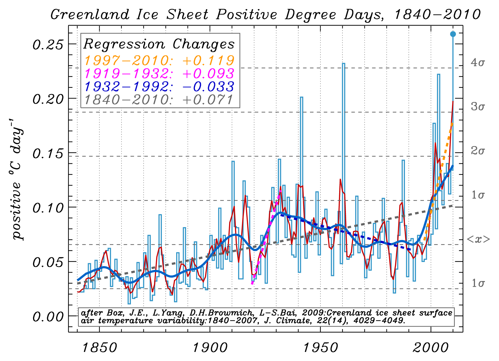
Figure 3:  Positive Degree Day reconstruction for the Greenland ice sheet after Box et al. (2009). The "regression changes" presented here are equal to the linear fit (dashed lines in the graphic) value at the end of the period minus the beginning of the period, for example, the 14-year change is the 2010 value minus the 1997 value. The blue Gaussian smoothing line is for a 29 year interval. The dark red smoothing line is for a 3 year interval.  PDDs are the sum of positive temperatures. A PDD sum of 10 has twice the melt potential as a PDD sum of 5. Note that not only is the recent melting convincingly distinguishable from that of the 20th Century, but that summer and annual average temperatures in recent years are increasingly above values in the 1920s-1930s. (Courtesy Dr. Jason Box)

Greenland’s past temperatures

Including year 2010 data reveals (as seen in Figure 5 at bottom), in contrast to the message of the Frauenfeld, Knappenberger, and Michaels paper, that recent Greenland temperatures are warmer than at any time during the 20th Century for the summer, autumn, and annual periods. The 1925-1935 spring season was warmer in 1930 than 2010, but not warm enough to make the corresponding annual average exceed that of the recent times.  Important for a melt reconstruction, what Frauenfeld, Knappenberger, and Michaels neglected to include, was that recent summer temperatures exceed those of any time during the past century.  As a result glaciers in southern Greenland have retreated far behind their meltlines from the early 20th Century.  Evidence of this can be seen in Mittivakkat Glacier (Figure 4 below):

Mittivakkat Glacier

Figure 4: Mittivakkat Glacier in Southern Greenland.  Note the red line indicating the 1931 extent of the glacier relative to the yellow line depicting its position in 2010 (Mernild et al, 2011)

One thing to remember is that the regional warming that Greenland experienced in the early 20th Century came at a time when the world overall was colder than it is today.  And that the warming then was a result of multiple forcings (in which GHG warming played a role) and is thus fundamentally different than the anthropogenic global warming of the most recent 30 years (in which GHG warming plays by far the predominant role).  Additionally, the global cryosphere (the parts of the world covered in ice) has experienced much greater warming (in terms of volume and global extent) in this the most recent period than in the time of supposedly similar warming (the early 20th Century).

Given the thermal lags of oceans and ice, it is clear that Greenland has yet to fully respond to the warming forced upon it, so a reasonable approximation of another 1-2° C is yet in its pipeline.  This will translate into yet greater mass losses to come, which evidence indicates may be experienced in non-linear fashion.

2010Anomalyvs1923-1961

Figure 5: Where 2010 ranks relative to the warm period observed from 1923-1961 by Frauenfeld, Knappenberger and Michaels (Source)

Two lingering questions remain:

  1. Why did Frauenfeld, Knappenberger, and Michaels not include year 2010 data when they were asked to and when the data were readily available, yet the other papers containing the 2010 data published before theirs did?
  2. Why did the journal publish this paper without the requested revisions?

Climate Warming is Real

Dr. Box:  

"Multiple lines of evidence indicate climate warming for which there is no credible dispute. No scientific body of national or international standing has maintained a dissenting opinion. I personally have found no credible science that disproves that human activity significantly influences climate.

An enormous and overwhelming body of science leads rational thinkers to the conclusion that humans influence climate in important ways. For decades, the science has indicated that human activity has become the single most influential climate forcing agent."

National and international science academies and scientific societies have assessed the current scientific opinion, in particular on recent global warming. These assessments have largely followed or endorsed the Intergovernmental Panel on Climate Change (IPCC) position of January 2001 which states:

An increasing body of observations gives a collective picture of a warming world and other changes in the climate system… There is new and stronger evidence that most of the warming observed over the last 50 years is attributable to human activities.

Acknowledgements

  • Dr. Jason Box, Assoc. Prof., Department of Geography, Byrd Polar Research Center, The Ohio State University, Columbus, Ohio, USA for his invaluable assistance, advice, knowledge and patience
  • Dr. Mauri Pelto, Professor of Environmental Science, Science Program Chair; Director, North Cascade Glacier Climate Project, Nichols College, Dudley, MA, USA for his timely insights and suggestions

Without the expertise of these two fine climate scientists this article could not have come to pass.

0 0

Printable Version  |  Link to this page

Comments

Prev  1  2  3  4  5  Next

Comments 151 to 200 out of 202:

  1. FK&M 2011 base their reconstruction on a multiple regression on the Greenland summer temperatures taken from four stations, and the Winter North Atlantic Oscillation. Base on this, they show melt extents in the 1930's to be significantly more extensive than those in the 1990s. However, as shown below, Greenland summer temperatures (red line, first graph)in the 1990's where equivalent to those in the 1930s, while the winter NAO index (second graph) was only a little stronger (more positive) in the 1930s. Given that, we would expect only a slightly stronger Ice Melt Extent Index for the 1930's than for the 1990's. This is particularly the case given that the Summer Temperature has 2.6 times the effect of the Winter NAO on Ice Melt Extent (FK&M 2011, 4th page of 7). This suggests at a minimum that the FK&M reconstruction is sensitive to the choice of surface stations in constructing their index. Given that, there is a significant probability that the choice of a larger number of surface stations would show a significantly stronger end 20th century melt relative to the 30's.
    0 0
  2. Tom, I have no issue with your characterization. My point is rather simple. As you probably know i've advocated for open science from day 1. I think papers should be published with turn key code and data. If that were the case any reviewer or subsequent reader could see for themselves if newer data changed the answer. And that would be that. Whatever the answer is. instead we have a situation where on all sides people make inferences about the motives of authors, reviwers, editors. I'm suggesting that one way past some of this is to push for reproducible results. I don't have any issue calling out michaels. When he and santer testified together, I thought that santer cleaned his clock. And I said so.
    0 0
  3. steven mosher@152 If you want papers published with turn key code and data, then I would agree that would be great, but who is going to provide the (quite considerable) additional funding to support that? Are you going to fund that just for climatology, or for all science? Sadly it is just unrealistic. Also the idea that would allow the reviewer to see if additional data would change the result, that would only apply to a limited range of studies. I am working on a project at the moment that has several processor centuries of computation behind it!
    0 0
  4. Dikram
    steven mosher@152 If you want papers published with turn key code and data, then I would agree that would be great, but who is going to provide the (quite considerable) additional funding to support that? Are you going to fund that just for climatology, or for all science? Sadly it is just unrealistic.
    I've often told Steve the same thing. I do however agree with the principle that authors should grant access to key data on request. So, for example, if someone asked Chip for the data points underlying FKM figure 2 or asked Tedesco for the data points underlying figures 1(c) in his paper, I think both authors should grant that sort of request and fairly promptly. Ideally there would be some sort of formal archive for this sort of thing possibly funded by NSF/DOE office of science or something. People whose projects were funded would be required to either deposit it there or say where the data are deposited. But turnkey code? With all data in a nice neat little folder? I think Mosher is insisting on something that goes beyond what is practical.
    0 0
  5. Tom Curtis at 10:47 AM on 6 May, 2011 In response to:
    1) Ice melt extent in the 2000's would be statistically indistinguishable from that for the highest period in the reconstruction. (This is true as it stands, but apparently was not worthy of comment in the paper.)
    Huh? I thought what everyone is upset about is that the paper basically says the melt during the 2000s is statistically indistinguishable from that for the prior reconstruction. But if you agree that the ice melt extent is 2000 is statistically indistinguishable from that of the highest period in the reconstruction, I'm sure Michaels will be happy to report that Tom Curtis decrees this is so.
    2) The two years with the greatest ice melt extent would have occurred in the last ten years, and five of the most extensive melts would have occurred in the last ten years. In no other ten year period would more than two of the ten most extensive melts have occured. 3) The year with the highest melt extent would be the most recent year, with just eleven reconstructed values having 95% confidence intervals encompassing that value.
    So what if the record happens to fall in the most recent year? This summer will probably have a lower melt than 2010. I'm unaware of any scientific rule that says papers discussing reconstructions can't be published if they happen to end with a melt index that is not a record. Moreover, if 2010 is a record it will still be a record until it is broken. The fact that it might not have been broken again in 2011 won't prevent anyone from pointing out that a record was broken in 2010.(And of course, if 2010 is not a record, it's not a record. ) On the claim that two years with the greatest ice melt would have occurred in the past ten years: How are you concluding this with any certainty? It's true that the satellite measurements would indicate that the melts for 2007 and 2009 are greater than all reconstructed melt indices. But the reconstructed melt indices have uncertainties associated with them. Based on the observation that the 2007 melt index falls outside the ±95% uncertainty intervals for the reconstruction and there is at most a 60% probability that the 2007 melt is greater than all melts during the previous period. (The probability is actually much lower because I did a quick calculation which assume the 2007 melt index exactly equaled the upper 95% confidence value for 20 cases. So I did ( 1- 0.975^20) = 0.3973 as the probability all previous 20 are lower. But this represents the upper bound for the probability that all 20 are lower because in each individual case the probability a particular value from the previous period is < 0.975). So with respect to 2007-- you can't know for sure its melt exceeded those in during the 30s. That certainly makes your claim that two years with the greatest melt occurred in the past 10 years tenuous. (I suspect if we got the more detailed data from Chip and did the full analysis, we'd find the probability your claim is true is less than 1/2. ) But even your claim that one year with the greatest melt occurred in the past 10 years is tenuous. Assuming your estimate that 2010 would fall outside the uncertainty intervals for 11 years, there is at least a 24% probability that the 2010 value is a not record. Very few people would consider this probability sufficiently high to say with confidence that even 2010 was a record. So you can't even say 2010 must be a record. (Though of course it might be. If we got the data from Chip, we could do a better calculation, and the probability that it's a record is even lower. ) If a reviewer has been thoughtful, they might have asked FKM to do this calculation to firm up the numbers-- but given the traditions for making statistical calls, no one looking at the probabilities would decree that a record can be called even with only 11 and even making the simplifying assumption I made above. But the reviewers didn't do that. The consequence is the text in FKM doesn't discuss this at all, and text that might have needed more extensive modification showing that the probability of a record is "x%" isn't included in the paper. As the abstract stands in the published paper, changing "11" to "20" and "2007" to "2010" does not need to be modified. (So, yeah, assuming your '11' is correct, I missed on edit.) As a practical matter, the abstract only needs a "tweak" and you would have been no happier with it. Note: When the observed index is falls inside fewer than 5 ±95% uncertainty intervals, a more refined calculation will be needed to figure out if we can 'call' a record. At some point-- I'm SWAGING when the observed melt index falls inside fewer than 2 ±95% uncertainty intervals-- it will be impossible to say that there is any realistic probability that the melt falls outside the range experienced during the 20s-40s. I suspect this will happen during the next El Nino. Since KFM's reconstruction is now published, you'll be able to do this and using the KFM reconstruction and they will need to admit it. (I don't think this notion seems to have sunk in.)
    4) The relatively low ice melt extents in the early satellite period are due in large part to major tropical volcanic eruptions, eruptions which were absent in the 1930s. In the absence of these eruptions, the longest and period of extensive melting would be that straddling the end of the 20th century, not that in the middle. Clearly natural forcings have favored extensive ice melt in the mid 20th century, while acting against it towards the end. (True also in 2009, and surely worth a mention in the paper.)
    First: If this is intended to engage or rebut anything I wrote, it's a bit misplaced. I wrote about changes to the existing manuscript that would be required if 2010 was incorporated. Second: I don't disagree with your explanation of why the data looks as they do. Given the nature of this paper, I even think the paper would be stronger with this sort of discussion inserted. However, the reviewer (Box) who made a rather vague suggestion to this effect while simultaneously requesting inclusion of data that was not available (and is still unavailable than 8 months later) bowed out because that not-yet-available data were not incorporated. Evidently, whatever happened, neither the editors, the other reviewers nor the authors thought to incorporate this sort of thing. It's worth noting that not every paper showing a time series or reconstructions discusses why the time series looks the way it does-- for example the "Surface mass-balance changes of the Greenland ice sheet since 1866 L.M.WAKE,1 P. HUYBRECHTS,2,3 J.E. BOX,4,5 E. HANNA,6 I. JANSSENS,2 G.A. MILNE1" doesn't discuss Volcanism when explaining they reported
    "Higher surface runoff rates similar to those of the last decade were also present in an earlier warm period in the 1920s and 1930s and apparently did not lead to a strong feedback cycle through surface lowering and increased ice discharge. Judging by the volume loss in these periods, we can interpret that the current climate of Greenland is not causing any exceptional changes in the ice sheet."
    So, while I agree both the Wake paper and the FKM paper -- both decreeing that this century appears more or less similar to the previous melt period-- might have benefited from inclusion of a few sentences mentioning causal factors for the previous high and low melt periods, neither did. It seems the editors and reviewers standards are consistent in this regard.
    A paper drawing these conclusions, IMO, would be substantially different from the paper actually produced. Certainly it would have been very hard for Michaels to place the spin on it that he as been doing.
    As I understand it, his "spin" amounts to your conclusion (1) above which is "Ice melt extent in the 2000's would be statistically indistinguishable from that for the highest period in the reconstruction. (This is true as it stands, but apparently was not worthy of comment in the paper.)" Since other conclusions you make are unsupportable based on the data, your suggesting that his including them would prevent him from "spinning" as he is seem a bit odd. It would be rather silly to suggest that FKM are required to include incorrect or tenuous conclusions to avoid whatever you, Tom, happen to consider "spin". Other issues that puzzle me in your comment:
    Tedesco shows mass loss, while FK&M show melt extent.
    The graph I inserted is figure 1C from Tedesco indicates it shows "standardized melting index anomaly". The caption reads "(c) standardized melting index (the number of melting days times area subject to melting) for 2010 from passive microwave data over the whole ice sheet and for different elevation bands." Tedesco also shows a graph of "SMB" (Surface Mass Balance". It's labeled figure 3a in Tedesco. Since FKM use melt extent, incorporating data for 2010 would involve 2010 melt extent data, not SMB data.
    Second, this analysis has been done graphically, and has all the consequent uncertainties (ie, the numbers might be out by one or two in either direction).
    Of course it's done graphically and your numbers might be out one or two.... I believe I said I was discussing an estimate and I assume you are too. We could add: Done in blog comments. Not even at the top of a blog post were many people could see it. Using Tedesco data as a proxy for the data that would really be used by FKM and so on. I've suggested before that this will be worth doing when the melt data used by FKM do become available. I see in your later comment you speculate that if only FKM had used a different proxy to reconstruct, they would get different answers, and you speculate as to what those results would be based on eyeballing graphs. Ok... but if their choice of proxy was tenuous, or the reviewers had wanted to see sensitivity to choice of proxy, then that was the reviewers call. They didn't make that call. Also: The fact that choice of proxy makes a difference widens the true uncertainty intervals on the reconstruction relative to those show in n FKM. So it would take an even longer time to decree that we feel confident that the current melt index is a record. When the melt index data are available, would you recommend doing the analysis to determine how much widen the uncertainty intervals on the reconstruction? It seems to me that may well be justified.
    0 0
  6. Well Eli Rabbet has something of potential interest to this issue. But I'm sure the "skeptics" will probably again bend over backwards to try and defend this too. "Now look at the legend, notice that the red line is a ten year trailing average. Now, some, not Eli to be sure, might conjecture, and this is only a conjecture, that while using a trailing average is a wonderfully fine thing if Some Bunny, not Chip Knappenberger to be sure, is looking at smoothing the data in the interior of the record, but, of course, Chip understands that if you are comparing the end of the data record to the middle, this, well, underweighs the end. The rising incline of the trailing average at the end is depressed with respect to the data. Some Bunny, of course, could change to a five year moving average, which would make the last point not the average of the melt between 1999 and 2009 but the average between 2003 and 2009, a significantly larger average melt. Of course, this effect would be even clearer if someone, not Eli to be sure, knew that the melt in 2010 was a record."
    0 0
  7. Well it appears the Beach House article on Cato and the Daily Caller has changed to exclude any specifics to this research. I thought I'd gone nuts, but the original was reposted elsewhere, so I was able to recheck my sanity.
    0 0
  8. grypo, Pat's Daily Caller article has always been a trimmed down version of his Current Wisdom piece for Cato. Here is the link to Current Wisdom piece which is where there is more detail given about our latest paper: http://www.cato.org/pub_display.php?pub_id=13010 I don't think anything has been changed in either article. -Chip
    0 0
  9. Oh, I was looking at this oops.
    0 0
  10. Grypo @157, The same misinformation and juvenile tone are being presented at the CATO site. More soon. The title egotistical and conceitful nature of title of their series, "Current Wisdom", beggars belief.
    0 0
  11. Daniel Bailey, While much attention has rightfully been placed on the decision by the author’s to exclude the record 2010 data, as a number of posters here have noted, another big story here is how the KFM2011 is being used by Pat Michaels to play down and to belittle the seriousness of the situation that future generations face down the road. In his CATO Institute missive, Michaels openly taunts and belittles the situation with this juvenile title “The Current Wisdom: Please Sell Me Your Beach House”. Fortuitously, the a new report has just been released titled “State of the Arctic Coast 2010:Scientific Review and Outlook" which contains a some inconvenient truths for Pat Michaels. In the report they state that: “Regions with frozen unlithified sediments at the coast show rapid summer erosion, notably the Beaufort Sea coast in Alaska, Yukon, and the Northwest Territories and large parts of the Siberian coast. The ACD compilation (Lantuit et al., 2011) showed that the Beaufort Sea coast in Canada and the USA had the highest regional mean coastal erosion rates in the Arctic (1.15 and 1.12 m/year in Alaska and Canada, respectively).” You see, rising sea levels are only part of the bigger picture that Pat Michaels unwisely chooses to ignore to advance his agenda. Again from the Arctic report: “Trends of decreasing sea ice and increased open-water fetch, combined with warming air, sea and ground temperatures, are expected to result in higher wave energy, increased seasonal thaw, and accelerated coastal retreat along large parts of the circum- Arctic coast.” As a result some communities have already had to be evacuated, with more on alert. From the report: ”The US Army Corps of Engineers (2006) report provides a synopsis of the situation for threatened Alaskan communities. The situation in some communities is sufficiently dire that they are considering immediate relocation (e.g. Shishmaref (http:// www.shishmarefrelocation.com/). In other cases (e.g. Tuktoyaktuk – Johnson et al., 2003; Catto and Parewick, 2008), phased retreat to a new location is an option which is now being considered (http://www.cbc.ca/technology/story/2009/09/08/climate-changetuktoyaktuk-erosion.html; http://hosted.ap.org/specials/interactives/_science/tuktoyaktuk/)" So a challenge to Pat Michaels. There are a few communities in Alaska alone who would probably very much like for you to buy their land and beach-front property. In fact, someone ought to let them know that Pat Michaels (and the CATO institute?) has publicly expressed a sincere interest in purchasing their land. I’m also interested to know whether or not his co-authors Frauenfeld and Knappenberger unequivocally stand by the bizarre challenge made by Michaels?
    0 0
  12. An addendum to my post at 161. Michaels also says this, here: "So should you sell your beach house because of the impending doom? I say yes. You need to beat the rush, put it on the market at a bargain-basement price, and sell it to me. And then I will keep it until the cows come home." Well, maybe there is a loophole for Michaels et al., because it seems that the cows have already "come home" as per the evidence cited @161 above. Then again, perhaps he should approach the residents of Tuktoyaktuk for some ocean front property.
    0 0
  13. Chip Knappenberger, would you please make the paper available online?
    0 0
  14. Albatross@161, Maybe you'll find this article to be of interest: Settling on an unstable Alaskan shore: A warning unheeded. -Chip
    0 0
  15. Pete@163, The terms of the AGU's usage policy are unclear to me, so I am not sure whether I can post the reprint or not. Maybe someone can clarify this. If allowed, I'd gladly make it avaible. -Chip
    0 0
  16. Chip I asked if you and Frauenfeld agreed with Pat's juvenile challenge? It seems then that you agree with Pat and are also interesting in buying some coastal property..... Re your political blog citation, yes there has "always" been coastal erosion, just as there have "always" been forest fires, yet we know that people cause fires too. You seem to be intent on missing the point entirely. This excerpt from the Arctic report referenced above: "There is growing evidence that accelerated erosion may be attributed to retreating sea ice, changes in storm wave energy, and increased sea-surface temperature (Jones et al., 2009b; Overeem et al., 2010; Barnhart et al., 2010)." I really do not know what compels you to be an apologist for the disingenuous actions of Pat Michaels. Anyhow, I have only gotten started with Pat's abuse of FKM11.....more soon.
    0 0
  17. Albatross@166, The climate topic of Pat's Cato article about buying beach houses was sea level rise (notably absent from the list you bolded). I imagine that he would take different things into consideration if he were looking into buying coastal property in Alaska (rather than say, the Outer Banks of North Carolina). -Chip
    0 0
  18. In this CATO Institute missive, Michaels makes this extraordinary claim: ”Our simple computer model further indicated that there were several decades in the early and mid-20th century in which the ice loss was greater than in the last (ballyhooed) ten years. The period of major loss was before we emitted the balance of our satanic greenhouse gases. So, about half of the observed change since 1979 is simply Greenland returning to its normal melt rate for the last 140 years or so, long before there was global warming caused by dreaded economic activity.” Really, "there were several decades in the early and mid-20th century in which the ice loss was greater than in the last (ballyhooed) ten years..."? Their research demonstrates no such thing, and they even state in their abstract that the melt in 2007 was the highest on record, "The greatest melt extent over the last 2 1/4 centuries occurred in 2007; however, this value is not statistically significantly different from the reconstructed melt extent during 20 other melt seasons, primarily during 1923–1961." and we also know that the 2007 record was surpassed in 2010. Michaels is publicly misrepresenting and exaggerating his own work, and that of his co-authors. If I were Knappenberger or Frauenfeld, I would very incredibly uneasy and unhappy about that. Also, I was unaware that Greenland had a "normal" melt rate. The above quote from Michaels also (predictably) plays into the “skeptic” myth that what we are experiencing now, and what we will experience under business as usual, is nothing out of the ordinary. It also suggests that the recent acceleration of ice loss from Greenland is attributable to natural variability. As the GISTEMP maps below show, the warming in the vicinity of the Greenland Ice Sheet (GIS) between 1923 and 1953 (based on the “warm” period noted by Wake et al. 2009) was highly regional in nature. Now compare that with what has been observed since 1980 (the most recent 30-yr period). Quite the striking difference. Something very different is happening, and this is still relatively early in our rather bizarre experiment that we have decided to undertake. Now, of course, internal climate modes and regional climate regimes can amplify or mute the underlying long-term trend. No denying that. But, oscillations cannot generate a long-term trend as we are witnessing (see here and here). As greenhouse gases increase, the greatest warming is expected to occur at high latitudes, and we are already observing polar amplification of the warming over the Arctic (Flanner et al. (2010), Screen and Simmonds (2010)) in response to the long-term warming trend.
    0 0
    Response:

    [DB] Fixed images.  I note that it was hotter in Mongolia way back when...

  19. Re the comments made at @167 by Chip, Instead of being an apologist for Michaels (why I care I don't know, it is your reputation that you are throwing away by doing so), how about you please read the actual State of the Arctic Coast report. Rising sea levels do not operate in a vacuum as some apologists would try and have us believe-- there are cumulative impacts at play here and rising sea levels is one of them. From the report's conclusions: "Sea-level rise in the Arctic coastal zone is very responsive to freshening and warming of the coastal ocean (leading to increased sea level at the coast) and is highly susceptible to changing large-scale air pressure patterns." Also, "Many Arctic coastal communities are experiencing vulnerabilities to decreased or less reliable sea ice, greater wave energy, rising sea levels, changes in winds and storm patterns, storm-surge flooding or coastal erosion, with impacts on travel (on ice or water), subsistence hunting, cultural resources (e.g. archaeological remains, burial sites) and housing and infrastructure in communities. In some places, this has necessitated community relocation, which in some cases increased vulnerability." And from Page 6 of the report: "The response to climate warming is manifest in a succession of other changes, including changes in precipitation, ground temperatures and the heat balance of the ground and permafrost, changes in the extent, thickness, condition, and duration of sea ice, changes in storm intensity, and rising sea levels, among other factors." Also from page 6: "There is evidence from some areas for an acceleration in the rate of coastal erosion, related in part to more open water and resulting higher wave energy, in part to rising sea levels, and in part to more rapid thermal abrasion along coasts with high volumes of ground ice. This directly threatens present-day communities and infrastructure as well as cultural and archaeological resources such as cemeteries and former settlement sites, particularly in areas of rising relative sea level (where postglacial uplift is limited or regional subsidence is occurring)." And I'm only on page 6 of the report at this point.....sea-level rise features prominently. Michaels is making fun of people losing their homes and having their lives affected by AGW. Shame on him, and shame on those who elect to uncritically apologize on his behalf.
    0 0
  20. Michaels also has said this, here: "But the rapid sea level rise beat goes on. In global warming science, we note, the number of scientific papers with the conclusion "it's worse than we thought" vastly outnumbers those saying "new research indicates things aren't so dire as previous projections." In a world of unbiased models and data, they should roughly be in balance." Whaaat? The science has to present a 50/50 balance, regardless of the reality? The overwhelming evidence points to a problem, that is not indicative of bias, but a reality presented by the data. There is just no getting away with that. This is an incredibly disingenuous and/or misguided belief that Michael's holds. I suppose then that using Pat's bizarre logic the same should apply to HIV/AIDS research suggesting that there is no link between AIDS and HIV, or research into linkages between between tobacco and cancer....That a scientist of Pat's alleged stature would hold the belief in the quoted text beggars belief.
    0 0
  21. Sorry, failed to provide a link for the quote @170. Here it is.
    0 0
  22. Folks - Keep in mind that Knappenberger and Michaels are principals of New Hope Environmental Services, "...an advocacy science consulting firm that produces cutting-edge research and informed commentary on the nature of climate, including patterns of climate change, U.S. and international environmental policy, seasonal and long-range forecasting targeted to user needs...". (Emphasis added.) New Hope Environmental Services also puts out the World Climate Report blog, which ties them closely to the Cato Institute. As such, it is to be expected that they will produce primarily advocacy position papers, i.e. PR papers, for their clients. Oddly enough, I have no objection to that as long as I know what the source is about, as I can then rely upon/discount the work accordingly. Much as I treated the work of the Tobacco Institute, or now treat any of the PAC's for "Clean Coal" and the like. I do wish that these advocacy groups would be called on their paid positions in public discussions, however, and not treated as unbiased science. Note: I consider it worthwhile to look at the reasoning behind work presented in the sphere of science, and paid advocacy definitely has an effect - I don't intend this as an ad hominen in any fashion. But this is the elephant in the room, the selective attention test.
    0 0
  23. Albatross @ 170... That has to be one of the most insane statements I've read in a while. I had to read it twice to make sure he was saying what he was really saying. Let's see if we can apply this thinking to something else... "The number of papers coming out saying 'there are far more dinosaurs with feathers in the Cretaceous than we thought' vastly outnumber the papers saying there are fewer than we thought. In a world of unbiased science these two should be equal." Hm... I'm thinking that Michaels is maybe just bitter because his own biased position is not panning out in the full body of research.
    0 0
  24. And yet another nugget from Pat Michael's CATO missive, in which he misrepresents the science again: "But, as we have noted previously in this Wisdom, many of the proposed mechanisms for such a rapid rise — which is caused by a sudden and massive loss of ice from atop Greenland and/or Antarctica — don't seem to operate in such a way as to produce a rapid and sustained ice release." I'm not sure to what CATO propaganda piece he is referring to, but that is certainly not what the paleo data suggest. From a post here at SkS on what happened the last time CO2 was this high, in which he discusses the work of Csank et al. (2011) and Dwyer and Chandler (2008). Specifically, Dwyer and Chandler note that: "These results indicate that continental ice volume varied significantly during the Mid-Pliocene warm period and that at times there were considerable reductions of Antarctic ice." Additionally, Rohling et al. (2009) conclude that: "Reconstructions indicate fast rates of sea-level rise up to 5 cm yr-1 during glacial terminations, and 1–2 cm yr-1 during interglacials and within the past glacial cycle." They also conclude that, "On the basis of this correlation, we estimate sea level for the Middle Pliocene epoch (3.0–3.5 Myr ago)—a period with near modern CO2 levels—at 25 +/- 5m above present, which is validated by independent sea-level data. Our results imply that even stabilization at today’s CO2 levels may cause sea level rise over several millennia that by far exceeds existing long-term projections." And from Pfeffer et al. (2008): "We consider glaciological conditions required for large sea-level rise to occur by 2100 and conclude that increases in excess of 2 meters are physically untenable. We find that a total sea-level rise of about 2 meters by 2100 could occur under physically possible glaciological conditions but only if all variables are quickly accelerated to extremely high limits. More plausible but still accelerated conditions lead to total sea-level rise by 2100 of about 0.8 meter." And from Grinsted et al. (2010): "Over the last 2,000 years minimum sea level (−19 to −26 cm) occurred around 1730 ad, maximum sea level (12–21 cm) around 1150 ad. Sea level 2090–2099 is projected to be 0.9 to 1.3 m for the A1B scenario, with low probability of the rise being within IPCC confidence limits." And looking forward, from Horton et al. (2008): "Our results produce a broader range of sea level rise projections, especially at the higher end, than outlined in IPCC AR4. The range of sea level rise results is CGCM and emissions-scenario dependent, and not sensitive to initial conditions or how the data are filtered temporally. Both the IPCC AR4 and the semi-empirical sea level rise projections described here are likely to underestimate future sea level rise if recent trends in the polar regions accelerate." Also, from Vermeer and Rahmstorf (2009): "For future global temperature scenarios of the Intergovernmental Panel on Climate Change's Fourth Assessment Report, the relationship projects a sea-level rise ranging from 75 to 190 cm for the period 1990–2100." Indications are that the loss of ice in the Polar regions may indeed be accelerating. And remember sea levels will continue to rise beyond 2100, and also that these estimates are higher than the upper range cited in the IPCC's latest report.
    0 0
  25. KR @172, Wow...so Pat's emotional appeal for unbiased reporting and balance rings very hollow indeed.
    0 0
  26. Yes, in a world of unbiased models and data the earth is younger than we thought, a few thousand years maybe ... I don't know what it is but don't call it science please.
    0 0
  27. And last, but not least, in his CATO missive Michael's argue a strawman about the work of Rignot et al. (2011) and in doing so misrepresents their work. But first the quote: "And, this is important, the period of the lowest ice melt extent across Greenland for more than a century occurred from the early 1970s through the late 1980s – or very near the beginning the time period analyzed by Rignot et al." And another version here: "There was another paper on Greenland ice published by my nefarious research team at the same time as Rignot's. Instead of looking at recent decades (satellite monitoring of polar ice only began in 1979), we estimated the Greenland ice melt using a remarkable 225-year record from weather stations established there by the Danish colonists. We found that about the time that the satellites started sending back data the ice melt was the lowest it had been for nearly a century. In other words, Greenland was unusually icy when Rignot et al. started their analysis." Now here is what Rignot et al. (2011) actually did. From their abstract: "Here, we present a consistent record of mass balance for the Greenland and Antarctic ice sheets over the past two decades, validated by the comparison of two independent techniques over the last 8 years." Specifically, all their figures (and trend lines) are for the period 1992 through 2009, much later than suggested by Michaels. Michaels has misrepresented Rignot et al's work. Also, the lowest SMB loss in the FKM study the minimum running mean in FKM was in the 70s, with the lowest three datapoints for that era in FKM's Fig. 2 occurring in a cluster in late sixties early seventies.
    0 0
    Response:

    [DB] Fixed Link tag.

  28. Science is built slowly one step at a time building upon the references which are your foundation. In the case of FKM the lack of consideration of obvious key references such as Wake et al. (2009) and Hall et al (2008) indicate a poor foundation that allows an armchair scientist to offer up an appealing data analysis, but one that is not really cognizant of the science reality that has been developed. Stephen Mosher advocates for open science data. I had a paper published in the discussion section of the Cryosphere yesterday. At this site all reviews and author responses are public and the paper may or may not end up being published. It does have to an editors review to be published in the forum. Do I feel compelled to initially share all the data gained from the field work that is the ground truth? This paper was based to a large extent on insight gained from living for six months on the glacier, with the longest period without a shower being 42 days, there was no water to be had with a snowbank inside our living quarters. An armchair scientist may want complete access to hard earned data such as this, but the actual researcher has earned first crack at it.
    0 0
  29. It's been questioned what FKM's data might have looked like if they'd included 2010 melt. I decided to spend two hours of my life finding out. Here' FKM2011 figure 2 pinched from Rabett Run's blog: It's not totally obvious what FKM actually did, but I found I could reproduce their data fit pretty well by using a 10 year running average with a five year forward shift. (in other words "year 2009" is defined by the average melt index of the years 2000-2009 inclusive (if you think about it that's really the average of 2005 and the 4 years previous and subsequent). Note that this is not quite identical to FKM Figure 2 for 2 reasons: 1. I determined the values by eyeballing the data points(think I did a pretty good job - blew it up large on lined paper) 2. FKM2011's fit is to the modelled data right through 2009. My fit is a splice (my bad) that includes the modelled fit through 1978, and the empirical data from 1979-2009. I did this because I simply couldn't see the white circles undeneath the blue ones in FKM's figure 2. However, it's somewhat preferable since it is a comparison of the directly measured empirical data from 1979 with the earlier data. I also omitted pre-1840 data. Note how the fit to the empirical data seems to lie rather low, relative to the points. That's because of a rising data set, a 10-year running average has the effect of delaying/suppressing the rise. Here's what it looks like with an estimate of the 2010 data added. I assumed here that the 2010 melt index is the same as the 2007 (it seems to be close to that – see Figure 2 in Daniel’s top post): Here’s a curve fit that is really more scientifically-justified (5 year non-trailing running average). Since it’s a 5 year average you lose 2 years front and back; however the data isn’t rather foolishly lagged!). Not saying this couldn't be done better. However it helps in discussions of what the effect of including/leaving out 2010 might be expected to be. To my mind the smoothing usd by FMK isn't too clever but at least they were quite clear how they did this, and the reviewer gave them a pass....
    0 0
  30. Chris @179, by close comparison of Tedesco's figure reproduced by Lucia @140, it shows the 2010 melt to be 120% of the difference between 2005 and 2007 higher than 2005. On your chart that would certainly make a visually discernible difference both to the location of the 2010 value, and to the end point of the running mean (five year or ten year). This is slightly more than the 116.7% of the 2005/2007 separation I reported earlier based on figure 2 of the main article. If you where to rework your graphs based on this value, it would save me my laborious attempt to do something similar to what you have done.
    0 0
  31. O.K. Tom; I'll do that later. However it's not obvious to me what your value should be. If you can suggest a value for the 2010 melt index based on the Tedesco data and compatible with the FKM reproductions in my post (2.2 ??), I'll use it. It will make very little difference to the 10 year lagged running average. Having plotted the data it's clear that's a half-assed means of smoothing time series data anyway (reviewer went AWOL) - It'll make a little more difference to the unlagged 5 year running average. I'll also plot the 10 year unlagged smooth which I think will illustrate how misleading a lagged 10-year smooth is, especially for data that is seemingly rising quite quickly at the contemporary end point. (Any other ideas, I'll plot them!) P.S. Note that when I say "fit" in my post with plots, I don't mean "fit" at all. I mean "running average" or "smoothing"... also it's conceivable that I didn't reproduce the data points exactly correctly, although I made sure that there were 10 data points for each decade of data. If someone thinks I've made any tiny errors, I can easily correct these. If anyone wants my list of melt index vs year, I can post those too.... Of course the authors could post theirs and that would be even better....
    0 0
  32. Chris, just a suggestion if you want to make any future analysis: there are several programmes that can extract data from graphs. Wikipedia even has a webpage about it: http://en.wikipedia.org/wiki/Converting_scanned_graphs_to_data with links to several programmes.
    0 0
  33. chris @181, I'm sorry if I was not clear enough. I just compared three data points on the Tedesco chart, 2005, 2007, and 2010. Setting the difference between 2005 and 2007 as 1, then the difference between 2005 and 2010 is 1.2. The value for 2010 = (v_2007 - v_2005) * 1.2 + v_2005, where v_x stands for the value for the year x. This assumes that FKM and Tedesco's Ice Melt Indices retain proportionality, which is probably not true, but close enough. The addition of the 2010 value does make a significant difference to the 10 year lagged mean in part because 2000 has a very low (in fact negative) ice melt index. Carrying the mean forward to 2010 not only adds 2010 to the ten year lagged mean, but drops 2000 from it, hence the relatively large effect. I would certainly like to see the author's publish a chart including 2010, or better yet, publish the annual values from the current chart so that we can remove the guess work.
    0 0
  34. Thanks Marco; I haven't ever bothered to look at these things since normally you can get the data by other means. I'll be very interested to know how well these actually work... O.K. Tom. However the added benefit of including the 2010 data (melt index 2.0 in my analysis) and dropping 2000 is already made in my re-analysis (second of my reconstructions in my post above). So increasing the 2010 melt index a tad more won't have much of an additional effect. I'll do it anyway...
    0 0
  35. A general point/opinion about this story of which I think there are 3 elements (I hope the moderators consider my comments appropriate since this thread clearly isn’t just about the science; it’s also about science misrepresentation, Greenland melt and the scientific review process): 1. Misrepresentation of science. It’s very sad that enormous sums are invested in institutions whose purpose is to cheat Joe Public out of one of the essential requirements of a democracy (the information required to make informed decisions). The posts by Albatross from #161 onwards, are probably the most relevant on this thread, since they address a particularly ugly problem. 2. Greenland ice melt. It’s a simple fact that when viewed in terms of raw numbers without consideration in the context of independent knowledge, Greenland ice melt doesn’t seem to be so very much different now that during the early-mid 20th century......yet. This can easily be misrepresented. 3. Scientific review. However the data was presented in FKM2011, they would have been used to support dismal rhetoric of the sort that Albatross has highlighted. However, IMHO some of the problems could have been addressed if at least one reviewer had chosen to review the paper properly. I detect an undercurrent of potential unhappiness about the editorial decisions on this paper, but in the absence of inside knowledge (which I have little interest in - although if it does appear it's bound to be gossipworthy!) I am going to support the editor here. He gave the manuscript to an expert reviewer, and the latter decided not to bother reviewing the paper properly. We know this since the reviewer has dumped his review on the blogosphere. There are some absolutely first class institutions in the US (the National Park Service, The National Institutes of Health and the system of public and private universities are some of my favourites). The value of the latter two in terms of advancing scientific knowledge is partly due to the peer review system in all its forms. I think we should be careful to nurture these since they can be powerful weapons in the face of efforts at self-interested misrepresentation.
    0 0
  36. #170 - Albatross Here's a similar quote from Michaels posted on Forbes. "In an unbiased world there should be an equal chance of either underestimating or overestimating the climate change and its effects, which allows us to test whether this string of errors is simply scientists behaving normally or being naughty. What’s the chance of throwing a coin six times and getting all heads (or tails)? It’s .015. Most scientists consider the .050 level sufficient to warrant retention of a hypothesis, which in this case, is that the UN’s climate science is biased." Forbes.com The worst counterfactual statement there by Michaels is: "Scientists, as humans, make judgemental errors. But what is odd about the UN is that its gaffes are all in one direction. All are exaggeration of the effects of climate change." Elsewhere, the new maths: 54 = 1 Last week, the most popular article from among those recently published in the American Geophysical Union’s (AGU) Journal of Geophysical Research-Atmospheres was one which presents a 225-yr reconstruction of the extent of ice melt across Greenland. my emphasis. The image posted shows the paper as 54th most popular download. http://www.worldclimatereport.com/...
    0 0
  37. Logicman @168, Good sleuthing. The mind boggles. Regarding the JGR-A numbers, I could be wrong, but I'm pretty sure that those numbers represent the number of downloads. If so, right now, the paper in question is in third place. For what it is worth, the paper doesn't feature under "editors" highlights"-- no surprise there, they are probably embarrassed about it. That all aside, I find it odd that the "skeptics" denounce popularity contests or polls, yet as soon as a 'skeptic' paper gets quite a few downloads they get all excited. A good number of those downloads are probably by glaciologists thinking "WTF?!".....I'm sure Lindzen and Choi also ranked high shortly after it was published ;) Chris @179, nice work! Looking forward to seeing the your updates should you decide to pursue this further.
    0 0
  38. Below are a couple more graphs; I’ve aligned them together so that they are easier to compare, with a description above all the graphs. See additional comments here for info on where the data comes from. A. as presented by FKM2011 with a 10 year trailing running average. B. as a 10 year running average should be presented (i.e. without a lag) – This shows the data up to the year up to which the running average can be calculated. Obviously the more years in the running average, the more years at the front and back of the series are left uncalculated. There isn't any justification I can think of for shifting the running average as if to pretend that the average has been calculated for each year to the end of the series; it hasn’t. Another way of saying this is that the averaged melt index value of around 0.5 was reached already by 2004. It didn't take until 2009 as FKM's analysis pretends. What it does next depends... C. as a 5 year running average, and incorporating the 2010 melt data, which differs a little from my previous post to accommodate the evidence that the 2010 melt was a little larger than 2007. I found I couldn’t reliably do this exactly as Tom suggested in @183, since the FKM data and Tedesco data aren’t related by a single specific scaling factor. So I’ve somewhat arbitrarily given 2010 a melt index of 2.2. It doesn’t make much of a difference if it is 2.0 (same as 2007), 2.1 or 2.2. The melt index value at the end of the record (2008) has a value very near 1.0. Make of it what you will. FKM's smoothing is somewhat illiterate scientifically-speaking, but they are trying to sell a particular message and the reviewers gave them a pass on this. On the other hand the real impact of the high 2010 melt year will only be apparent if subsequent years are also high or higher. If that happens to be the case as physics might predict, then a robust 10 year smoothing of the data should help to suppress the rise for a little longer! A. B. C.
    0 0
  39. Any chance of getting error bars added to the graph, Chris? Re that '20s/'30s bump, someone said earlier that it was down to solar influences. IIRC that's not right, although perhaps it's a small factor, and the big one (scraping my memory here) was likely black carbon from industrial emissions.
    0 0
  40. As a furtherance to Albatross' comment at 161 above, there is a new release from Snow, Water, Ice, Permafrost in the Arctic (SWIPA) 2011 entitled: Executive Summary and Key Messages English translation here (WARNING: Big File [31 Mb]; fast connections only!) For those without high-speed access: Key finding 1 The past six years (2005–2010) have been the warmest period ever recorded in the Arctic. Higher surface air temperatures are driving changes in the cryosphere. Key finding 2 There is evidence that two components of the Arctic cryosphere – snow and sea ice - are interacting with the climate system to accelerate warming. Key finding 3 The extent and duration of snow cover and sea ice have decreased across the Arctic. Temperatures in the permafrost have risen by up to 2 °C. The southern limit of permafrost has moved northward in Russia and Canada. Key finding 4 The largest and most permanent bodies of ice in the Arctic – multiyear sea ice, mountain glaciers, ice caps and the Greenland Ice Sheet – have all been declining faster since 2000 than they did in the previous decade. Key finding 5 Model projections reported by the Intergovernmental Panel on Climate Change (IPCC) in 2007 underestimated the rates of change now observed in sea ice. Key finding 6 Maximum snow depth is expected to increase over many areas by 2050, with greatest increases over Siberia. Despite this, average snow cover duration is projected to decline by up to 20% by 2050. Key finding 7 The Arctic Ocean is projected to become nearly ice-free in summer within this century, likely within the next thirty to forty years. Key finding 8 Changes in the cryosphere cause fundamental changes to the characteristics of Arctic ecosystems and in some cases loss of entire habitats. This has consequences for people who receive benefits from Arctic ecosystems. Key finding 9 The observed and expected future changes to the Arctic cryosphere impact Arctic society on many levels. There are challenges, particularly for local communities and traditional ways of life. There are also new opportunities. Key finding 10 Transport options and access to resources are radically changed by differences in the distribution and seasonal occurrence of snow, water, ice and permafrost in the Arctic. This affects both daily living and commercial activities. Key finding 11 Arctic infrastructure faces increased risks of damage due to changes in the cryosphere, particularly the loss of permafrost and land-fast sea ice. Key finding 12 Loss of ice and snow in the Arctic enhances climate warming by increasing absorption of the sun’s energy at the surface of the planet. It could also dramatically increase emissions of carbon dioxide and methane and change large-scale ocean currents. The combined outcome of these effects is not yet known. Key finding 13 Arctic glaciers, ice caps and the Greenland Ice Sheet contributed over 40% of the global sea level rise of around 3 mm per year observed between 2003 and 2008. In the future, global sea level is projected to rise by 0.9–1.6 m by 2100 and Arctic ice loss will make a substantial contribution to this. Key finding 14 Everyone who lives, works or does business in the Arctic will need to adapt to changes in the cryosphere. Adaptation also requires leadership from governments and international bodies, and increased investment in infrastructure. Key finding 15 There remains a great deal of uncertainty about how fast the Arctic cryosphere will change in the future and what the ultimate impacts of the changes will be. Interactions (‘feedbacks’) between elements of the cryosphere and climate system are particularly uncertain. Concerted monitoring and research is needed to reduce this uncertainty. The biggest unanswered questions identified by this report are: • What will happen to the Arctic Ocean and its ecosystems as freshwater is added by melting ice and increased river flow? • How quickly could the Greenland Ice Sheet melt? • How will changes in the Arctic cryosphere affect the global climate? • How will the changes affect Arctic societies and economies?
    0 0
  41. Below is FK&M 2011's key figure modified to include a 2010 value and to change the 10 year trailing mean to a straight 10 year mean. The 2010 value is calculated from Tedesco's figure as detailed @183. The image was made purely by manipulating images. What difference does it make? 1) The 2010 value falls within the 95% confidence limits of eight, or possibly nine of reconstructed pre 1979 values, compared to twenty for 2007. 2) The 10 year mean ends with a value of 0.9 compared to 0.7 for 2009. For comparison, the peak of the 10 year mean in 1 in 1924. 3) A minor graphical point, the 10 year mean ends with an uptick instead of levelling of as it does without 2010 included. These may look like minor features, but viewed at normal viewing scale, they do stand out and give a distinctly different impression. In particular, when coupled with the trailing mean, ending at 2009 gives the visual impression that the most recent melt values may have reached a peak at a decadal mean distinctly lower than the peak in 1924. Including 2010 and using a standard 10 year running mean, in contrast, gives the visual impression of a still rising value which is already at the same levels of the 1924 peak. I think this difference is important for spin, but not in science. Contrary to some commentators I do not think the use of a trailing mean is 'unscientific'. It is certainly not best practise, and can mislead the unwary, but it will not mislead anyone who actually reads the captions (unless they want to be). On the other hand, I do think the difference between 0.7 and 0.9 on the 10 year mean, and between the peak recent value lying within the confidence interval of just eight rather than 20 reconstructed values is scientifically relevant. That difference approximately doubles our confidence that the most recent peak value is in fact the actual peak value over the entire period, at least using Lucia's simplistic interpretation of confidence intervals. The difference in ten year means also significantly increases our confidence that current melts have at least matched and will probably soon exceed those of the 1920s. It also gives us reasonable confidence that they already exceed those of any other decade. That last point probably deserves some attention. It is a clear emphasis of FK&M 2011 that "We find that the recent period of high‐melt extent is similar in magnitude but, thus far, shorter in duration, than a period of high melt lasting from the early 1920s through the early 1960s." (My emphasis) However, the recent period including 2010 exceeds in magnitude all but one decade of of that forty year period. Given that 2010 also appears to be confirming Box's very plausible prediction, it would be a foolhardy person to argue from FK&M that ice melts in Greenland will soon, if they do not already, cause far more rapid rises in sea level than at any time in the twentieth century.
    0 0
  42. Tom, Eli got a copy of the data for the graph by writing to Frauenfeld.
    0 0
  43. Mr. Knappenberger, at #164: “Maybe you'll find this article to be of interest: "Settling on an unstable Alaskan shore: A warning unheeded".” ~ ~ ~ ~ ~ ~ ~ How is that 2007 article supposed to make me feel any better about the current dynamics that are unfolding in the arctic? Can explain that what are you seeing in that report that reassures you into believing current conditions are little more than but “normal” natural patterns? It’s like, what’s the point of comparing an extreme 1963 storm with today’s day to day deterioration? And how does your favored article address the various inconvenient facts pointed out at #168 & #174 Albatross, or the above fifteen key finding (#190 Daniel Bailey) of the Snow, Water, Ice, Permafrost in the Arctic (SWIPA) 2011 entitled: Executive Summary and Key Messages? PS. One Directional Skepticism Equals Denial {further thoughts}
    0 0
  44. Logicman @ 186: "Scientists, as humans, make judgemental errors. But what is odd about the UN is that its gaffes are all in one direction. All are exaggeration of the effects of climate change." One of the more publicized retractions lately was of a paper that significantly underestimated sea level rise and therefore found agreement with the IPCC's 2007 underestimate. This happened back in 2010 and was even covered in the mainstream media a bit, and certainly must have made the rounds in more climate-geeky circles. Presumably that includes Pat Michaels. I see that Pat's piece claiming the IPCC never underestimates the dangers of climate change was published this April, more than a year after coverage of the Siddall et al. retraction and several years after widespread acknowledgement that the IPCC's 2007 sea level predictions were too low. There's no excuse for this, I have to conclude that Michaels is simply lying. Terms like distortion, misrepresentation, spin, etc. don't cover it.
    0 0
  45. Tom, this paper, to say nothing of Mchaels' and Knappenberger's entire careers, is an effort to mislead the unwary, so dismissing that as you do is entirely missing the point. An amusing exercise for those moderately informed about the details of the science is to read through a bunch of World Climate Report posts and spot the central lie. The vast majority have one.
    0 0
  46. #193 - citizenschallenge Thanks for reminding me of a point I forgot to address. #164 - Chip Are you endorsing the worldclimatereport article that you link to? It affords me an opportunity to demonstrate the methods used by deniers to obfuscate, deny and delay. The political intent behind the article is to show that coastal erosion in the Arctic is not new - which I do not dispute. However, the implicit suggestion that a former moderate rate of erosion from one cause is equivalent to a current high rate from a different cause is a leap of illogic which I am unable to accept. In support of the notion of 'nothing new', the author/s present cherry-picked selections from 'Arctic' and conclude with: [quote] Hume et al. (1972) include this photograph (Figure 1) with the caption: “Aerial view of the bluffs near the village recently settled. One building collapsed and one has been moved from the bluffs as a result of the 1968 storm. The beach formerly was 30 m. in width at this point. Photo taken in August 1969.” The authors go on to add “The village will probably have to be moved sometime in the future; when depends chiefly on the weather…” [endquote] Unfortunately for the author/s, the storm events and prior erosion to which they refer are widely known. The major causes of erosion studied in Hume et al (1972)are storm erosion and erosion due to the use of beach materials for construction. The full citation, cut off in its prime by the denier/s is: "The village will probably have to be moved sometime in the future; when depends chiefly on the weather, but also on man's use of beaches." (my emphasis) The erosion was formerly due to human removal of natural coast protection materials, storms and natural summer melt of permafrost in that order of importance and ranged up to ~3 meters of bluff erosion per year. The greatest driver of erosion today is global warming and the rate is up to ~10 meters per year. denier article: http://www.worldclimatereport.com/... Hume et al (1972): Hume et al For the benefit of any reader who would like to see how many other cherries were picked, here is the complete index of free to download Arctic journal issues: Arctic Archive
    0 0
  47. Response:

    [DB] Anyone who wants to respond to this needs to do so on the Tracking-the-energy-from-global-warming thread, where this subject more properly belongs.  Thanks!

    I'm open to advice. It's done.
    0 0
  48. Tom That difference approximately doubles our confidence that the most recent peak value is in fact the actual peak value over the entire period, at least using Lucia's simplistic interpretation of confidence intervals. I'm not sure how you are getting "doubles" our confidence the most recent peak value is in fact the actual peak value or even how you are defining doubling our confidence. If we were remotely confident year X was a peak year (thought the probability was greater than 50%) we could hardly double our confidence to more than 100%. Using the actual reconstructed, the uncertainty in the reconstruction based on the residuals to the reconstruction and the 2007 melt index value values, I get a very low probability that 2007 exceeded the melt index during the years for which FKM provide reconstructed values. (I get the probability 2007 actually is the peak value near 12-13%). So, 2007 was probably not a record. On the other hand, It occurred to me that in addition to estimating the probability it's a record, I could also estimate where it stood in the distribution of likely "true" (not reconstructed) values of the melt index. (This turns out to be very easy to do and I'm going to discuss this likely on Tuesday.) I'm also getting that 2007 is probably in the top 2.5% of all values in the period of the reconstruction. What actual numerical value are you getting for 2010 using your graphical method? I can check whether your estimate of 2010 would likely be a record. (Knowing numerical values, I think the result will be that 2010 is also probably not a record, but who knows? I'm sure since your estimate for 2010 is higher than 2007, too is in the top 2.5% of all values in the period of the reconstruction. )
    0 0
  49. lucia @198, in attempting to rebut a prior comment you argued that an upper limit could be placed on the probability that 2007 was the peak value over the period, which said was derived by the formula "( 1- 0.975^20) = 0.3973 as the probability all previous 20 are lower". In fact, the probability that all 20 previous values within the range of statistical significance are lower, is just the probability the 2007 was higher, or using your simple test of the upper bound of that probability, 0.975^20 =~= 0.60. Reducing the number of years within statistical significance to eight increases the upper bound of that probability to approx 0.88, ie, it effectively halves our uncertainty. What is more, it effectively halves the uncertainty that 2010 has the highest value of those years which are within statistical significance relative to 2007 regardless of what that probability (using your naive assumptions) regardless of what that probability is for the excluded years (those years for which 2007 is within their 95% confidence limit, but 2010 is not) because all of those years are very close to being at the 95% confidence limit for 2007. So I was careless in my wording. I should have said that our uncertainty halves rather than that our certainty doubles. And I should also have restricted that claim to your naive interpretation. But the increase in certainty is real, and significant. I say your naive interpretation, of course, because it assumes the difference between actual and reconstructed values follows a normal distribution (which is unproven) and that the values are independent, which is known to be false in that there is significant autocorrelation in the series, particularly once the effects of major tropical volcanoes are excluded. (As there are known to have been no major tropical volcanoes in the period 1920-1960, the latter is particularly important.) It assumes that the values determined by satellite observation have no uncertainty. It also assumes that the method of reconstruction is not biased in favour of high values in the middle of the twentieth century, whereas I suspect there is reason to think it is. (Note, I am not making any claim of wrong doing, only of statistical bias that resulted from perfectly reasonable methods.) Now if you where to calculate the autocorrelation of the series excluding the three years after any major tropical volcano, and use that autocorrelation in determining the probabilities of any given year exceeding the 2007 (or 2010) value, I would be very interested. I am, unfortunately, not mathematician enough to do that myself; but I am logician enough to know that without factoring autocorrelation in, your probability calculations are effectively worthless.
    0 0
  50. In fact, the probability that all 20 previous values within the range of statistical significance are lower, is just the probability the 2007 was higher, or using your simple test of the upper bound of that probability, 0.975^20 =~= 0.60.
    Sorry- Yes. I goofed that up in the comment. That's what I get for scrawling on pads while writing comments. I did it this way in my blog post. However, as I noted before: that's the upper bound. The MI for 2007 is not on the edge of the 95% confidence interval, but further in. But that problem is not amenable to discussing in comments, so I did it at my blog. (Actually, I did a slightly different problem at my blog-- but I'll be posting this exact one.) So, the cummulative probability for 1928 v. 1931 is .73 not 0.95 and the one for 1931 is 0.76 not 0.95. The product is 0.55. Accounting for all years get you down to 12.6% and 2007 was probably not a record. But 2010 may be. Because FKM is published we can compute this when the 2010 data are in. (They aren't yet though.) So...what do you estimate for 2010? I can run the numbers baed on your estimate for 2010 and add it at my blog.
    I say your naive interpretation, of course, because it assumes the difference between actual and reconstructed values follows a normal distribution (which is unproven)
    Sure. I made one of the most common assumptions in statistics. Aware that these are open questions, I asked Chip for the underlying data. The errors do look normal as tested by plotting the histogram and eyeballing the histogram. There are only 30 or so values in the reconstruction, so we aren't going to have much power to reject the assumption of normality, and really, this looks pretty normal. Even if you want to call it naive, I'm comfortable making a very common assumption.
    hat the values are independent,
    The correlogram suggests the errors are uncorrelated.We only have 30 errors. Once again, you can call this naive, but I'm comfortable with assuming the errors are uncorrelated.
    (As there are known to have been no major tropical volcanoes in the period 1920-1960, the latter is particularly important.)
    I agree there weren't any, but I'm not sure how you think this affects the distribution of the residuals, (i.e. 'errors' or difference between the reconstructed MI and the one that would have been measured by satellite if the satellite had been in place back in 1928.) The point of the calculation is to figure out whether it's likely 2007 is or is not a record. This is separate from explaining why we may or may not be seeing a record. It's important to keep these two issue separate. In any case, there weren't any major volcanic eruptions after something like 1993. So...?
    It assumes that the values determined by satellite observation have no uncertainty.
    Yes. At my blog where I have more space, and can proof-read more easily, and insert images more easily etc, I say this. :) FWIW: If the values determine by the satellite have uncertainty, the probability that 2007 is a record will be lower than we calculated.
    (Note, I am not making any claim of wrong doing, only of statistical bias that resulted from perfectly reasonable methods.)
    Well.... in fact, I checked the things you are assuming I did not check, and the problem is a typo in the comment. It seems to me that while you may be well intentioned, you are
    Now if you where to calculate the autocorrelation of the series excluding the three years after any major tropical volcano, and use that autocorrelation in determining the probabilities of any given year exceeding the 2007 (or 2010) value, I would be very interested. I am, unfortunately, not mathematician enough to do that myself; but I am logician enough to know that without factoring autocorrelation in, your probability calculations are effectively worthless.
    For testing whether or not a record occurred, the recontructed melt index is "deterministic"-- they are already observed. The temporal autocorrelation that would matter is the one for the errors that matters. The temporal autocorrelation for the MI themselves is not zero and matters to a slightly different question. (That different question is an important one, but I haven't done it yet.) I'd invite you to visit this post and suggests questions you think might be worth testing. I discuss 3 questions there, but, in truth, there are 4 questions with 4 different answers. The question we are discussing here has to do with "is it a record". The conversation has gone that way because that's what the wording in FKM seemed to be discussing. (I've emailed Chip, and it turns out that was the concept they were discussing. The wording was clearer in the first version submitted.) But if you go back to my previous comment, you'll see I've been considering other questions someone might ask. I discuss these at my blog. One is: Where does 2007 fall in the range of MI that likely occurred during the period of the reconstruction? (I call this Q2.) If you note above: I said that 2007 is outside the ±95% confidence intervals for that. There is a third question I thought of, which is a tweak on Q2, which focuses on the full range of natural variability (given matched forcings). I haven't done that one because (a) I thought of how to word it yesterday just before company was arriving and (b) it's a bit more complicated than the other ones. The complication in the computation requires me to formally account for the temporal autocorrelation in the melt indices-- but actually, accounting for that will do the opposite of what you 'like' relative to Q2. I do think you'll be interested in the posts showing various features I'll be putting up this week. If you visit the blog posts, you'll be able to ask for other graphs, which I can make. If I need to get additional data from Chip, to account for whatever it is you think needs to be accounted for, I'll get the data.
    0 0

Prev  1  2  3  4  5  Next

You need to be logged in to post a comment. Login via the left margin or if you're new, register here.


The Consensus Project Website

THE ESCALATOR

(free to republish)


© Copyright 2024 John Cook
Home | Translations | About Us | Privacy | Contact Us