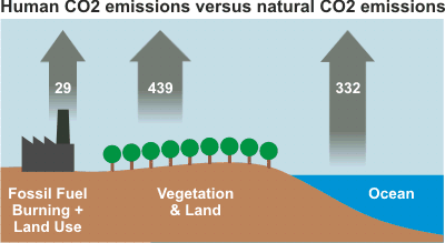
Figure 1: Human CO2 emissions compared to natural CO2 emissions. Numbers represent flux of carbon dioxide in gigatonnes (Figure 7.3 in the IPCC AR4).
Always keen for shiny, colourful diagrams to use on my website, I've created a simplified carbon cycle diagram. The data is taken from Figure 7.3 in the IPCC AR4 (thankfully the IPCC AR4 is now in HTML format - thanks to Ari for the heads up). Having my own version of the carbon cycle allows me to play with the diagram, illustrating exactly how one particular skeptic argument is constructed.
The argument is "Human CO2 emissions are small compared to natural emissions". Humans emit 29 gigatonnes of carbon dioxide every year. In contrast, land and vegetation emit 439 gigatonnes and the ocean emits 332 gigatonnes of carbon dioxide per year. One cannot deny that 29 gigatonnes of human emissions is small compared to 771 gigatonnes of natural emissions. But is this the full picture?

Figure 1: Human CO2 emissions compared to natural CO2 emissions. Numbers represent flux of carbon dioxide in gigatonnes (Figure 7.3 in the IPCC AR4).
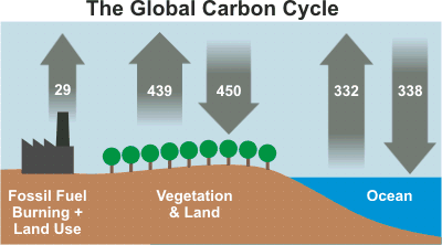
What this argument fails to disclose is that nature both emits and absorbs carbon dioxide. Land and vegetation are a strong carbon sink, absorbing 450 gigatonnes per year. Similarly, the ocean absorbs around 338 gigatonnes per year. The net contribution of carbon dioxide from nature is -17 gigatonnes per year. A more complete picture of the carbon cycle is depicted in Figure 2:

Figure 2: Global carbon cycle. Numbers represent flux of carbon dioxide in gigatonnes (Figure 7.3 in the IPCC AR4).
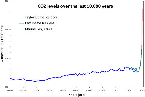
Figures 1 and 2 are a visual demonstration of the dangers of focusing on one piece of puzzle while ignoring the broader picture. A false argument doesn't necessarily have to contain falsehoods - omitting all the facts can be enough to paint a misleading picture. In this case, a fuller understanding of the carbon cycle shows us that the climate is in approximate balance. Carbon dioxide levels have remained at relatively steady levels over the past 10,000 years. In fact, current CO2 levels of 385 parts per million are the highest in 15 to 20 million years (Tripati 2009).
 Figure Figure 3: CO2 levels (parts per million) over the past 10,000 years. Blue line derived from ice cores obtained at Taylor Dome, Antarctica (NOAA). Green line derived from ice cores obtained at Law Dome, East Antarctica (CDIAC). Red line from direct measurements at Mauna Loa, Hawaii (NOAA).
Posted by John Cook on Tuesday, 29 December, 2009
 |
The Skeptical Science website by Skeptical Science is licensed under a Creative Commons Attribution 3.0 Unported License. |