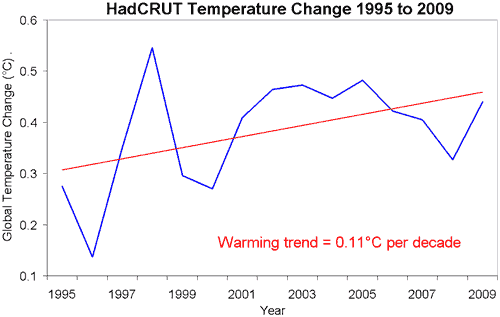
Figure 1: HadCRUT global temperature change in degrees Celsius. Blue is yearly average. Red is linear trend (HadCRUT).
A headline in the Daily Mail has spread like wildfire, claiming that Phil Jones, ex-director of the University of East Anglia’s Climatic Research Unit, said "there has been no global warming since 1995". Not only did Phil Jones not say these words, this interpretation shows a poor understanding of the scientific concepts behind his words. To fully understand what Phil Jones was saying, one needs to read his actual words and understand the science discussed. Here is the relevant excerpt from the BBC interview:
BBC: Do you agree that from 1995 to the present there has been no statistically-significant global warming
Phil Jones: Yes, but only just. I also calculated the trend for the period 1995 to 2009. This trend (0.12C per decade) is positive, but not significant at the 95% significance level. The positive trend is quite close to the significance level. Achieving statistical significance in scientific terms is much more likely for longer periods, and much less likely for shorter periods.
BBC: How confident are you that warming has taken place and that humans are mainly responsible?
Phil Jones: I'm 100% confident that the climate has warmed. As to the second question, I would go along with IPCC Chapter 9 - there's evidence that most of the warming since the 1950s is due to human activity.
Phil Jones is saying there is a warming trend but it's not statistically significant. He's not talking about whether warming is actually happening. He's discussing our ability to detect that warming trend in a noisy signal over a short period. To demonstrate this, look at the HadCRUT temperature record from 1995 to 2009. The linear trend is that of warming. However, the temperature record is very noisy with lots of short term variability. The noisy signal means that over a short period, the uncertainty of the warming trend is almost as large as the actual trend. Hence it's considered statistically insignificant. Over longer time periods, the uncertainty is less and the trend is more statistically significant.

Figure 1: HadCRUT global temperature change in degrees Celsius. Blue is yearly average. Red is linear trend (HadCRUT).
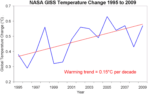
It bears remembering that the HadCRUT record only covers around 80% of the globe. Analysis by European Centre for Medium-Range Weather Forecasts (ECMWF) and NASA GISS (Hansen 2006) find that the areas omitted by HadCRUT are some of the fastest warming regions in the world. Consequently, the HadCRUT record underestimates the warming trend, as demonstrated by the NASA GISS record which covers the whole globe:

Figure 2: NASA GISS Global temperature change in degrees Celsius. Blue is yearly average. Red is linear trend (NASA GISS).
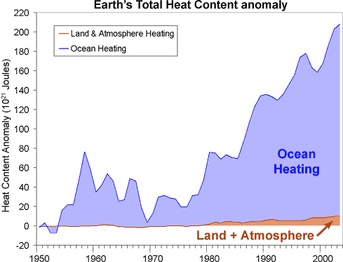
However, even this doesn't give you the full picture. Surface temperature is only a small fraction of our climate with most of global warming going into the oceans. When all the heat accumulating in the oceans, warming the land and atmosphere and melting ice is tallied up, we see that global warming is still happening.

Figure 3: Change in total Earth heat content from 1950 (Murphy 2009).
Posted by John Cook on Tuesday, 16 February, 2010
 |
The Skeptical Science website by Skeptical Science is licensed under a Creative Commons Attribution 3.0 Unported License. |