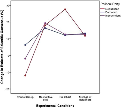
Yale University and George Mason University are conducting some of the pioneering research into the efficacy of consensus messaging. Their latest study in Climatic Change tested the effect of three different ways to communicate the scientific consensus: a simple text message, a pie-chart and metaphors (e.g., likening the 97% consensus on climate change to a 97% consensus among doctors). They found that the most effective messages in increasing awareness of consensus were the simple text message and pie-chart. The most interesting result was that pie-charts were most effective on Republicans:
 Pie-charts get a bad rap among science communicators (and often not without reason), but in this particular instance, the pie-chart is quite effective in communicating the overwhelming agreement among climate scientists. When SJI Associates designed The Consensus Project website, they used the 97% pie-chart as the website logo. It seems they knew what they were doing (I also like the visual double-entendre of the pie-chart forming a C). They used the same imagery in the shareable infographics communicating the results of our 97% consensus paper:
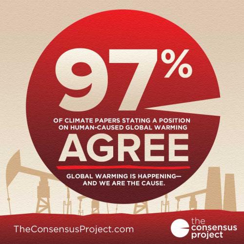
Climate deniers also understand the effectiveness of pie-charts in communicating the scientific consensus on human-caused global warming. Coincidentally, a slideshow by a climate denier group was released just days before the Yale/GMU study, attacking the use of pie-charts to communicate the consensus:
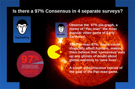
This denier pre-emption of social science research echoes Frank Luntz' infamous 2002 memo advising Republicans to attack the scientific consensus on climate change in order to erode public support for climate policies - long before social scientists began researching the link between perception of consensus and support for climate action.
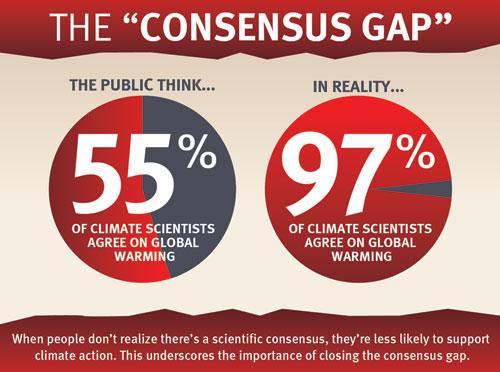
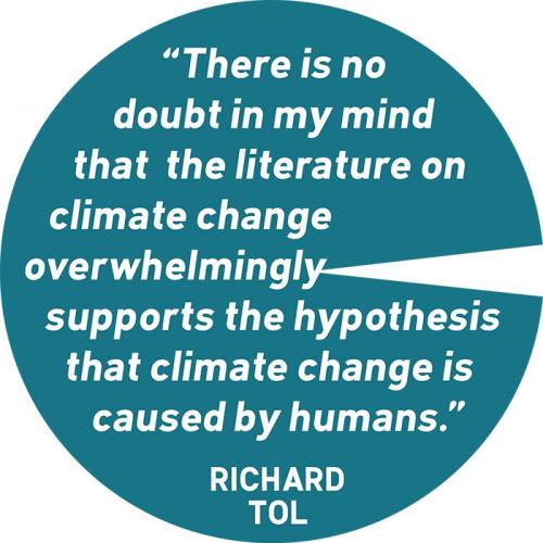
The take-home from this latest research is that simple and/or visual messages are effective in closing the consensus gap, which is one of the more important steps required to achieve climate action. Or as Chris Mooney puts it, "You keep it simple, and you show pretty pictures." This is why we offer a rich resource of simple visuals communicating the scientific consensus that are freely available for republishing. There are several variation on the pie-chart including this latest addition:
Posted by John Cook on Thursday, 10 July, 2014
 |
The Skeptical Science website by Skeptical Science is licensed under a Creative Commons Attribution 3.0 Unported License. |