The 97% v the 3% – just how much global warming are humans causing?
A pair of climate scientists recently had a dispute regarding how much global warming humans are responsible for. Gavin Schmidt from Nasa represented the consensus of 96–97% of climate experts in arguing that humans have been the dominant cause of global warming since 1950, while Judith Curry from Georgia Tech represented the opinions of 2–4% of climate experts that we could be responsible for less than half of that warming.
Curry is to be the featured speaker on this subject at a National Press Club event tomorrow hosted by the Marshall Institute; a right-wing thinktank that has spread misinformation about the dangers of smoking, ozone depletion, acid rain, DDT, and now climate change. She may also discuss the subject at an event next week hosted by the fossil fuel-funded right-wing think tank Texas Public Policy Foundation (TPPF).
The exchange between Schmidt and Curry can be read on RealClimate – a blog run by climate scientists. The discrepancy in both the quantity and quality of the supporting evidence used by each scientist was one of the most telling aspects of their debate.
For his part, Schmidt referenced the most recent IPCC report. The IPCC summarises the latest and greatest climate science research, so there is no better single source. The figure below from the IPCC report illustrates why 96–97% of climate science experts and peer-reviewed research agree that humans are the main cause of global warming.
The black bar indicates the amount of global surface warming observed from 1951 to 2010. The green bar shows the amount of warming caused by human greenhouse gas emissions during that time. The yellow is the influence from other human effects (mainly cooling from human sulfate aerosol emissions, which scatter sunlight), and the orange is the combined human effect. Below those are the contributions from external natural factors (mainly the sun and volcanoes) and from natural internal variability (mainly ocean cycles), while the whiskers show the uncertainty range for each.
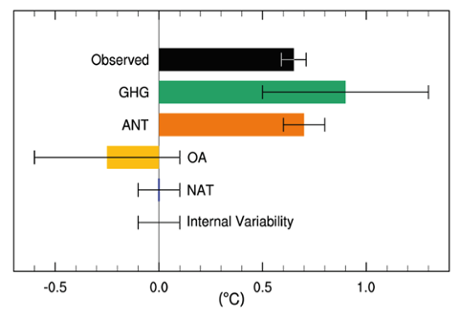 IPCC AR5 figure 10.5: Likely ranges (whiskers) and their mid-points (bars) for attributable warming trends over the 1951–2010 period due to greenhouse gases, other anthropogenic forcings (OA), natural forcings (NAT), combined anthropogenic forcings (ANT) and internal variability. The HadCRUT4 observations are shown in black.
Notice that the green and orange bars are both bigger than the black bar. This shows that greenhouse gases have caused more warming than has been observed over the past six decades, but some of that was offset by cooling from human aerosol pollution. And the best estimate from the body of peer-reviewed climate science research is that humans are responsible for more than 100% of the global surface warming since 1950, with natural factors probably offsetting a little bit of that with a slight cooling influence.
Schmidt illustrated this key point in the figure below, which is called a probability distribution of the warming caused by humans since 1950. The curve is centered at about 110% – the most likely value for the human contribution to global warming, while the probability of the human contribution being less than 50% is almost nil.
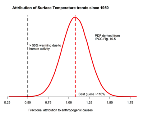 The probability density function for the fraction of warming attributable to human activity (derived from figure 10.5 in IPCC AR5). The bulk of the probability is far to the right of the ‘50%’ line, and the peak is around 110%. Source: RealClimate
Again it’s important to remember that the IPCC report is just a summary of the latest and greatest climate science research. The figures above are supported by the papers that have specifically investigated the attribution of recent global warming. This isn’t just one study; it’s based on many studies that are all in strong agreement. As the IPCC report concluded,
It is extremely likely that human activities caused more than half of the observed increase in GMST [global mean surface temperature] from 1951 to 2010.This assessment is supported by robust evidence from multiple studies using different methods.
It’s not just “more than half,” it’s also most likely close to 100%. In fact it’s just as likely that humans are responsible for about 160% of the global surface warming since 1950 as it is that we’re only responsible for 50%.
Curry disagrees with the expert consensus on this issue, but her arguments are rather muddled and “confused,” as Schmidt puts it. Her main argument is that there is uncertainty regarding the contribution of internal variability. The problem with that argument is that over long periods of time (like the six decades since 1950), positive and negative phases of ocean cycles tend to cancel each other out, and thus internal variability doesn’t have a large influence on long-term temperatures. As the first figure above shows, the IPCC estimates the temperature influence of internal variability since 1950 at ±0.1°C, during which time we’ve seen about 0.65°C global surface warming.
Curry also references a report written by Nic Lewis for the anti-climate policy think tank Global Warming Policy Foundation (GWPF), which I wrote about here. The GWPF report argues that the climate sensitivity is toward the lower end of the IPCC estimated range. However, the report is biased towards Lewis’ preferred approach, finding poor excuses to reject the many other methods that arrive at higher climate sensitivity estimates. Moreover, recent research has identified flaws in Lewis’ approach that explain why it incorrectly yields the lowest climate sensitivity estimates. In any case, even if the GWPF were correct, it wouldn’t disprove that most of the warming since 1950 is human-caused.
Curry’s other reference is to a single paper written by Zhou & Tung at the University of Washington in 2013, which concluded that roughly half of the global surface warming over the past 32 or 50 years could be explained by ocean cycles (specifically, the Atlantic Multi-decadal Oscillation). Matt Ridley also recently referenced this paper in an error-riddled Wall Street Journal editorial (debunked here and here and here and here). However, as Schmidt points out,
Tung and Zhou assumed that all multi-decadal variability was associated with the Atlantic Multi-decadal Oscillation (AMO) and did not assess whether anthropogenic forcings could project onto this variability. It is circular reasoning to then use this paper to conclude that all multi-decadal variability is associated with the AMO.
Click here to read the rest
Posted by dana1981 on Monday, 15 September, 2014
