
Figure 1: daily averaged values of the TSI from radiometers on different space platforms since November 1978.
The most precise measurements of solar activity are satellite observations of Total Solar Irradiance (TSI). TSI is also a useful proxy for other solar activity such as solar flares, cosmic radiation, sunspots, radio flux, UV radiation and x-ray flares - all of which correlate with TSI. However, there is no single continuous record since satellites began taking measurements in 1978. Instead, scientists have had to splice various satellite data together into a single composite record. The two most cited composites are by Frolich and Lean 1998 (PMOD) and Willson 1999 (ACRIM). ACRIM shows a slight increase in solar activity while PMOD shows an even slighter cooling trend.
Figure 1: daily averaged values of the TSI from radiometers on different space platforms since November 1978.
Both composites show little long term trend in TSI over the 30 years since satellite measurements began. Scafetta 2006, using the warming ACRIM trend, concludes "since 1975 global warming has occurred much faster than could be reasonably expected from the sun alone." So neither composite indicate the sun has been the primary cause of the last 3 decades of global warming. Nevertheless, determining the more accurate TSI reconstruction is a significant piece in the climate puzzle.
The major difference between the two composites is the handling of data between 1989 and 1991. There is a 2 year gap between ACRIM-I and ACRIM-II (tragically due to the Challenge space shuttle explosion). To fill the gap, both composites use the HF data but in dramatically different ways.
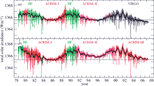
Figure 2: PMOD TSI composite (top) versus the ACRIM TSI composite (bottom). Coloured lines give the daily values with the black solid lines giving the 81 day mean.
PMOD applies corrections to the HF data, which has many sudden jumps due to changes in the orientation of the spacecraft and to switch-offs. Figure 3 demonstrates how the HF corrections are responsible for virtually all of the difference between the long-term drifts of the composites.

Figure 3: The difference between the ACRIM and PMOD composites. The grey line gives the daily values, the black line the 81 day running mean. The step in the ACRIM gap during 1989 is clearly seen and is about half the amplitude of the solar cycle variation.
Another way of comparing the two composites is a scatter plot of TSIACRIM vs TSIPMOD. Most of the data has ACRIM exceeding PMOD - this is for data after 1992. However, there is a small population of points where ACRIM is slightly smaller than PMOD, forming a second, dotted line.
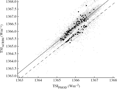
Figure 4: Scatter plot of the daily values (grey) and independent 81-day means (black) of TSIACRIM as a function of the corresponding TSIPMOD value.
So which composite correctly handled the HF data? Does TSI dramatically increase during the HF period as ACRIM supposes and the raw HF data indicates? Or did PMOD get their calibrations right when they adjusted the data to show slight solar cooling over the ACRIM gap? Fortunately, there are a number of independent measurements that can confirm solar activity over this period.
The latest independent test comes in the form of a new, wordily titled paper, "Recent oppositely directed trends in solar climate forcings and the global mean surface air temperature. II. Different reconstructions of the total solar irradiance variation and dependence on response time scale" (Lockwood 2008). It compares PMOD and ACRIM to a TSI reconstruction based on measurements of solar magnetograms dating back to 1976 (Wenzler 2006). The agreement between PMOD and Wenzler's TSI reconstruction is very good (a correlation coefficient of 0.91). The corresponding correlation with ACRIM is 0.84. Also revealing is a scatter plot of the PMOD composite with Wenzler's reconstruction:
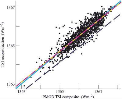
Figure 5: Scatter plot of the daily values of the TSI, as simulated from ground-based magnetograms, as a function of the simultaneous PMOD composite value (1979–2003). The dashed mauve/orange line is the best least-squares linear regression fit and the light blue line is the ideal line of perfect agreement.
If the PMOD composite is correct, the data points should be clustered around the ideal (light blue) line. If ACRIM is correct, a second population should appear aligned along the dashed blue line. Figure 5 shows no such second population. Wenzler's TSI model provides another independent confirmation for the PMOD composite.
So independent tests indicate the PMOD composite is the more accurate TSI reconstruction. The sun has shown a slight cooling trend over the last 3 decades. Not only is the sun not contributing to global warming, it has had a slight, long term cooling effect.
Posted by John Cook on Tuesday, 25 March, 2008
 |
The Skeptical Science website by Skeptical Science is licensed under a Creative Commons Attribution 3.0 Unported License. |