A new paper from scientists at the Danish Meteorological institute investigates the geographical distribution of warming over the period of the recent slowdown. Interestingly they fail to find any significant contribution from the omission of the rapidly warming Arctic from some temperature datasets. This is surprising, given that the DMI's own data, as well as the AVHRR satellite data, the major weather model reanalyses and land based weather stations all show rapid Arctic warming at a rate which should affect global trends.
We have reproduced their work and established the reasons for their result. Gleisner and colleagues fail to find the impact of Arctic warming for three reasons: where they are looking for it, how they are looking for it, and when they are looking for it. We will consider each of these questions in turn.
First let's do a very simple sanity check to see if missing out the Arctic should have a noticeable effect on Arctic temperature trends.
HadCRUT4 had on average 64% coverage for the region north of 60°N for our original study period of 1997-2012. This region corresponds to about 6.7% of the planet's surface. Therefore the missing region corresponds to about 2.5% of the planet. Eighty percent of the missing region is north of 70°N where coverage is very incomplete.
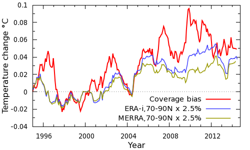
The rate of Arctic warming in the MERRA for region north of 70°N, where most of the missing coverage occurs, is 1.3°C/decade. The ERA-interim reanalysis shows a higher rate of 1.7°C/decade. (Check it yourself)
The trend for the rest of the world is much smaller. Therefore, the missing region in the Arctic alone should increase the global trend by roughly 0.03 to 0.04°C/decade. The trend in HadCRUT4 over that period is about 0.05°C/decade. So inclusion of the Arctic alone might be expected to increase the global trend by 60-80%, as illustrated in Figure 1. Gleisner et al provide no explanation for the apparent contradiction between their results and the weather models.
Figure 1: Global impact of Arctic warming estimated from reanalyses. The JRA-55 analysis (not shown) shows good agreement with ERA-interim.
As a check, the AVHRR satellite surface temperature dataset shows a trend of 1.1°C/decade over the larger region north of 64°N over the same period. This falls between the ERA-interim and MERRA values over the same region.
Further contributions to the difference arise from the fact that most of the missing coverage arises from land and sea ice, where warming has been faster than over the oceans. (Coverage in other parts of the planet also plays a role). This simple calculation suggests that our results are plausible. So why do Gleisner and colleagues not find any impact on global trends from Arctic warming?
Gleisner and colleagues fail to find the impact of rapid Arctic warming in three satellite datasets: two are the familiar microwave sounding data from UAH and RSS. The third is a new Radio Occultation (RO) dataset, which derives information from the delay in radio signals due to the refractive index of the Earth's atmosphere. They look for the impact of Arctic warming on global trends using this figure:
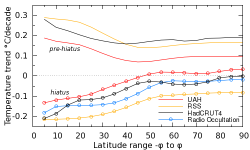
Figure 2: Temperature trend plotted against latitude range covered, with equatorial temperature trends on the left and global temperature trends on the right. The figure contrasts pre-hiatus trends (top lines) which hiatus trends (bottom lines). Replotted from Gleisner et al figure 4.
The figure shows the cumulative contribution to the warming trend from successively higher latitudes in the various temperature datasets. So on the left, we have temperature trends for a narrow band of the planet around the equator. On the right are temperature trends for the whole planet. They consider two periods - a pre-hiatus period showing high trends (lines) and a hiatus period showing low or negative trends (lines and points).
Let's concentrate on the satellite data for now (i.e. the colored lines). If Arctic warming makes a significant contribution to global trends, the lines should curve upwards at the right hand edge of the plot. But they don't. The high latitudes do not make a significant difference.
But this should not have been a surprise. Rapid arctic warming is known to be a near surface phenomena; warming above the surface is more moderate (Simmons and Poli, 2014). This is also an expected fingerprint of sea-ice related feedbacks of Arctic amplification (Screen and Simmons, 2010; Serreze and Barry, 2011; Cohen et al., 2014). (This may also explain why the CW14 UAH-hybrid reconstruction does not capture all of the Arctic warming demonstrated by some weather models.)
As a simple check we can look at the trends in the ERA interim weather model on the hiatus period for the region north of 70°N. As we noted before, the surface (2m) trend on 1997-2012 is 1.7°C/decade. However if we go up 3km into the atmosphere to the 700mb level, the trend drops to only 0.02°C/decade. (Check it yourself)
In other words, by looking at the satellite data they were looking in the wrong place.
When we calculate a temperature reconstruction we don't know what the right answer is. As a result we need a way of testing whether our methods are valid in order to determine whether we can trust the answers. The methods need to be validated. Validation tests made up the bulk of our original paper.
One of the tests we used was adopted from the HadCRUT4 analysis, and involved testing the how well our temperature reconstruction could reproduce a known global temperature map from incomplete data. The same test can be applied to the Gleisner temperature reconstruction.
As a starting point, we need a set of globally complete surface temperature maps. These don't have to correspond to reality (although it is helpful if they do). For this purpose we'll use temperature data from the MERRA weather model, a conservative choice because it shows the slowest Arctic warming.
The validation test works like this:
For the purposes of validation, lower errors indicate a better reconstruction.
The Gleisner temperature reconstruction involves taking the average of all temperatures present in a given latitude band, and then averaging the temperatures of the bands as if they were complete.
The errors in the different reconstructions by month are shown in Figure 3. The impact of coverage bias is visible as a decline around 2001 in the HadCRUT4 method. This bias is somewhat mitigated in the Gleisner method but with only a small reduction in error. The errors are significantly reduced by kriging, consistent with the results of Dodd et al. (2014).
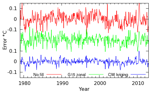
Figure 3: comparison of the errors in reconstructing the MERRA temperature field using no infilling, the Gleisner et al zonal method, and kriging.
The root means squared errors are given in the following table.
| Method | RMS error |
|---|---|
| HadCRUT4 (no coverage correction) | 0.051 |
| Gleisner et al (zonal) | 0.043 |
| Cowtan and Way v2 (kriging) | 0.024 |
The Gleisner method, despite its simplicity, does produce slightly better results than the HadCRUT4 approach of ignoring missing cells. Kriging significantly outperforms either approach, halving the error in the estimated temperatures in comparison to the HadCRUT4 method.
If we include all three temperature reconstructions in the latitudinal temperature plot, we obtain Figure 4.
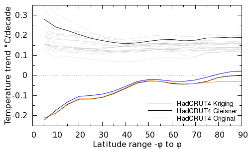
Figure 4: As Figure 2, but comparing three different reconstruction methods: The original HadCRUT4, the Gleisener et al. approach and kriging (bottom lines). Pre-hiatus trends (top lines) are shown for the Gleisner et al. hiatus start date (black line) and for start dates in the range 1968-1988 (thin grey lines).
When the temperature trends from the Gleisner analysis are compared with HadCRUT4, their reconstructed global trends are higher than for HadCRUT4, and the difference is at high latitudes. However the impact of coverage is certainly smaller than reported in our analysis. The increase in hiatus trends is rather more substantial using the kriging calculation. The increase covers the whole latitude range, however it is greatest at high latitudes.
One other feature is shown by the thin grey lines in Figure 4. The Gleisner pre-hiatus period is rather unusual in that the chosen start date produces both fast global warming, and very fast tropical warming, compared to other choices of start date. This seems to be due to their pre-hiatus period starting in a cool La Niña year and ending in warm El Niño year.
So Gleiser and colleagues do find an Arctic signal in the surface data, but it is smaller than we would expect. Some of the discrepancy is explained by the simplicity of their temperature reconstruction method, but not all of it.
The final reason that Gleisner et al do not find much impact of coverage bias concerns when they are looking for it. Let's take a look at the latitudinal trend plot once more, this time looking at the study period from our paper, i.e. from 1997 to 2012. This period is shown in Figure 5:
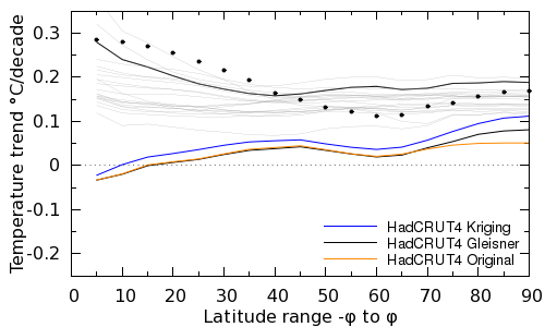
Figure 5: As Figure 4, but with the hiatus trends (bottom) covering the period since 1997-2012 (as CW14) rather than 2002-2013. The black points show the G15 method applied to the period 1999-2010 when the ENSO trend is inverted with respect to the period 1997-2012.
Over this period the impact of coverage bias is indeed rather greater. Our reconstruction accounts for at least half the difference between the hiatus and pre-hiatus trends for all but two choices of start year for the pre-hiatus period. The Gleisner et al approach also picks up most of the Arctic component of the coverage bias.
We already suspect that the shape of the curves for the pre-hiatus period depends on the El Niño trend over the study period. Does that apply to the hiatus period as well? We can test that by taking a period with a positive El Niño trend from within the hiatus period, for example 1999-2010. The results are shown by the black points in Figure 5 using the Gleisner et al temperature reconstruction. The trends over this period look much more like the pre-hiatus trends, apart from the uptick due to rapid Arctic warming. That's an interesting result for further study.
The final reason Gleisner et al don't find much role for coverage bias during their hiatus is their choice of study period. By 2005, coverage bias is largely established, and so while it biases the temperatures after that point, it has rather little impact on the trends.
We agree with many of the points raised by Gleiner and coauthors. The authors state that:
"omission of successively larger polar regions from the global-mean temperature calculations, in both tropospheric and surface data sets, clearly indicates that data gaps poleward of 60° latitude can not explain the observed differences between the hiatus and the pre-hiatus period"
And we agree. In our original briefing document we stated:
"To interpret the 16 year trend, it is necessary to take into account all of these factors, including volcanoes, the solar cycle, particulate emissions from the far East and changes in ocean circulation. The bias addressed by this paper is just one piece in that puzzle, although a largish one."
On the last point our only disagreement with Gleisner and colleagues arises from the choice of research question. In seeking to explain temperature trends post-2002, coverage bias does play a more limited role in the temperature trends. However, we suggest that even over this period Gleisner and colleagues' conclusions arise from a combination of the use of tropospheric datasets which cannot observe Arctic surface warming, and upon a surface temperature reconstruction which shows only limited skill in validation.
However in seeking to explain trends back to the late 1990s coverage bias is more significant. Further, if we wish to explain model-observational divergence, ignoring the role of coverage bias leaves an unexplained offset between the models and observations which is already largely in place by the start of the Gleisner study period. In our view, analyses that take into consideration the full range of observed and physically-valid contributions to the rate of warming (e.g. Schmidt et al. 2014; Huber and Knutti 2014) represent our best understanding of the the evolution of modeled and observed trends.
Data and methods for our analysis are available here. Our full response, sent to Gleisner et al in January 2015, is available on our updates page.
For context, there have been other discussions of our work in the literature. In our view the most important is Simmons and Poli (2014), which provides a comprehensive investigation of recent Arctic warming.
Posted by Kevin C on Tuesday, 17 February, 2015
 |
The Skeptical Science website by Skeptical Science is licensed under a Creative Commons Attribution 3.0 Unported License. |