Wow, was this a bad year for those who deny the reality and the significance of human-induced climate change. Of course, there were the recent flurry of reports that 2014 surface temperatures had hit their hottest values ever recorded. The 2014 record was first called on this blog in December and the final results were reported as well, here. All of this happened in a year that the denialists told us would not be very hot.
But those denialists are having a tough time now as they look around the planet for ANY evidence that climate change is not happening. The problem is, they’ve been striking out.
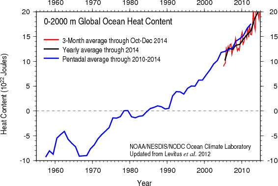
And just recently, perhaps the most important bit of information came out about 2014 – how much the Earth actually warmed. What we find is that the warming is so great, NOAA literally has to remake its graphs. Let me explain this a bit.
We tend to focus on the global temperature average which is the average of air temperatures near the ground (or at the sea surface). This past year, global air temperatures were record-breaking. But that isn’t the same as global warming. Global warming is properly viewed as the amount of heat contained within the Earth’s energy system. So, air temperatures may go up and down on any given year as energy moves to or from the air (primarily from the ocean). What we really want to know is, did the Earth’s energy go up or down?
The trick to answering this question is to measure the change in energy of the oceans. A thorough review of ocean heat measurement methods is found here; we paid the requisite fee to make the paper open access. Anyone can download and read it.
So what do the new data show? Well, it turns out that the energy stored within the ocean (which is 90% or more of the total “global warming” heat), increased significantly. A plot from NOAA is shown above. You can see that the last data point (the red curve), is, literally off the chart.
The folks at NOAA do a great job updating this graph every three months or so. We can now say that the 2014 Earth had more heat (thermal energy) than any year ever recorded by humans. We can also say that the folks at NOAA will likely have to rescale their graph to capture the new numbers. The NOAA site is updated by Dr. Tim Boyer and can be found here. Click on slide 2 to view the relevant image.
If people want to read a review of ocean heating that is written for a general audience, I suggest our recent peer-reviewed paper which can be found here.
