2014 is over, and all the major temperature record providers have reported their annual temperatures, generating a lot of discussion as to whether the year was the hottest on record. Whether 2014 was hottest or not doesn’t really change our understanding of the science, but the media coverage should make it very clear that it is important for social reasons.
In 2014 we also released our version 2 temperature reconstructions based on separate treatment of land and oceans. The long infilled reconstruction, which covers the same period as the underlying HadCRUT4 data, is the most used. So how does 2014 compare in our infilled temperature reconstruction?
| C&W | Berkeley | GISTEMP | NOAA | HadCRUT | |
|---|---|---|---|---|---|
| 1 | 2010 | 2014 | 2014 | 2014 | 2014= |
| 2 | 2014 | 2010 | 2010 | 2010 | 2010= |
| 3 | 2005 | 2005 | 2005 | 2005 | 2005 |
| 4 | 2007 | 2007 | 2007 | 1998 | 1998 |
| 5 | 2009 | 2006 | 1998 | 2013 | 2003 |
| 6 | 2006 | 2013 | 2013 | 2003 | 2006 |
| 7 | 2013 | 2009 | 2002 | 2002 | 2009 |
| 8 | 1998 | 2002 | 2009 | 2006 | 2002 |
| 9 | 2003 | 1998 | 2006 | 2009 | 2013 |
| 10 | 2002 | 2003 | 2003 | 2007 | 2007 |
As has been anticipated, we show 2014 as the second hottest on record. And not by a close margin - the temperature anomaly for 2014 was 0.61°C, as compared to 0.63°C for 2010. Given that our work is motivated by the desire to understand why the different versions of the temperature record differ, the difference is interesting.
There is a possible pattern here: NOAA show 2014 warmer than 2010 by more than GISTEMP, and HadCRUT4 show a similar contrast with us. Also the two GHCN-based records show 2014 warmer relative to 2010 than the Climatic research Unit (CRU) based records. This suggests that both infilling and the use of the CRU data tend to reduce 2014 in comparison to 2010.
The comparison with Berkeley Earth is more interesting. Like Berkeley we show 1998 much further down the list than GISTEMP, NOAA or HadCRUT4. In our view this is because NASA, NOAA and HadCRUT4 are underestimating temperatures over the last decade. In the case of NOAA and HadCRUT4, this is primarily due to the omission of the rapidly warming Arctic, while GISTEMP is extrapolating from rather fewer Arctic stations, many of which feature downward adjustments.
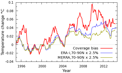
The impact of coverage bias on the HadCRUT4 record can be estimated from the difference between our temperature reconstruction and HadCRUT4. But we can also obtain a simple independent estimate of the contribution of the Arctic to the total coverage bias by determining a temperature series for the Arctic (north of 70°N), and scaling by the fractional area of the missing region of the Arctic in HadCRUT4 (about 2.5% of the planet’s surface). The results are shown in Figure 1:
Figure 1: Arctic contribution to coverage bias
Both the ERA-interim and MERRA weather model reanalyses suggest that the Arctic contributes a little over half of the total bias, despite the small size of the affected region. The Arctic explains the dip in bias in 2004, and almost all of the bias in 2005. ERA-interim shows a peak in Arctic temperatures in 2010, whereas MERRA shows a plateau since 2005. The JRA-55 reanalysis and Berkeley Earth tend to support ERA-interim (Simmons and Poli 2014). The plateau in Arctic temperatures suggests that we should not necessarily expect runaway Arctic warming or a rapid loss of Arctic sea ice; and the rapid Arctic warming events we have looked at in the CMIP-5 models also tend to be of limited duration. The contribution of the Arctic to the warmth of 2010 can be seen in temperature anomaly maps for the two years (Figure 2).
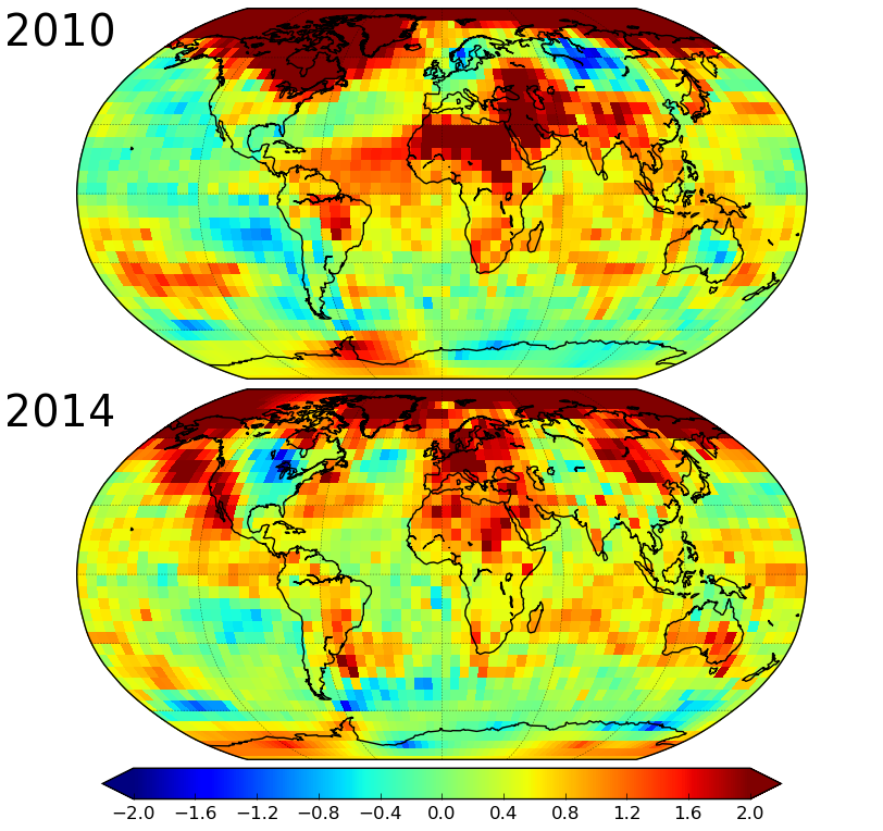
Figure 2: Comparison of temperature anomalies for 2010 and 2014
The rest of the bias comes from the remainder of the planet, and shows a peak in around 2010. How do the various global reconstructions compare over the rest of the planet? For this comparison we look at 3 latitude zones: the Arctic (60°N-90°N), the Antarctic (60°S-90°S), and the rest of the world (60°S-60°N). The polar zones each account for about 7% of the planet. Temperature comparisons for the last two decades are shown for these zones in Figure 3.
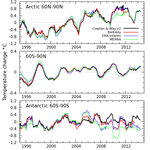
Figure 3: Zonal temperature comparison (CORRECTION: The middle panel should be labelled 60S-60N)
Most of the uncertainty in our temperature reconstruction comes from the Antarctic (and to a lesser extent Africa), because the stations are much sparser there than in the Arctic. As a result we expected significant disagreement in the Antarctic temperatures. The results however were a surprise: The agreement is reasonable from the mid 80’s to about 2005. After 2005 the records diverge, although Berkeley and ERA-interim are the closest. Our reconstruction is noticeably warmer than the others in 2009-2010. The difference between our reconstruction and Berkeley over that period is about 0.4°C for the Antarctic, which would correspond to a difference of 0.03°C in the global record. The low latitude differences also play a role, although these are geographically far more diffuse and thus harder to investigate.
The next step will be to find out why the disagreement occurs, although I suspect this will be more difficult than for the Arctic. Nonetheless, identifying the causes of differences between the different temperature reconstructions has proven very informative in our work so far. While it is not possible to draw a conclusion about which series is more realistic until the cause of the discrepancy is known, we can estimate the impact of different versions of the Antarctic record. If the Berkeley temperature data for the region south of 60°S were substituted for ours, then the global trend on our original study period of 1997-2012 would be reduced by 0.012°C/decade. This would bring the temperature trend in our current reconstruction to about 0.105°C/decade. In contrast to Berkeley, the GISTEMP data show very similar trends to us over the same region, however there are substantial year on year differences. This highlights the uncertainty in the Antarctic temperature record.
So was 2014 the hottest on record? We don't know yet, but we know one of the places where we need to look for the answer.
The provision of an ensemble of 100 temperature reconstructions is probably the most important innovation introduced in HadCRUT4, enabling users to estimate the impact of correlated uncertainties in the temperature record on their own work. In this respect HadCRUT4 represents the state-of-the art in the field. We have therefore started distributing temperature series for our reconstruction for each of the individual HadCRUT4 ensemble members.
A number of scientific papers have cited our work over the last year. Here are some which are of particular interest.
Posted by Kevin C on Monday, 2 February, 2015
 |
The Skeptical Science website by Skeptical Science is licensed under a Creative Commons Attribution 3.0 Unported License. |