Our new paper in Science Bulletin (Richardson et al. 2015) explains why a recent study (Monckton et al. 2015) calculated less warming than others that used the same basic technique (e.g. Otto et al. 2013). We found that the differences could be explained because, while most other studies use physics and real-world measurements where possible, Monckton et al. relied a lot on a narrative approach.
For example, instead of testing their prediction against real world data records, they invented their own "observations" up to 2050. While their prediction looks good when compared with the future they made up, they look bad compared with the past that we've already measured.
Monckton et al. modify a simple equation called an "energy balance model" (e.g. Budyko 1969). This tries to calculate how much warming or cooling we should expect if something changes on Earth, such as when a volcano erupts or we put greenhouse gases into the air. The result that you get depends on two main factors: how quickly the Earth reacts to warming and its so-called "sensitivity".
Monckton et al. come up with a value for sensitivity that is different from other studies, but while other research combines physics, measurements and statistics to calculate it, Monckton et al. prefer a different approach. They come up with a small value by pointing out that their simple equation works like the equation for a certain type of electronic circuit. They say that electrical engineers would design such a circuit and make sure that it is not very sensitive. Therefore they decide that Earth is not very sensitive and future global warming will be small.
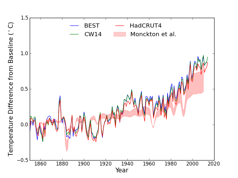
Normally researchers test their calculations against measurements if possible, and since Monckton et al. estimate temperature change then it would make sense to check against measurements of temperature change. We have global temperature records since 1850, but Monckton et al. didn't do this comparison. This is what it looks like, consistently calculating temperatures that are cooler than measurements:
Figure 1 Three different records of global temperature are shown as lines and the red shaded area shows the Monckton et al. 2015 expected temperature changes given a record of heating changes on Earth (Otto et al. 2013). The temperature records are Cowtan & Way (CW14), Berkeley Earth (BEST) and HadCRUT4. All temperature records and projections from a baseline of 1850-1900.
Monckton et al. talk about the results of the computer simulations used by the Intergovernmental Panel on Climate Change (IPCC). They say that these models are "running hot". Here is what that comparison looks like:
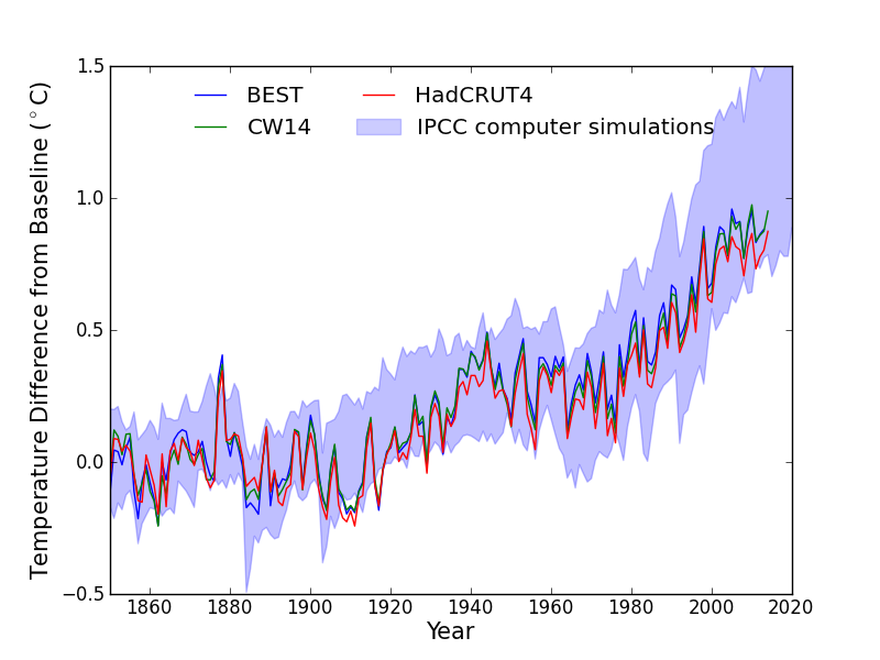
Figure 2 Three different records of global temperature shown as lines (BEST, CW14, HadCRUT4) against the range of temperature changes projected by computer simulations used in the 5th IPCC report.
We compared the IPCC and Monckton et al. projections over 2000-2010. We focussed on the Berkeley Earth and Cowtan & Way temperature records because they estimate the global temperature, while HadCRUT4 misses out some key areas. We found that the IPCC computer simulations ran a little hot: 0.07-0.08 C over 2000-2010. Meanwhile, Monckton et al.'s projections ran cold by 0.27-0.28 C. Monckton et al.'s projection had a bias that is about 350% larger than the IPCC computer simulations for these datasets.
Measured temperatures are toward the lower end of the computer simulations. Lots of studies have looked into this and it seems to be explained mostly by ocean circulation changes that appear to be natural and temporary (e.g. Meehl et al. 2011; Kosaka & Xie 2013; England et al. 2014; Risbey et al. 2014). Monckton et al. don't talk about this research, and you might also wonder why they criticise the IPCC calculations then produce their own estimates that do much worse. The reason they thought they were doing well was that they compared their projections with "observations" up until 2050.
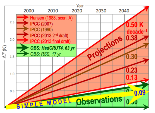
Figure 3 The Monckton version of comparing models and observations. Note that the "observations" go up until 2050.
Monckton et al. don't have any real measurements from 2050, of course. Instead they chose two periods from 2 different temperature series and assumed that those rates of change will continue until 2050.
They select 17 years of data from one satellite record and 63 years from a surface record, but making random choices like this can lead to accidental "cherry picks" that don't represent the real world. It just so happens that Monckton et al. managed to choose periods with lower rates of warming because of well-known reasons.
We cut the risk of cherry picking by using the full temperature records back to 1850, and when compared against real world data rather than Monckton et al.'s future storyline, their model does badly.
There are many other warning signs littered through the Monckton et al. paper. During their argument that climate sensitivity is low because electronic engineers design circuits in a certain way, they used records of past climate change to make their point. They said that past climate has been relatively stable, so a small number should be picked for future global warming. They didn't talk about how studies used these records of past climate to calculate what the real value should be, and that the results contradict Monckton et al. (e.g. Hoffert & Covey 1992; Covey et al. 1996; Crucifix 2006; Rohling et al. 2012)
Another contribution to Monckton et al.'s low calculated value of future global warming is that they assume that Earth reacts very quickly to climate change. Plenty of studies have looked at this, and they conclude that the oceans suck up plenty of heat: just like how it takes time for a pot full of water on top of the stove to boil, it takes time for Earth to warm up as well.
Right now we haven't finished warming up and there is "warming in the pipeline", which adds to our expected future global warming. Monckton et al. disappear this heat in a sentence or two. We can see whether their assumption is good by looking at measurements of heat in the ocean. If they are right then it hasn't increased recently and the result will be a horizontal line on the graph. This is what the measurements say:
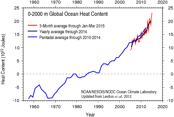
Figure 4 Changes in the amount of heat in the ocean in units of 10-billion-trillion Joules from NOAA NODC. This shows that Earth is still gaining heat at a rate about 4 nuclear explosions per second: we haven't finished warming up yet.
The Monckton paper is packed full of interesting things so this post is just a taster. But this taster is enough to explain why we were surprised that this paper made it into a scientific journal. A scientific paper goes through a round of "peer review", where anonymous experts are supposed to check the methods and make sure that relevant other research is included.
It seems the reviewers of the Monckton et al. paper either didn't know about a lot of climate research, or they didn't think it was relevant. They apparently weren't bothered about the global temperature record, the Argo buoy network or studies on climate sensitivity and recent temperature changes. They didn't ask for the model to be tested against real-world data, and seemed happy with a model manufactured on wordplay rather than scientific methods. This is why we argue that its results simply aren't credible.
NOTE: This post represents the personal views of Dr. Mark Richardson and does not represent the position of the University of Reading, California Institute of Technology or NASA Jet Propulsion Laboratory.
NOTE 2: This work was unfunded and so we were not able to pay for the open access fee. We are working on getting a publicly accessible version of the accepted paper.
Posted by MarkR on Wednesday, 3 June, 2015
 |
The Skeptical Science website by Skeptical Science is licensed under a Creative Commons Attribution 3.0 Unported License. |