
Here's the abstract of a new paper in Nature Geoscience on Arctic sea-ice volume:
Changes in Arctic sea ice volume affect regional heat and freshwater budgets and patterns of atmospheric circulation at lower latitudes. Despite a well-documented decline in summer Arctic sea ice extent by about 40% since the late 1970s, it has been difficult to quantify trends in sea ice volume because detailed thickness observations have been lacking. Here we present an assessment of the changes in Northern Hemisphere sea ice thickness and volume using five years of CryoSat-2 measurements. Between autumn 2010 and 2012, there was a 14% reduction in Arctic sea ice volume, in keeping with the long-term decline in extent. However, we observe 33% and 25% more ice in autumn 2013 and 2014, respectively, relative to the 2010–2012 seasonal mean, which offset earlier losses. This increase was caused by the retention of thick sea ice northwest of Greenland during 2013 which, in turn, was associated with a 5% drop in the number of days on which melting occurred—conditions more typical of the late 1990s. In contrast, springtime Arctic sea ice volume has remained stable. The sharp increase in sea ice volume after just one cool summer suggests that Arctic sea ice may be more resilient than has been previously considered.
OK, let's pick this apart. Arctic sea-ice volume is the trickiest of the sea-ice variables to measure. Extent and area are by contrast straightforward. Volume depends on the survival of multi-year ice in any melt season. A pronounced melt season, like 2012, sees some of the multi-year ice lost. But if any of the ice that didn't melt in 2012 makes it through the 2013 season, you are going to get a volume increase. The authors state that they observed 33% more ice volume in autumn 2013 relative to the 2010-2012 mean. They go on to state that in 2014 there was 25% more ice volume relative to 2010-2012 – in other words it dropped again. That shows up on the following ice thickness distribution plot: the thickest ice is in red. Big red blob for 2013, much smaller one for 2014.
Such observations are reasonably consistent with PIOMAS:
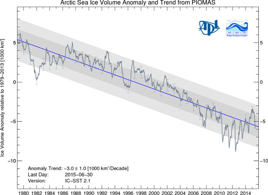
In the PIOMAS graph, we see a sharp plunge in the Arctic sea-ice volume anomaly down to the 2007 record (at the time) minimum. We then see volume recovering a bit until 2010, when we see the first of three extremely low years culminating in 2012, followed by the years referred to in the above abstract. These variations, taking place over periods of a few years, are simply noise on a longer-term trend - the blue line. We see such noise in all aspects of the climate system over such short timescales.
Here are the results presented in the Nature Geoscience paper. The Cryosat-2 estimates of total (red stars), first-year (green diamonds) and multi-year (blue triangles) sea-ice volume are shown, as well as model estimates of volume from PIOMAS. Unsurprisingly they show that most Arctic sea-ice variability involves thin first-year ice, which is the most prone to melting. The uptick in multi-year sea-ice following the 2013 melting season (the fourth lot of blue triangles from the left) can clearly be seen.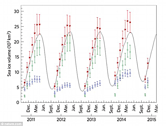
The media picked up on this story, of course. According to the Guardian:
Ice in the Arctic staged a surprise revival in 2013, bucking the long-term trend of decline, according to the first analysis of the entire ice cap’s volume. The revival was the result of cooler temperatures that year and suggests that, if global warming was curbed, the Arctic might recover more rapidly than previously thought.
Just a small moan about this piece: please, please stop calling Arctic sea-ice the ice-cap. It's a fragmented floating ice-sheet whose fluctuations have only a small bearing on other cryosphere-related climate consequences such as sea level rise. It's far better to refer to the elevated, terrestrial ice-sheets as ice-caps. They are a separate kettle of fish, so to speak, since ice volume-loss from them contributes directly to sea-level rise and the physics of such fluctuations are entirely different, involving additional phenomena such as glacier dynamics and so on.
Terminology nitpicks aside, for full-on inaccuracy with respect to this story we need to turn to the UK's Daily Mail. In an editorial comment entitled, “Climate change and an inconvenient truth”, it opined thus (with my weary responses in between):
In a major report last year, the Intergovernmental Panel on Climate Change gave a grave assessment of how man-made global warming was rapidly destroying the Arctic ice cap.
It is – both the Arctic sea ice AND the Greenland ice-cap. So far, so good.
Steadily increasing temperatures had made the pack ice contract by up to 12 per cent between 1979 and 2012, leading to rising sea levels which threatened to swamp coastal regions – not to mention endangering stranded polar bears.
No, no, no! Give me strength! Pack ice (i.e. sea-ice) does NOT affect sea-levels to that extent. See this Skeptical Science post and discussion for more information.
By the middle of the century ‘a nearly ice-free Arctic Ocean’ was likely for a large part of the year, the report predicted.
Yes we expect such conditions by some point this century under Business as Usual. Onwards...
How interesting then, that the latest analysis of 88million measurements from the European Space Agency’s Cryosat satellite show the northern ice-cap INCREASED by a staggering 41 per cent in 2013 and, despite a modest shortage last year, is bigger than at any time for decades.
This starts OK then descends into absolute tripe. In 2013, sea-ice volume was 33% greater relative to the 2010–2012 seasonal mean. The abstract above says exactly that. The 41% figure comes from an older (2014) AGU abstract by the same team. The Nature Geoscience paper has more data. But that's a minor quibble. It's the "bigger than at any time for decades" that is the howler here. It's so bad it's not even wrong. To turn a few years into decades is either being ignorant (quite possible, such things happen rather often in today's media) or, I put it to the writer, intending to deliberately mislead the readership (disgraceful - and happening all too often in today's media). I hope it's the first one.
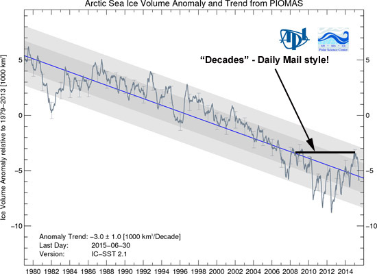
Let's see that PIOMAS graph again, with some added annotation. This is the Daily Mail's idea of decades:
On we plod through the rest of the Mail's offering:
Of course, the climatologists will come up with explanations – as they did for the fact that global temperatures have barely changed since the year 2000. They’ll say 2013 was a freak year, that in spite of temporary fluctuations long-term trends remain the same, that cooling ‘episodes’ are as much a feature of climate change as warming and so on.
Yes – 2013 was a colder summer up in the Arctic with a shorter melting season. All the data show this. No need for emotive words like “freak”. Colder years do occur in a warming trend – nothing new in that.
But the more they juggle their theories to fit the inconvenient truths, the more the public will question whether these prophesies of global doom are based on genuine science, or guesswork.
So you hope, I guess. Because the reason why they may question the science is down to grossly inaccurate and confusing reportage like the above. Science is a progressive thing: the more data we collect and analyse the clearer the picture with respect to what is occurring.
And they will rightly wonder whether solemnly committing to climate change targets while saddling ordinary people with a raft of spurious green taxes serves any real purpose – other than being an expensive exercise in gesture politics.
And now we come to it. However, I put it to this Daily Mail leader-writer that if the public are going to objectively consider the implications of climate change and the measures required to mitigate it, then they need clear and accurate information. Do the politics bit once you have that to hand. And, just for balance, I put it again to Guardian writers that it's best to distinguish sea-ice from land-based ice-caps!
In the meantime, here's an animation of the ice volume changes (data from PIOMAS) set to music, by Andy Lee Robinson:
Link in case it won't play:
https://www.youtube.com/watch?v=nuKVk1gMJDg&feature=youtu.be
UPDATE July 25th 2015:
Through much persistence by Jim Hunt and Phil (see comments below), they have succeeded in getting the Mail to revise their wording a little. "Decades" has been downgraded to "years". This revision is however still lazy. You only need look at the PIOMAS graph above to realise that "five years" would be quite acceptable. "Years" could mean anything. Link to Jim's blog detailing the efforts they had to go to:
http://greatwhitecon.info/2015/07/an-inconvenient-truth-about-the-mails-climate-coverage
Reference:
Rachel L. Tilling, Andy Ridout, Andrew Shepherd & Duncan J. Wingham (2015): Increased Arctic sea ice volume after anomalously low melting in 2013. Nature Geoscience, published online 20 July 2015.
Posted by John Mason on Thursday, 23 July, 2015
 |
The Skeptical Science website by Skeptical Science is licensed under a Creative Commons Attribution 3.0 Unported License. |