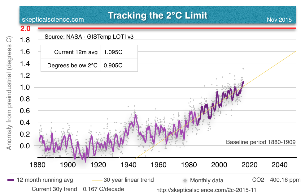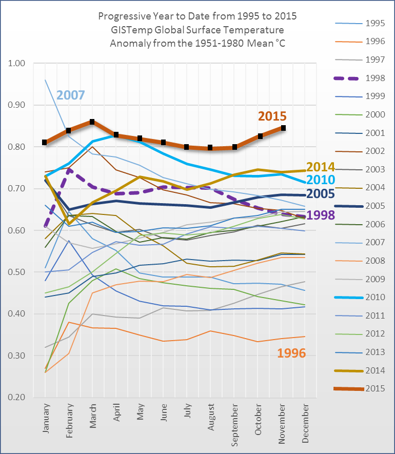
November produced another scorcher in the GISS record, coming in at 1.05°C over baseline. If we add our preindustrial baseline adjustment of -0.256 we get a preindustrial anomaly of 1.306°C (this is the difference between the GISS baseline and the 1880-1909 preindustrial baseline).

[Click here to view a full size version of this graph.]
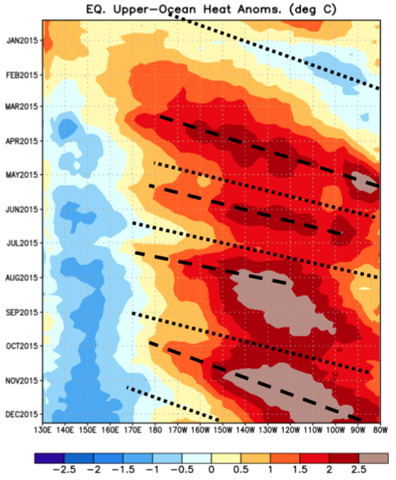
Watching the progression of the kelvin wave on the weekly ENSO report of NOAA, this past week Nino3 and Nino3.4 dropped slightly from 3.0 to 2.9 and 2.8, respectively. It's possible we're seeing the peak of this year's super el Nino, but as Yogi Berra always said, "It ain't over till it's over."

We'll keep our collective eyes out on this, but another upwelling phase seems to just be peeking its head up right there at the bottom of the chart.
The latest satellite data have still not registered this el Nino at all, but based on past el Nino events that will probably change in the early part of 2016. Sou at Hotwhopper has a really great chart comparing past el Nino events here:

Sou also produces probably one of my favorite temperature graphs of all time, which I think everyone should follow.

Suffice to say, 2015 has been freakishly warm compared to previous years. 2016 is likely to be very similar, and it's probably not going to be until 2017 that we see any retreat from this level of warmth.
Again, starting with July 2015, you can find any specific version of the 2°C Limit chart at: skepticalscience.com//pics/2c-[YYYY]-[MM].png
Posted by Rob Honeycutt on Friday, 1 January, 2016
 |
The Skeptical Science website by Skeptical Science is licensed under a Creative Commons Attribution 3.0 Unported License. |