
NOTE: this was originally posted by Alden Griffith at Fool Me Once as a video presentation debunking Christopher Monckton's assertion that temperature trends are below the IPCC's predicted temperatures.
Monckton calculates his "predicted temperatures" using an equation found in the IPCC report (Working Group 3, Chapter 3) that is used to examine the long-term temperature response to carbon dioxide emissions: Teq = ECS × ln(CO2end / CO2start) / ln(2). This is essentially a ratio increase in CO2 multiplied by the equilibrium climate sensitivity (ECS), a value that represents how sensitive temperature is to changes in CO2. The IPCC gives the range for ECS of 2.0 to 4.5, with a "best estimate" of 3.0.
With this equation, Monckton uses the CO2 values from the IPCC’s A2 scenario: a CO2start value of 368 ppm in 2000 and a CO2end value of 836 ppm in 2100. He then examines the IPCC’s low- and high-end ECS values (2.0 and 4.5), but uses the "central estimate" of ECS = 3.25 instead of the IPCC’s "best estimate". Monckton has simplified the original equation by dividing ECS by ln(2) in order to provide a single multiplier. Here are the equations that produce the range of warming that Lord Monkton claims is predicted by the IPCC:
2.9 × ln(836/368) = 2.4 C
4.7 × ln(836/368) = 3.9 C
6.5 × ln(836/368) = 5.3 C
You can see that these values match up with the "IPCC predicts warming" values shown on Monckton’s figures.
There are four fundamental problems with using these values to "predict" temperatures and attributing them to the IPCC:
1. The IPCC does not "predict" anything on this matter – they make multiple projections assuming different future emissions scenarios. This may sound trivial, but it’s a very important distinction. Monckton narrows the analysis to a single scenario (A2) and labels it a prediction.
2. Temperature rise for the A2 scenario is very unlikely to be linear, and single values in °C / century are inappropriate when looking at temperatures for time periods of less than a century. This is particularly problematic when looking at very short time periods early in this century, which are likely to exhibit less warming than later in the century.
3. These equations predict the equilibrium temperature response, which is the final temperature change once the climate has fully adjusted to a change in CO2. It does not represent the temperature expected for the year that CO2 concentration reaches the value used in the equation (and will always be higher than this value). The IPCC is abundantly clear on this point.
4. The IPCC never uses or presents these values to project global temperatures in the first decade of the 21st century.
In his most recent figures from July 2010, Monckton has decided to address the fact that warming to equilibrium temperatures by 2100 is clearly wrong (fundamental problem #3). He does this by simply reducing equilibrium temperatures by one-fifth (or multiplying by 0.8) to convert to "transient warming", although it is unclear where he gets this conversion factor from. He has applied these changes to his "prediction zone" on the graph, but he has not changed the legend of the figure which still lists the incorrect equilibrium values after "IPCC predicts warming."
I was able to recreate Monckton’s July 2010 figure from scratch by plotting monthly temperatures as the average of the UAH and RSS satellite temperature values, and adjusting them like Monckton so that "the anomalies are zeroed to the least element in the dataset." I then plotted Monckton’s "transient" prediction zone using 3 lines with linear increases of 2.4 × 0.8 = 1.92 C/century, 3.9 × 0.8 = 3.12 C/century, and 5.3 × 0.8 = 4.24 C/century. I then zeroed the prediction zone "to the start-point of the least-squares linear-regression trend on the real-world data." Here is the result:
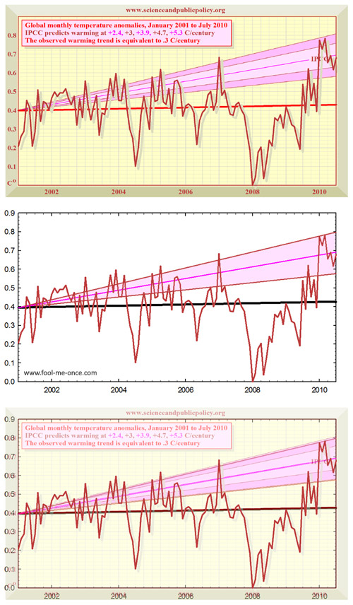
Figure 1: My reproduction and overlay of Monckton’s figure from his July 2010 SPPI report. (top) Monkton’s original figure; (middle) my reproduction; (bottom) overlay of the two. If anything, Monckton’s projection zones are slightly above the "transient" linear increases of 1.92 C/century, 3.12 C/century, and 4.24 C/century.
His prediction zones match up virtually perfectly to linear increases in temperature out to 2100 (highlighting fundamental problem #2). We can then extend these out to 2100 and examine whether Monckton’s warming rates in degrees per century match up with the actual IPCC projections:
![]()
Figure 2: Extensions of the "transient" linear warming paths from Figure 1, superimposed on the IPCC’s actual A2 temperature projection. Prediction zones were zeroed to the start of the Jan 2001 to July 2010 regression line of the UAH and RSS monthly average, using the base period of 1980-1999 to match the IPCC figure’s base period.
Monckton’s new transient warming zone aligns with the actual IPCC A2 projections quite well by 2100. However the problem with a linear temperature prediction is apparent (again, fundamental problem #2): Monckton’s transient warming path entirely excludes the bottom half of the IPCC projections until after 2030.
So as of his July 2010 report, Monckton’s prediction zones may have some relevance to temperatures at the end of the century (although they still suffer from fundamental problems #1 and #4 no matter what). However, they remain both inappropriate (fundamental problem #2) and deceptive (fundamental problems #1 and #4), when used for comparisons with recent observed temperatures. All of the prediction zones on his figures prior to July 2010 – including those shown in testimony to congress – suffer from all four fundamental problems. Just to highlight what a substantial issue fundamental problem #3 is, let’s examine the linear increase to 2100 based off of equilibrium warming:

Figure 3: The same as Figure 2, but using equilibrium linear warming paths.
Until Lord Monckton starts using the actual IPCC temperature projections and stops using climate sensitivity equations to "predict" temperatures from 2001 to 2010, his figures will be fundamentally flawed and unattributable to the IPCC.
- What about Monckton's CO2 predictions? -
Although, the primary topic here is Monckton’s "IPCC" temperature predictions, his "IPCC" CO2 predictions are also completely at odds with what is actually presented in the IPCC. Barry Bickmore from Brigham Young University has done an excellent bit of detective work to help elucidate the matter (see his RealClimate post here).
Dr. Bickmore compared Monckton’s "IPCC A2" CO2 values to the actual IPCC A2 CO2 values and found that, other than the start and end points, Monckton’s values are always higher. There is absolutely no justification for this. I’ve reproduced the same result by carefully scaling and overlaying Monckton’s graph onto the IPCC’s figure 10.20a (here’s an uncropped larger version):

Figure 4: Lord Monckton’s graph of the "IPCC’s predicted CO2" trend superimposed on the actual CO2 concentration trend from the IPCC’s figure 10.20a. Monckton’s "IPCC prediction" is clearly higher than the actual IPCC trend (which follows the observed values quite well).
Many thanks to Alden Griffith who allowed the notes to his video presentation to be republished here and as the advanced rebuttal to the skeptic argument "IPCC overestimate global warming".
Posted by Alden Griffith on Tuesday, 14 September, 2010
 |
The Skeptical Science website by Skeptical Science is licensed under a Creative Commons Attribution 3.0 Unported License. |