In Part 1A and Part 1B we looked at how surface temperature trends are calculated, the importance of using Temperature Anomalies as your starting point before doing any averaging and why this can make our temperature record more robust.
In Part 2A and in this Part 2B we will look at a number of the claims made about ‘problems’ in the record, and how misperceptions about how the record is calculated can lead us to think that it is more fragile than it actually is. This should also be read in conjunction with earlier posts here at SkS on the evidence here, here & here that these ‘problems’ don’t have much impact. In this post I will focus on why they don’t have much impact.
If you hear a statement such as ‘They have dropped stations from cold locations so the result is now give a false warming bias’ and your first reaction is, yes, that would have that effect, then please, if you haven’t done so already, go and read Part 1A and Part 1B then come back here and continue.
Part 2A focused on issues of broader station location. Part 2B focuses on issues related to the immediate station locale.
Now to the issues. What are the possible problems?
One issue that has received considerable attention is the question of the ‘quality’ of surface observation stations, particularly in the US. How well do the stations in the observation network meet quality standards with respect to location and avoidance of local biasing issues, and how much might this impact on the accuracy of the temperature record.
The upshot of investigations into this is that, at least in the US, a substantial proportion of stations have poor location quality ratings. However, analysis of the impact of the site quality problems by a number of independent analysts suggests that these problems have had almost no impact on the accuracy of the long term temperature record. How could this be? Surely that is the whole point of these quality rankings – poor quality sites can give bad results. So why wouldn’t they?
The definition of the best quality sites, Category 1 is as follows:
“Flat and horizontal ground surrounded by a clear surface with a slope below 1/3 (<19º). Grass/low vegetation ground cover <10 centimeters high. Sensors located at least 100 meters from artificial heating or reflecting surfaces, such as buildings, concrete surfaces, and parking lots. Far from large bodies of water, except if it is representative of the area, and then located at least 100 meters away. No shading when the sun elevation >3 degrees.”
Down to Category 5:
“(error ≥ 5ºC) - Temperature sensor located next to/above an artificial heating source, such a building, roof top, parking lot, or concrete surface”
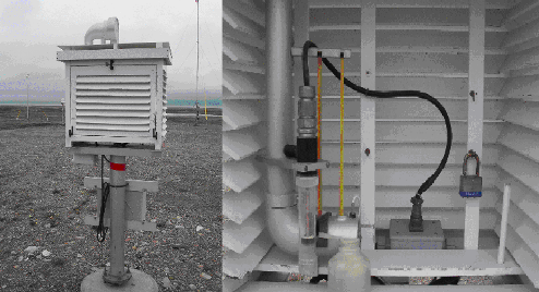
Lets consider a few of these factors. And remember, we are interested in factors that have an impact on long-term changes in the temperature readings at a site. If a factor results in a bias in the reading but this bias does not change over time, then it will not impact on the analysis since we are interested in changes – static biases get cancelled out in the analysis and have no long-term impact. Firstly, let's look at the standard enclosure used for a meterological measurement station – the Stevenson Screen:
The screen is designed to isolate the instruments inside from outside influences, particularly radiant effects from its surrounds and rain. It is usually made from a material such as wood or similar that is a fairly good insulator and isn’t going to change temperature too much because of radiant heating/cooling from its surroundings. The double-slatted design suppresses air movement from wind through the enclosure, minimising wind chill effects and restricting rain entry onto the instruments. The double-slatted design also means that any air rising from beneath the enclosure isn’t being preferentially drawn into or out of the box. And the design of the base allows air movement from below while shielding from radiation from below.
So what are the problems which can change the category of a temperature monitoring station to lower than 1?
A problem may arise if the station isn’t located on sufficiently flat ground. This can produce air movements that are caused by temperature, resulting in warmer air possibly moving towards the station. However, unless there have been really major earthworks around the site, this factor doesn’t change over time and is unlikely to have a long-term changing impact.
This can impact on air movements around the station. Also, if the vegetation changes substantially – low grass to shrubs and trees - then this could change water evaporation rates around the station and alter air temperatures. Major increases in vegetation might have a cooling effect on the station due to evaporative effects, while declines in vegetation back to Category 1 standards might have a warming impact. However, unless there is a regular and progressive change in the vegetation pattern around the station, this would not produce an ongoing change of any bias. If maintenance of vegetation around the station over its lifetime has been poor or erratic, then the bias may fluctuate up and down. This would create shorter term fluctuations in the bias but this would tend to cancel out in the longer term.
If the degree to which the station and its surrounds are shaded over the course of the day changes, this can alter local heating. Primarily this is going to impact as a result of shading causing differing heating/cooling of the ground under/around the enclosure, resulting in changes in the temperature and flow rate of rising air up through the enclosure. Unless the cause of the shading varies over long, multi-year time frames such as trees growing or buildings rising, the shading effect is not a long-term changing biasing factor. Depending on the cause of the shading, this may cause changes in the bias over the course of a day and over the seasons, but as a multi-year bias, this would remain constant.
This too is a static bias. The body of water would have a cooling effect due to evaporation that would vary with daily weather conditions and the seasons but would not be a multi-year biasing factor.
Essentially surfaces such a brick, concrete, bitumen, etc. that can act as local heat stores, greater than normal grass covered earth would be, that can then release heat either radiantly or by heating the surrounding air. These can be vertical structures, horizontal surfaces away from the enclosure, or a horizontal surface beneath the enclosure. The enclosures are designed to minimise radiant heat penetration into the enclosure from its surrounds, so the major impact of such static heating sources is going to be from heating surrounding air which may then pass through the enclosure. This will be worst when such a surface is very close to the enclosure, particularly beneath it, generating rising warmer air into the box.
Also an important factor will be the extent to which any such surfaces tend to form a partial ‘room’ around the enclosure, restricting horizontal air movement. Any such surface will tend to heat the air near/above it, causing that air to rise. More air is then drawn in to replace this, potentially flowing over or through the enclosure. If the distances involved and the geometry of the site result in this new air being warmer than the general surroundings, this could provide a warming bias for the site. Conversely if this replacement air is being drawn from a location that isn’t warmer then there may be no bias at all, possibly even a cooling effect. Ambient winds may also blow warmed air towards, or away from enclosure, depending on wind direction. And the effect of any such bias will vary over the course of the day and the seasons.
However, since the main source of any such bias is the amount and layout of such surfaces and sunlight, these biases won’t change over multi-year time frames unless the area of the surfaces is changing. This could be due to construction, or changes in shading of these surfaces such as by trees growing or building construction nearby. And some of these shading changes could actual reduce the bias over time, resulting in a long-term cooling trend. Also to be considered is whether the site is included within a region that is or becomes urban, in which case the UHI adjustments mentioned previously may cancel out any bias completely. And we still have to allow for area weighting of data from such a site when averaged over the Earth's land surface. And this doesn’t affect the oceans at all.
These are similar to the static surfaces, but they are things that actively pump heated air into the environment. Things such as Air Conditioner condensers, Exhaust fans, Heater flues, Cooling towers, Vehicle exhausts, etc. As with the static sources, a key issue here is geometry. They are generating hot air which will tend to rise unless winds blow it towards the enclosure. Does any such device actively blow warm air towards the enclosure? Or does its operation tend to draw air in from elsewhere and over the enclosure? How distant is the device and what is the geometry?
Also how long does the device operate for; 24/7 or intermittently? A station may be next to a large car park, but unless there is continuous activity, even thousands of cars have no extra impact if they are all parked and empty. Does an Air-conditioner run 24/7 or just 9-5 weekdays? Is it a reverse cycle A/C unit also used for heating in winter or at night, in which case it will pump out colder air then that doesn’t rise? How much do these activities vary with the seasons? And ultimately do these activities grow in magnitude over multi-year time frames? Otherwise they again contribute to short-term intra-annual biasing but not multi-year effects. And they may be cancelled out anyway by UHI compensations.
The US network certainly isn’t as good as it should be. There are certainly factors operating there that influence short term daily and seasonal readings and these may have important implications for use in daily Meteorological forecasting which rely on absolute temperatures. However, for long term multi-year Climatological uses, it is perhaps easy to overestimate the impact of these problems.
It easy to understand how our subjective impressions, standing near a poor quality site, seeing an A/C roaring away or feeling the radiant heat from a concrete parking lot nearby, could lead us to think this is a big issue. But the combination of the screening properties of the enclosures, long-term averaging, anomaly-based averaging, and UHI compensation will certainly tend to remove many biases that do not have long term-trend changes. And area averaging over the Earth's land surface combined with the fact that most of the Earth is water reduces any impact even further.
So it isn’t surprising that the long term temperature trend data doesn’t seem to be significantly affected by station quality issues. That is not to say that there may not be noticeable impacts on shorter term measures – local and seasonal trends and possibly daily temperature range (DTR) effects for example. But for the headline Global Temperature Anomaly, which is a main indicator of Climate Change, station quality issues appear to be a very minor issue, something that ‘all comes out in the wash’.
Finally we come to ‘Station Homogenisation’ – the process of reviewing station data records looking for errors that are a result of how the measurement was taken, rather than what the temperature actually was.
A common misconception is that ‘the thermometer never lies’. That the raw data is the gold standard. As anyone who works in any field involving instrumentation knows, this isn’t true; there are always ‘issues’ that you have to monitor for. Any instrument, even a simple thermometer will have its own built in biases.
Sometimes there will be readings that are just plain whacky. And surrounding influences can have an impact. A thermometer out in the sunshine will have a different reading from one shaded by your hand for a few minutes. A caretaker who can work quickly taking the readings when the enclosure door is open will produce a different bias from one who works slowly, or reads the instruments in a different order. Bias and error is everywhere.
If readings at a station weren’t always taken at the same time of day, this can introduce biases. Changes in the instruments used can introduce a bias. Some readings can be just plain wrong. Imagine some scenarios:
So, we can’t simply take the raw data at face value. It has noise in it. We need to analyse this data looking for problems and correcting them when we are confident enough of the correction. But also being careful that we don’t introduce errors through unjustified corrections. This requires care and judgment and it is sometimes a real detective story. And often corrections cannot be made until many, many years later because you need lots of data before you can spot changes in bias.
So this process of working through the data, trying to make it more accurate is ongoing.
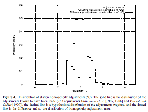
But what of its impact on the temperature record? Again, if the biases at a station don’t change over time, they don’t affect our analysis. Individual errors matter but they will tend to be random, some higher, some lower so when we average over large areas and long time periods, they tend to cancel out. Again, it is problems that cause changing biases that matter. And analysis of changes due to Homogenisation in the record indicate that there are as many cooling changes as warming ones. Such as this from Brohan et al 2006:
So, Part 1A looked at how we should calculate the temperature record and why the method used is very important to the result. And that this doesn’t necessarily match our intuitive idea of how it should be done; in this our intuition is often wrong. In Part 1B looked at how we DO calculate the temperature record, that is using the method outlined in part one and that the area weighting scheme used by one record is based on empirical evidence. In Part 2A we looked at some of the areas where the temperature record has been criticised with respect to its broader locale. And in this post we have explored issues related to the immediate surrounds of the station.
I think we have seen that there are many reasons why we tend to overestimate the effect of these problems. This conclusion is consistent with the evidence here, here & here from various analyses that show that these possible problems haven’t had any significant effect on the result.
My conclusion is that we can have a strong confidence in the results produced for the global temperature trend. Any problems will show up more in short-term patterns such as seasonal, monthly and daily trends. But the headline global numbers look pretty robust.
You will have to make up your own mind but I hope I have been able to give you some food for thought when you are thinking about this.
Posted by Glenn Tamblyn on Sunday, 5 June, 2011
 |
The Skeptical Science website by Skeptical Science is licensed under a Creative Commons Attribution 3.0 Unported License. |