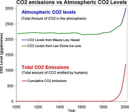
Figure 1: CO2 levels (Green Line - Law Dome, East Antarctica and Blue line - Mauna Loa, Hawaii) and Cumulative CO2 emissions in gigatonnes of CO2 (Red Line - CDIAC).
What The Science Says:
The human fingerprint in global warming is evident in multiple lines of empirical evidence - in satellite measurements of outgoing infrared radiation, in surface measurements of downward infrared radiation, in the cooling stratosphere and other metrics.
Climate Myth: It's not us
'What do the skeptics believe? First, they concur with the believers that the Earth has been warming since the end of a Little Ice Age around 1850. The cause of this warming is the question. Believers think the warming is man-made, while the skeptics believe the warming is natural and contributions from man are minimal and certainly not potentially catastrophic à la Al Gore.' (Neil Frank)
In science, there's only one thing better than empirical measurements made in the real world - and that is multiple independent measurements all pointing to the same result. There are many lines of empirical evidence that all detect the human fingerprint in global warming:
That rising carbon dioxide is caused by human CO2 emissions should be obvious when comparing CO2 levels to CO2 emissions:

Figure 1: CO2 levels (Green Line - Law Dome, East Antarctica and Blue line - Mauna Loa, Hawaii) and Cumulative CO2 emissions in gigatonnes of CO2 (Red Line - CDIAC).
Confirmation that rising carbon dioxide levels are due to human activity comes from analysing the types of carbon found in the air. Carbon has three key isotopes: carbon 12, making up 98.97% of all carbon on Earth, has 6 neutrons in its atomic nucleus, carbon 13 has 7 and carbon 14 has 8. Plants have a lower C13/C12 ratio (written d13C) than the atmosphere due to a degree of isotopic fractionation during photosynthesis. That isotopic fingerprint passes from dead plant-debris into the geological record as coal, oil and gas deposits. If rising atmospheric CO2 comes from fossil fuels, then d13CO2 should be becoming more and more negative as that isotopic fingerprint is released into the atmosphere in ever-increasing amounts. Indeed this is precisely what is occurring (Ghosh & Brand 2003) and the slope of the trend correlates with the trend in global emissions, almost like a mirror image.
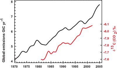
Figure 2: Annual global CO2 emissions from fossil fuel burning and cement manufacture in GtC yr–1 (black), annual averages of the 13C/12C ratio measured in atmospheric CO2 at Mauna Loa from 1981 to 2002 (red) (IPCC AR4 WG1 Ch. 2).
Further confirmation comes by measuring oxygen levels in the atmosphere. When fossil fuels are burned, the carbon in the fossil fuels are joined to oxygen, creating carbon dioxide. As CO2 increases in the atmosphere, oxygen decreases. Observations show oxygen levels are falling at a rate consistent with the burning of fossil fuels.
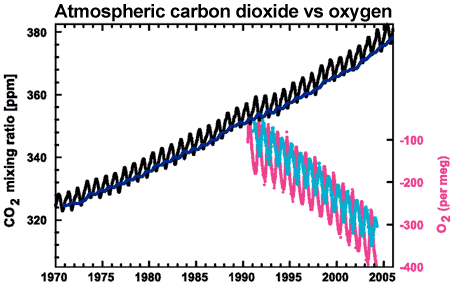
Figure 3: CO2 concentrations from Mauna Loa, Hawaii (black) and and Baring Head, New Zealand (blue). In bottom right corner is atmospheric oxygen (O2) measurements from Alert, Canada (pink) and Cape Grim, Australia (cyan) (IPCC AR4 WG1 2.3.1 adapted from Keeling et al. 2006).
Satellites measure infrared radiation as it escapes out to space. A comparison between satellite data from 1970 to 1996 found that less energy is escaping to space at the wavelengths that greenhouse gases absorb energy (Harries et al. 2001). Thus the paper found "direct experimental evidence for a significant increase in the Earth's greenhouse effect". This result has been confirmed by more recent data from several different satellites (Griggs & Harries 2004, Chen et al. 2007).
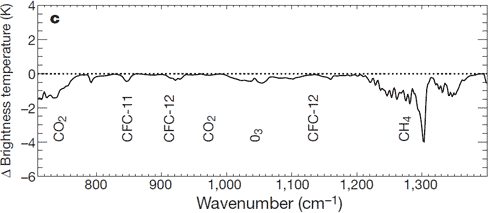
Figure 4: Change in spectrum from 1970 to 1996 due to trace gases. 'Brightness temperature' indicates the equivalent blackbody temperature (Harries 2001).
That less heat is escaping out to space is confirmed by surface measurements that find more infrared radiation returning to earth. Several studies have found this is due to an increased greenhouse effect (Philipona et al. 2004, Wang & Liang 2009). An analysis of high resolution spectral data allows scientists to quantitatively attribute the increase in downward radiation to each of several greenhouse gases (Evans 2006). The results lead the authors to conclude that "this experimental data should effectively end the argument by skeptics that no experimental evidence exists for the connection between greenhouse gas increases in the atmosphere and global warming."
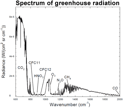
Figure 5: Spectrum of the greenhouse radiation measured at the surface. Greenhouse effect from water vapor is filtered out, showing the contributions of other greenhouse gases (Evans 2006).
Another human fingerprint can be found by looking at temperature trends in the different layers of the atmosphere. Climate models predict that more carbon dioxide should cause warming in the troposphere but cooling in the stratosphere. This is because the increased "blanketing" effect in the troposphere holds in more heat, allowing less to reach the stratosphere. This is in contrast to the expected effect if global warming was caused by the sun which would cause warming both in the troposphere and stratosphere. What we observe from both satellites and weather balloons is a cooling stratosphere and warming troposphere, consistent with carbon dioxide warming (Karl, 2006; Santer et al., 2013)
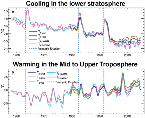
Figure 6: (A) Change in lower stratospheric temperature, observed by satellites (UAH, RSS) and weather balloons (HadAT2 and RATPAC), relative to period 1979 to 1997, smoothed with seven month running mean. Major volcanic eruptions indicated by dashed blue lines (Karl 2006).
If an increased greenhouse effect was causing warming, we would expect nights to warm faster than days. This is because the greenhouse effect operates day and night. Conversely, if global warming was caused by the sun, we would expect the warming trend to be greatest in daytime temperatures. What we observe is a decrease in cold nights greater than the decrease in cold days, and an increase in warm nights greater than the increase in warm days (Alexander et al. 2006, Fan 2010). This is consistent with greenhouse warming.
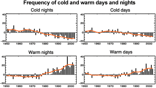
Figure 7: Observed trends (days per decade) for 1951 to 2003 in the number of extreme cold and warm days and nights per year. Cold is defined as the bottom 10%. Warm is defined as the top 10%. Orange lines show decadal trend (IPCC AR4 WG1 FAQ 3.3 adapted from Alexander et al. 2006).
Note: The paragraph below figure 1 was updated on July 2, 2023 by John Mason.
 |
The Skeptical Science website by Skeptical Science is licensed under a Creative Commons Attribution 3.0 Unported License. |