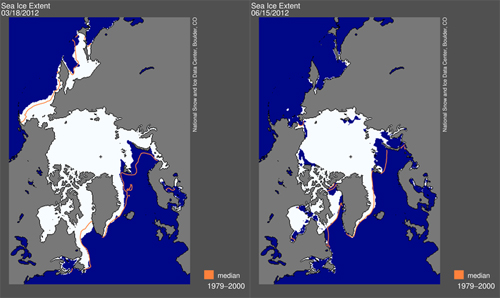
Sea ice extent maximum on the left and how it looks now on the right (source: NSIDC)
If you want to mislead people into thinking that there is nothing weird going on in the Arctic, you have to do it during winter. In winter things almost look normal on some graphs, with gaps between trend lines and long-term averages not as ridiculously big as during spring and summer. If you're lucky anomalous weather patterns can make those trend lines come real close to the long-term average, and you'll have a couple of weeks of shouting 'recovery', ridiculing scientists and suggesting graphs are being cooked. It's an annual ritual on pseudo-skeptic blogs, which is only logical. The Arctic is becoming ever more problematic for their life work, ie denying AGW could ever be a problem and thus delaying any meaningful action on mitigating the consequences of AGW. Thank God water still freezes in winter.

Sea ice extent maximum on the left and how it looks now on the right (source: NSIDC)
But what happens in winter is only interesting in so far as it influences the melting season that comes after it. The fact that this year saw a late finish to the freezing season, with an extreme expansion of sea ice into the Bering Sea, was far from irrelevant, but it didn't tell the whole story either. Another part of that story was covered in a guest blog on ClimateProgress in February (Arctic Sea Ice Update: Spectacular and Ominous), and the whole story as I saw it was told in this SkS post: Arctic Winter Analysis. It quite simply came down to this: "Sea ice on the Atlantic side of the Arctic looks vulnerable, sea ice on the Pacific side should be thicker."
The melting season is well underway now and in the last two weeks sea ice has been disappearing so fast that 2012 is leading all other years on practically all sea ice extent and area graphs. Take for instance this graph I've made, based on Cryosphere Today sea ice area data: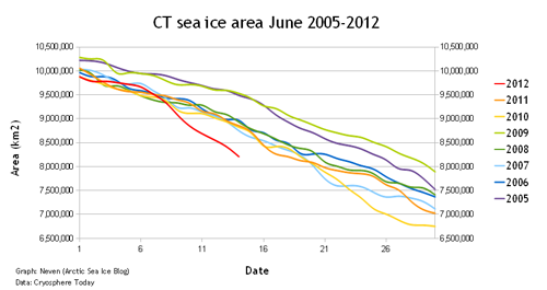
That looks pretty spectacular, doesn't it? Sea ice area has never been so low for this date in the satellite record, not even close to it. 2012 has over half a million of square kilometres less ice than record minimum years 2007 and 2011.
There was a distinct possibility this would happen, although I didn't expect it to happen quite this early. But now that it has happened, it's not difficult to see what the causes are. First of all, the extra ice in the Bering Sea that caused the late maximum, was wafer-thin and so has now virtually disappeared (I compared this year's situation with previous years in this post on the ASI blog). All the easy ice is as gone as the easy oil.
Second, that vulnerability on the Siberian side of the Arctic is becoming ever more visible, with the Northern Sea Route possibly opening up for commercial shipping very early this year. Here's a comparison to previous years for the western part of the Northern Sea Route (the eastern side doesn't look so great either):
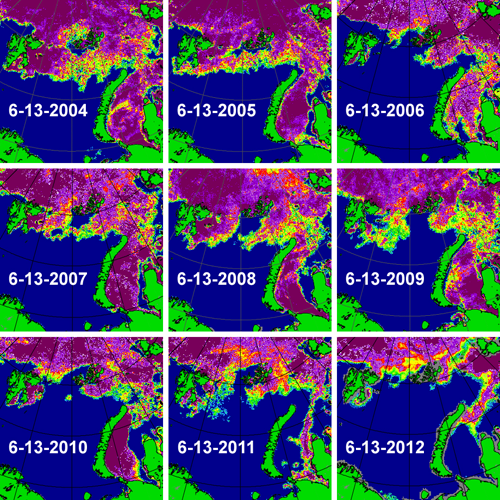 Go to Cryosphere Today to see how the Arctic regions are called
A third reason for the recent rapid decline is the widespread formation of melt ponds on ice floes. These are fooling satellite sensors into believing that there is open water where there actually isn't, causing sea ice area to go down faster than sea ice extent. The NSIDC FAQ page explains it well:
A simplified way to think of extent versus area is to imagine a slice of Swiss cheese. Extent would be a measure of the edges of the slice of cheese and all of the space inside it. Area would be the measure of where there is cheese only, not including the holes. That is why if you compare extent and area in the same time period, extent is always bigger.
One could say those melt ponds are making the trend lines artificially low, especially on sea ice area graphs. Although this is true, it isn't the only reason for the recent nosedive and at the same time it's an indication of how much the Sun is beating down on the Arctic right now. We are approaching Summer Solstice, meaning that the Sun shines practically all day in these northern latitudes, and thus heat will accumulate everywhere where there are clear skies and no ice to reflect the incoming sunshine.
This effect has started to become visible on the sea surface temperature anomalies all around the Arctic:
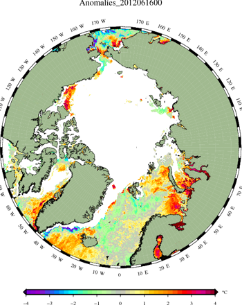 source: Danish Meteorological Institute
The water seems to be warming up big time in the polynyas (large stretches of open water) that recently opened up, especially in the Kara and Barents Seas, that are 'coincidentally' thought to be a source for some of the blocking patterns that cause outbursts of cold air to spill out from the Arctic and cause extreme winter conditions further down on the Northern Hemisphere (also known as WACC, Warm Arctic Cold Continents).
One could also say that the stage is being set for the latter part of the melting season, as sea surface temperatures play a big role in the final outcome of the melting season. But that's a worry for later. What can we expect in the short-term? Will trend lines continue to plummet?
Short answer: I don't think they will. The weather conditions that let all that built-up melting potential come to fruition, are in the process of switching. And although this means that those Siberian Seas are also going to get a good dose of sunshine, and the Northwest Passage (which is still chock-full of ice right now) will start opening up as well, the speed of the decline will probably level off a bit on those sea ice extent and area graphs. Until weather conditions switch again, of course.
Here's a brief explanation of how it works in general with those Arctic weather systems:
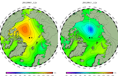
These images from the Danish Meteorological Institute show the distribution of sea level pressure (SLP) in the Arctic. The image on the left is from 10 days ago and has a big red/orange blob over the Beaufort Sea and the Arctic Basin. This was the big high-pressure system that was responsible for the rapid decline of the past two weeks. High-pressure systems do two things. They bring clear, cloudless skies and they cause winds that turn in a clockwise (or anti-cyclonic) direction. Those black lines are called isobars and they give an indication of how the winds are blowing. In this case those winds caused the ice to move away from the Canadian coast, and on the other side of the Arctic to be blown out into the Atlantic (some of that ice being thicker, multi-year ice).
We see the exact opposite in yesterday's SLP image on the right. This low-pressure system has moved over the Central Arctic in the last couple of days, bringing clouds and cyclonic, anti-clockwise turning winds that makes the ice pack turn in reverse again. It won't make the melting stop, in fact, clear skies over the Siberian Seas will guarantee a lot of heat accumulation there (which will come into play at the end of the melting season and the start of autumn), but trend lines on the various sea ice area and extent graphs will stop falling off a cliff. The current weather forecast is for this low-pressure system to dominate the Arctic for the coming 4-5 days. After that it's anybody's game.
And so I conclude: Nothing in the Arctic is a dead certainty. But if one thing is clear after the first phase of the melting season, it's that there's a very high chance of records being broken again if this year's weather conditions resemble those of last year or 2010. This of course has to do with a high probability that the ice pack is overall thinner than ever. If weather patterns resemble those of 2007, the year of the perfect storm (with high-pressure systems on the American side of the Arctic for the entire melting season), it will become clearer than ever that something weird and potentially dangerous is going on in the Arctic.
I'll report again if and when something worthwhile happens. In the meantime go to the Arctic Sea Ice blog if you want to read more regular and detailed updates. And check the daily updated graphs, maps and webcams on the Arctic Sea Ice Graphs website.
Posted by Neven on Wednesday, 20 June, 2012
 |
The Skeptical Science website by Skeptical Science is licensed under a Creative Commons Attribution 3.0 Unported License. |