


 Arguments


Arctic Winter Analysis
Posted on 12 May 2012 by Neven
This is a re-post from the Arctic Sea Ice blog.
 I'm starting this blog post off with a conclusion that was reached a while back already: sea ice on the Atlantic and Russian side of the Arctic
looks vulnerable, sea ice on the Pacific and North American side
should be thicker.
Right, with that out of the way we can now look at various aspects of the 2011/2012 freezing season, and compare them to previous years, to be precise the previous freezing season of 2010/2011, and the freezing seasons leading up to and following that other record year: 2006/2007 and 2007/2008. Simply put: I'll be comparing 2007, 2008, 2011 and 2012 before their respective start of the melting season.
I'll try not to use too many words, but I'll be using a lot of images. A bigger version of these images can be found by clicking on them in the original blog post.
Ice age
I'll start with the AARI ice age maps. These images are for the end of April, and they look upside down, because it's from the perspective of the Russians who produced them:
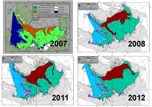
This year, at the end of April, the Arctic seems to hold less of the brown 'old ice' than last year and 2007 (older version), and a tad more than 2008, that had relatively little multi-year ice (MYI) after the 2007 melting season/massacre.
Another source that was already mentioned in the A first clue blog post, were these images based on data compiled by NASA senior research scientist Josefino Comiso from NASA's Nimbus-7 satellite and the U.S. Department of Defense's Defense Meteorological Satellite Program (credit: NASA/Goddard Scientific Visualization Studio). The images show the amount of MYI at its maximum, I presume:
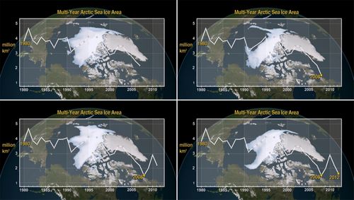
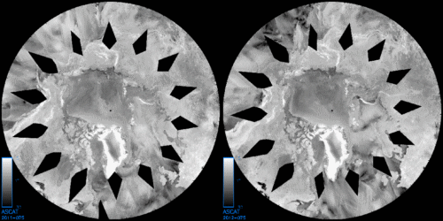
These images look similar to the ones from AARI, with 2012 showing less old ice/MYI than 2007 and 2011, and a bit more than 2008 (look at the graph in the bottom right image). However, at the time a flag was raised by Spanish blogger Diablobanquiso on his excellent blog, maintaining there was more MYI than AARI and Comiso indicated. He based himself on ASCAT radar images, where slightly brighter white represents older ice. The following image shows March 16th 2011 and March 15th 2012 side by side (unfortunately there are no radar images available from 2007 and 2008), with 2012 merging into an image made by Diablobanquisa, showing what part was missing from AARI and Comiso:
In my view he was proven right when James Maslanik and Chuck Fowler produced their bi-yearly graph/map for NSIDC, showing March ice age distribution, compared here with our other years of interest:
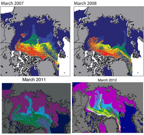
Here we see the zone delineated by Diablobanquisa on the ASCAT radar images that reaches much further towards the East Siberian Sea. Could it be that Comiso and AARI overlooked it because it stands out less clear than the rest of the MYI on the radar images? Maybe there's a difference in the way the respective teams define old ice/MYI. Either way, it still looks like 2012 has less old ice/MYI than 2011 and 2007, but more than 2008.
This isn't surprising as there has been a lot of transport of ice towards Greenland and the Canadian Archipelago, and through Fram Strait.
Sea level pressure and ice drift
The movement of ice floes is largely determined by wind, and wind is largely determined by sea level pressure gradients. So let's first have a look at SLP maps from NOAA's Earth Science Research Laboratory (daily mean composites page). I have divided the freezing season up into 3 parts with a duration of two months each:
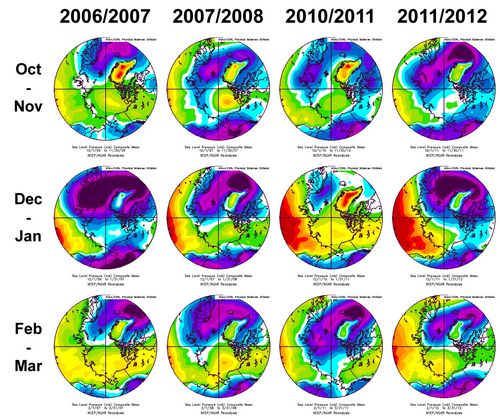
Obviously the mean of two months of SLP patterns will look similar from year to year, but there is still some interesting info here. Take a look for instance at the purple-blue region of low pressure around Greenland. Low pressure means winds blowing counter-clockwise, so the intensity of this low pressure area tells us something about ice transport through Fram Strait and towards Greenland and the Canadian Archipelago. Darker purple means more transport, and particularly the Dec-Jan row looks intense in this sense for this winter and the winter preceding the 2007 melting season.
Also noteworthy is how far the purple blot stretches towards Siberia. Looking at Dec-Jan for this year and last year we see that the low doesn't stretch all the way over Novaya Zemlya, which partially explains why that region showed a retreat of ice earlier on in 2012 and 2011: westerly winds blowing between high and low pressure systems.
One last thing I noted is that comparing Dec-Jan from year to year, and also Feb-Mar from year to year, the pressure over Siberia seems to be getting higher every winter. Whether this means anything with regards to the WACC theory (Warm Arctic, Cold Continents), I wouldn't know. Either way, it's not relevant to this Winter Analysis.
The effect of the various SLP patterns can also be seen on these excellent IFREMER/CERSAT sea ice drift maps (hat-tip yet again to Diablobanquisa). I've made an animation covering the October-March period of 2011/2012:
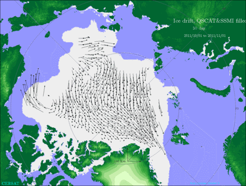
In December and January there are a lot of long arrows, pointing towards Fram Strait, but also to Greenland, the Canadian Archipelago and the Beaufort Sea. This explains in large part why the ice pack looks vulnerable on the Atlantic/Siberian side of the Arctic, and should be stronger on the Pacific/North American side of the Arctic. But there are other factors as well.
Air and sea surface temperatures
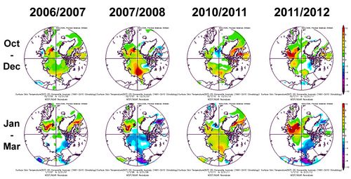
For SAT and SST images we turn again towards that most excellent tool: the daily mean composites page from NOAA's Earth Science Research Laboratory. First of all the surface air temperatures of the four freezing seasons, divided into two periods:
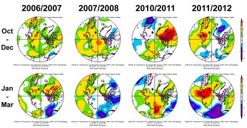
With regards to the first half of the freezing season we see that in 2006/2007 and 2007/2008 large parts of the Arctic are anomalously warm, and the freezing season of 2010/2011 had a very big anomaly over Baffin Bay and the Canadian Archipelago. In the second half of the last freezing season the contrast between the positive anomaly in the Barentsz/Kara region and the negative anomaly in the Bering Sea is very pronounced.
And now for the SSTs:
I'm not really sure how useful this is, because it would seem to me that satellites can't measure SSTs when the sea is covered by ice (maybe I did something wrong while entering the parameters on the daily mean composites page), but nevertheless we see again a big contrast between the Atlantic and Pacific sides of the Arctic for the second half of the past freezing season, a contrast that translated into record anomalies in the Barentsz and Bering Seas.
Ice thickness
One final comparison to look at are the thickness maps generated by the Naval Research Laboratory's PIPS model and its follow-up, the Arctic Cap HYCOM/CICE/NCODA Nowcast/Forecast System (ACNFS):
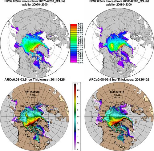
There seems to be a lot more of the thickest 4-5 meter thick ice north of Greenland and the Canadian Archipelago when compared to 2008. But then again, PIPS wasn't the best tool for ice thickness projections, so I'll just have a look at higher-resolution ACNFS images and compare 2012 to 2011.
There seems to be less thick ice now than last year, but overall it's thicker, which makes sense, after all those winds pushing the winds from Siberia towards Greenland, the Canadian Archipelago and the Beaufort Sea in December and January. Here too the Atlantic side of the Arctic looks vulnerable, compared to last year, and there's a lot more (thin) ice in the Bering Sea.
---
So that was all the evidence for the conclusion given at the start of this blog post. The big questions now are of course:
- How thick is the ice on the North American and Pacific side of the Arctic?
- Will it be able to fend off the attacks from the west/south, just like in 2010 and 2011?
- How fast will the ice on the Atlantic and Russian side disappear?
- What will the effect of that be on local SSTs and the adjacent ice edge?
How this plays out, mostly depends on the weather, albeit less so than in the past when ice was thicker. We will be keeping a close watch through the (bi-)weekly ASI updates, the monthly NSIDC and PIOMAS updates, comparisons of sea ice concentration maps and an animation here and there.


 0
0  0
0 judgement: not very healthy.


Comments