A recent comment thread at RealClimate contains some loose talk about Skeptical Science (SkS), including one commenter's complaint that SkS has not (or not adequately) discussed the climate projections of the IPCC's 1990 First Assesment Report (FAR). Although we have posted about the FAR in the past, this is a good time to take another look.
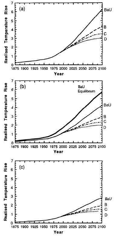
Figure 1 shows the IPCC's 1990 projections from FAR, figure 6.11, page 190 (the original pdf is a scanned image that is slightly skewed; I have corrected that here).

Figure 1: IPCC FAR Figure 6.11, surface temperature projections
As you can see, the IPCC shows three graphs in the figure, for three different equilibrium climate sensitivities (how much the planet will warm in response to a doubling of atmospheric CO2 once it reaches energy equilibrium). This is because in 1990, the value of equilibrium climate sensitivity was not well known, and IPCC was covering several possibilities: (a) is for a sensitivity of 4.5° for CO2 doubling (which FAR labels as a "high" estimate); (b) is for 2.5° (FAR calls this the "best" estimate), and (c) is for 1.5° (called the "low" estimate).
Within each graph are four projections based on four emissions scenarios. So there is not one climate projection in the FAR, but twelve different projections based on twelve different possibilities. Here are my measurements of the temperature increase rates (in °C per decade) shown in the figure of these twelve possibilities, for the period 1990-2010 (Table 1).
Table 1: FAR Figure 6.11 Surface Temperature Projections
| Emissions Scenarios: | ||||
|---|---|---|---|---|
| Equilibrium Sensitivity | BaU | B | C | D |
| 4.5° (High estimate, graph a) | .35 | .25 | .25 | .25 |
| 2.5° (Best estimate, graph b) | .24 | .20 | .18 | .17 |
| 1.5° (Low estimate, graph c) | .18 | .14 | .12 | .11 |
The discussion on RealClimate was kicked off by recent editorials in the Wall Street Journal (WSJ). Back on January 27, sixteen scientists and engineers (many with undisclosed ties to the oil industry) wrote an editorial in the WSJ minimizing the dangers of global warming.
The editorial drew quite a few negative reviews because of its bad science. Economist William Nordhaus publicly complained that the Gang of 16 had misrepresented his work, and subsequently wrote an article setting the record straight that his research shows the opposite of what the WSJ "skeptics" claimd (climate mitigation actually saves money). And at least two negative letters to the editor appeared in WSJ's own pages: one by Robert Bryer of the American Physical Society, and one by Kevin Trenberth and 37 other noted climatologists. The original editorial ran about 1200 words, while the two letters to the editor were about 700 words combined.
On February 21, the WSJ doubled down with another 1900 words from the Gang of 16. One would think that a reputable newspaper, having been accused of misrepresentation in the first instance, would exercise great caution when publishing a second go-round by the same authors. Alas, this was not the case. The WSJ and its Gang of 16 have simply dug the hole deeper, this time by misrepresenting the FAR. Here's the graph that appeared in the WSJ:
Figure 2: The WSJ figure (misrepresentation), intended to show how bad climate models are
The eye is immediately drawn to the high-slope line labelled "IPCC 1990." This line shows a temperature increase of 0.32°C per decade, far outside of most climate projections. Looking back at Table 1, only one projection is anywhere close to the 0.32°C per decade increase that the WSJ graph shows: the business-as-usual (BaU) scenario coupled with a sensitivity of 4.5°C. This raises two important questions.
1. When the IPCC report shows three possibilities for climate sensitivity, is it fair to claim (or to imply) that the highest of those three is more preferred by the IPCC than the other two?
I think any fair-minded person would say the answer is no. In fact, most people would say that if any were preferred, it would be the middle of the three, not either extreme. And since the IPCC itself labels the middle of these estimates as "best," they have answered the question themselves. Using the "high" estimate alone, as the WSJ has done, is misleading at best.
Beyond that, current science has narrowed the range of possibilities for equilibrium climate sensitivity considerably. Both the 1.5°C and 4.5°C sensitivities now seem unlikely. The best estimte from the most recent IPCC report is about 3°C, while Royer et. al. (2007) puts it at 2.8°C based on 500 million years of climate data. So the middle of the three possibilities in 1990 has indeed turned out to be the most likely. The IPCC's label of "best" was correct at the time.
2. Of the four emissions scenarios in these graphs, which has been closest to the emissions we have actually experienced during the past 20 years?
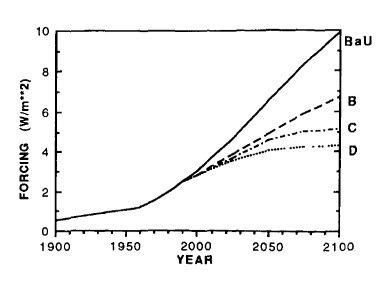
Figure 3 shows the FAR's projections of radiative forcing for the four emissions scenarios they considered.

Figure 3: FAR Figure A.6, radiative forcing under different emissions scenarios
Once again the figure from the pdf scan was skewed and was corrected before analysis. Table 2 summarizes those forcing estimates.
Table 2: FAR Figure A.6 radiative forcing projections from 1990 to 2010
| Scenario | Change in forcing, 1990-2010 |
|---|---|
| BaU | +1.23 W/m² |
| B | +0.78 W/m² |
| C | +0.70 W/m² |
| D | +0.63 W/m² |
| Actual | +0.63 W/m² |
The actual forcing increase of +0.63 W/m² is from NOAA's Annual Greenhouse Gas Index. The FAR projections were based on four emission scenarios, and we now know that Scenario D was virtually identical to what we have actually experienced, and about half that of the BaU scenario. The BaU scenario of 1990 did not actually happen.
The collapse of the former Soviet Union led to a decimation of Soviet Block industry which nearly halved Eastern European emissions. In addition, the Montreal Protocol put an end to manufacturing of some of the most potent chlorofluorocarbons (CFCs, which are greenhouse gases), and its effect has been swift. Also, growing global recognition of the threat of climate change has rapidly increased the adoption of renewable energy, both in the US and especially in Europe; government subsidies such as feed-in tarrifs have encouraged this trend. Meanwhile, the rising price of fossil fuels has led to slower economic growth than most would have predicted in 1990.
If we look again at the temperature predictions for Scenario D, the FAR predictions were increases of 0.25, 0.17, and 0.11°C per decade, based on sensitivities of 4.5, 2.5, and 1.5°C for CO2 doubling, respectively. The central figure of 0.17°C, based on the best sensitivity estimate, is virtually identical to the actual observed temperature increase over the past 30 years (Figure 4). Foster & Ramstorf (2011) puts the increase at 0.16 +/- .02°C per decade.
Figure 4: Actual IPCC FAR projections under observed emissions (Scenario D) compared to observed temperatures from NASA GISS
To summarize, the IPCC's First Assesment report of 1990 hit the bullseye in terms of climate modeling. It was a remarkably accurate projection, especially considering that the climate models available in 1990 were crude by modern standards.
As it happened, world events took an unpredictable turn in the 1990s which limited emissions growth to the low end of IPCC FAR predictions. The work of the IPCC, such as FAR, has been a spur to these collective actions, and is the reason IPCC was awarded the 2007 Nobel Peace Prize.
The Wall Street Journal's misrepresentation of the IPCC's work does a disservice to its audience, to the public, and to mankind as a whole.
Posted by keithpickering on Saturday, 3 March, 2012
 |
The Skeptical Science website by Skeptical Science is licensed under a Creative Commons Attribution 3.0 Unported License. |