The GLOBAL global warming signal
Highlights
- New global temperature series confirm the GISTEMP results using only the HadCRUT3, NCDC and/or UAH data.
- Once El Nino is taken into account there is no evidence for a slowdown in warming over the period 1996-2010.
- If the HadCRUT4/HadSST3 ocean temperature corrections are also included then the underlying global warming rate is ?0.2°C/decade.
- There remain uncorrected cool biases in the temperature trends.
Introduction
Global warming involves warming of the whole globe (the clue is in the name), but it does not necessarily affect every part of the globe at the same rate.
Different parts of the globe can experience very different changes under greenhouse warming. As a result, if you want to measure global warming, you have to measure the whole globe, not just a part of it. But of the three main in situ temperature records (GISTEMP, NCDC and HadCRUT), only GISTEMP is near-global in coverage over recent decades, and only by means of allowing each weather station to cover a larger region of the map. The incomplete coverage of the Hadley and NCDC datasets may be seen in Figure 1, along with three global temperature reconstructions.
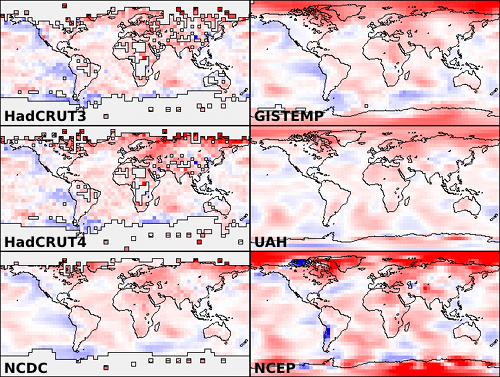 Figure 1: Coverage maps for various temperature series. Colors represent mean change in temperature between the periods 1996-2000 and 2006-2010, from +2C (dark red) to -2C (dark blue). Note that the cylindrical projection exaggerates the polar regions of the map.
In this article I will attempt to redress the balance by presenting 16 new versions of the temperature record (10 of which I consider to be realistic), each of which has global or near-global coverage. Thirteen of these are created by creating a composite of a non-global series (HadCRUT3/4, NCDC or BEST) with a global series (GISTEMP, UAH or the NCEP/NCAR reanalysis). The remaining three series are derived by extrapolating the HadCRUT3/4 and NCDC data.
As with my previous article, these results have not been subject to peer review and should be treated as tentative. However the diversity of methods and consistency of the results are strongly suggestive.
Summary of results
I will start by summarizing the results, and then describe the methods and data in detail.
Since the main impact of incomplete coverage is seen in recent temperature trends, we will start by looking at these. The trend over the 15 year period 1996-2010 is shown in Figure 2 for each of the 16 new temperature series (colored bars), compared to the official versions (white bars with coverage percentages superposed). Some of the temperature series have known problems, however two clusters of likely trends have been identified; I have named these the GISS cluster (due to similarity with GISTEMP) and the Had4 cluster (for series based on HadCRUT4).
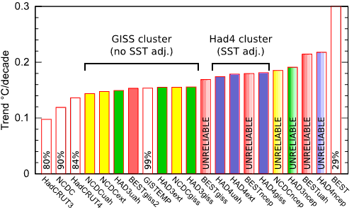 Figure 2: Global temperature trends 1996-2010
The global temperature records from these two clusters are shown in Figure 3, along with GISTEMP, NCDC and HadCRUT3 using a 60 month moving average. Use the buttons below the graph to select between 30- and 60- year views. The records are also available as a .CSV file which may be read into any spreadsheet program.
The 15 year trend (1996-2010) for the GISS cluster of 6 temperature series is 0.147°C/decade (this is the value for NCDCext, chosen because it is unaffected by the HadSST2 1998 discontinuity). However there has been a tendency towards more frequent La Nina conditions over the period, which has impacted this trend. Foster and Rahmstorf (2011) estimate this influence at -0.026°C/decade, so the underlying warming trend is 0.173°C/decade. This is comparable to the 0.17°C/decade long term trend found by Foster and Rahmstorf. (They also estimate a net cooling effect due to the solar and volcanic influences, however these terms are less well determined and so I have omitted them.)
The 15 year trend (1996-2010) for the Had4 cluster of 3 temperature series, each of which includes the new HadSST3 bias corrections, is 0.179°C/decade (for HAD4ext). Including the El Nino term, the underlying warming trend is 0.205°C/decade.
The two representative trends quoted above are conservative estimates and include a known cool bias due to smoothing - the other trends variously include known cool and warm biases. There is additional evidence for each of these biases, but they have not yet been quantified.
The problem
I have presented 3 articles on the subject of coverage bias - HadCRUT3: Cool or uncool?, GISTEMP: Cool or uncool? and HadCRUT4: Analysis and critique. The most important issues are as follows:
- Poor coverage of both poles leads to a signficant cool bias in the Hadley and NCDC datasets.
- This has become an issue since around 1980 because rapid greenhouse warming leads to a significant change in the global distribution of temperatures.
How can this problem be addressed? Two approaches are explored here. We could use a globally complete dataset, such as the GISTEMP extrapolated data, the UAH satellite data, or the NCEP/NCAR reanalysis data to fill in the missing regions of the map. Alternatively, we could simply extrapolate the Hadley or NCDC data to fill in the missing regions of the map. We will consider each of these approaches in turn.
Coverage completion using two datasets
In HadCRUT4: Analysis and critique I showed how the GISTEMP or UAH map data could be used to estimate the coverage bias in the Hadley datasets. The basic method was to work out how much the GISTEMP (or UAH) temperature estimate for any month would be biased if its coverage were reduced to match the corresponding month from the Hadley dataset (with one caveat - the map series need to be adjusted to have the same baseline period).
But if we know how big the bias is, we can correct for it by subtracting the bias term from the biased data, and thus create an unbiased temperature series. To do this we need two temperature series:
- A time series, which provides data with good temporal stability, but incomplete geographical coverage, and
- A coverage series, which provide data with good geographical coverage. Temporal stability is not required for this series.
Map series are required for both datasets. The maps from the time series are used to determine a coverage mask for each month, and a (biased) global temperature estimate. The maps from the coverage series are used to determine the coverage bias. Temperatures for the coverage map are calculated with and without the mask - the difference between them is an estimate of the coverage bias.
There is an alternative (mathematically equivalent) way of looking at this method. We are taking the map from the coverage series, and adding a constant to every cell so that the mean of the map matches the mean of the times series map over cells where they both have coverage. The average over the whole of the adjusted coverage map then provides the unbiased temperature estimate.
It should be clear that we can add or subtract a constant to every cell in a map for the coverage series - and thus adjust the global temperature for that series up or down for any month - without affecting the result. Thus temporal instability or bias in the coverage series does not affect the results. The only factor which affects the results is the difference in mean temperature between the masked region and the whole map.
I have performed this calculation using 4 time series and 3 coverage series. The time series are as follows:
- HadCRUT3: The HadCRUT3 dataset has 80% global coverage over the past 15 years, with poor coverage of the Arctic, Antarctic and also parts of Africa, Asia and Australia.
- HadCRUT4: The HadCRUT4 dataset has 84% global coverage over the past 15 years. It improves the land coverage of the Arctic, Asia and Australia, but not the Arctic ocean, Antarctica or Africa.
- NCDC: The NCDC dataset has 90% global coverage over the past 15 years. This relatively good coverage is acheived by filling in missing map cells by modelling the long range geographical variations in the data. However this infilling step is only performed at low latitudes, hence the lack of polar coverage seen in Figure 1.
- BEST: The BEST dataset only covers the land area (i.e. 29%) of the planet. However this is just another kind of incompleteness, and so can be addressed in the same way as the incompleteness in the Hadley and NCDC datasets. The BEST preliminary data only runs to March 2010, so to estimate the trend to the end of 2010 the trend to the end of the data has been adjusted downward by 0.006°C/decade (this figure being the change in the GISTEMP trend on the same period when the last 9 months are omitted). The BEST team do not distribute map series, so I have assumed complete coverage of land areas only.
The coverage series are as follows:
- GISTEMP: The GISTEMP dataset provides ~99% coverage over the period 1996-2010, by allowing each weather station to provide temperatures for a 1200km radius circle about the station rather than an arbitrarily sized grid box. (The 1200km radius was determined by examining temperature variations in regions with plentiful weather stations.) However it is based on much of the same data as the time series datasets, and so does not provide significant additional information.
- UAH: The UAH satellite series by contrast is an independent source of temperature data. Coverage is near global, with 5° around the pole interpolated, and the entire globe is sampled by a single instrument. High altitude locations such as the Antarctica and the Andes are problematic however, with some ground contamination of the microwave signals. A bigger issue is temporal stability - there have been numerous adjustments to the data over previous years, and there are still significant uncertainties, see for example Of Satellites and Air, Seeing the BEST part of the Satellite Temperature Record?, and a comparison of UAH and RSS. Also UAH measures lower troposphere (LT) temperatures which are not directly comparable to surface temperatures - from Figure 1 it may be seen that the geographical variation is slightly muted in comparison to GISTEMP. As a result the UAH data is expected to undercorrect any coverage bias.
- NCEP/NCAR reanalysis: The NCEP/NCAR reanalysis dataset provides an alternative method of determining global temperatures. Instead of just performing a statistical analysis of the weather station and sea surface observations, the reanalysis attempts to construct a complete model of the state of the Earth's atmosphere at any point in time. This is achieved by using a modern weather model to produce a 'nowcast' for any date in the past using not just the weather stations, but also data from weather balloons, satellites and radar. This data is less useful for determining long term trends because the results are influenced by the introduction of new data sources (in particular the satellite data in 1979; e.g. Chen et al, 2008), but is useful for determining a physically consistent geographical picture.
These datasets allow the construction of 12 composite series. These have been named using a composite of the name of the time series followed by the name of the coverage series, i.e. HAD3giss, HAD4giss, NCDCgiss, BESTgiss, HAD3uah, HAD4uah, NCDCuah, BESTuah, HAD3ncep, HAD4ncep, NCDCncep, BESTncep.
One additional issue arises with the BEST time series data. Since the BEST data is based on land stations and covers land areas only, to make a realistic assessment of bias, the common coverage region of the coverage series map must be defined in the same way. In the GISTEMP land-ocean data and in the UAH and NCEP data, coastal cells contain a hybrid of land and ocean temperatures, which prevent the calculation of an uncontaminated land-only series. This leads to an undercorrection, and so an overestimate of the resulting trends. To address this issue I constructed one additional composite series - BESTgiss2 - in which the common coverage temperature for GISTEMP was constructed from the GISTEMP land-only data (i.e. the dTs 1200km dataset).
Extrapolating a single dataset
The simplest approach to improving the coverage of a temperature series is to fill in any map cell for which no observations are available with the temperature from the nearest cell for which an observation is available. Omitting the cell completely is mathematically equivalent to setting it to the mean value for the whole map. The reasoning for using a nearby value is that this is likely to be a better estimate of the temperature than the value of the more distant cells which comprise the bulk of the map. Like GISTEMP I have imposed a maximum distance limit of 1200km, which is enough to provide near complete coverage for most of the last 60 years.
GISTEMP uses a related but more sophisticated approach of allowing each station to influence an area of radius 1200km around the station, with a weight that decreases with distance. This is a form of kernel smoothing.
These methods are not without their own biases. If the missing region represents an extreme of temperature anomaly, then the global average from the incomplete data will be biased, as shown in Figure 4. Kernel smoothing introduces two effects - firstly it flattens out both high and low extremes (which doesn't introduce a bias in the global average), and secondly it extrapolates from well populated regions into sparsely populated regions (which does). As a result, GISTEMP and GISTEMP-based temperature series (see below) may be expected to have a cool bias.
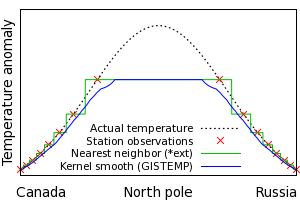 Figure 4: Bias due to nearest neighbor or kernel smoothing
Can this cool bias be confirmed from the data? GISTEMP provide two datasets based on land temperate stations only: dTs 1200km and dTs 250km, which differ in the area of influence of a given station. The 250km radius dataset should show less smoothing bias over the region where both datasets have coverage. Temperature series were therefore calculated for both series over the region where they share coverage, and the trends on the period 1996-2010 compared, with the following results:
| GISTEMP dTs 250km: |
0.312°C/decade |
| GISTEMP dTs 1200km: |
0.284°C/decade |
Note that this bias only applies to temperatures estimated from land stations, but does not account for regions where there is no coverage and thus no bias estimate is available. Therefore at this stage the total impact of this bias is unknown.
The extrapolation approach allowed the construction of 3 additional series, named using the name of the time series and the suffix 'ext', i.e. HAD3ext, HAD4ext, NCDCext. Extrapolation cannot be applied to the BEST data due to the lack of maps and the small starting coverage.
Results
The trends in °C/decade on the 15 year period 1996-2010 (with the previously noted caveat for the BEST data) are given in the following table for all 16 new temperature series. Values I consider likely to be unreliable are given in italics.
HAD3giss
0.156 |
HAD3uah
0.149 |
HAD3ncep
0.191 |
HAD3ext
0.155 |
HAD4giss
0.181 |
HAD4uah
0.174 |
HAD4ncep
0.218 |
HAD4ext
0.178 |
NCDCgiss
0.155 |
NCDCuah
0.144 |
NCDCncep
0.185 |
NCDCext
0.147 |
BESTgiss
0.169 |
BESTuah
0.214 |
BESTncep
0.180 |
BESTgiss2
0.153 |
The following details are noteworthy:
-
HAD3giss duplicates GISTEMP very well. This makes sense, given that we already know that HadCRUT3 and GISTEMP agree well where they share coverage. HAD4giss then provides an estimate of what GISTEMP might look like if it adopts the new HadSST3 ocean temperature data.
-
HAD3ext and HAD4ext duplicate HAD3giss and HAD4giss well, but without using the GISTEMP data. Given that GISTEMP also extrapolates into the polar regions (although using a different method), it is unsurprising that the results are similar.
-
HAD3uah and HAD4uah are interesting because they represent a completely independent approach to filling in the missing regions of the globe, and yet give similar results. The undercorrection resulting from the use of satellite data may be seen in the fact that HAD3uah is low and BESTuah is high: The UAH data does not provide enough correction to bring the two results together.
-
The NCDC data gives marginally lower trends than the HadCRUT3 data for each of the above cases, but is otherwise very similar.
-
BESTgiss2 gives an indication of what a global BEST dataset may look like using a current-generation SST dataset. The other BEST temperature series are biased high due to the coastal contamination issue.
-
All of the 'good' datasets (i.e. the GISS cluster, the Had4 cluster and BESTgiss2) suffer either from smoothing bias because they rely on nearest neighbour interpolation or the kernel-smoothed GISTEMP data, or from undercorrected coverage bias because they use the UAH data.
The outlier temperature series (i.e. the ones I suspect are unreliable) are shown in Figure 5. BESTuah highlights the problem of undercorrection when using UAH for infilling - the BEST land-only series overestimates recent warming, and UAH does sufficiently correct for this. The NCEP corrected series also show higher rates of warming over recent decades - this could reflect the fact that they avoid the smoothing bias of the other series, but my working hypothesis is that there is an unindentified problem in using the reanalysis data in this way.
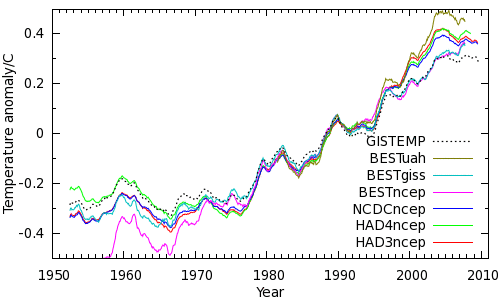 Figure 5: Outlier temperature series
The remaining series, BESTgiss2, is shown in Figure 6. This provides an indication of what a future BEST land-ocean temperature series might look like (assuming that the HadSST3 bias corrections are not included). This series shows more pronounced warming since 2002 than GISTEMP.
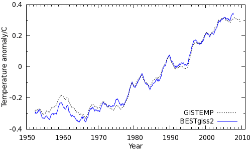 Figure 6: The BESTgiss2 temperature series
Conclusions
Coverage bias signficantly impacts recent temperature trends. The methods used here to estimate and correct for that bias are rudimentary, but present a coherent picture of continued warming. It is striking that three different approaches, when applied to either the HadCRUT3 or NCDC data, yield a record which is very similar to GISTEMP. The same approaches applied to the HadCRUT4 data lead to a greater warming trend owing to the inclusion of the HadSST3 bias corrections.
Taking into account the effect of the El Nino cycle on recent trends, the warming rate of the largest cluster of datasets is consistent with longer term trends. If the HadSST3 adjustments are also correct, the underlying warming rate probably exceeds 0.2°C/decade. There are still known cool biases in each of these time series.
We have not taken any account the impact of a possible increase in aerosol cooling. This raises the worrying possibility that the underlying warming rate has been accelerating, and has been masked by aerosol emissions and the biases in the temperature series. Further developements on SST adjustments and aerosol impacts will hopefully clarify the situation.
Posted by Kevin C on Wednesday, 4 July, 2012
 Figure 1: Coverage maps for various temperature series. Colors represent mean change in temperature between the periods 1996-2000 and 2006-2010, from +2C (dark red) to -2C (dark blue). Note that the cylindrical projection exaggerates the polar regions of the map.
 Figure 2: Global temperature trends 1996-2010
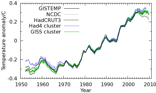
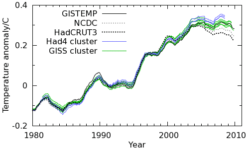
 Figure 4: Bias due to nearest neighbor or kernel smoothing
 Figure 5: Outlier temperature series
 Figure 6: The BESTgiss2 temperature series
