We previously examined a paper published by McLean, de Freitas, and Carter (2009) which showed that most of the short-term variability in lower atmosphere temperatures is due to changes in the El Niño Southern Oscilliation (ENSO). This was not a new finding at the time, but the authors also subsequently claimed that changes in ENSO could explain a substantial amount of the long-term global warming trend. This claim was not supported by the analysis in their paper.
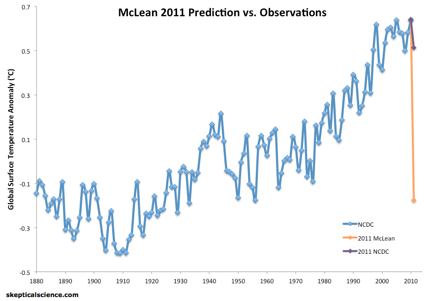
Nevertheless, lead author John McLean predicted a record-shattering cooling for the year 2011, based on the methodology in their paper. As we subsequently documented, that prediction was quite far off (Figure 1).
Figure 1: NCDC global average surface temperature from 1880 through 2010 (blue), McLean's 2011 prediction (orange), and the actual 2011 NCDC temperature (purple).
Average global surface temperatures were cooler in 2011 than 2010 mainly as a result of changes in ENSO. We know that La Niña years tend to be colder at the Earth's surface while El Niño years tend to be hotter (Figure 2).
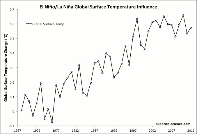
Figure 2: NOAA annual global surface temperatures from 1968 through 2012 with La Niña years in blue, El Niño years in red, ENSO neutral years in black, and volcanic years as orange triangles. Linear trends for 1968–2012 for each of the three categories (excluding volcanic years) are shown in the final frame.
However, McLean predicted:
"It is likely that 2011 will be the coolest year since 1956"
For that to be true would have required overcoming about 0.75°C of global surface warming over the prior 55 years. In short, McLean mistook short-term variability with the long-term global warming trend.
We can also illustrate this difference graphically. A climate contrarian blog attempted to support McLean's failed prediction with the graphic shown as Figure 3.
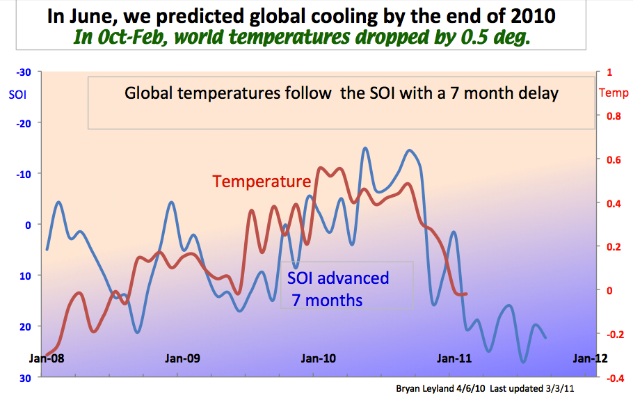
Figure 3: Climate contrarian defense of McLean's 2011 prediction (source)
Again, this shows short-term temperature changes closely following ENSO (specifically the Southern Oscillation Index [SOI]). However, the graphic only shows a very short timeframe. How do SOI and lower atmosphere temperatures compare over the long-term?
We answer this question in Figure 4. This figure compares the same data sets used in McLean et al. (2009): the SOI (blue) compared to lower troposphere temperatures as measured by satellites (by the University of Alabama at Huntsville [UAH], orange) and radiosondes (instruments on weather balloons [RATPAC-A] from NOAA, red).
The first frame shows the same timeframe as in Figure 3, followed by the long-term data since 1958, the linear trends, and finally the de-trended data.
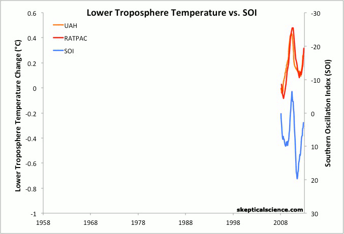
Figure 4: SOI (blue) compared to lower troposphere temperatures as measured by satellites (UAH, orange) and radiosondes (RATPAC-A, red), with 12-month running averages, as in McLean et al. (2013). The first frame shows the data since 2008, the second frame since 1958, the third frame adds the linear trends, and the fourth shows the de-trended data.
As Figure 4 illustrates, SOI has no long-term trend. After all, ENSO is an oscillation which alternates between El Niño and La Niña cycles. Over the long-term, these cycles average out to zero. Meanwhile the lower atmosphere has warmed substantially due to human-caused global warming.
If we remove the long-term warming trends, we can see once again that the short-term wiggles in the temperature data are strongly influenced by changes in ENSO. However, the long-term global warming trends are not – they are due to the human-caused increased greenhouse effect.
Posted by dana1981 on Monday, 6 May, 2013
 |
The Skeptical Science website by Skeptical Science is licensed under a Creative Commons Attribution 3.0 Unported License. |