UPDATE 27 Mar 2014: I just discovered that my talk at the Climate Action Summit was posted on YouTube:
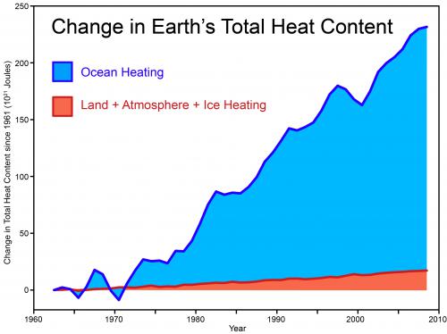
Last weekend, I gave a talk at the Climate Action Summit on the latest climate science. During the talk, I showed the following graph of the Earth's total heat content, demonstrating that even over the last decade when surface temperature warming has slowed somewhat, the planet continues to build up heat at a rate of 4 Hiroshima bomb detonations worth of heat every second. This data comes from a paper lead authored by Australian climate scientist John Church that tallies up the heat accumulating in the oceans, warming the land and atmosphere and melting the ice:
The next day, I was (pleasantly) surprised to see an AAP journalist had written an article about my talk (and also included some of the science on extreme weather presented by the distinguished scientist Lesley Hughes who spoke after me). The headline, "Climate change like atom bomb", focused on the Hiroshima metaphor (which I believe was first used several years ago by James Hansen). The article was picked up by a number of outlets across the world with a curious concentration of coverage in India. Subsequently, a number of people have commented on this metaphor or emailed me questions. So I thought I would address in this post, with some help from Dana Nuccitelli, why we use this metaphor and how the "4 Hiroshima bombs worth of heat per second" was calculated.
A book I recommend to all communicators, particularly those working with a complex, abstract concept like climate, is Made to Stick by Chip & Dan Heath. The book explores what makes a message "sticky" - how do you communicate a message that attracts attention and sticks in the memory. They identify six traits, some of which appear in all sticky ideas:
The difficulty of climate communication is we often have to explain statistical concepts that are complex, abstract, dry and opaque - everything opposite to a sticky idea. So the challenge is communicating what's happening to our climate in simple, concrete, unexpected ways.
This is even more important when debunking misinformation. Not only do we need to show how the myth is wrong, we also have to replace the myth with a credible, more compelling alternative narrative. The Heath brothers summate this process with characteristic stickiness:
"Fight sticky ideas with stickier ideas"
For example, one sticky idea is the myth that global warming stopped in 1998. The typical response to this myth is to point out that it's misleading to cherrypick short periods in a long-term warming trend. A sticky way of communicating this in a visual manner is the Escalator graph. The power of a sticky visual is demonstrated by the fact that the Escalator has been featured in a PBS documentary and by Senator Whitehouse on the senate floor.
Another sticky way of expressing this same idea is to examine the physical reason why there is a long-term warming trend - because the planet is building up heat. This is vividly demonstrated in the following graph which shows surface temperature jumping up and down from year to year while the Earth's total heat content shows a steady, near-monotonic increase.
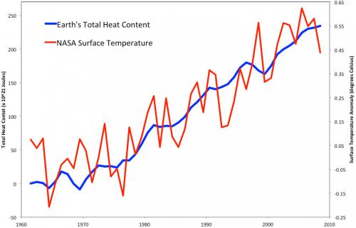
The blue line in this graph is not a statistical long-term trend or a 5-year average - it's actual yearly data of total heat content. The long-term warming trend is grounded in physical reality - the planetary energy imbalance. So I suggest a sticky way to communicate global warming is to express it in units of Hiroshima bombs worth of heat. This ticks all the sticky boxes:
The fact that out of a conference full of talks, rousing speeches and fascinating workshops, an AAP journalist chose that specific metaphor as the headline in an article picked up by media across the globe testifies to the stickiness of the Hiroshima metaphor. However, I'm happy to throw down the gauntlet - if someone can come up with a stickier metaphor to express our climate's energy imbalance, I would happily switch to it.
In 2012, several Skeptical Science contributors teamed up with John Church to publish a paper (Nuccitelli et al. 2012) in response to a flawed publication by Douglass & Knox (2012). In our paper, we analyzed global heat data, created by combining pentadal (5-year average) ocean heat content data to a depth of 2,000 meters from Levitus et al. (2012), and land, atmosphere, and ice heating data from Church et al. (2011).
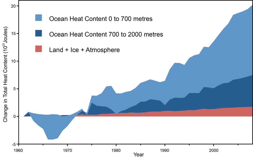
As this figure shows, there has been no significant slowing in global heat accumulation, contrary to the mythical 'global warming pause'. So, how do we come up with 4 Hiroshima atomic bomb detonation equivalents per second from this data?
The slope of the global heat accumulation graph tells us how rapidly the Earth's climate is building up heat. Over the past decade, the rate is 8 x 10²¹ Joules per year, or 2.5 x 10¹⁴ Joules per second. The yield of the Hiroshima atomic bomb was 6.3 x 10¹³ Joules, hence the rate of global heat accumulation is equivalent to about 4 Hiroshima bomb detonations per second. That's nearly 2 billion atomic bomb detonations worth of heat accumulating in the Earth's climate system since 1998, when we're told global warming supposedly 'paused'. That has to be the worst pause ever.
The data used in Nuccitelli et al. (2012) are now available for download so you can check it out for yourself.
Posted by John Cook on Monday, 1 July, 2013
 |
The Skeptical Science website by Skeptical Science is licensed under a Creative Commons Attribution 3.0 Unported License. |