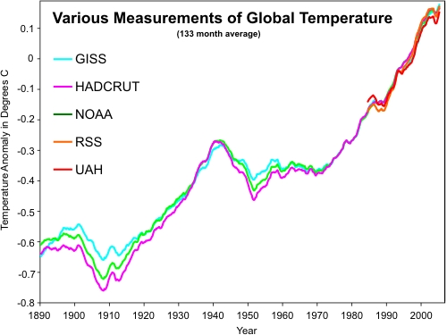
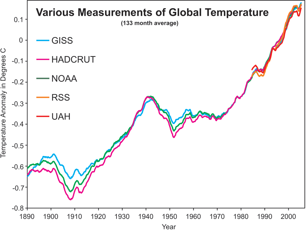
I've added a new graphic to the list of Hi-rez Climate Graphics: a composite of all the major global temperature records, going back to 1890 (obviously the satellite records only begin in the late 20th century). Many thanks to Benjamin Franz who sent me the spreadsheet of all the data:
Benjamin has published a series of useful graphs including a version of the graph above. The data comes from surface temperature measurements of NASA GISS, HadCRUT, NOAA plus the satellite measurements of lower atmosphere temperature by RSS and UAH. The data was originally compiled by Kelly O'Day from Climate Charts and Graphs who put all 5 datasets into a single spreadsheet. The problem is all the different temperature records use different base periods.
Temperature records are expressed as an anomaly (or variation) from a specified base period. For example, the base period for both satellite recoreds (UAH and RSS) is 1979 to 1998. So for example, when the UAH record says 0.5°C, it actually means the temperature is 0.5°C warmer than the average temperature over 1979 to 1998. The GISS base period is 1951 to 1980. HadCRUT use the base period 1961 to 1990. NOAA use 1971 to 2000. The choice of base period doesn't really matter as its the trend that's important, not the absolute values. Nevertheless, some people do get a little confused when comparing two temperature records that use different base periods.
To get around the problem of different base periods, Benjamin normalised all the datasets by calculating each temperature record's average value over the period 1980 to 2010. Then he calculated the temperature anomaly from the 1980 to 2010 base period. Thus each record now used the same base period and could be directly compared.
As surface temperature is a noisy signal, with plenty of variation from year to year, Benjamin calculated the long-term trend by calculating the 133 month moving average. That is what is shown in the graph above. The graph is also available in a number of formats:
Now I would love to add the European Centre for Medium-Range Weather Forecasts (ECMWF) reanalysis to this graph. The ECMWF record covers the full globe but uses an independent technique to NASA to estimate warming in the Arctic regions. Their data is available on their website but I've never been able to penetrate their obtuse interface (no offence to the good folk at the ECMWF). So if anyone is able to post a link to the pertinent data or even better, hand it to me on a silver platter in Excel format (hint, hint), please be my guest :-)
P.S. - for a more rigorous treatment of this subject, Tamino at Open Mind has two recent blog posts worth a look: Odd Man Out and Comparing Temperature Data Sets.
Posted by John Cook on Thursday, 23 December, 2010
 |
The Skeptical Science website by Skeptical Science is licensed under a Creative Commons Attribution 3.0 Unported License. |