It is said that a picture tells a thousand words. And, as we all know, every picture tells a story. By extension, movies tell thousands of stories.
The Earth Observatory’s mission is to share with the public the images, stories, and discoveries about climate and the environment that emerge from NASA research, including its satellite missions, in-the-field research, and climate models.
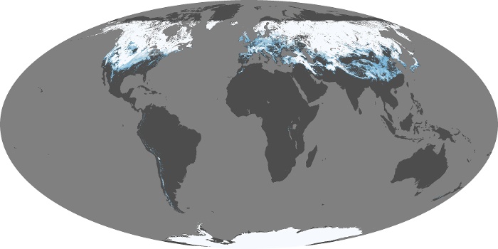
Fig 1. Snow cover, 2006-2011
Fig 2. Net radiation, 2006-2011
(Click here for the full-sized animation)
Earth's climate, including its average surface temperature, depends on the balance between incoming and outgoing energy. Energy comes in to the system when sunlight penetrates the top of the atmosphere. Energy goes out in two ways: reflection by clouds, aerosols, or the Earth's surface; and thermal radiation — heat emitted by the surface and the atmosphere, including clouds. The balance between incoming and outgoing energy is called net flux. Snow on the ground can dramatically change Earth's net flux by increasing the amount of sunlight the ground reflects.
The snow cover map shows the fraction of an area covered by snow on a monthly basis. Measurements were made by the MODIS sensor on NASA's Terra satellite. Gray indicates land areas with no snow, darkest blue represents minimal snow cover, and solid white indicates 100 percent snow cover. Because MODIS relies on visible light to assess snow cover, the sensor cannot collect data over the highest latitudes of the Northern Hemisphere during winter when no sunlight reaches the polar region.
The map of net flux shows monthly changes in the balance of incoming and outgoing energy on Earth as measured by the Clouds and the Earth Radiant Energy System (CERES) sensor on NASA's Terra and Aqua satellites. Places where the amounts of incoming and outgoing energy were in balance are yellow. Places where more energy was coming in than going out (energy surplus) are red. Places where less energy was coming in than going out (energy deficit) are blue-green.
The most obvious pattern in both maps is the way they both change with the seasons. The comparison starts in late summer in the Northern Hemisphere. As the September equinox approaches, a zone of positive net flux (more energy coming in than going out) is nearly centered over the equator. As the season changes into winter, Northern Hemisphere snow cover increases. Meanwhile, the zone of positive net flux shifts to the Southern Hemisphere , and a swath of negative net flux (more energy going out than coming in) appears in the high latitudes of the Northern Hemisphere. The pattern reverses on the March equinox.
The influence of snow cover on net flux is most clearly demonstrated in areas of permanent snow cover: Greenland and Antarctica. Snow is so reflective that even on the December and June solstices — when alternate hemispheres are receiving the maximum amount of direct sunlight they will receive all year — the net flux of these permanently snow-covered places is still zero or slightly negative. In December, the Southern Ocean surrounding Antarctica has an energy surplus (red): it is absorbing more energy from incoming sunlight than it is reflecting or emitting as heat. But Antarctica itself remains yellow, which means that incoming and outgoing energy are in balance. This balance is possible because the snowy surface reflects so much more incoming sunlight than the dark blue waters of the ice-free ocean. A similar pattern appears over Greenland in June, when the surrounding area is red (energy surplus) while Greenland itself is yellow-green (slightly negative net flux).
Fig 3. Annual Mean NH Snowfall Extent (Rutgers University Global Snow Lab)

Fig 4. NH Aurora Borealis (NOAA POES satellite); SH here.
Posted by Daniel Bailey on Thursday, 13 October, 2011
 |
The Skeptical Science website by Skeptical Science is licensed under a Creative Commons Attribution 3.0 Unported License. |