


 Arguments


How cold winters fit in the big picture of global warming
What the science says...
The cold snap is due to a strong phase of the Arctic Oscillation. This is causing cool temperatures at mid-latitudes (eg - Eurasia and North America) and warming in polar regions (Greenland and Arctic Ocean). The warm and cool regions roughly balance each other out with little impact on global temperature.
Climate Myth...
2009-2010 winter saw record cold spells
"Britain's big freeze is the start of a worldwide trend towards colder weather that seriously challenges global warming theories, eminent scientists claimed yesterday. The world has entered a 'cold mode' which is likely to bring a global dip in temperatures which will last for 20 to 30 years, they say." (Daily Mail)
Through December 2009 and January 2010, a dramatic cold spell swept across Eurasia, England and parts of North America. The most spectacular image capturing this phenomenon is a satellite photo revealing the whole of Britain covered in snow. Does this mean global warming has stopped? To determine this, one needs to step back and look at the broader picture. For starters, here is a temperature map of the entire Arctic circle and beyond:
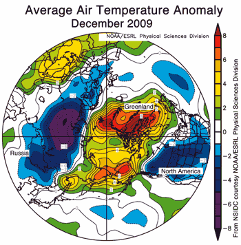
Figure 1: Map of temperature anomalies for December 2009 at roughly 1000 metres altitude for the region north of 30°N (NSIDC). Areas in orange and red correspond to strong warm anomalies. Areas in blue and purple correspond to cool anomalies.
Eurasia and North America are experiencing unusually cold conditions. On the other hand, Greenland, eastern Siberia and the Arctic ocean are experiencing unusual warmth. The warmest regions (more than 7° Celsius above average) are over the Atlantic side of the Arctic, including Baffin Bay and Davis Strait. Unsurprisingly, sea ice extent was below average in this region.
These strong contrasts in temperature are the result of a strongly negative phase of the Arctic Oscillation. This is caused by opposing patterns of atmospheric pressure between the polar regions and mid-latitudes. During a negative phase, pressures are higher than normal over the Arctic and lower than normal in mid-latitudes. In December 2009, the Arctic Oscillation index was -3.41, the most negative value since at least 1950. Note the blue dot in the bottom right corner representing December 2009.

Figure 2: Blue dots are monthly Arctic Oscillation Index. Red line is one year running mean (sourced from Andrew Revkin, plotted by Ignatius Rigor).
An even broader picture is a global map of temperature anomaly in the last week of December 2009. Here we see that much of the planet is experiencing warmer temperatures than usual, including North-east America, Canada, North Africa, the Mediterranean, and south-west Asia.
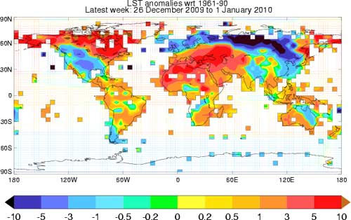
Figure 3: Map of global temperature anomalies, December 26 to January 1 (Met Office).
To conclude that global warming has ended based on recent cold snaps is another example of the misleading practice of focusing on small pieces of the puzzle while ignoring the broader picture. Interestingly, Roger Pielke Sr takes the opposite approach when assessing global temperature in December 2009 as measured by satellites. Despite the regional cold weather, global temperature has not shown a dramatic drop in December, leading Pielke to conclude (with original emphasis included):
"This data shows why the focus needs to be on the regional scale and that a global average is not of much use in describing weather that all of us experience."
After taking a broader look at global temperature, Pielke is forced to conclude that it's preferable to focus on small pieces of the puzzle than the bigger picture. Better that is, if the global picture isn't giving you the result you're looking for.
Last updated on 23 October 2016 by John Cook. View Archives


Hi,
I've recently encountered a denier who made these statements:
I see that the thirty-year moving temperature averages for New York City have barely budged since the 1960's. The 1950's and before were measured elsewhere so those do differ; lower summer temperatures, higher winter temperatures.
What do 30 year moving temperature averages for New York have to do with human caused climate change? I'm thinking this is a bit of a straw man since you don't use a single state to show evidnce that global warming is not occuring.
TVC15 - cherry-picking. Always suspect cherry picking or strawman fallacy when talking to deniers. Have a look at global distribution of temperature change and see why they may have picked NY. eg here.
TVC15 @18,
Firsty note that the denialist is talking of "New York City" which is even more 'single point' than "a single state". And of course such a localised temperature record, be it state or city, provides no evidence on its own to prove or disprove the existence of temperature rises resulting from AGW. I would assume the use of 30-year rolling averages is a nod to the data being climate rather than weather although still local climate.
That said, has the 30-year rolling average temperature of NYC "barely budged since the 1960's"?
I am no expert of US temperature records, but a quick trawl of the GISTEMP site yields GHCN data for New York Centrl Pk Twr. I haven't checked the Long/Lat but will assume this is as it appears - a record from the heart of NYC. Bar four years, the record is complete back to 1880 and when presented as 30-year rolling averages it shows a rise since the early 1970s of +0.026ºC/year which is well above the global (land+ocean) average of +0.018ºC/year but perhaps about right for land temperatures and perhaps a bit on the high side of US land. (This NASA web-page says "Since the year 2000, land temperature changes are 50 percent greater in the United States than ocean temperature changes.") Relative to 1960, the latest 30-year average (data to 2018) stands +0.65ºC higher. So I struggle to see a temperature that has "barely budged since the 1960's"
And another source of temperature data for NYC is BEST which provides data (but only to 2013) showing the 30-year rolling average rising at +0.025ºC/year since the early 1970s and a rise of +0.51ºC (data to 2013) which is thus showing the same as the GHCN data.
So a question to your denialist is to ask where they gets their data from. Is it actually from NYC, NY, USA?
Thank you both @19 scaddenp and @20 MA Rodger!
I found this graph as well that shows temps only rising in NY.
Climate Data Grapher
What I've learned in debating climate change deniers is that science deniers won't be convinced by evidence because their views are not based on a rational way of responding to evidence in the first place.
Here we go again!
Climate deniers are using a spell of unusually cold weather in Europe to incorrectly argue that CO2 emissions are not warming the planet.
How global warming can cause Europe's harsh winter weather by Jeannette Cwienk, Environment, Deutsche Welle (DW), Feb 11, 2021
John Hartz,
Reading your link and then searching a while online I see reports that the cold spell you report is the coldest in Europe in the last 10 years. I found a report that one country set a cold record in a different cold spell in the middle of January.
Going to the National Climate Data Center (USA national) they have a record temperatures page. Settting the page on global records (they do not have a European only page) I see in the last week there were 837 cold records and only 273 daily high records. In the harder to achieve monthly records there were only 12 low records in the past 7 days with only 2 high records. There was only 1 all time cold record globally in the last 7 days and no hot records.
Trying to measure a longer time in the past year there were 50,000 daily cold records and 109,000 hot records, hardly an ending of global warming. For monthly records there were 2100 cold records and 7,000 hot records. For all time records there were 32 cold records and 487 all time hot records.
In Europe last week it was cold compared to the past 10 years of hot weather. It was normal weather for 100 years ago. The denialists can only remember the past ten years so they think it is cold when it is really not. In addition, they often say record snow means it is cold. Record snow is not the same as record cold. Science predicts that in a warming world there is more precipitation. In cold areas that means more snow.
By contrast, the Summer in Winter in the USA and Canada (in March 2012) produced thousands of daily records and hundreds of all time records. In some locations the low temperature at night was higher than any previously recorded high temperatures!
Of course, regular readers of SkS are already aware of this. The NCDC records page is a good location to counter this denier myth.
I misspoke in post 23. There were hundreds of monthly records in the "Summer in Winter". Since it was winter no all time hot records were set. the summer was still hotter than the winter.