At the recent scandal-plagued Heartland climate conference, Don Easterbrook gave a presentation in which he discussed his previous predictions of global cooling. Given the inaccuracy of those predictions after just one decade, we were surprised to learn that Easterbrook had highlighted them in his talk, going as far as to claim that his global cooling projectons have thus far been more accurate than the global warming projections in the 2001 Intergovernmental Panel on Climate Change (IPCC) Third Assessment Report (TAR).
However, to make this claim, Easterbrook had to distort the IPCC's actual model projections, claiming:
"In fact the IPCC predicted in the year 2000 that we would be experiencing 1 degree increase in temperature between the year 2000 and 2010."
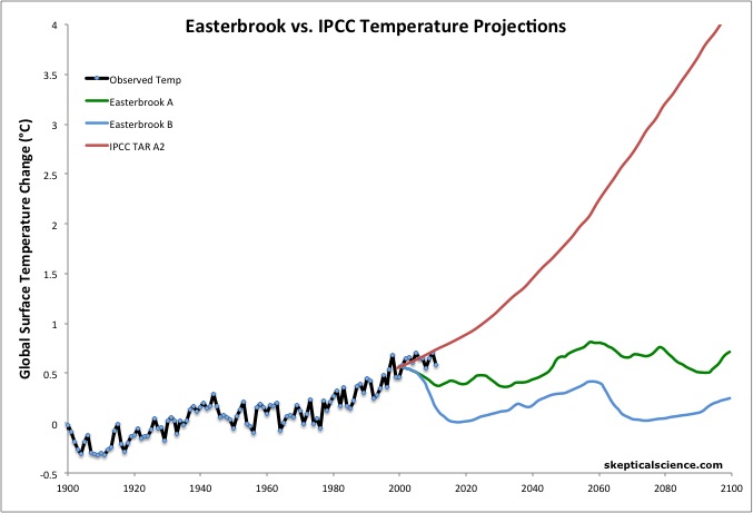
As Skeptical Science readers are undoubtedly aware, and as we will show in greater detail below, this assertion is an outright falsehood. Distortions of the IPCC projections aside, was Easterbrook correct in his claim that his temperature predictions were more accurate than those in the TAR? As Figure 1 shows, the simple answer is no.
Figure 1: Easterbrook's two global temperature projections A (green) and B (blue) vs. the IPCC TAR simple model projection tuned to seven global climate models for emissions scenario A2 (the closest scenario to reality thus far) (red) and observed global surface temperature change (the average of NASA GISS, NOAA, and HadCRUT4) (black).
The IPCC TAR produced global temperature projections based on a number of possible greenhouse gas emissions scenarios from their Special Report on Emission Scenarios (SRES). As we recently showed in our discussion of the 2011 International Energy Agency (IEA) CO2 emissions update, thus far actual emissions have most closely followed Scenario A2 from the SRES. Thus Figure 1 depicts the IPCC TAR Scenario A2 temperature projection based on a simple climate model which was tuned to the seven Atmosphere-Ocean General Circulation Models (AOCGMs).
Over the first decade or two of the 21st Century, the IPCC projected close to 0.2°C surface warming per decade. Thus we were very curious to find out where Easterbrook had obtained the information that led him to assert that the IPCC had predicted a 1°C increase over the first decade of the century (see minute 6 in the video and the lower right panel in Figure 4 below). Easterbrook's depiction of the IPCC projection is quite unlike the report's actual model projections (Figure 2).
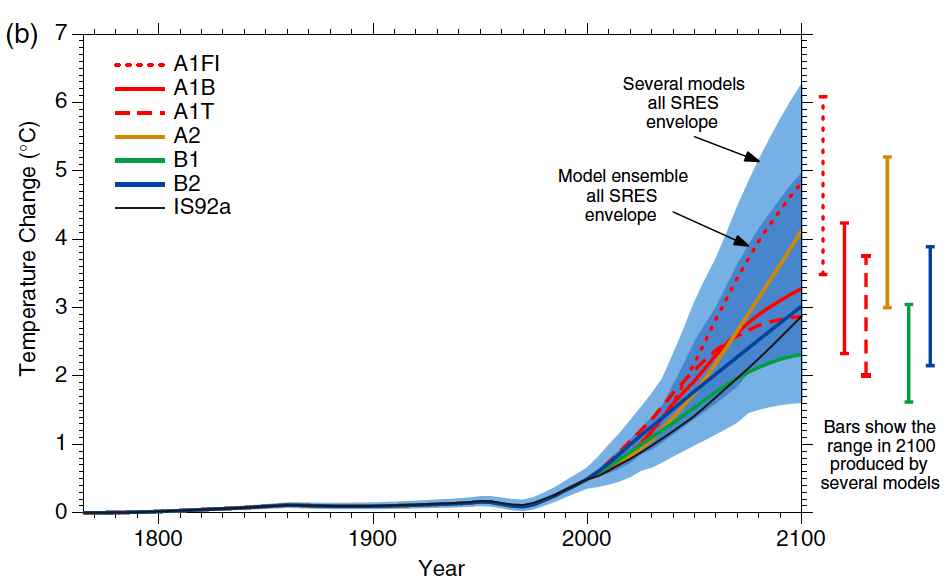
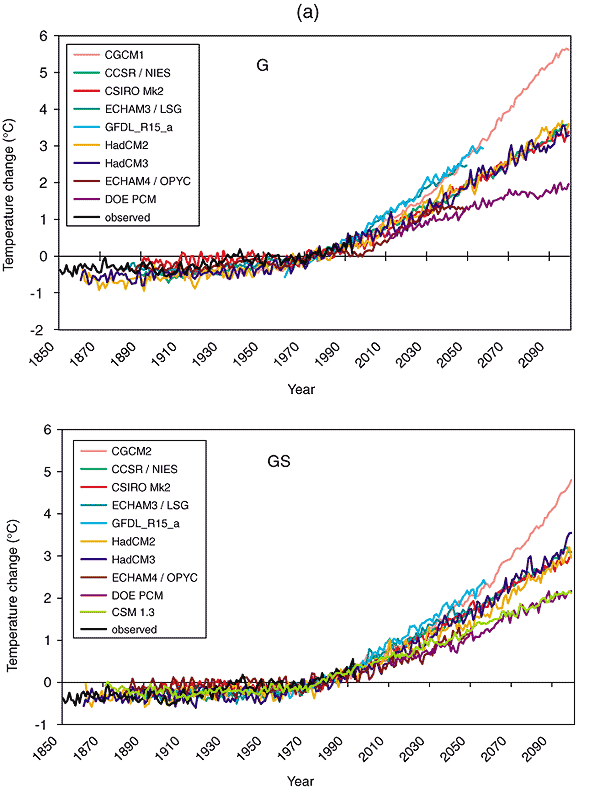
Figure 2: From IPCC TAR, historical anthropogenic global mean temperature change and future changes for the six illustrative SRES scenarios using a simple climate model tuned to seven AOGCMs. Also for comparison, following the same method, results are shown for IS92a. The dark blue shading represents the envelope of the full set of thirty-five SRES scenarios using the simple model ensemble mean results. The light blue envelope is based on the GFDL_R15_a and DOE PCM parameter settings. The bars show the range of simple model results in 2100 for the seven AOGCM model tunings.
A Skeptical Science contributor contacted Easterbrook to inquire as to the source of his depiction of the IPCC projections. Easterbrook responded that he had obtained them from the IPCC website, but that the data must have been subsequently altered or removed, because he could no longer find it.
Tom Curtis did some sleuthing to try and find the source of Easterbrook's graphic, and it appears that he has identified it correctly as the HadCM3 temperature simulation in Figure 9.5 (a) G (Figure 3 below).
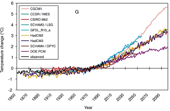
Figure 3: IPCC TAR Figure 9.5 (a) The time evolution of the globally averaged temperature change relative to the years (1961 to 1990) of the DDC simulations (IS92a). G: greenhouse gas only. The observed temperature change (Jones, 1994) is indicated by the black line. (Unit: °C). See Table 9.1 for more information on the individual models used here.
In Figure 4, Tom Curtis has overlaid Easterbrook's depiction of the IPCC temperature projection onto the HadCM3 curve from Figure 3.
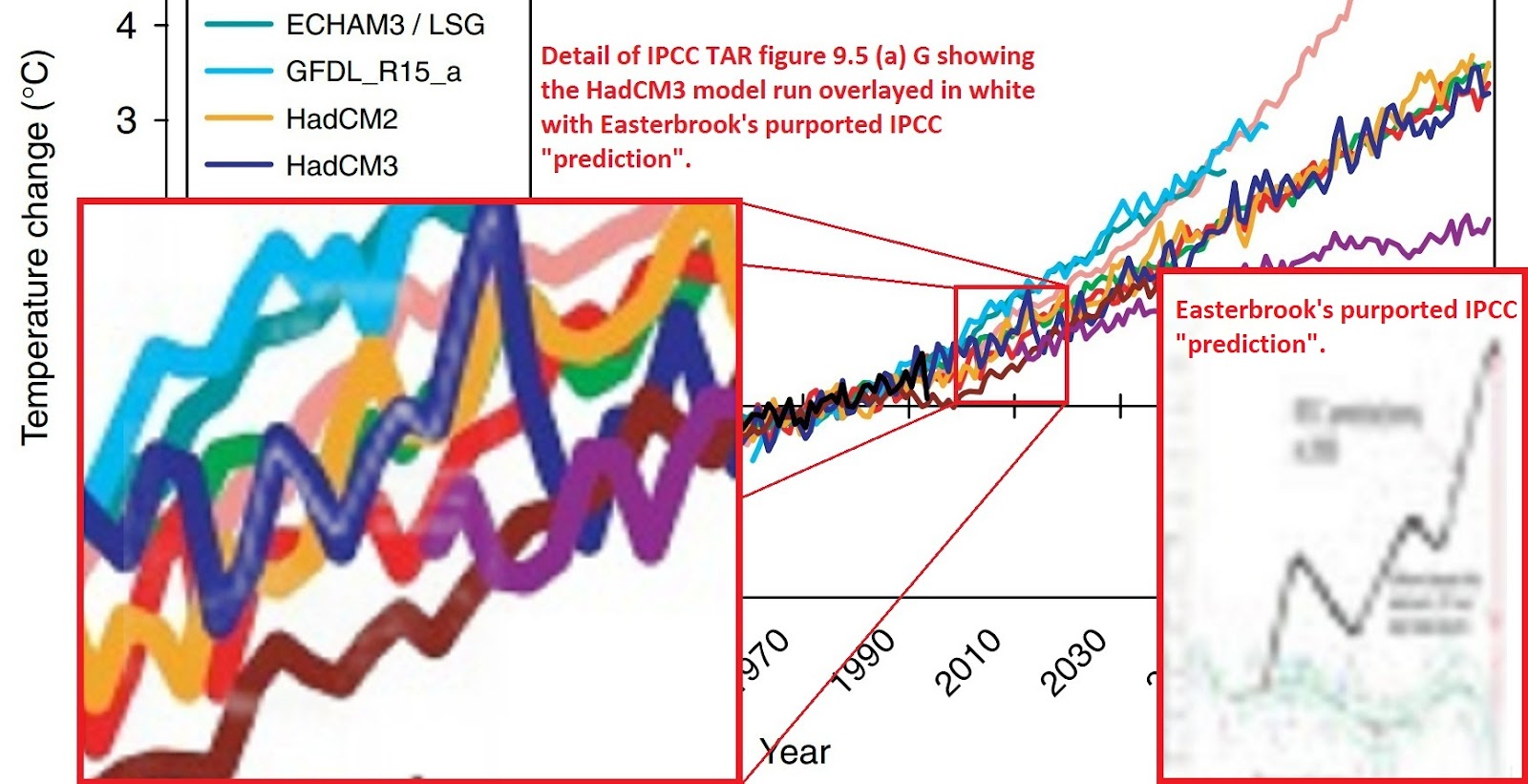
Figure 4: IPCC TAR Figure 9.5 (a) blown up for the timeframe 2000 to 2020 to illustrate Easterbrook's curve (gray) overlaid on the HadCM3 curve (dark blue). The two curves align almost perfectly from 2000 to 2011.
The fundamental flaw in Easterbrook's graphic is outlined in the caption to Figure 3 above, which depicts individual model global temperature change simulations to greenhouse gas changes only, rather than simulations responding to changes in the total global radiative forcing (which the IPCC shows in Figure 2 above).
On top of that, Easterbrook has selected a model run which happens to simulate a large temperature spike right around 2011, after which temperatures immediately fall and don't return to their 2011 levels for another 20 years. This anomalous temperature spike is due to the fact that Easterbrook relied on a single model simulation as opposed to the average of a number of simulations.
After some more sleuthing, Tom Curtis discovered that Easterbrook had shown the same IPCC HadCM3 greenhouse gas-only model run at the 2010 Heartland conference, but in that case, he showed the entire curve (see minute 7:35 in this video, and Figure 5 below).

Figure 5: Don Easterbrook's global temperature graphic presented during the 2010 Heartland conference.
During the 2012 Heartland conference, Easterbrook elected only to show the HadCM3 greenhouse gas-only forcing simulation data up to 2011, at the peak of its short-term temperature spike, exaggerating the supposed difference between models and data.
Additionally, if you look closely at Figure 5, even in Easterbrook's own distorted IPCC presentation the largest minimum to maximum temperature difference in the first decade of the 21st century, if you exaggerate the change by cherrypicking the endpoints rather than calculating a statistical trend, is only about 0.6°C, not 1°C.
To summarize Easterbrook's distortions of the IPCC TAR temperature projections:
Thus Easterbrook's claim that the IPCC TAR projected a 1°C global surface warming from 2000 to 2010 was not even remotely accurate.
However, as we have previously discussed, the average global surface temperature over the first decade of this century has indeed warmed at a dampened rate. There are several reasons for this; for example, aerosol emissions have risen, there has been a preponderance of La Niña events at the end of this timeframe, there has been increased heat storage in the deep oceans, and there was also an extended solar minimum.
Frankly with all of these effects acting in the cooling direction, it's amazing that surface temperatures continued to warm over the past decade, but they did. The average of the NASA GISS, NOAA, and HadCRUT4 global surface temperature data sets shows a 0.08°C warming from 2000 through 2011 (Figures 1 and 3).
On the other hand, Easterbrook's two temperature projections showed a 0.2°C and 0.5°C cooling over this period, while the IPCC TAR Scenario A2 projection showed a 0.2°C warming (Figure 6).
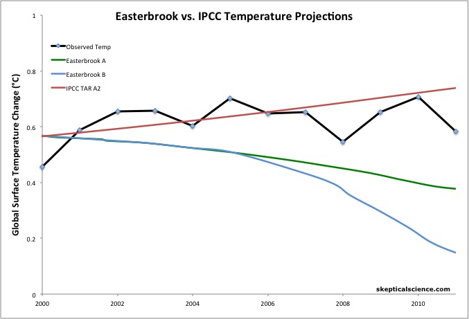
Figure 6: Easterbrook's two global temperature projections A (green) and B (blue) vs. the IPCC TAR simple model projection tuned to seven global climate models for emissions scenario A2 (the closest scenario to reality thus far) (red) and observed global surface temperature change (the average of NASA GISS, NOAA, and HadCRUT4) (black) over the period 2000 through 2011. The IPCC TAR projection and the 1998-2002 average temperature anomaly are baselined to match Easterbrook's projections in 2000.
So while the IPCC TAR projection was too high by about 0.12°C for the reasons discussed above, Easterbrook's projections were too low by 0.28°C and 0.58°C. Despite all of these non-greenhouse gas factors acting in the cooling direction over this timeframe, the IPCC projection was still much closer to reality than Easterbrook's.
Perhaps the most disturbing aspect of this presentation is the degree of misinformation and distortion of reality associated with it. Any climate scientist can immediately tell you that the IPCC projected approximately 0.2°C global surface warming over the first decade of the century - certainly nowhere near 1°C. Yet nobody at Easterbrook's presentation spoke up to correct the glaring mistake, which was central to his entire talk. There were few climate scientists present at the Heartland conference, but the fact that nobody caught or corrected Easterbrook's error speaks volumes about the lack of climate expertise and/or lack of interest in getting the facts right amongst the conference attendees.
As a result, Heartland members are now touting Easterbrook's misinformation to a more mainstream audience, such as by Peter Ferrara at Forbes magazine. While a partisan policy analyst like Ferrara can perhaps be forgiven for deferring to a scientist like Easterbrook on scientific matters, somebody should have caught the error immediately before Ferrara had a chance to disseminate this misinformation.
Additionally, Easterbrook should never have made this error to begin with. The caption of the IPCC figure he used was clear and explicit that it depicted model simulations responding to only the greenhouse gas forcing. Even if the graphic in question depicted responses to the total global radiative forcing, to cherrypick a single model run and ignore the fact that it displays an anomalous spike in 2011 reveals exceptionally poor data analysis on Easterbrook's part.
The fact that such a glaring distortion of reality was presented at the Heartland conference (at least twice) without being corrected and was subsequently disseminated to a much larger audience by Heartland members reveals a distinct lack of true skepticism amongst the Heartland Institute and its conference attendees.
Posted by dana1981 on Thursday, 7 June, 2012
 |
The Skeptical Science website by Skeptical Science is licensed under a Creative Commons Attribution 3.0 Unported License. |