Why Arctic sea ice shouldn't leave anyone cold
Posted on 27 August 2012 by Neven
In the past week the Arctic sea ice cover reached an all-time low, several weeks before previous records, several weeks before the end of the melting season. The long-term decline of Arctic sea ice has been incredibly fast, and at this point a sudden reversal of events doesn't seem likely. The question no longer seems to be "will we see an ice-free Arctic?" but "how soon will we see it?". By running the Arctic Sea Ice blog for the past three years I've learned much about the importance of Arctic sea ice. With the help of Kevin McKinney I've written the piece below, which is a summary of all the potential consequences of disappearing Arctic sea ice.
Arctic sea ice became a recurrent feature on planet Earth around 47 million years ago. Since the start of the current ice age, about 2.5 million years ago, the Arctic Ocean has been completely covered with sea ice. Only during interglacials, like the one we are in now, does some of the sea ice melt during summer, when the top of the planet is oriented a bit more towards the Sun and receives large amounts of sunlight for several summer months. Even then, when winter starts, the ice-free portion of the Arctic Ocean freezes over again with a new layer of sea ice.
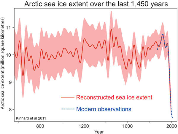 Since the dawn of human civilization, 5000 to 8000 years ago, this annual ebb and flow of melting and freezing Arctic sea ice has been more or less consistent. There were periods when more ice melted during summer, and periods when less melted. However, a radical shift has occurred in recent times. Ever since satellites allowed a detailed view of the Arctic and its ice, a pronounced decrease in summer sea ice cover has been observed (with this year setting a new record low). When the IPCC released its Fourth Assessment Report in 2007, it was generally thought that the Arctic could become ice-free somewhere near the end of this century. But changes in the Arctic have progressed at such speed that most experts now think 2030 might see an ice-free Arctic for the first time. Some say it could even happen this decade.
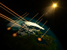 What makes this event significant, is the role Arctic sea ice plays as a reflector of solar energy. Ice is white and therefore reflects a large part of incoming sunlight back out to space. But where there is no ice, dark ocean water absorbs most of the sunlight and thus heats up. The less ice there is, the more the water heats up, melting more ice. This feedback has all kinds of consequences for the Arctic region. Disappearing ice can be good for species such as tiny algae that profit from the warmer waters and extended growing season, but no sea ice could spell catastrophe for larger animals that hunt or give birth to offspring on the ice. Rapidly changing conditions also have repercussions for human populations whose income and culture depend on sea ice. Their communities literally melt and wash away as the sea ice no longer acts as a buffer to weaken wave action.
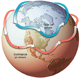 But what happens in the Arctic, doesn't stay in the Arctic. The rapid disappearance of sea ice cover can have consequences that are felt all over the Northern Hemisphere, due to the effects it has on atmospheric patterns. As the ice pack becomes smaller ever earlier into the melting season, more and more sunlight gets soaked up by dark ocean waters, effectively warming up the ocean. The heat and moisture that are then released to the atmosphere in fall and winter could be leading to disturbances of the jet stream, the high-altitude wind that separates warm air to its south from cold air to the north. A destabilized jet stream becomes more 'wavy', allowing frigid air to plunge farther south, a possible factor in the extreme winters that were experienced all around the Northern Hemisphere in recent years. Another side-effect is that as the jet stream waves become larger, they slow down or even stall at times, leading to a significant increase in so-called blocking events. These cause extreme weather simply because they lead to unusually prolonged conditions of one type or another. The recent prolonged heatwave, drought and wildfires in the USA are one example of what can happen; another is the cool, dull and extremely wet first half of summer 2012 in the UK and other parts of Eurasia.
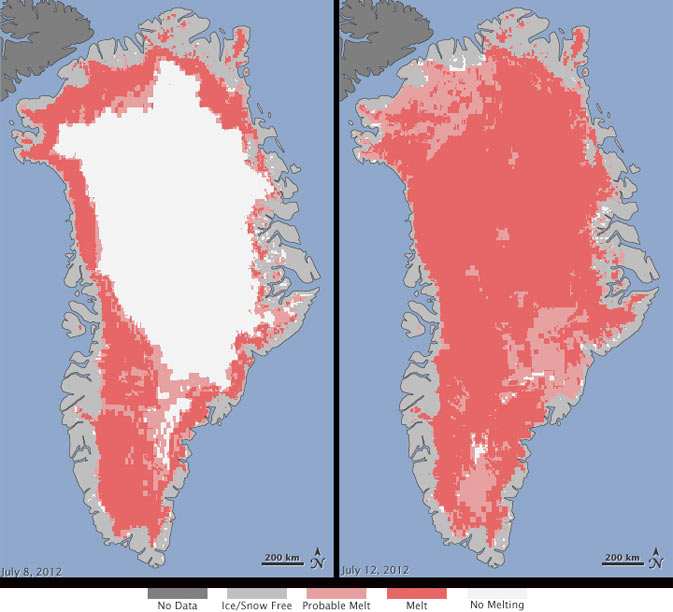 The accumulation of heat in Arctic waters also influences other frozen parts of the Arctic, such as glaciers and ice caps on Greenland and in the Canadian Archipelago. As there is less and less sea ice to act as a buffer, more energy can go into melting glaciers from below and warming the air above them. This has a marked effect on Greenland's marine-terminating glaciers and the Greenland Ice Sheet. Not only are glaciers flowing faster towards sea, but there is also a rapid increase in the summer surface melt Greenland experiences, leading to accelerating mass loss from the Greenland Ice Sheet. As the Arctic warms, an increased contribution to sea level rise is inevitable.
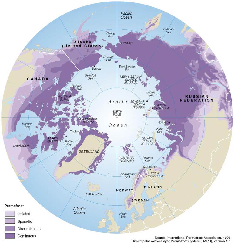 Another way Arctic warming could have worldwide consequences is through its influence on permafrost. Permanently frozen soils worldwide contain 1400-1700 Gigatons of carbon, about four times more than all the carbon emitted by human activity in modern times. A 2008 study found that a period of abrupt sea-ice loss could lead to rapid soil thaw, as far as 900 miles inland. Apart from widespread damage to infrastructure (roads, houses) in northern territories, resulting annual carbon emissions could eventually amount to 15-35 percent of today’s yearly emissions from human activities, making the reduction of greenhouse gases in the atmosphere a much more difficult task.
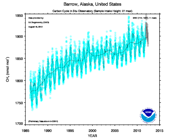 An even more worrying potential source of greenhouse gases is the methane in the seabed of the Arctic Ocean, notably off the coast of Siberia. These so-called clathrates contain an estimated 1400 Gigatons of methane, a more potent though shorter-lived greenhouse gas than carbon dioxide. Methane clathrate, a form of water ice that contains a large amount of methane within its crystal structure, remains stable under a combination of high pressure and low temperature. At a depth of 50 meters or less the East Siberian Arctic Shelf contains the shallowest methane clathrate deposits, and is thus most vulnerable to rising water temperatures. Current methane concentrations in the Arctic already average about 1.90 parts per million, the highest in 400,000 years.
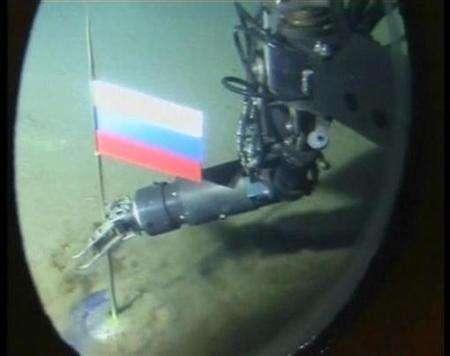 Apart from these unrecoverable sources of fossil fuel the Arctic is also endowed with large amounts of recoverable oil and natural gas. As the sea ice retreats, the Arctic's fossil treasures are eyed greedily by large corporations and nations bordering the Arctic Ocean. Not only might this lead to geopolitical tensions in a world where energy is rapidly becoming more expensive, it is also highly ironic that the most likely cause of the disappearance of Arctic sea ice - the extraction and burning of fossil fuels - could lead to more extraction of said fuels. Another feedback loop.
News articles referring to the Arctic and its sea ice usually have pictures of polar bears accompanying the text. But although many animals in the Arctic will be impacted negatively by the vanishing of Arctic sea ice, much more is at stake. After thousands of years in which the sea ice played a vital role in the relatively stable conditions under which modern civilization, agriculture and a 7 billion strong world population could develop, it increasingly looks as if warming caused by the emission of greenhouse gases is bringing an end to these stable conditions. Whether there still is time to save the Arctic sea ice, is difficult to tell, but consequences will not disappear when the ice is gone. It seems these can only be mitigated by keeping fossil fuels in the ground and out of the air. Whichever way you look at it, business-as-usual is not an option.
For more information on Arctic sea ice, check out the Arctic Sea Ice blog.
Images used:
Arctic sea ice extent reconstruction - Kinnard et al. 2011
Sea ice albedo feedback - NASA
Polar jet stream - NC State University
Greenland ice sheet surface melt - NASA
Permafrost distribution in the Arctic - GRID-Arendal
Atmospheric methane concentration - NOAA ESRL
Russia plants flag at North Pole - Reuters


 Arguments


 Based on that graph, it is not at all clear that the rapid trend to increased daily melt had ended, even though it has already continued four weeks beyond the normal inflection point. As it is, a sea ice extent minimum under 4 million km^2 looks a dead certainty, and minimum sea ice extents of 3.5 million km^2 or less are well on the cards.
In any event, caution should be used in using your graph; and if used, the difference between 40 year mean and annual data is clearly mentioned as a caveat so that we do not accidentally mislead. (Note, if you are inclined to amend the graph to reflect my "more accurate" position mentioned above, don't. That position was worked out from a back of the envelope calculation, and is indicative only.)
 0
0  0
0 [Source]
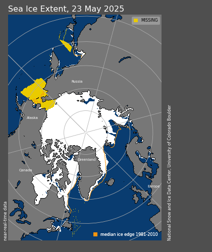
Arctic Sea Ice Extent August 2012:
 [Source]
Comparable?
 To highlight that difference, deconstruct also overlaid 1946 (representative of the colder mid-40s) with 2012:
 So that begs the question, which was the most comparable melt: 1938 to 2012...or 1938 to 1946?
Enquiring minds want to know.
 Same caveats as before: a five-day running mean, running off the end so that the last few days are incomplete. One slight modification: the most recent day in the IARC/JAXA data set seems to always get updated to a larger value the following day (Tamino has mentioned this), so this time I've left it out, as it really kicks the end of the 2012 data downward. If you compare this graph to the one from a week ago, you can see that the last bit of last week's graph has come up - due to the dual effects of the incomplete running mean and the last subject-to-revision data point.
A bit of clarification: someone at Neven's blog mentioned that this doesn't show much other than what you see on the direct extent graph. It shouldn't - it's the same data, just visualized a bit differently. What does become clearer in the graph here is that the rapid decrease in ice extent is quite unusual this year. The early August storm shows up clearly - and this was the second period of rapid loss this season. Only 2007 shows a similar drop.
This year's data around day 230 is not nearly as dramatic as it appeared in the earlier graph, but it does show that the melt rate was at or past the bottom end of anything seen before for that time of year. Once the line reaches zero and passes into positive numbers, we'll basically be making the passage into freeze season. (Yes, I know: this is extent, not area, so an increase in extent could be less ice spread over a larger area, but the big numbers will be dominated by freezing.)
Currently, ice melt continues, but now at rates that are pretty common for this time of year - the line is in the middle of the pack (pun intended) compared to previous years. Other blogs have mentioned that the arctic weather forecast is showing chances of another good storm in the next few days. It will be interesting to see if this has any effect. If something odd shows up, I'll try to post another graph.


Comments