Climate Science Glossary

Term Lookup

Enter a term in the search box to find its definition.

Settings

Use the controls in the far right panel to increase or decrease the number of terms automatically displayed (or to completely turn that feature off).

Term Lookup

Settings


All IPCC definitions taken from Climate Change 2007: The Physical Science Basis. Working Group I Contribution to the Fourth Assessment Report of the Intergovernmental Panel on Climate Change, Annex I, Glossary, pp. 941-954. Cambridge University Press.

Home Arguments Software Resources Comments The Consensus Project Translations About Support

Bluesky Facebook LinkedIn Mastodon MeWe

Twitter YouTube RSS Posts RSS Comments Email Subscribe


Climate's changed before
It's the sun
It's not bad
There is no consensus
It's cooling
Models are unreliable
Temp record is unreliable
Animals and plants can adapt
It hasn't warmed since 1998
Antarctica is gaining ice
View All Arguments...


Username
Password
New? Register here
Forgot your password?

Latest Posts

Archives

Ten temperature records in a single graphic

Posted on 26 January 2011 by John Cook

Last week in Monckton Myth #2, Robert Way published an intriguing graph 'All Method Temperature Index'. The graph plots the average of ten different global temperature datasets:

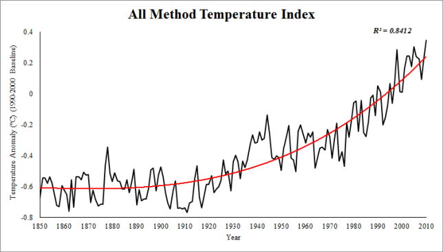
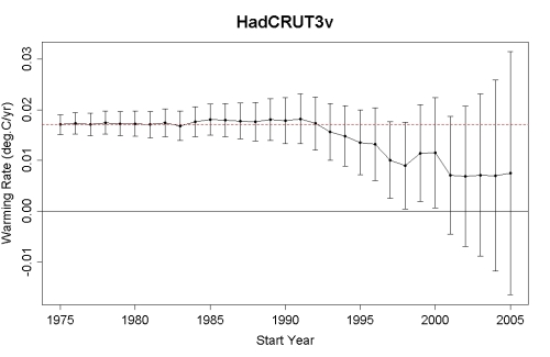
Figure 1: All Method Temperature Index (AMTI). 1990-2000 Baseline.

To create this graph, Robert had to track down a number of different temperature series. There were your classic "rock star" datasets - NASA GISS, NOAA and HadCRUT. The other favourites, although not going back as far as the thermometer records, are the satellite records UAH and RSS.

But another great addition are a number of other "reanalysis products". These are datasets that use a wide range of sources to reconstruct temperature. This includes thermometers, radiosondes, satellites, buoys and ship measurements. This way, they're able to create temperature records covering the entire globe, even Arctic regions that other datasets such as UAH, RSS and HadCRUT fail to cover. This is important because the Arctic is warming faster than the rest of the planet. To omit the Arctic is to underestimate the global warming trend.

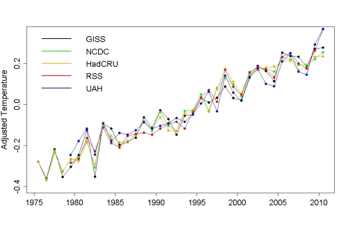
Robert has also plotted a graph of all ten temperature records in a single graph, a vivid reminder that many independent lines of evidence all tell us the same thing. I've added it to our steadily growing Climate Graphics resource:
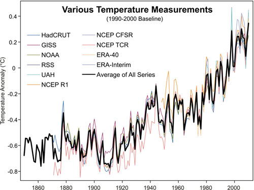
As with all our climate graphics, this is under a Climate Commons license so you're free to use this elsewhere. And the graph is available in a number of formats including an Excel Spreadsheet which contains all of Robert's methodology including the ten datasets and his graph from Monckton Myth #2. I'm very happy about this as I've been wanting to get hold of the European reanalysis data for while but have been too lazy busy to process the data myself :-)

0 0

Printable Version  |  Link to this page

Comments

Prev  1  2  3  

Comments 101 to 137 out of 137:

  1. Pirate, the only reason Fossil Fuels are so cheap is because-from the outset-they've enjoyed enormous financial support from Governments across the world. They still enjoy these subsidies in *spite* of them being mature industries. Next time try couching the question about renewable energy by adding in how much the fossil fuel industry is currently costing tax payers.
    0 0
  2. So, I took a look at the Survey from Pirate, & its the most biased piece of rubbish I've ever seen. How could anyone judge if the planet were warming or cooling over the past 100 years when looking at a graph with a 50,000 year scale? Total nonsense. The last question is also extremely loaded, given that many renewable energy technologies are *very* reliable (you might say *more* reliable-as renewable energy can be better scaled to demand than coal or nuclear power) & have far lower environmental impacts than coal or nuclear power. I think this "survey" reveals a lot about how survey results can be skewed by the bias of the person designing the survey.
    0 0
  3. @pirate: "My purpose of posting the comment about the AP Physics students was not to imply any scientific basis to discredit AGW, but to show that public perception of AGW is very different than what you may think." Sorry, but that stinks of sample bias. You are basically saying that one classroom represents what "public perception of AGW" is. Nearly every poll on the subject shows that a majority of the people accept AGW theory, including in the US. A recent Rasmussen poll said that: "Fifty-eight percent (58%) of voters see global warming as at least a somewhat serious problem, with 33% who see it as a Very Serious problem. Thirty-eight percent (38%) are not concerned about global warming, including 17% who say it is Not At All Serious." Note that Rasmussen is generally perceived to have a slight conservative bias, so I think these numbers are not exaggerated. So, for what it's worth, it seems that public perception of AGW is quite different from what *you* think.
    0 0
  4. I completed Pirate's survey, but I'll bet my result gets excluded.
    0 0
  5. Taking a look back at a graph that Pirate posted in this thread, and then taking a look at the graph for his survey I noticed that they both cover a 400,000 year span, and it was true, they don't really show that much warming. But then I remembered our good old standard issue Temperature estimates relative to today from over 800,000 years of the EPICA ice cores in Antarctica., and it tells a whole different story. Amazing how things come to life when you put them in the -- proper perspective.
    0 0
  6. Agreed on the survey - designed to get a predetermined response. Graphs like his are a fav of the "skeptics" as they always end in 1950 - effectively they hide the incline in global temperatures observed over the past 60 years. By design or quirk of happenstance? You be the judge... A form of mind-control, if you will. The Yooper
    0 0
    Moderator Response: [muoncounter] Mind control? Or maybe just the first line here?
  7. I don't mean to be nosy Daniel, but do you need a "yooper scooper" where you live? I'll bet if you do, that you get less use out of it every year. Eh!
    0 0
  8. I did the survey too. Who on earth thought that last question was well-designed?
    0 0
  9. #108: "Who on earth thought that last question was well-designed?" The survey as a whole reeks of bias; even the ordering of the questions is leading. In a survey that asks about current climate change, how can there be no presentation of current data? Are the students just supposed to guess or have they already been shown the answer? As a fellow science teacher, I'm embarrassed to see this. Here is a link to the US high school AP Environmental Science curriculum outline. Note in particular section VII. "Global change", which is supposed to represent 10-15% of the course. Among the content: Greenhouse gases and the greenhouse effect; impacts and consequences of global warming; reducing climate change; relevant laws and treaties. One has to wonder how that class went. Although it would be interesting to see how a class survey taken before an objective presentation of the data compared to one taken afterwards.
    0 0
  10. @ Ron @ 107 For the uninitiate, this is a Yooper scooper (average: person, boots, house, winter snow depth). We even have the smaller kid's size. But I use this 10.5 HP, 28" cut snowblower. @ muoncounter Exactly! The Yooper
    0 0
  11. Just to jump in here in defence of 'pirate' and the survey. It looks to me like several people here may have taken the wrong impression from what he said about the survey. My reading of what he said and the content of the survey is that this was a survey 'created by' his students, not just simply responded to by them. So yes, there are 'problems' with the survey. Qyestion 1 has 3 options for example without the obvious 4th option - 'all of the above'. But is this something foisted on the students, or a fault with what they produced? Perhaps pirate can clarify this.
    0 0
  12. Students produce work as they are guided. Pirate claims this is student work, but the survey reflects directly the points that he has emphasized in his postings at his first post here. The graph they used is the same one he first posted!! If Pirate emphasizes in class 400,000 year old data that shows natural changes and then asks is current change natural his students will follow the same pattern. Then the students will show up here and say "My high school environmental teacher said" and they will have to unlearn what they were taught. It is hard to unlearn false data.
    0 0
  13. DB @ 83, This line from the website you plucked the modified McShane & Wyner Graph says it all" "I've taken the liberty of (unscientifically) adding this onto the McShane and Wyner hockey stick graph..." Nuff said.
    0 0
    Moderator Response: [Daniel Bailey] You failed to do your homework. The addition to the sqeptic's darling (McShane & Wyner's graph - thoroughly debunked in peer-review) is from a simple average of the IPCC's low-to-high estimates of expected temperature rises. As these estimates date from 2007, they are old and since been superceded by newer, and much higher, estimates. Both of which you might have noted had you done a bit more work. Simply dismissing the graph without attempting to understand why it differed from your expectations is a classic example of cognitive dissonance in action. If this were a graded exercise your score would not be very good.
  14. DB @ 66, That top graph shows human civilization fluorishing as we came out of an Ice Age. We've done quite well over the last 10,000 years. Of course, nothing can be inferred from this graph about any positive or negative effects of a temperature rise when and if it happens. But, when and if it drops...
    0 0
    Moderator Response: [Daniel Bailey] Short of Yellowstone going critical? Absent a negative feedback of considerable size, good luck with unphysical wishes.
  15. Marcus @ 102 How can any 100 year period tell you anything about climate and climate cycles? Pick and choose any 100 year period from that graph and we can "demonstrate" rapid rise, rapid decline, or stability.
    0 0
  16. Michael Sweet @ 112 First, that is a different graph in the survey than I posted here. Second, show me where the data is false.
    0 0
  17. Muon @ 109, Yep, that's pretty much our curriculum. And, I'm sure that your impressive research and insight also showed you that in Unit 2 they learn about "Natural Ecosytem Change" including "Climate Shifts, Species Movement and Ecological Succession". All of which are natural and have occurred many times throughout Earth's history. When we teach (you, me, or anybody else) a student Unit 2 about natural climate change and the mechanisms and results of such, if we do our job correctly they should question the proposed mechanisms of artificial climate change.
    0 0
  18. Glenn @ 111 Thanks for backing me up. Knowing my stance, I purposely was hands off. The only faculty guidance they got was from the librarian who was running the computer lab. She believes in AGW. This survey was completely student driven. I would be interested if the readers of this website would redesign the questions. I will even resend the survey to the original participants.
    0 0
  19. Archie @ 103, I was not representing the poll of that class as the view of the general public. They do represent the smartest and brightest of the students at my high school. The results of the survey I sent out to our faculty and our state's Environmental Compliance Deparment (since we are 1 of 10 pilot schools participating in a statewide environmental awareness program), showed numbers roughly similar to what you posted but somewhat less in the numbers belieive climate change is a serious concern.
    0 0
  20. Pirate - there is a major issue with the teaching if they construct Q1 the way they did. The right answer (which is missing from the options), is the temperature rise (from solar) increases CO2 directly, which in turns forces temperature higher. Ie GHG can work to amplify other forcings. Albedo also works in the same way. However, you obviously cant infer that from the one graph and it is extremely misleading to present that as the basis. Is this how they were taught? And in past, what about the question as to where that CO2 came from compared to now etc etc. Therein lies the rub for high schools when tackling any complex topic. You can pose all kinds of hypotheses that kind of work - if you dont do the maths. However high school students have neither the physics nor sufficient maths to do that themselves. (Chances are teachers dont either). What all of us do in these situations is rely on peer-reviewed conclusions from specialist who can do the work. The really bad way to do it from climate science, to nutrition, to vaccines etc etc is to accept answers from web without peer-reviewed backing. Science education needs to hammer that hard. A middle ground would be buy EdGCM and let students play with the scenarios themselves. I actually like the idea of ice core as example for teaching because it could lead to mathematical questions about conditions for runaway feedback etc, use of stable isotope for source characterization, and so on. However, so little time to teach so many things, I'd rather see students get serious background in science fundamentals, scientific method and maths.
    0 0
  21. "But, when and if it drops." So on the basis of what your students have been taught, how about you research the question of what the chances of ice age are with 400ppm of CO2 and when that might happen. Do you think this is unknowable?
    0 0
  22. So, pirate, you didn't allow them to submit a draft of the survey for feedback from you and other members of the science faculty? You just let them go with a flawed survey? I do agree that we should design a survey. It would be an interesting conversation and product. Of course, I'd rather ask them open-ended questions, starting with "According to climatologists, how does human-caused global warming happen?" Few incoming freshmen at my highly-selective university can articulate a decent answer to this. I occasionally get answers like "The heat from our burning fossil fuels warms up the planet."
    0 0
  23. #117: "when we teach ... a student Unit 2 about natural climate change and the mechanisms and results of such, if we do our job correctly they should question the proposed mechanisms of artificial climate change." Questioning the mechanisms would indeed be a good outcome. Therein lies the problem: If you, me or anyone else taught that the mechanisms for past climate change were the same mechanisms controlling today's climate, then you, me or anyone else really should be teaching poetry or painting, not science. If any student in that class of so-called best and brightest did not question a teacher who put forth that anthropogenic influences did not play a major role in today's world, then those students still have lots to learn - not just about climate change, but about how to take responsibility for their own education. Just wondering what you put forth as the mechanisms of natural climate change and what you said about what's happened recently. And why you think that what you teach first (Unit 2) necessarily controls what is understood later (Unit 7). Did you teach that human influence can modify climate for good, not just for bad? If so, how could your students fail to question the mantra 'it's all natural'?
    0 0
  24. Pirate @ 115. Given the short space of time our civilization has been on this planet, & the speed with which recent climate change has occurred, compared to past climate cycles, I think 100 years can tell a huge amount. The reality remains that the planet has warmed more in 60 years than it has at any other point in the past 10,000 years. By excluding this period from your graph, you're creating a definite bias.
    0 0
  25. I'm sorry, Pirate, but I'm *shocked* that you're a teacher-given your comment at 115. It really does display a shocking amount of ignorance on your part. Point 1, those climate change events in the graph are over 50,000 year periods of time. Were you to zoom in on any single, 100 year period, you'd actually see *very little* change (last time I calculated it, the average rate of change during each interglacial is around +0.005-+0.01 degrees per decade-about 1%-2% of the rate of change we've seen in the last 60 years). Point 2 is that the warming we're seeing during each interglacial period is easily explained by changes in Total Solar Irradiance & CO2-whereas the last 60 years *cannot* be explained by changes in Solar Irradiance-a very relevant piece of information that anyone taking this survey would need access to. Thirdly, when considering the scope of human civilization, Geological Time is largely irrelevant. Even if we were to exit the current interglacial period tomorrow, it would be about 1,000 years-at least-before we'd ever see any negative impacts. Compared to the changes being wrought by Anthropogenic influences, natural changes just pale into insignificance over the period of human history.
    0 0
  26. Pirate This is OT, the moderator may be able to suggest better thread to continue this conversation. Reading the survey, it is not spelled out whether the survey is meant as a test to measure peoples understanding of AGW concepts, or their opinions about it independent of their understanding. I will assume the later. Here are some comments & changes - mine bracketted so (* *) 1. Examine the above graph. It shows the relationship of CO2 to global temperature over a period of 400,000 years. The data is fairly well agreed upon by all scientists. (* This question seems to be posing its choices as either/or options which isn't really meaningful *) Please select one of the following answers. a. CO2 forces temperature change. b. Temperature forces CO2 change. c. Another factor, or factors, influences both. (* d. All of the above *) 2. From the graph: the Earth's current average temperature is: (* This question is quite strange. Does average mean averaged over the entire graph, or over the entire earth. If over the entire Earth then what is meant by 'currently' - 2011, the last century, the last 10,000 years (the Holocene)? From the graph a mark 1 eyeball can only really discern the last 10,000 years. And the signal is noisy. I wouldn't include this question in its current form at all *) 3. The Earth's climate changes over time. (* I would reword this as The Earth's climate has changed over time for many reasons. *) 4. Historically (prior to the industrial revolution) the climate has changed due to natural cycles (solar, orbital, landmass movement, volcanic eruptions, etc...). (* The use of 'cycles' here is problematic. Some aspects of climate may be cyclical such as orbital and short term solar. Others are not such as landmass changes or very long term solar. So the literally correct answer is No when actually the answer to what the question implies would be Yes. So a change to... *) Historically (prior to the industrial revolution) the climate has changed due to (* various natural factors *) (solar, orbital, landmass movement, volcanic eruptions, etc...). 5. The Earth is currently in a period of rapid climate change. (* Again a problem with language that could distort peoples answers. What constitutes 'rapid'? This is mixing two separate questions - is warming hapenning, and is it rapid. Are your students trying to determine how strongly their subjects think that climate is changing vs how strongly they thing that the change is rapid *) 6. Human (anthropogenic) contribution of CO2 from the combustion of fossil fuels to the atmosphere contributes to global warming. (* You might consider rewording this so that it questions peoples sense of the magnitude of the contribution but then we have 2 questions in one again. I wouldn't change this *) 7. Anthropogenic CO2 is causing rapid climate change and is responsible for disastrous weather situations around the world. (* Again a question with several parts. I have already commented on 'rapid'. 'is causing' is present tense so the second part of the question is misleading. Perhaps reword as...*) Anthropogenic CO2 is causing (* *) climate change and is (* predicted to *) be responsible for disastrous weather situations (* and many other problems around the world in decades to come *). 8. Alternative energy sources (solar, wind, geothermal...) are currently more expensive and less reliable than fossil fuel (coal, oil, natural gas, etc...), hydroelectric, or nuclear. All forms of energy generation have some type of environmental impact. Alternative energy sources (solar, wind, geothermal...) are currently more expensive and less reliable than fossil fuel (coal, oil, natural gas, etc...), hydroelectric, or nuclear. All forms of energy generation have some type of environmental impact. Are you willing to pay more for your utilities to reduce anthropogenic CO2 generation? (* This question has a problem. By comparing the action to be taken which appears negative with the result desired of reduced CO2, the costs of NOT acting aren't being presented as the alternative to the costs of acting. Perhaps the last sentence needs to be reworded...*) 'Are you willing to pay more for your utilities to reduce anthropogenic CO2 generation (* to guard against these problems in the future *)?' Some additional questions that would be useful in elucidating what peoples opinions are based on: What information will give us the best understanding of whether the climate is changing? a. Weather Station data from the USA - 1.5% of the Earth b. Weather Station data from all the countries in the world - 30% of the Earth c. Sea Surface Temperatures from the oceans - 70% of the Earth d. Satellits data from nearly all the Earth's surface e. Volumes of Ice melting from around the world f. Heat accumulating in the depths of the worlds oceans g. The total of all of the above. Who developed the scientific theories of AGW? a. The US Government, NASA etc b. Al Gore c. A handful of US & British scientists d. The IPCC e. 10's of 1000's of scientists, from countries all around the world, from many different branches of science, starting in the 1950's How big is the IPCC. How many employees does it have? a. 10 b. 100's c. 1000's d. 10's of 1000's
    0 0
  27. Interesting, but I find there are two many data gaps for this combined gap to be statistically valid. But what does it really achieve? No-one is really questioning that we have been in a warming phase - it's the cuase that's questioned. I couldn't, in all conscience, use this graph because I believe the methodology isn't valid. Why would I need to - I can just use Hadcrut which goes back further than any other, and still shows warming. I'd rather do this than use a plot that's wide open to criticism on to methodology.
    0 0
  28. #127: "rather do this than use a plot that's wide open to criticism on to methodology." Many people question the validity of one temperature measure or another. Others fail to realize that there are different baselines in the different measures. It is extremely valuable to show that they are consistent, as Robert has done here. See also Assessing surface temperature reconstructions, which tells the same story. Most people feel that more data are preferable.
    0 0
  29. I agree - more data showing much the same thing (though GISS is a bit out from the others) is better, rather than trying to average it all. But, as I said, warming isn't really in question anyway - it's the cause of the warming.
    0 0
  30. "It's cooling" is currently the #4 argument because enough self-proclaimed skeptic are still asserting that the warming stopped at some point; e.g. 1998.
    0 0
  31. Bibliovermis - to be fair, I must admit that when I check Hadcrut and RSS, and look only at data for the past 15 years, there is no statistically significant trend up or down that I can find. That's not to say that global warming has stopped - we need another 15 years of no trend before such a claim could be made. However, we can't just draw a straight line through curved data, in the hope that extrapolation will follow that line. Basically, we really don't know what it's doing - the hottest year based on most data sets was 1998, and there's the chance that it may have peaked - only time will tell. 2011 is certainly off to a colder start.
    0 0
    Moderator Response: (DB) Actually, 2010 was the hottest year in most datasets (HADCrut has 2010 as tied with 1998). Tamino has a post up at Open Mind showing statistically significant temp rises since 2000. For HadCRUT3v, note that the error bars don't include zero until 2001:
  32. #131: "look only at data for the past 15 years, there is no statistically significant trend ..." Ah, the fine art of the cherrypick. Something about the statement "When I look at data only for this statistically insignificant period, I find no statistical significance," should give you pause. See Global warming stopped in ... and any of several threads about statistical significance. And here's a most excellent graph by Tamino, which should change your outlook: That's about 0.17 degrees C/decade.
    0 0
  33. muoncounter - if you read my post again, you'll see that I pointed out that at least 30 years is needed for a trend to be meaningful. I've selected this period because it was mentioned in an earlier post. Interesting - when I compare the above plot to my plot taken from Hadcrut data, it's very different. The Hadcrut site http://www.cru.uea.ac.uk/cru/data/temperature/hadcrut3vgl.txt gives the following : 1997 : 0.349 1998 : 0.529 1999 : 0.304 2000 : 0.278 2001 : 0.407 2002 : 0.455 2003 : 0.467 2004 : 0.444 2005 : 0.474 2006 : 0.425 2007 : 0.397 2008 : 0.333 2009 : 0.437 2010 : 0.468 This concerns be because something seems very wrong - possibly in my data source. I would appreciate it if someone can clarify why my Hadcrut data seems wrong. Sorry I can't insert the plot. I'll check the Tamino link to see if it explains the data source.
    0 0
  34. #133: "I pointed out that at least 30 years is needed for a trend to be meaningful." Sorry, I thought your conclusion was "Basically, we really don't know what it's doing ... only time will tell" which seemed to be based on 15 years of something or other. Thirty years (or 50 years) of temperature data doesn't support that conclusion. "something seems very wrong" Read the Tamino post; he's made a series of adjustments to put the datasets on a common baseline and take out the oscillatory noise. What he's showing is a trend that is common to all measures -- and that trend is quite meaningful.
    0 0
  35. Thanks - I'll go through this in detail. Where possible, I try to get as close to the data source as possible (eg the Hadcrut data I listed earlier). I get concerned when someone modifies data, and gets a different gradient or trend. Normalisation with a baseline shift is fine, but the basic trends normally shouldn't change. I expect I'll find the answers when I study the text. Keep in mind that my earlier comments were based on data I've looked at from the actual data sets before these adjustments are applied, so I'm seeing a different picture.
    0 0
  36. I still struggle and fight with myself about global warming and the science behind it. It's hard to argue with the science and impact though. Theoretically it is very simple what is happening and what our actions are causing. The question, the debate, the argument is how much this is exacerbating this or conversely how much this would naturally occur and happen anyway without us.
    0 0
    Moderator Response: See the Skeptical Science posts "It’s not us" and "It’s a natural cycle."
  37. Retro, it was difficult for me because it's the kind of disaster that doesn't develop at "human speed." The boiling frog analogy applies to a certain extent. The average world citizen non-scientist has to take it on faith that the consequences are serious or spend a lot of time becoming familiar with the basics (which requires retirement, unemployment, being single, owning the means of production, or having a certain type of job). It's hard to take it on faith or even understand the basics with mass media trying to turn it into a commodity by making a debate out of it--and institutions like Heartland that are openly dedicated to creating unskeptical doubt.
    0 0

Prev  1  2  3  

You need to be logged in to post a comment. Login via the left margin or if you're new, register here.


The Consensus Project Website

THE ESCALATOR

(free to republish)


© Copyright 2024 John Cook
Home | Translations | About Us | Privacy | Contact Us