


 Arguments


1998 DIY Statistics
Posted on 7 January 2010 by MarkR
Guest Post by Mark Richardson
"It hasn’t warmed since 1998" is still a very popular argument. The article in the myths section here uses the scientific literature to argue against this, and statisticians reject it too. But using a spreadsheet you can do simple tests on the temperature record to see for yourself.
Imagine you’re trying to detect warming or cooling where you live in the Northern Hemisphere. You leave your thermometer outside in the shade and you run out at 3pm to read it. Then you run out every hour afterwards until you go to bed at midnight. Unbelievably the temperature is going down! Global warming must be over!
Obviously this is because you’re going from day to night; a natural cycle that doesn’t contain useful information about underlying warming or cooling. Fortunately, there are two simple ways to get around this.
- Only compare like-with-like, eg compare midday one day with midday the next.
- Use a ‘running mean like a 24 hour average.
I’m going to concentrate on 2) because it accounts for the changing amplitude of the cycle (eg a day with clear skies will have a warmer day/cooler night than a day with cloudy skies, comparing midday with midday wouldn’t work as well).
So you keep measuring the temperature day after day, starting in July and by December you’re really confused. It looks like you’re cooling. Global warming must be wrong again!
Obviously not; you’re in the Northern Hemisphere so you’re going into winter. Another pesky natural cycle has ruined your trend. So repeat 2), average over 12 months and you can compare years.
It’s ridiculous to compare night with day, or summer with winter; so why do some people compare an El Nino year with a La Nina year? Or a strong El Nino with a weak El Nino (this is like comparing midday with clouds to midday without clouds). You can’t extract any useful information about trends from this data!
To show you that this works, I’m going to make up a temperature record using just 3 things – greenhouse gases, the solar cycle & El Nino Southern Oscillation. These are 3 of the biggest factors affecting temperature, so it should look something like the real temperature record.
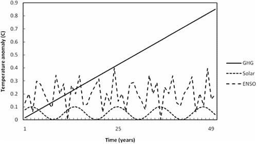
Figure 1 – Components of temperature series
To make up my ‘toy’ temperature series I add these together and get figure 2. It does a reasonable job of looking like the real temperature record for the last ~40 years and that’s what you’d expect for a period of roughly constant average solar output & El Nino.
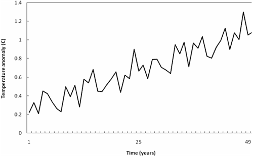
Figure 2 - Toy temperature series built from GHG, ENSO and solar components.
There is definite global warming from greenhouse gases, but there are still periods when you get a negative trend. Figure 3 is from a 9 year period in the graph for example.
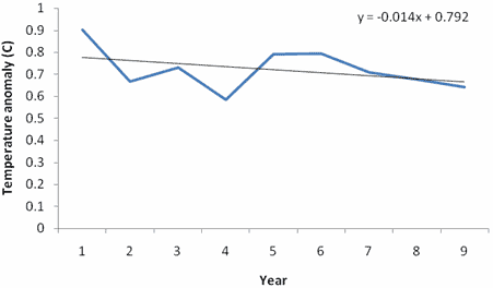
Figure 3 – Example negative trend from toy temperature series. Years 24-32.
So how do you decide what average to take? Well, you start by averaging over at least one period of the cycle; eg to cancel out day/night you take 24 hours, for summer/winter 12 months and for the solar cycle 11 years.
In a real data series without knowing all of the cycles, a scientist would do something called a ‘Fourier Transform’ – a clever bit of maths which tells you how long the cycles are. Here I know the periods: they are 4-8 years (El Nino) and 11 years (solar cycle). I’m going to take a 10 year average (remember, you can do this at home and try any average period you want to see what happens!), which is close enough to 11 that it should filter out most of the cycles.
Figure 4 shows there’s some little wiggles because 10 years doesn’t perfectly capture the periods but the interesting thing is the trend; it’s very close to the data and it thinks that there’s a warming trend of +0.017C/year.
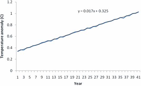
Figure 4 – Running mean 10 year average temperature.
This is exactly what I put into my toy model as the greenhouse gas warming. I tried the same trick with a quadratic equation and yet again, the averaging trick works and calculates very close to the underlying trend – try for yourself!
How could you use this trick to work out underlying trends in real temperature data? Follow the steps:
- Work out the period of the cycles using a Fourier Transform or by looking them up
- Take an average using the longest period
- Extract a trend
You can do it at home! There are example Fourier Transforms of the temperature on the internet, or you can just use the solar cycle as a baseline, take 10 or 11 year averages and know that this roughly covers the solar cycle and El Nino. Figure 5 shows an example using the HadCRUT3 temperature record.
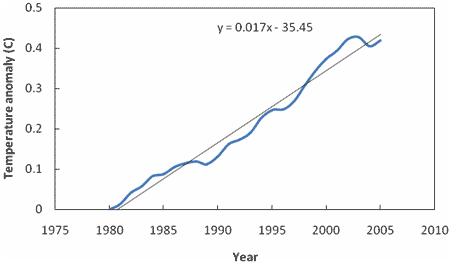
Figure 5 – HadCRUT3 using 10 year running mean for period 1975-2009. Temperature anomaly shifted up by 0.006C so that all values are positive.
This smooths out the short period cycles, but there is a slight dip recently. However, the decade trend is upwards (about +0.018C/yr), and short, small dips can be expected because you get wiggles from the cycles not fitting exactly into a 10 year trend. The average El Nino Index also dropped significantly from 1995-2009.
Once you count for the El Nino and solar cycles then you can see that something with a period longer than 10 years (and from that graph, longer than 60 years) is warming us. The rest of this site shows a lot of the evidence as to why scientists believe this effect is greenhouse gases, rather than anything else.
Many thanks to Mark Richardson for contributing this guest post.


 0
0  0
0


Comments