Climate Science Glossary

Term Lookup

Enter a term in the search box to find its definition.

Settings

Use the controls in the far right panel to increase or decrease the number of terms automatically displayed (or to completely turn that feature off).

Term Lookup

Settings


All IPCC definitions taken from Climate Change 2007: The Physical Science Basis. Working Group I Contribution to the Fourth Assessment Report of the Intergovernmental Panel on Climate Change, Annex I, Glossary, pp. 941-954. Cambridge University Press.

Home Arguments Software Resources Comments The Consensus Project Translations About Support

Twitter Facebook YouTube Mastodon MeWe

RSS Posts RSS Comments Email Subscribe


Climate's changed before
It's the sun
It's not bad
There is no consensus
It's cooling
Models are unreliable
Temp record is unreliable
Animals and plants can adapt
It hasn't warmed since 1998
Antarctica is gaining ice
View All Arguments...


Username
Password
New? Register here
Forgot your password?

Latest Posts

Archives

More animations of the Warming Indicators

Posted on 3 February 2011 by John Cook

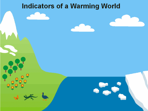
Just when you thought every possible iteration and variation of the Indicators of a Warming World graphic had been explored, several more have appeared. After posting Chip Fletcher's animated powerpoint last week, Chemware offered to create an animated GIF version. Here it is - he went that extra mile and also added links from each indicator to the relevant webpage:

51 kB animated graphic of climate change

For the glutton for punishment, Chemware created a 1024 pixel version of the animated GIF. In addition, Martin Hedberg also emailed me two variations of Chip's original Powerpoint:

  1. In version 1.1, each warming indicator fades in using 'sweep' rather than 'move in'. The different indicators sweep from top and down or reverse depending on what is happening.
  2. In version 1.2, the order of appearance was changed to what Martin found more logical.

Many thanks to Chemware and Martin for their efforts (and Chip for getting the ball rolling in the first place). One of these days, I'm going to create an equivalent "Human Fingerprints graphic (which has been updated several times over the past few months as I discover additional fingerprints). I wonder whether that too will undergo as many different variations.

0 0

Printable Version  |  Link to this page

Comments

Comments 1 to 5:

  1. I put together a video on "fingerprints" and "indicators". With help from Bach!
    0 0
    Response: Thanks for the link. Here's the embedded video for those of you too lazy to click on the link:
  2. Well done. My next request would be an "indicators of a climate sensitivity of 3˚C or higher" graphic... with links to Skeptical Science pages, as well as to the individual peer-reviewed papers supporting each indicator. IMO, we are letting the deniers "win" when we let them focus too much of the debate on the obvious and undeniable (whether the world is warming, what is actually causing the warming, whether greenhouse gases actually work as understood, etc.). The relevant debate, at this point in time, is "how warm are things going to get?" Lindzen and Spencer know this is the only battleground they have left, so they put their energies into the magical properties of clouds, despite a severe lack of evidence supporting their position. On the other side, there are myriad proxy studies, simple physics based mathematics, model results, and more that point to 3˚C or higher. Every time I look, it seems like another study points to 3˚C+ warming.
    0 0
  3. Grypo @1, Nicely done (and same for Chemware and Martin)! Grypo-- I found that I did not have quite enough time to read the text on many of your slides. Maybe shorter versions in larger font, or keep the slides up longer?
    0 0
  4. National Geographic have prepared a variation of this theme, shown on a global map. It can be found at http://environment.nationalgeographic.com/environment/global-warming/gw-impacts-interactive/ The site also links to what we can expect as a result of the warming.
    0 0
  5. Thanks Alb. I'm going to readjust the timing on those slides over the next couple of days and then fix the font color. I think the white works better.
    0 0

You need to be logged in to post a comment. Login via the left margin or if you're new, register here.


The Consensus Project Website

THE ESCALATOR

(free to republish)


© Copyright 2024 John Cook
Home | Translations | About Us | Privacy | Contact Us