


 Arguments


Where did global warming go? Here's where...
Posted on 12 January 2010 by John Cook
There is a dramatic cold spell sweeping across Eurasia, England and parts of North America. The most spectacular image capturing this phenomenon is a satellite photo revealing the whole of Britain covered in snow. One is tempted when confronted with these sorts of images to wonder what happened to global warming. Lest we succumb to temptation, it's best to step back and look at the broader picture. For starters, here is a temperature map of the entire Arctic circle and beyond:
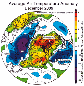
Figure 1: Map of temperature anomalies for December 2009 at roughly 1000 metres altitude for the region north of 30°N (NSIDC). Areas in orange and red correspond to strong warm anomalies. Areas in blue and purple correspond to cool anomalies.
Eurasia and North America are experiencing unusually cold conditions. On the other hand, Greenland, eastern Siberia and the Arctic ocean are experiencing unusual warmth. The warmest regions (more than 7° Celsius above average) are over the Atlantic side of the Arctic, including Baffin Bay and Davis Strait. Unsurprisingly, sea ice extent was below average in this region.
These strong contrasts in temperature are the result of a strongly negative phase of the Arctic Oscillation. This is caused by opposing patterns of atmospheric pressure between the polar regions and middle latitudes. During a negative phase, pressures are higher than normal over the Arctic and lower than normal in middle latitudes. In December 2009, the Arctic Oscillation index was -3.41, the most negative value since at least 1950. Note the blue dot in the bottom right corner representing December 2009.

Figure 2: Blue dots are monthly Arctic Oscillation Index. Red line is one year running mean (sourced from Andrew Revkin, plotted by Ignatius Rigor).
An even broader picture is a global map of temperature anomaly in the last week of December 2009. Here we see that much of the planet is experiencing warmer temperatures than usual, including North-east America, Canada, North Africa, the Mediterranean, and south-west Asia.
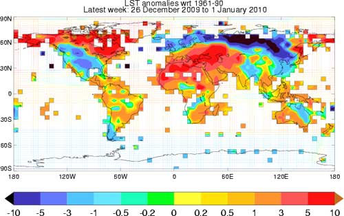
Figure 3: Map of global temperature anomalies, December 26 to January 1 (Met Office).
To conclude that global warming has ended based on recent cold snaps is another example of the misleading practice of focusing on small pieces of the puzzle while ignoring the broader picture. Interestingly, Roger Pielke Sr takes the opposite approach when assessing global temperature in December 2009 as measured by satellites. Despite the regional cold weather, global temperature has not shown a dramatic drop in December, leading Pielke to conclude (with original emphasis included):
"This data shows why the focus needs to be on the regional scale and that a global average is not of much use in describing weather that all of us experience."
After taking a broader look at global temperature, Pielke is forced to conclude that it's preferable to focus on small pieces of the puzzle than the bigger picture. Better that is, if the global picture isn't giving you the result you're looking for.


Comments