


 Arguments


Behind the Lines: Herschel's Discovery of Infra-Red
Posted on 11 December 2013 by jg
As I study climate science, I draw pictures—my way of taking notes. At first, these illustrations were for myself, but with help from Skeptical Science authors, I've created many that are now in our climate graphics resources:
As with all our resources, these images are available to anyone to republish under our creative commons license. I will be adding to these, and when an image has a story of discovery behind it, I'll share it as a look behind the lines.
Behind the lines with Herschel's Discovery
A recent illustrated project is our interactive climate history timeline, based on a post by John Mason and converted into it's interactive format by Paul D., with editing by Paul and Baerbel. I created the icons and some of the illustrations that accompany various passages. One of the first (in time sequence) summarizes Herschel's discovery of infra-red:
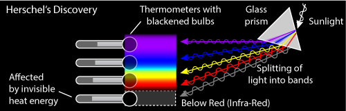
Figure: Depiction of Herschel's discovery of infra-red light
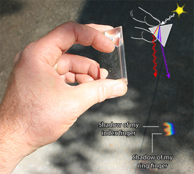
Herschel's objective was to measure the temperature of the different wavelengths of light revealed by a prism. I had a mental image of the experiment from textbooks: Light source, prism, rainbow colors, and a very dignified Herschel. First decision: get rid of Herschel so I could finish the illustration within my deadline.
Second, confirm that I was placing the surviving elements, sun (light source), prism, light rays, in a defensible orientation:
I like to personally verify details in a drawing, when possible. I had no trouble finding a prism among my astro-junk (acquired from years of astronomy outreach), and used it to examine the relative position of the light scattering:

However, from this photo one cannot definitively conclude which facets of the prism the light enters and exits through to create the bands of color. Consequently, I erred on the first version of my illustration.
The second time I took photos, I made sure to test which facets the light passed through. Putting my fingers over two of the facets confirmed the direction of the light through the prism.
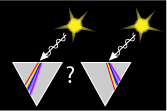
Next, I wanted to indicate the relative temperature of the thermometers placed in the color bands, and here I encountered a puzzle. A web search on "Herschel Experiment" reveals many photos of this experiment that I could not reconcile with what I knew of the energy output of the sun. For example, thermometers placed in the blue and yellow light showed lower temperatures than the thermometers in the red and infrared. This same result led Herschel to realize there were invisible energies coming from the sun. But, the energy output of a 5700–5800K star, our sun, is greater in the visible wavelengths than in the infra-red, and most of the visible light should be passing through the atmosphere whereas the infra-red should meet interference from some well-known greenhouse gases. How could these redder wavelengths be hotter?

Figure: A black body radiation curve suggests that the peak energy should not be in the red. This illustration is meant to show my question, and is not meant so show the exact alignment of light wavelengths.
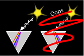
As anyone who's acquired a pile of astrojunk may know, it's easy to see purple and yellow fringes on the moon when looking through cheap optics. Poor optics suggest that the medium that light travels through affects the various wavelengths differently. And with a prism, the redder wavelengths are bent less than the bluer wavelengths.
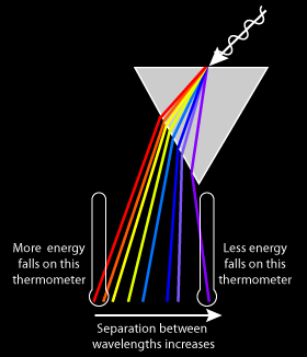
The result is that the blue wavelengths in the classic Herschel experiment are more spread out than the redder wavelengths and thus more energy reaches the thermometers measuring the red end of the spectrum. The Herschel experiment shows the presence of infra-red, but fails to measure the energy in each color. An underlying understanding of the physics makes a big difference in how to interpret the results.
The history of climate science has many wrong turns, observations and experiments that have led scientists to incorrect conclusions. For example, consider Wood's greenhouse box experiment, an attempt to emulate radiative heat build up as a model of the atmosphere's greenhouse effect. In this experiment a box that should trap infra-red does not gain more heat than one designed to lose infra-red. Some people cite this experiment to argue that there is no greenhouse effect (and therfore, no worry that we can enhance it). However, the atmosphere's greenhouse effect also depends on elements not present in an agricultural greenhouse or in Wood's greenhouse box, elements that need satelite measurement and physics-based models to understand.
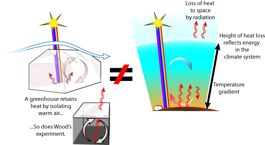
Figure: greenhouses lack the atmosphere's temperature gradient, varying height of thermal energy equilibrium, and heat loss to space.
The public's understanding of current climate science also suffers from incomplete observations that lead to incorrect conclusions. Why is Antarctic sea ice increasing? Why does an increase in greenhouse gases cool the stratosphere? Why does CO2 rise follow temperature in Antarctic ice cores? Perhaps these are future topics.


I am very grateful for all of the graphics done/presented on sks:
I reposted them many times over: 1 illustration can tell so much ...
(I wish I were a millionaire: then I could donate more to sks ...).
Very interesting post! I love learning more about scientific discoveries of the past. Looking forward to more posts in this series.
Too easy to forget the beauty of the basics! What a nice article.
The strength of Methane vis a vis Carbon dioxide as a greenhouse gas is 20 0r 30 times as much only if you include the phrase "on a 100 year basis". It's actual strength is somewhere around 100 times that of Carbon dioxide and hence the approximately 2ppm methane in the atmosphere has the same effect as 200ppm Carbon dioxide. I reverse engineered the figure using a half life of 7 years and a relative strength of 20 on a 100 year basis and got x140. Does anyone know where the original work is that worked out the actual relative strengths. In the NSIDC web site, they recently used a figure of x86.
http://mtkass.blogspot.co.nz/2013/03/the-real-strength-of-methane.html
wlhgmk@gmail.com