


 Arguments


Climate Bet for Charity, 2016 Update
Posted on 20 April 2016 by Rob Honeycutt
We are now half way into a climate bet made between a number of climate realists and climate contrarians who were commenting on the NoTricksZone blog 5 years ago. This bet originated when I made an off-handed comment at NTZ that I felt contrarians don't have the convictions of their often emphatic beliefs because I'd never found any who would bet on the climate.
Both Dana and myself were active on NTZ at that time, and we worked up a bet through Pierre Gosselin, who owns the NTZ site. Eventually we agreed to a bet stating that, based on an average of UAH and RSS satellite data, the decade of 2011 to 2020 would be warmer than the decade of 2001 to 2010. Realists saying, "Yes, this decade would be warmer." And contrarians saying, "No, this decade would not be warmer."
From there Pierre posted the bet on his website. Eventually, the climate realists raised upward of $10,000 in "realist" bets, and contrarians raised something around half of that for the "contrarian" position.
Half way through, how do things stand? That sort of depends on how you're currently tracking the data.
Running decadal average
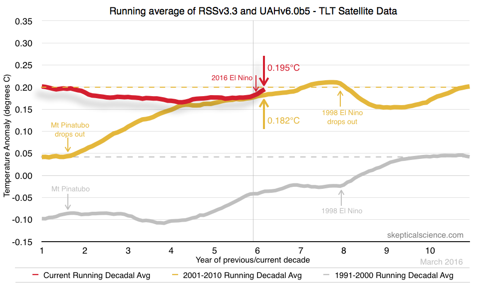
My preferred method to track the bet is to use a running decadal average and compare where the results would be if the bet had been made ten years previous to this month. Who would win in that case? When you look at it in that context there is no point during the past 5 years when the most recent decade was cooler than the previous decade. It's been close very recently, but still the most recent decade has remained warmer than the previous in the satellite data. (Full size graphic.)
Data updates
To date, we've only had one major data update coming from the University of Alabama, Huntsville (UAH) group when they moved from their version 5.5 to version 6.0. That had the effect of lowering the UAH trend fairly significantly, and brought it more in line with the Remote Sensing Systems (RSS) v3.3 data.
Last month RSS updated their TTT and TMT data (total troposphere and mid-troposphere, respectively) from version 3.3 to 4.0, which raised those trends significantly. They have yet to update the TLT data (lower troposphere, which we're using) to version 4.0, but when that happens we expect to see more warming from about 2000 forward.
Everything seems to be okay on both sides so far. We agreed that, in spite of differing opinions and perhaps through gritted teeth, each group (UAH and RSS) are good scientists doing their best to get accurate results. We are continuing to operate under the assumption that we will be basing the bet on the most recent TLT data sets published by UAH and RSS.
Short term climatic influences
An aspect that was not considered when the bet was initiated was the timing of climate events on the data. The reason I've included the 1991-2000 data on my chart is to help identify these. We had the Mt. Pinatubo eruption in mid-1991. Pinatubo acted to cool the planet for a couple of years after the eruption, and you can see how the decadal average levels off and then cools slightly. Conversely, in 1998 we saw sharp warming from a super El Nino, and the decadal trend warms quickly and then levels off with the following la Nina.
Climatology works with 30 year time spans as a normal yardstick. One decade can have a lot of influence from the kinds of short term events mentioned above, and 10 years of data is most certainly not going to be statistically significant. None-the-less, I have a great deal of confidence, based on the available scientific research, that the human influence on global warming is strong enough to make it nearly certain that, short of a massive low latitude volcanic event, we will win this bet. Dana did a recent piece in the Guardian showing why betting against global warming is a sure way to lose money.
Other presentations of the horse race
A blogger called "Kiwi Thinker" has picked up on this bet and decided to create his own graph of how this is progressing. Kiwi Thinker calls his graph an "accumulating average", but I would say he and I have different ideas about what an accumulating average is.
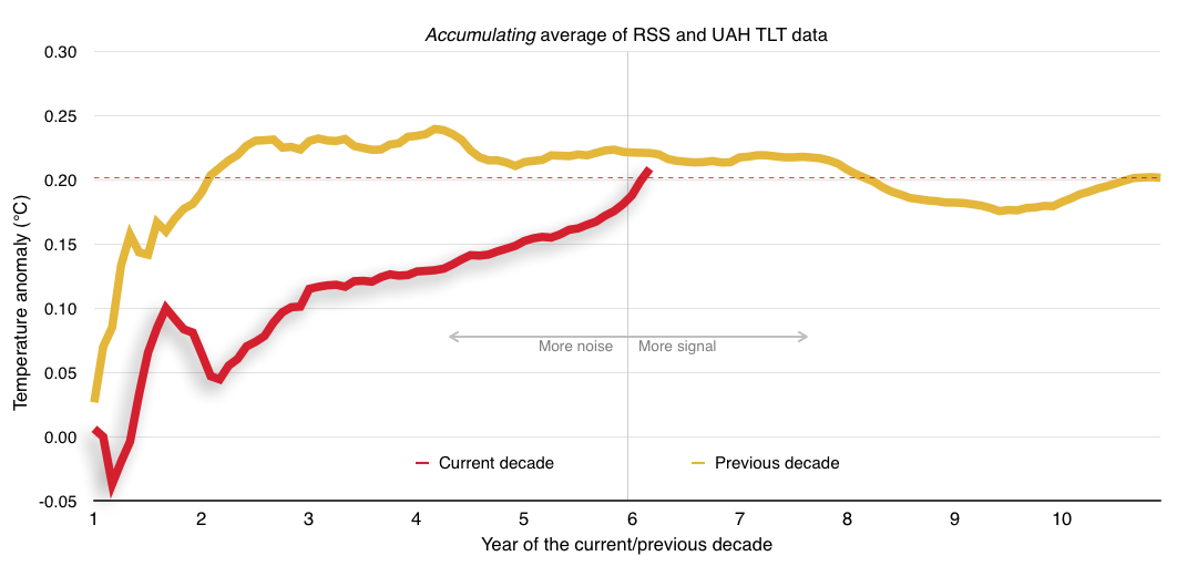
I've created my own accumulating average below and it's nothing like his. My method is to simply take the average of RSS and UAH the first month, then include the average of the two the next month, and then fill the formula down from there. Such a method is accurate but doesn't really reveal very much information merely because the early data is mostly noise. And, as you might expect, the plot levels out as the data accumulates. (Full size image.)
It took me some time to figure out what Kiwi Thinker was doing with his method. He's taking the average of RSS and UAH on the first month and divides it by 120 (months). The next month averages RSS and UAH, divides by 120 and then adds the previous month. (Full size image.)
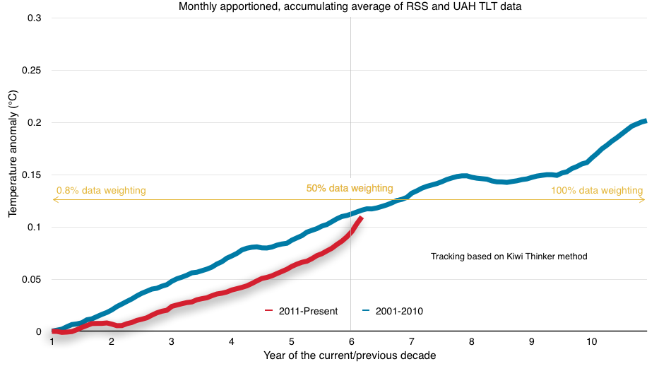
Kiwi Thinker's method more or less presents the data as a horse race by giving more and more weight to the to the average as it accumulates; in essence, it's double accumulating. It's not an accurate graph because, well, for one, it's saying that the current accumulated average of RSS and UAH is just above 0.1°C, and that's not the case. And the average of UAH+RSS was certainly not 0°C in January 2011. If you average the data for the first 5 years and 3 months (Jan 2011 to present) you get an anomaly of 0.209°C, not 0.109°C.
I'm still struggling to ascribe any real meaning to this chart.
It's really neither here nor there, though, since he will end up with the right answer when the bet finalizes. I just think he's going to be in for a rude surprise over the next 5 years. His method is going to over-emphasize the trend and make it look like we're going to hell in a hand basket. I would also note that on his chart his Y-axis tops out at 0.25°C. He's probably going to have to shift that up to 0.3°C or higher before all is said and done.
I believe the running decadal average method, used in the top graph, offers far more interesting information about decadal warming by making every point along the plot a 10 year average. That makes it easy to compare any two decadal averages by merely choosing a point along the plot and referencing the point directly above or below it.
New climate bet widget
We're adding a new widget to the SkS right-side sidebar that will be updated on a monthly basis. The next 5 years of this bet are going to be where all the fun is, so it's worth having a little reminder of where things stand.
Here, I'm going to go one step further than just stating that this decade will be warmer than the last. I'm going to predict this decade will end at least 0.1°C warmer than the last, based on UAH+RSS. [This statement is ancillary to the bet.] If I'd made such a statement that ended this month my prediction would be wrong. But looking at how the decadal average rose after the 1998 El Nino, and noting that the following la Nina will only act to flatten the plot after that, I think +0.1°C is pretty safe. You can also note that, after the cooling from Pinatubo dropped out of the average, temperature rose almost 0.15°C in about 5 years. Relative to the decadal trend, that may be somewhat analogous to the extended la Nina and ENSO neutral conditions we've seen since the 1998 El Nino. Note also that 2001 started ~0.15°C warmer than 1991, and 2011 was ~0.15°C warmer than 2001. It's not unreasonable to expect 2020 will end as much as 0.15°C warmer than 2011.
The bigger message
While bets are a fun way to engage people in the issue, it has no direct bearing on what's really important. It's overwhelmingly clear that human activities are responsible for most or all of the warming of the past 50 years. If we continue to emit carbon into the atmosphere at our current rate we risk unconscionable consequences for later generations. We absolutely must shift our energy systems away from fossil fuel sources and replace them with carbon-free energy. We have precious little time to make this fundamental and massive adjustment.


I think I've worked out how to get something out of KT's plot.
The one advantage it has is that because the denominator is constant, the noise level is also constant across the plot.
Against this, it incorporates a meaningless trend term which is solely dependent on the choice of baseline.
Suppose you were to rebaseline the UAH/RSS mean series by subtracting the mean of the first decade from the series. Then the first decade becomes a CUSUM plot, with the start and end points equal by definition. Progress on the second decade can be seen by whether the line is currently above or below zero.
CUSUM plots are not very intuitive, so I'm not saying it's a good representation. But it does have some mathematical meaning.
Thanks, Kevin. It's certainly interesting to look at the question different ways. If the decade plays out to the expected 0.15°C over the previous one, that will end up looking very different than what I think he's anticipating. I'm going to be curious how KT's responds as this moves forward.
Yes. That's effectively what I've said, that KT's methods are going to end up with the same result in the end. Although, I'm not clear on what you mean when you say, "Your running average is effectively assuming that the remaining months will continue with the same average anomaly and Kiwi's is assuming that the remaining months will have an anomaly of zero."
That's not registering for me somehow.
Gotcha. Now I get what you're saying.
Couldn't find the widget for the bet on the right-hand side bar.
The "warmists" line has topped the "coolists" in recent months on Kiwi Thinker's chart.
http://www.kiwithinker.com/climate-bet/
(This is an updated link, so things may be different than today if you click on it later in time)
[PS] Fixed link. Please use the link tool in the comment editor in future.
KT is a little overly optimistic for his position, stating, "I’m guessing the green line will cross back under the red in five or six months as El Nino fades out and La Nina arrives."
He fails to grasp his own data. A La Nina will act to flatten the trajectory, not cause it to fall back below that trajectory. Meanwhile, models are actually projecting the La Nina to be a mild one.
Rob Honeycutt @9, the data used is the average of the RSS TLT (anomaly interval of 1979-1998) and UAH TLT (anomaly interval of 1981-2010). Because of the recent anomaly intervals, negative values are still possible with a strong enough La Nina (as happened in 2008) or volcano. Moreover, it is not clear that KT is projecting negative values, as five to six months of near zero values would bring about a cross over with the red line.
I think it is fairer to say that his comment is likely to be optimistic because it is consistent with his global warming skepticism. A La Nina as strong as that in 2008 would now result in a slowly rising trend rather than a flat or negative trend due to the increased underlying temperature in the interval.
On a side note, I presume the use of the most recent version of UAH (v6 Beta) is consistent with the terms of the bet. In that case the likely update of the RSS TLT inline with current update of the TTT and TMT products to version 4 will also be required by the terms of the bet before the bet is due. As that update resulted in a significant increase in the warming trend in the TTT and TMT products, it is also likely to do so in the TLT product, thereby increasing the overall trend (just as the update to UAH v6 will have decreased it). Given that, and given the decrease in the 2001-2010 cumulative sum in 2008 makes the "skeptic" side of the bet a poor one from the current outlook.
Because of the way KT has created the graph, I'm not so sure a La Nina would do it. Because of the fact that he's weighting the graph as it goes, that gives his chart, essentially, a diagonal axis. As new cooler data is added, it would offset previous warming data and maintain the same diagonal (flat) trend. I believe the 2008 La Nina shows prominently because the previous warming data it offsets is much weaker.
Rob, he describes his method, saying:
Given that method, in any month with a negative anomaly, the cumulative sum is decreased. Therefore, for a negative trend, a sufficiently strong La Nina would do it. Having said that, by some indices, 2008 was a record breaking La Nina, and by others 2011/12 was among the strongest La Ninas on record. While 2008 resulted in a distinctly negative short term trend due to several months in a row with a negative anomaly, 2011/12 only managed a couple of negative months interspersed among positive months so that the overall short term trend was flat. That negative short term trends are possible is clearly seen in the graph below in the 2008 values (around week 97 on the red line).
Given this, and global warming, for a new La Nina to actually generate a negative short term trend in this method, it would have to be off the charts. Likewise, for a volcano to do it, it would have to be larger than Pinatubo. Possible, but unlikely in both cases. An interval with no gain, ie, a flat short term trend, however, is possible with a moderate to strong La Nina.
Having explained that, it occurs to me that we may be talking at cross purposes. If you are maintaining that La Ninas cannot make the full trend negative (ie, from week 0 to the current week) I would agree. Global warming has taken that one of the cards. But in that case neither was KT claiming that it would likely occur.
I think we're saying essentially the same thing. The terms get confusing because of the progressive weighting method KT is using. If I'm not mistaken, for the current decade line to drop below the previous decade line would require a La Nina at least double the scale (or duration) of the recent El Nino. For that to happen within "the next 6 months" would require something even greater in scale than that.
But again, I think my running decadal chart is a much better indication of where things actually stand and is also a better illustrator for where things are likely going to end.
On the issue of data sets, I think the terms of the bet lock us into TLT data. We did update the UAH data to v6, and I assume RSS will eventually update their TLT to a v3 similar to their other data.
Right now we're using the cooler version of the RSS data, and the updated UAH TLT data acted to cool the data. Even at that we're still likely to win the bet. I ran a test of my chart using the new RSS TTT data and the effect was... um, dramatic to say the least.
Rob Honeycutt @13.
Your opponent appears to be a true stary-eyed optimist. For is green & red lines to come back together by the end of the year (which is his 'guess' for what we can expect) let alone "cross back under", it would require the last five months of 2016 to average +0.063. Such a five-month average last happened back in early 2012 but to instantaneously happen following a value of +0.4 would require a leap into fantasy.
I say five months as July's UAH6 & RSS are both posted yielding a value of +4.3 - the divergence of red & green continues.
I have to say I am not very impressed with any of the graphical representation of this 2000s/2010s comparison so attempted a quick alternative here (usually 2 clicks to 'downlaod your attachment'). (Note, the reason why my graph suggests a warmer 2010s has been running since February while the Kiwi Thinker shows it only since May is because the first years of 2001-10 were on average warmer than the last years of 2001-10. It took a couple of extra months to match those warmer early years.)
By my method for running decadal data, since current decade and previous decade are inclusive of a full 10 years, it would actually require both data sets to fall back to 0°C and stay there for six months in order to bring the current decadal average 0.001°C below the previous decadal average.
I agree. I'm thinking that's not in the cards.
MA Rodger @14, having crunched the numbers, to drop to an anomaly of 0 in one month requires a drop that is 3.55 standard deviations of the mean monthly drop in temperature anomaly over the period January 1981-present. The drop would be nearly one and a half times the largest monthly drop to occur in that interval, including during the Pinatubo eruption. Alternatively it would require an average drop of more than 1.6 times the maximum six month drop in that interval, including during Pinatubo. I would like to revise my opinion, and now agree with Robb that it is decidely optimistic.
With regard to presentation, I have no major problem with KT's chart, but think it needs a line indicating the benchmark, as shown below:
The idea is that the relevant comparison is not with monthly cumulative value, but with mean cumulative value over the full decade. If the 2010s line did drop back to the 2000s value in six month, and maintained the same average rate of increase thereafter, it would still win the bet for the climate realists.
"We're adding a new widget to the SkS right-side sidebar that will be updated on a monthly basis."
Hi Rob. It'd be good to see that widget, or alternatively an update to the graph here, which was going to be updated monthly, but hasn't been since March. Your chart is more intuitive than KT's.
I see that Kiwithinker has adopted "the line indicating benchmark" in his latest posting, as per Tom Curtis @6.
His latest posting is perhaps less optimistic than his June posting when he said "I’m guessing the green line will cross back under the red in five or six months as El Nino fades out and La Nina arrives." Including August's data, the 2010s are now further ahead than the 2000s have ever been since the start of the bet. And all indicators are suggesting that lead will increase in the short term. Indeed, to manage a 'crossing' by the end of the year to put the 2000s back in the front would now require 4 months averaging a negative anomaly. That's actually a pretty rare event these days. It has happened this century only in 2011 and 2008.
I wonder if "Kiwi thinker" has revised his opinions on climate change. Good to see the image still being updated.