Climate Science Glossary

Term Lookup

Enter a term in the search box to find its definition.

Settings

Use the controls in the far right panel to increase or decrease the number of terms automatically displayed (or to completely turn that feature off).

Term Lookup

Settings


All IPCC definitions taken from Climate Change 2007: The Physical Science Basis. Working Group I Contribution to the Fourth Assessment Report of the Intergovernmental Panel on Climate Change, Annex I, Glossary, pp. 941-954. Cambridge University Press.

Home Arguments Software Resources Comments The Consensus Project Translations About Support

Twitter Facebook YouTube Mastodon MeWe

RSS Posts RSS Comments Email Subscribe


Climate's changed before
It's the sun
It's not bad
There is no consensus
It's cooling
Models are unreliable
Temp record is unreliable
Animals and plants can adapt
It hasn't warmed since 1998
Antarctica is gaining ice
View All Arguments...


Username
Password
New? Register here
Forgot your password?

Latest Posts

Archives

Despite uncertainty, CO2 drives the climate

Posted on 18 October 2010 by dana1981

In August 2010, Nature published a commentary by Penner et al. which mainly focused on the uncertainty regarding the effect short-lived pollutants (such as aerosols and black carbon) have on the climate. As is often the case, many in the blogosphere misinterpreted and misunderstood the statements and conclusions in the commentary. Not surprisingly, the biggest misinterpretation related to the contribution of anthropogenic greenhouse gases to global warming. Below is the most misunderstood quote, in which I've emphasized the key word.

"Of the short-lived species, methane, tropospheric ozone and black carbon are key contributors to global warming, augmenting the radiative forcing of carbon dioxide by 65%. Others — such as sulphate, nitrate and organic aerosols — cause a negative radiative forcing, offsetting a fraction of the warming owing to carbon dioxide."

Numerous blogs have (mis)interpreted this statement to mean that carbon dioxide is only causing 35% as much global warming as previously believed. A more accurate reading of the quote is that certain short-lived pollutants cause warming in addition to carbon dioxide - quantitatively, approximately 65% as much warming as CO2. And certain other short-lived species cause a cooling effect which offsets some of this warming.

This is not a new conclusion. The IPCC puts the radiative forcing from CO2 at 1.66 W/m2, compared to the forcing from other greenhouse gases, black carbon, and tropospheric ozone at approximately 1.4 W/m2. Similarly, the negative forcing from aerosols is approximately -1.2 W/m2.

Figure 1: Radiative forcing estimates from the IPCC FAR

Thus if anything, the 65% figure is an underestimate of the contributions of short-lived pollutants to global warming, but this contribution does not change the 1.66 W/m2 radiative forcing from CO2 or the amount of global warming it has caused.

Much ado has also been made about another quote from the commentary:

"Warming over the past 100 years is consistent with high climate sensitivity to atmospheric carbon dioxide combined with a large cooling effect from short-lived aerosol pollutants, but it could equally be attributed to a low climate sensitivity coupled with a small effect from aerosols. These two possibilities lead to very different projections for future climate change."

This statement gets to the main point of the commentary - that there remains significant uncertainty regarding the effect of these short-lived pollutants on the global climate. However, estimates of the planetary climate sensitivity to increasing atmospheric CO2 and other radiative forcings are not solely based on the change in the mean global temperature over the past 100 years. In fact, the climate sensitivity parameter has been estimated through many different methods, including:

  • climate models
  • recent responses to large volcanic eruptions
  • recent responses to solar cycles
  • paleoclimate data
  • data from the last Glacial Maximum
  • and yes, data from the instrumental period
All of these different methods show strong agreement, overlapping in the IPCC climate sensitivity range of 2 to 4.5°C for a doubling of atmospheric CO2 (2xCO2).

sensitivity summary

Figure 2: Distributions and ranges for climate sensitivity from different lines of evidence. The circle indicates the most likely value. The thin colored bars indicate very likely value (more than 90% probability). The thicker colored bars indicate likely values (more than 66% probability). Dashed lines indicate no robust constraint on an upper bound. The IPCC likely range (2 to 4.5°C) and most likely value (3°C) are indicated by the vertical grey bar and black line, respectively (Knutti and Hegerl 2008)

Interestingly, Penner et al. find that whether the climate sensitivity parameter is on the low or high end, reducing anthropogenic emissions of the short-lived warming pollutants would achieve a significant reduction in global warming over the next 50-100 years.  In the red lines in the Figure 3, they employ a climate model with a sensitivity of 5°C for 2xCO2, slightly outside the IPCC likely range.  The blue line is a climate model with a sensitivity of 2°C for 2xCO2, on the lower end of the IPCC range.  Note that even with the lower climate sensitivity, the model shows the planet warming 3°C by 2100 in this emissions scenario (see the figure caption for further details).

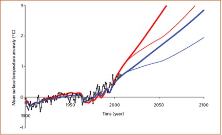
Figure 3: Global mean temperature measurements (black) and projections based on an IPCC scenario with high emissions (A2) for a climate sensitivity parameter of 5°C (upper red) and 2°C (upper blue). Linearly decreasing the total anthropogenic radiative forcing owing to methane, tropospheric ozone and black carbon — starting in 2010 and achieving pre-industrial levels by 2050 — results in significant near-term climate mitigation (lower blue and red curves) (Penner 2010)

Unfortunately, reducing the short-lived cooling pollutants such as aerosols would cause a warming effect of similar magnitude, and so CO2 remains the primary pollutant of concern.  Coincidentally, a group of scientists from NASA GISS just published a paper in Science entitled Atmospheric CO2: Principal Control Knob Governing Earth's Temperature.

Although it is important to reduce the remaining climate uncertainties, such as the magnitude of the impacts of short-lived pollutants, it does not change the fact that CO2 is very likely the driving force behind the current global warming, or that if we double the amount of CO2 in the atmosphere from pre-industrial levels, the planet will likely warm in the range of 2 to 4.5°C.

This post is the Intermediate version (written by Dana Nuccitelli [dana1981]) of the skeptic argument "CO2 only causes 35% of global warming".

0 0

Printable Version  |  Link to this page

Comments

Comments 1 to 30:

  1. These two recent articles are sure to stimulate confusion: From Lacis, Schmidt et al: Noncondensing greenhouse gases, which account for 25% of the total terrestrial greenhouse effect, From Schmidt and Reudy et al: water vapor is the dominant contributor (∼50% of the effect), followed by clouds (∼25%) and then CO2 with ∼20% The other side doesn't bother with such detail; hence they can do a far better job of homogenizing their message.
    0 0
  2. A couple of things bother me about Figure 3. The first thing is that zero is not set to the temperature for 2010 or at least 2009, but for what looks about 1960. I'm currently reading "Proofiness" by Charles Seife and one of his first example of a misleading graph is setting the index at a place where the reader doesn't expect it. If you look at 2010, then the temperature increase is only a little over 2 degrees. It also looks like the graph assumes that CO2 will double between now and 2100. That would mean an average increase of about 4.3 PPM per year and increase of between 6 and 7 PPM per year by 2100. That seems questionable considering current demographic projections to the world reaching ZPG around 2040-50 and population stabilizing between 9 and 10 billion. To reach over 6ppm would require a big increase in average carbon output per capita, which also seems unlikely since most of the carbon hog countries are looking at declining population.
    0 0
  3. Joel, setting some part of the 20th century as the baseline for global temperature anomalies is the norm. That's what everyone does. And in a business as usual, high emissions scenario as employed in Figure 3, atmospheric CO2 will double from pre-industrial levels before 2100. You appear to be neglecting rather large developing countries like China and India. That's a rather large omission.
    0 0
  4. #2: "To reach over 6ppm would require a big increase in average carbon output per capita" Isn't that what happens when developing nations develop? See Wikipedia: China, India, Vietnam, all have short doubling times for their per capita emissions.
    0 0
  5. Joel #2: It should be noted that the IPCC projected a range of different emissions scenarios. The point of using the high end A2 scenario in this writeup is presumably to show that even in such a 'worst case' scenario the possible mitigation effects of controlling these other pollutants are significant. That said, the A2 scenario actually projects 836 ppm at 2100, which is more than double the current 390 ppm and just over three times the 'historical baseline' value of 278 ppm. As others have noted, this is based on the assumption of continued industrial development around the world. You should also note that the 'population will stabilize between 9 and 10 billion' it is just one of a range of projections.
    0 0
  6. #3. I know that is a common convention and it is always misleading, especially when you clip the graph out of context, so we don't know what the 0 degrees represents. You said "Note that even with the lower climate sensitivity, the model shows the planet warming 3°C by 2100 in this emissions scenario.". Did you mean 2010 or 1950-80? Most people reading it weren't born in 1950 and a lot of them weren't born in 1980 and are going to assume that you meant it was going warm 3 degrees between 2010 and 2100. If you can't re-normalize the data to the current year, then at least mark an X and label it 2010.
    0 0
  7. Not to sound overly reactive, but how often should we reset the baseline, Joel? Every year? And by your recommendation, why should the baseline not be set to any arbitrary year we choose, as opposed to 2010? What's so special about 2010 in the statistical record? The cynic in me imagines that trying to shorten the longitudinal perspective this way has an objective of comfort as opposed to cold-hearted assessment.
    0 0
  8. Joel, I find your argument that something which is the norm and which everybody is accustomed to is "misleading" very hard to swallow. Anyway the figure is from a peer-reviewed scientific paper and used in an Intermediate level rebuttal. In both cases the audiences should know how to read a simple graph, and if they don't, they can always ask.
    0 0
  9. There are a few requirements to define the baseline for the temperature anomaly, the first being that it cannot be any single year. Being it an average over 30 years, it's better if temperature didn't change much over that period. Finally, you want the best data possible, and this excludes any 19th century period. The three decades 1950-80 look very appropiate.
    0 0
  10. #4 & #5 lets me use another section of "Proofiness" that the author call "regression to the moon". The example was some scientists that analyzed men and women sprinting records and did a linear projection and concluded that women would beat the men in the 100 meter in 2154. This paper actually got published in Nature. Doing a linear projection of carbon emissions for 10 year would be fairly reasonable assumption. For 20 years, not so much. For 90 years, it is gibberish. The way I see it, we have three kinds of countries. Developed countries Developing countries, and not so developing countries. In rough numbers, since I'm too lazy to look it up, call it 2 billion developed, 2.5 developing and 2.3 NSD. The developed counties are all at ZPG or below. The developed countries have fairly flat carbon emissions per capita and they will have less people by 2100, so their carbon emissions will be flat or decrease by 2100. The NSD counties will have a lot more people, but they won't be able to use a lot more fossil fuels, because they don't have the money to buy or the infrastructure to use a lot more fossil fuels. If fuel prices go up a lot, then they might actually be using less. Developing counties eventually become developed counties, like former developing countries like Taiwan, Korea and Singapore. I figure China gets there about 2040 and India by 2060. At that point their emissions per capita flatten out and their population decreases. China is already at ZPG and India should be there in 10 years of so. Above is rather simplistic, since it assumes it is actually possible to triple out production of fossil fuels. Does anyone actually think we will producing three times as much petroleum in 2100? Ever hear of peak oil? We would be extremely lucky to maintain our current production. Part of this will be addressed by tar sands and shale oil, but at much higher prices. This also opens opportunities for renewables to grab part of the market and makes hybrids and electric cars a reasonable purchase without tax subsidies. There is also a reasonable case that we can't triple our production of coal either. China has already started importing coal, but the are limits to how much coal they can practically import. China has a nuclear power program that is growing by leaps and bounds. They will have more nuclear plants than the United States by 2025. By 2040 nuclear plants will be displacing coal plants. That is about the year when China estimates that the CO2 emissions will flatten out. A few years after that it will start go down.
    0 0
  11. Incidently, Stephen Schneider at one point thought that particulates would dominate the effect of CO2 and that cooling would prevail. This was one source, if not the main source, of the media splash on 'global cooling'. Not very much later, he retracted that position with the admission that he'd gotten some of the math wrong. This was in the 1970s. So, it's not an easy determination to make, but more is known now than it was then.
    0 0
  12. #8 When I looked at the reference you gave, Figure 1 explained in the first sentence what the baseline was, so saying that scientists don't have to explain that seems kind of spurious. Why don't you use the graph that explains explains the baseline?
    0 0
  13. #10: "since it assumes it is actually possible to triple out production of fossil fuels. ... Ever hear of peak oil?" Have you ever heard of coal? China is #1 in CO2 emissions (total, not per capita) for the past few years, primarily due to their most abundant source of energy: Coal. Coal's CO2 emissions per kwh of electricity generated is much higher than petroleum. See Table 1 here. As far as China's nuclear industry, they are shooting for 75 MW by 2020, up from 9 MW now. That's still a drop in the bucket, especially if you go with per capita energy needs for a 'developing' nation.
    0 0
  14. If you set up the spreadsheet correctly, there shouldn't be any need to reset the baseline. You should be able to set it up to draw the X and Y crossings corresponding to the current date. An alternative would be to have the spreadsheet draw a symbol at the current date. Sort of like the You are Here symbol on a mall map.
    0 0
  15. Uh, maybe I missed something, but what difference does it make where the baseline is?
    0 0
  16. Joel, Take a step back and try to understand that you are not the first person to understand the problems with extrapolating current trends into the future. BTW, isn't this what you are doing by predicting a date for when China will have more nuclear plants than coal plants. You should also realize that does not mean that they will have less coal plants than they have now. Also try to understand that there is more than one scenario in AR4. These predictions of the future are much more, 'If A happens, we can expect B to be a result.' than they are a prediction that 'A will happen'. Lastly, please explain your math. Pre-industrial levels of CO2 were about 287 ppm. Currently we are at about 388 ppm. So, we are about 1/3 of the way to a doubling already. The levels are increasing by about 2 ppm currently. Even if the current levels of production stop growing immediately, at the current rate, we'll reach a doubling by around 2010 + ((287ppm*2) - 388ppm)/(2ppm/yr) = 2103. Wow, that is _so_ far off from 2100. However, if you look up the levels of CO2 in the atmosphere, there is every indication that the rate of increase is increasing, and not decreasing. So, there is every indication that a doubling will be reached before then, and no indication that any reduction will occur without some form of intervention. Peak oil will happen; it's just a matter of when, but there are plenty of other sources of fossil fuel around. Incidently, if you look at US Department of Energy predictions, there is no reduction of fossil fuel use expected. Regarding, "there shouldn't be any need to reset the baseline". Umm, you are right, and most of the baselines were established 30 years ago or more. Then again, as has been pointed out repeatedly, if the audience can read a graph, why does it matter?
    0 0
  17. Oil's part of the problem, Joel, coal is the biggest. Here's some data on where coal is headed: From United States Energy Information Administration Notice that population does not track coal consumption; your correlation is specious. The swerve you see post-2002 continues; for 2008 production was 7,271,249 thousand short tons. There's lots more coal available, dirtier going forward, but plenty to burn unless we choose to do otherwise. This business of changing the baseline seems simply an exercise in politically correct thinking.
    0 0
  18. muoncounter @13... That's interesting that China is shooting for 75MW (surely they mean GW) by 2020. They're shooting for 230GW in wind by the same time.
    0 0
  19. This discussion may be trending off-topic. Nevertheless... The advent of of natural gas production from shales, made possible through the improvements in drilling and hydraulic fracturing technology, has radically altered the notion of "peak oil". The resource potential of shales is immense. Electricity generation from natural gas results in approximately 37% less carbon emissions than coal, for an equivalent amount of energy... but that's still 63% more than zero. At this point, energy supply is driven by market economics (not quite "free"-market!), and coal remains an economically viable energy resource. Even if world oil production begins to decline, there's still plenty of fossil carbon available to generate energy... and... .er.... CO2 as a by-product. Environmentalists who were counting on "peak oil" to reduce the rate of carbon emissions will likely be disappointed, despite the environmental benefits of natural gas. It will require some sort of artificial "meddling" in the marketplace to substantially alter this trend.
    0 0
  20. archiesteel #15 - you didn't miss anything, the baseline is completely unimportant.
    0 0
  21. Joel wrote: "I'm currently reading "Proofiness" by Charles Seife and one of his first example of a misleading graph is setting the index at a place where the reader doesn't expect it." Which is entirely subjective. Most readers expect the baseline for temperature anomalies to be an average over the timeframe of the data series or some portion thereof. Your apparent expectation that it would be the average over the year 2010 (which isn't over yet... so, what, recalculated daily?) is highly anomalous. Your claim that a graph which doesn't conform to YOUR assumptions is intentionally "misleading" says alot more about you than it does the graph. In short, you're looking for excuses, and incredibly thin excuses at that, to find fault... so, of course, you will.
    0 0
  22. #18: See the graph here. Projection for China's nuclear energy in 2020 is given as 150 billion kwH; this works out to 17 MW of generating capacity.
    0 0
  23. Joel, I have the opposite problem from you. I think the baseline should be set at 1850 so that the rise reflects all the temperature increase from the start of the idustrial era. We can compromise by choosing the time frame when the graph was originally started, say 1950-1980. That corresponds to when I was a child so it makes sense to me. Oh wait, that is what they did.
    0 0
  24. @muoncounter: considering there are 8760 hours in a year, 150 billion KWh (or 150 TWh) gives approximately 17 GW or power, not 17 MW. 150,000,000,000,000 ÷ 8760 = 17,123,287,671.23
    0 0
  25. #21 As I have already said (#12), the problem was with dana1981 reproducing the graph without the caption explaining in the first sentence that the baseline was 1950-80. Dana1981 made the graph proofy by using Figure 3 instead if Figure 1.
    0 0
  26. #18 You need to google the term Capacity Factor. If you want to compare Wind to Nuclear, take the Wind number and divide by 5. In the U.S., at least, wind turbines run at 20% of capacity and nuclear plants are in the high nineties.
    0 0
    Moderator Response: Reminder to everybody, please do not delve into issues of competing energy technologies here on Skeptical Science.
  27. Joel #25: The baseline used in the graph is, in this case, completely immaterial to the point being made by the graph. Should it also have specified the data source? And the full details of the compilation methodology? And all of the base temperature station results? The fact that more information exists does not mean it is "misleading" to cite only the information relevant to the point being made. Again, your objections are picayune.
    0 0
  28. #24 Obviously this graph is way out of date. The reactors they have under construction already would exceed that number. http://www.world-nuclear.org/info/inf63.html The article expects 80GWe by 2020, but since I started following the Chinese energy issues this number keeps getting revised upwards every month or two. If you scroll downward they have detailed information on the plants under construction, scheduled and proposed. The 80GWe only includes planned and under construction plants. It takes the Chinese about 48 months to build a reactor, so anything started by 2016 should be online by 2020. The Chinese government is projecting their carbon emissions to flatten out by about 2040. From what I can see they are totally serious about meeting that goal. Understanding these points is vital. IPCC projections are no better than the economic models they use for inputs. The science can be perfect, but with a bad economic model it is GIGO.
    0 0
  29. Joel #28: "IPCC projections are no better than the economic models they use for inputs. The science can be perfect, but with a bad economic model it is GIGO." All of which is smoke since the IPCC projections span a range of emissions scenarios that extends both above and below what you consider likely. They covered everything from impossibly high (i.e. continuous population and economic growth) to impossibly low (i.e. immediate cessation of all fossil fuel use). In short, it's covered.
    0 0
  30. Ramanathan's done some work on aerosols, including black carbon. See figure 2. His work indicates black carbon forcing (warming effect) has been underestimated by the IPCC somewhat and aerosols (cooling effect) have also been underestimated. No effect on CO2 or other greenhouse gas forcing estimates. Black Carbon and Global Warming
    0 0

You need to be logged in to post a comment. Login via the left margin or if you're new, register here.


The Consensus Project Website

THE ESCALATOR

(free to republish)


© Copyright 2024 John Cook
Home | Translations | About Us | Privacy | Contact Us