First Look at HadCRUT4
Posted on 18 April 2012 by dana1981
Morice et al. (2012) explains the changes in HadCRUT4, which incorporates land temperatures from CRUTEM4 (as described by Jones et al. 2012) and sea surface temperatures (SSTs) from HadSST3 (as described by Kennedy et al. 2011 Part 1 and Part 2).
CRUTEM4 has been updated to include more data:
"US station data have been replaced with the newly homogenized US Historical Climate Network (USHCN) records [Menne et al., 2009]. Many new data have been added from Russia and countries of the former USSR, greatly increasing the representation of that region in the database. Updated versions of the Canadian data described in [Vincent and Gullett, 1999, Vincent et al., 2002] have been included. Additional data from Greenland, the Faroes and Denmark have been added, obtained from the Danish Meterological Institute [Cappeln et al., 2010, 2011, Vinther et al., 2006]. An additional 107 stations have been included from a Greater Alpine Region (GAR) data set developed by the Austrian Meteorological Service [Auer et al., 2001], with bias adjustments accounting for thermometer exposure applied [Böhm et al., 2010]. In the Arctic, 125 new stations have been added from records described in Bekryaev et al. [2010]. These stations are mainly situated in Alaska, Canada and Russia. See Jones et al. [2012] for a comprehensive list of updates to included station records."
HadSST3 includes both an increased number of SST measurements, and new adjustments for recently-identified biases. Gavin Schmidt provides a good discussion of some of the issues with historical SST measurements at RealClimate.
Kevin C has produced a great animated GIF comparing the global coverages of HadCRUT3 and HadCRUT4, illustrating that the most notable difference is better coverage in HadCRUT4 (Figure 1).
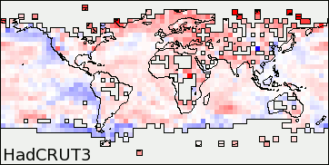
Figure 1: global geographic coverages of HadCRUT3 and HadCRUT4. Colors represent mean(2006-2010) minus mean(1996-2000), from +2°C (red) to -2°C (blue).
Figure 2 compares HadCRUT4 to the previous version, HadCRUT3. Note that so far HadCRUT4 data are only available through 2010.
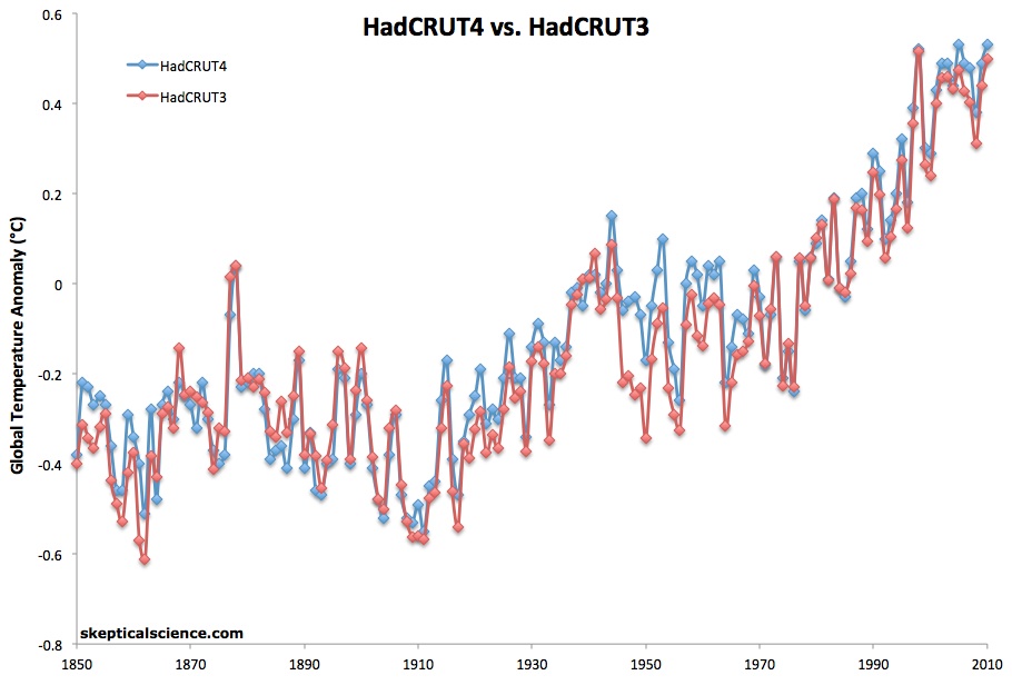
Figure 2: HadCRUT4 (blue) vs. HadCRUT3 (red) annual global surface temperatures
The largest change comes during the mid-20th Century, for example due to an adjustment to account for the sources of SST data switching during World War II from European fleets to almost exclusively US fleets (discussed by Schmidt at the link above). These adjustments, which somewhat dampen the mid-century cooling, are quite apparent in Figure 3, which takes the difference between HadCRUT4 and HadCRUT3.
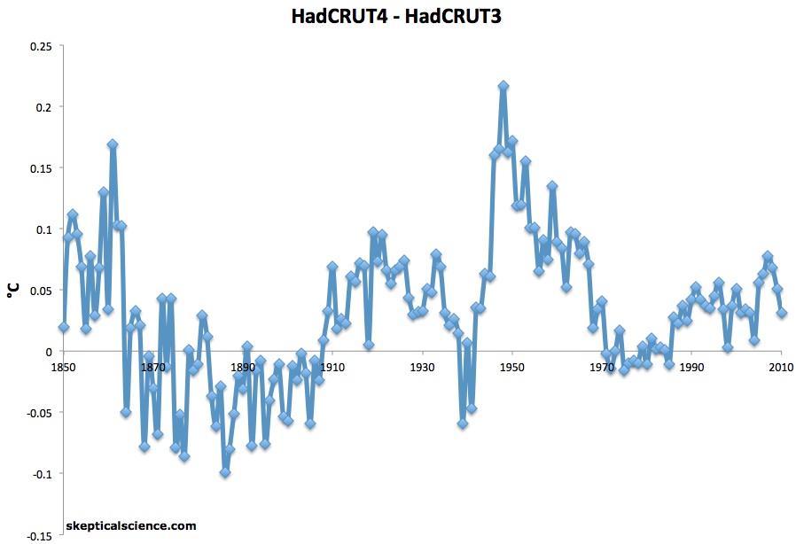
Figure 3: HadCRUT4 minus HadCRUT3 annual global surface temperature data
In HadCRUT4, the hottest years on record are 2010 and 2005, with 1998 right behind in a statistical tie. This brings HadCRUT4 into better agreement with the surface temperature records from NCDC and GISS, which also have 2010 and 2005 as the hottest years on record, whereas HadCRUT3 had 1998 as the hottest.
This is something of a dark day for the many climate "skeptics" who in recent years have exclusively used HadCRUT3 to argue the myth that global warming has stopped, thanks to its cool bias. In fact, they were already attacking CRUTEM4 a month ago.
There is no longer any excuse for using HadCRUT3, and HadCRUT4 is in better agreement with the two other major surface temperature data sets. In fact, the HadCRUT4 linear trend in recent years now falls between the other two, a bit higher than NCDC but a bit lower than GISS. For example, the 15-year trends (1996 through 2010, which can be found with the SkS temperature trend calculator) are:
-
0.157 +/- 0.146°C/decade (GISS)
-
0.136 +/- 0.145°C/decade (HadCRUT4)
-
0.121 +/- 0.140°C/decade (NCDC)
-
0.098 +/- 0.156°C/decade (HadCRUT3)
So we can probably expect to see the 'skeptics' using NCDC surface temperature data from now on.

Arguments


CRUTEM3/4 reject stations which are more than 5 sigma from the cell mean, but that only works if there are at least 3 stations in the box.
You can get an even clearer picture of the frequency or otherwise of unrepresentative stations with this applet from Nick Stokes, which shows a globe of anomalies for every weather station for November of last year. You can see a few which are obvious outliers - there's an obvious one in Romania (just West of the Black Sea).
526520 389-1005 1483 ZHANG YE 19511988 101951
526570 382-1003 2789 QILIAN CHINA 19562007 301956
526810 387-1030 1367 MINQIN CHINA 19392010 101939
527540 373-1001 3302 GANGCA CHINA 19572007 301957
527650 374-1016 2682 HAO-MEN CHINA 19562007 301956
528560 363-1006 2743 GONGHE CHINA 19532007 301953
528660 366-1018 2262 XINING CHINA 19362011 301936
528680 360-1014 2072 HEY-IN CHINA 19562007 301956
528760 363-1029 1905 MINHE CHINA 19562007 301956
528890 361-1039 1517 LANZHOU CHINA 19322007 101932
529570 353-1007 3290 TONGDE CHINA 19542007 301954
But:
Only one has data for the 2006-2010 period: XINING
Only one has data for the 1996-2000 period: LANZHOU
So we've got a break in continuity for cell reporting. The homogenisation algorithm would normally take care of this, but it is failing in this case. Why? Because XINING has data before 1996 and after 2000, with a big gap in the middle. I suspect that there are two different stations here which require different homogenisation offsets, but which are reporting as a single station.
This is the sort of situation (fortunately rare) that the BEST scalpel algorithm is designed to address.
One minor gripe I have is the representation of the globe as a rectangualr grid in visualisations, such as Fig 1. It's not a big gripe, as GISS have been doing it for years, and I know from personal experience that it's an awful lot easier to plot data in this way! But it does over-highlight, from a purely visual perspective (and for no other reason), the red areas at the top and bottom of the world. In the Hadley datasets also over-highlights the surface area covered by missing data. It should of course be noted, before anyone suffests otherwise, that this is accounted for in calculations of global anomalies!
HadCRUT3: land: 0.255 C/decade ocean: 0.058 C/decade
HadCRUT4: land: 0.310 C/decade ocean: 0.088 C/decade
Difference: land: 0.055 ocean: 0.030
(Don't expect these number to match the distributed values.)
Taking into account the different areas covered, the ocean looks as though it's a slightly larger effect. However because I have use the global rather than land and ocean maps I'm overestimating the ocean trend and underestimating the land trend. I guess the two play a similar role.
That doesn't come across in the graphic, because the ocean change is a small change smeared over the whole map.
(I will try and do the calc properly at some point.)
It can no longer be said, that 1998 was the warmest year ever, according to CRU. They succeeded in rewriting their data. But it is a Pyrrhus Victory. Now 2007 and 2010 are both 0.01 degrees warmer than 1998, acoording to HadCrut. This means that there is no significant difference between 1998, 2007 and 2010. The only conclusion can be, that the warming trend in the last 15 years is zero. One does not need to be a climate sceptic to see this.
(-Snip-)(do not ask me for links, this is common knowledge). So, even with HadCrut4 we are on the edge of rejecting the present climate models. One does not need to be a climate sceptic to see this.
"This means that there is no significant difference between 1998, 2007 and 2010. The only conclusion can be, that the warming trend in the last 15 years is zero. One does not need to be a climate sceptic to see this."
It means no such thing. One does not need to be a statistician to see that taking 3 data points and ignoring all the rest of the data is rubbish. Hadcrut4 and GISS both show a warming over .11C since the beginning of 1998. Since the end of 1998 (after the huge El Nino), they show over .16C of warming. Your warming trend of "zero" is nonsense.
"Some years ago, Phil Jones said, that 15 years without warming were the maximum that could be expected from the present climate models (do not ask me for links, this is common knowledge)"
Please provide links anyway; you don't get out of substantiating your claims by hand-waving away the need to do so.
As Composer @10, I hope we're just victims of Poe's Law here.
[DB] No Poe here. fydijkstra is a long-time fake-skeptic with a history of drive-by thread hijacking at SkS. Between mystical "Cycles" and "It's all a conspiracy" (indeed, it's conspiracies-all-the-way-down-Wednesday), no thread is safe. A sample of his work:
"@Bernard J. Why should anyone deny these numbers? It is a huge blessing, that the earth is able to store all this heat, without harmful effect on the climate! The oceans are a perfect heat buffer. If we had no oceans, we should invent them! They are the best weapon against global warming."
Everyone, DNFTT
15 years of course is not generally long enough to clearly show trends in temperature data (even though I think most pepole would agree there appears to have been some warming since 1996), so lets extend the trend to the past 30 years:
fydijkstra, do you still think "the warming trend in the last 15 years is zero", given the above plots from the same dataset?
Skywatcher thanks for showing just how wrong fydijkstra is.
"(do not ask me for links, this is common knowledge)."
Please, this is a science site, as such please quantify your claims and provide links when attrobuting claims to scientists so that others can validate your claims.
Also, thank you for coming here to demonstrate the misguided/misinformed understanding that "skeptics" have about the science.
http://arstechnica.com/science/news/2012/04/modern-ocean-temperatures-compared-to-challenger-expedition-data.ars
compares temperatures taken from the challenger expedition in 1870 with today's argo temperatures. The increase is remarkably small over the 140 years. I'd have thought it would be a tad greater.
The change in mean global temperature from 1880-1889 to 2002-2011 is 0.76 C (Gistemp). As you can confirm from figure 2 above, that is approximately the same as the change from 1870 to 2002-2011. The change in ocean temperatures over the same period is 0.53 C. The difference is because land warms faster than ocean. The estimated difference from comparison of Challenger and Argos data is 0.59 +/-0.12 C, which is quite close, but if anything warmer than expected. That is particularly the case because the Challenger data may be biased warm. As the article says:
"Hadcrut4 and GISS both show a warming over .11C since the beginning of 1998"
Using the skepticalscience trend calculator, I get ~0.083 for both data sets, and the trends are not statistically significant. Did you run trends including more recent data? If so, what was the stat sig for those?
skywatcher @ 13
The trend since 1996 is not statistically significant. Caution.
[DB] "The trend since 1996 is not statistically significant."
Actually, 2 main points:
1. skywatcher was responding to the claim by fydijkstra that "the warming trend in the last 15 years is zero"; skywatcher ably showed the trend to not only be non-zero, but positive.
2. Tamino, in his The Real Global Warming Signal thread, showed that (once controlling for exogenous factors) not only is the warming trend since 1996 statistically significant, but that the trend in all 5 datasets examined showed statistically significant warming since 2000.
QED
F & R 2011 methodology gives statistically significant trends for shorter periods, yes, but that was not what skywalker was refering to.
"1. skywatcher was responding to the claim by fydijkstra that "the warming trend in the last 15 years is zero"; skywatcher ably showed the trend to not only be non-zero, but positive."
Just off the first graph that skywatcher diaplyed, one can see that the uncertainty is greater than the trend. Therefore one cannot ably demonstrate a warming trend 'for the last 15 years' from that.
So I guess you are saying that the addition of the second observation, warming over the past 30 years, makes skywatcher's conclusions solid. Is this because we take the 30-warming trend to be the null hypothesis, and that the recent 15 year trend does not invalidate it?
I ask because I have been among the many (inlcuding commenters and contributors here and Tamino etc) who rebut 'skeptics' who use non-statistically significant trend estimates to make strong claims.
Here's another way of doing it, but I don't think it's quite right either:
Trend 1967 to 1996 inclusive (30 years, to overcome noise)
Now extend to the most up-to-date data point (1967 - Dec 2010?).
Not only has the trend continued, it has increased.
But, the trend difference is not statistically significant.
I am leery - perhaps overly leery considering very low skill in stats - of using non-statistically significant trends to say very much at all.
More importantly, we also have an understanding of the nature and magnitude of the noise inherent in the system (F&R 2011, Santer et al 2011), mostly due to ENSO, and so we do not expect significant warming trends due to AGW for periods less than about 15 years - Santer et al went for 17 years on that one IIRC. So indeed the recent 15-year trend, whether significant or not, does not invalidate anything, as short trends are often measuring the noise rather than the underlying signal. That point shows just how specious the 'global warming has stopped' arguments are, when they look at short segments of data. Pielke Sr came a cropper on this very point here at SkS, when he tried to claim that the trend had changed, based on short recent segments of temperature data ... segments of data which were decidedly noise rather than signal!
You can download the entire ball of wax right here.
Remember -- this is the data-set that skeptics wanted so badly that they buried the CRU with FOI demands about 3 years ago. This is the data-set that was the focus of so much of the "climategate" fuss.
Now, given that the skeptical community has had this entire data-set in their hot little hands for nearly 9 months, the obvious question to ask is, "So, what have they done with it?".
It would seem to me that if skeptics were really interested in performing independent verifications of the CRU's work (as opposed to abusing FOI laws to conduct a dishonarable campaign of harrassment), they would have put something out by now.
Remember that the Muir Russell Commission was able to write its own software and compute its own global-average temperature results from the raw station data in about two days (using nothing more than publicly-available information about the CRU's processing techniques).
So here we are, nearly 9 months after the data-set that skeptics had been demanding was released to them ... and AFAICT those skeptics have yet to publish their own analysis that either confirms the CRU's results or uncovers flaws in the CRU's methodology.
What's taking those skeptics so long? They've had nearly *nine months* to perform a few days' worth of real work.
The CRUTEM3 station data can be downloaded here.
I'm waiting for the hadsst3 data to 2010. HadCRUT4 contained one surprise for me, but ideally I need the rest of the SST data before I can write it up.