


 Arguments


Lindzen's Junk Science
Posted on 8 March 2012 by dana1981
This is a re-post from Gavin Schmidt at RealClimate regarding another Lindzen misrepresentation in the seminar discussed in Lindzen's London Illusions. As noted by Skeptical Science reader WheelsOC, the graphic in question used by Lindzen in his London presentation appears to have been created by Howard Hayden and posted on Junk Science. This suggests that the error discussed by Schmidt was actually made by Hayden and then uncritically reproduced by Lindzen (who also did not provide a reference citation for the faulty graphic in his presentation).
Richard Lindzen is a very special character in the climate debate – very smart, high profile, and with a solid background in atmospheric dynamics. He has, in times past, raised interesting critiques of the mainstream science. None of them, however, have stood the test of time – but exploring the issues was useful. More recently though, and especially in his more public outings, he spends most of his time misrepresenting the science and is a master at leading people to believe things that are not true without him ever saying them explicitly.
However, in his latest excursion at a briefing at the House of Commons in the UK, among the standard Lindzen arguments was the following slide (which appears to be a new addition):
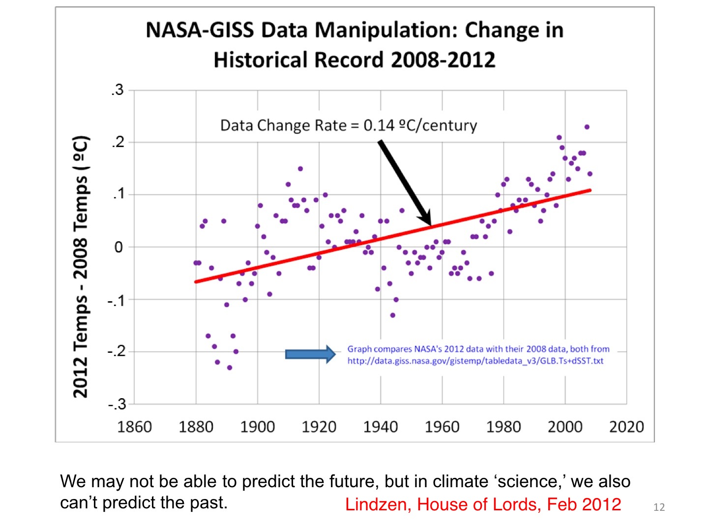
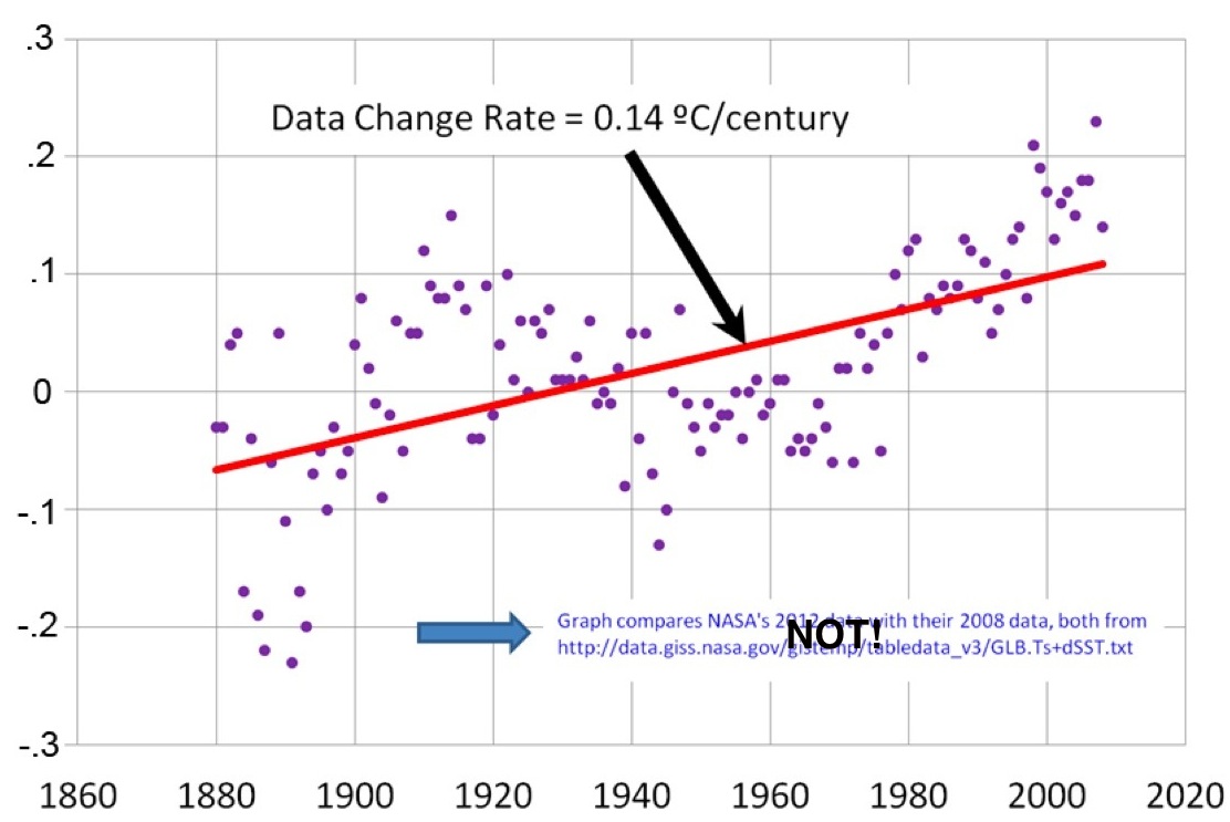
What Lindzen is purporting to do is to compare the NASA GISS temperature product from 2012 to the version in 2008 (i.e. the y-axis is the supposedly the difference between what GISS estimated the anomaly to be in 2012 relative to 2008). A rising trend would imply that temperatures in more recent years had been preferentially enhanced in the 2012 product. The claim being made is that NASA GISS has ‘manipulated’ (in a bad way) the data in order to produce an increasing trend of global mean temperature anomalies (to the tune of 0.14ºC/Century compared to the overall trend of 0.8ºC/Century) between the 2008 and 2012 versions of the data, which are apparently shown subtracted from each other in Lindzen’s figure. Apparently, this got ‘a big laugh’ at his presentation.
However, this is not in the least bit true: the data are not what he claims, the interpretation is wrong, and the insinuations are spurious.
The annotation indicates that Lindzen is using the GISTEMP Land-Ocean Temperature index (LOTI, i.e. the index that includes weather station data and sea surface temperature data to give a global anomaly index with wide spatial coverage) (“GLB.Ts+dSST.txt”). There is another GISTEMP index (the Met station index) which only uses weather station data (“GLB.Ts.txt”) which doesn’t have as much coverage and has a substantially larger trend reflecting the relative predominance of faster-warming continental data in the average.
Old versions of the data can be retrieved from the wayback machine quite readily, for instance, from February 2006, October 2008 or December 2007. The current version is here. I plot these four versions and their differences below:

As should be clear, the differences are tiny, and mostly reflect slightly more data in the earlier years in the latest data and the different homogenisation in GHCN v3 compared to GHCN v2 (which was used up to Dec 2011). This is however in clear contradiction with Lindzen – the biggest difference in trend (between 2006 and today), is a mere 0.05ºC/Century, and from 2008 to 2012 it is only 0.003ºC/Century – a factor of 40 smaller than Lindzen’s claim. What is going on?
The clue is that the transient behaviour of Lindzen’s points actually resembles the time evolution of temperature itself – not homogenisation issues, or instrumental or coverage changes. Indeed, if one plots the two GISTEMP indices and their difference (using current data), you get this:
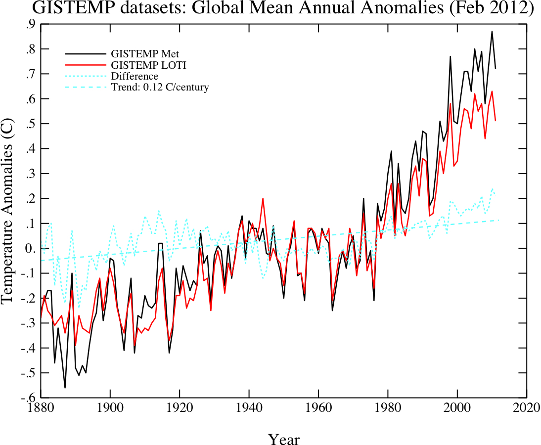
Thus it looks very much like Lindzen has plotted the difference between the current Met Station index and an earlier version of the LOTI index. I plotted the Feb 2012 Met index data minus the Feb 2009 LOTI index, and I get something very close to Lindzen’s figure (though it isn’t exact):
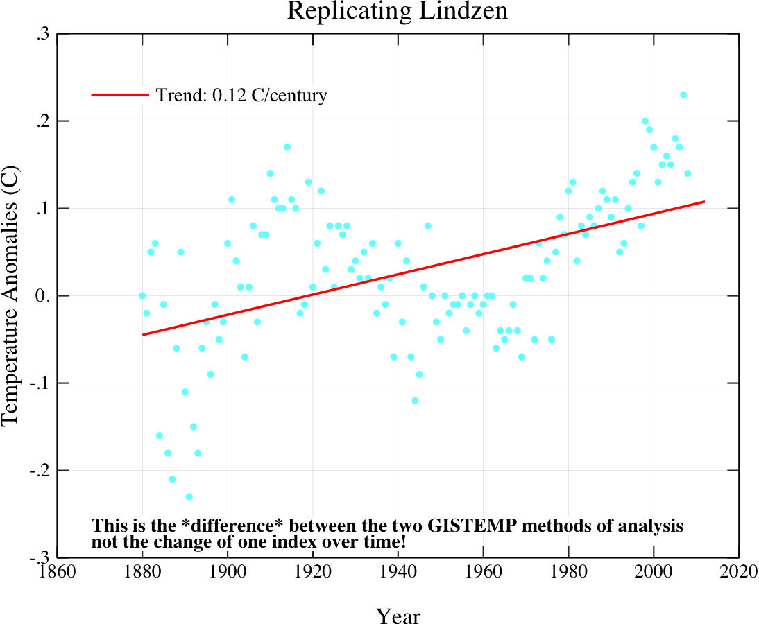
This is sufficient to conclude that Lindzen did indeed make the mistake of confusing his temperature indices, though a more accurate replication would need some playing around since the exact data that Lindzen used is obscure.
Thus, instead of correctly attributing the difference to the different methods and source data, he has jumped to the conclusion that GISS is manipulating the data inappropriately. At the very minimum, this is extremely careless, and given the gravity of the insinuation, seriously irresponsible. There are indeed issues with producing climate data records going back in time, but nothing here is remotely relevant to the actual issues.
Such a cavalier attitude to analysing and presenting data probably has some lessons for how seriously one should take Lindzen’s comments. I anticipate with interest Lindzen’s corrections of this in future presentations and his apology for misleading his audience last month.


The site What's Up With That Watts? has a point by point dissection of a 2009 lecture by Richard Lindzen: Part 1, Part 2, Part 3.
Thanks for the plug Tom.
I've just finished another one that's worth mentioning here:
Saturday, March 8, 2014
Howard Hayden’s one-letter disproof of global warming claims - examined
http://whatsupwiththatwatts.blogspot.com/2014/03/hayden-disproves-global-warming-claims.html#more