Climate Science Glossary

Term Lookup

Enter a term in the search box to find its definition.

Settings

Use the controls in the far right panel to increase or decrease the number of terms automatically displayed (or to completely turn that feature off).

Term Lookup

Settings


All IPCC definitions taken from Climate Change 2007: The Physical Science Basis. Working Group I Contribution to the Fourth Assessment Report of the Intergovernmental Panel on Climate Change, Annex I, Glossary, pp. 941-954. Cambridge University Press.

Home Arguments Software Resources Comments The Consensus Project Translations About Support

Bluesky Facebook LinkedIn Mastodon MeWe

Twitter YouTube RSS Posts RSS Comments Email Subscribe


Climate's changed before
It's the sun
It's not bad
There is no consensus
It's cooling
Models are unreliable
Temp record is unreliable
Animals and plants can adapt
It hasn't warmed since 1998
Antarctica is gaining ice
View All Arguments...


Username
Password
New? Register here
Forgot your password?

Latest Posts

Archives

The surprising result when you compare bad weather stations to good stations

Posted on 31 August 2010 by Jim Meador

The website surfacestations.org enlisted an army of volunteers to photograph US surface temperature measurement stations and document stations located near parking lots, air conditioners, or anything else that might impose a warming bias. They found that 89% of the stations did not meet the US weather service siting criteria in one way or another. That is not good. Does this prove that a US warming trend is just the artificial influence of parking lots and air conditioners on the temperature record coming from bad stations?

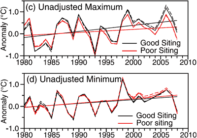
No. Actually, an analysis shows that good and bad stations show very similar trends for temperature over time. The chart below compares data from stations that surfacestations.org identified as good, as well as bad stations. Notice that good stations track very closely to bad stations, and actually the good stations show more of a warming trend!
Maximum
Figure 1. Annual average maximum and minimum unadjusted temperature change calculated using (c) maximum and (d) minimum temperatures from good and poor exposure sites (Menne 2010).

The volunteers from surfacestations.org deserve credit for pointing out siting problems of the US Weather Service temperature measurement stations. Unfortunately the fact that good and bad stations show the same upward trend proves that warming in the US is not just a measurement problem. Temperatures are trending upward around the globe, not just in the US. Microsite influences on temperature measurements in the US can't explain the US temperature rise, much less the global rise.

This post is the Basic version (written by Jim Meador) of the skeptic argument It's microsite influences. We're currently writing plain English versions of all the skeptic rebuttals. If you're interested in helping with this effort, please contact me.

0 0

Printable Version  |  Link to this page

Comments

Prev  1  2  

Comments 51 to 68 out of 68:

  1. To quote you, omnologos: The "surprising result" shows (a) that "good" or "bad" is not a relevant way of categorizing stations regarding warming trends, in other words the work done by surfacestations.org is irrelevant in that respect OR (b) that the warming trend is spurious. The answer is (a), "not relevant", since the placement issues discussed affect offsets/accuracy, not repeatability/placement. Subset analysis clearly shows that the warming trends occur irrespective of subset selection, and are not spurious.
    0 0
  2. omnologos, you seem to believe that "good" and "bad" station placement is an experimental independent variable, with anthropogenic global warming theory providing strong reasons to expect the "bad" condition to display a different temperature trend than the "good" condition. Therefore you think that indistinguishability of the good and bad stations' trends is evidence against anthropogenic global warming theory. You are wrong. Anthropogenic global warming theory never, ever, has made different predictions for "bad" stations than for "good" stations. Even if there had been a difference in trend between those two classes of stations, that difference would have had no consequence for global warming theory. You should notice that not even Watts & Co. have made the claims that you are. That's because your claims are nonsensical. The only reason Watts & Co. were making noise about station siting was their claim, without any theoretical justification whatsoever, that the trend really is zero, and that the apparent trend is an artifact of bad station siting. Even that hypothesis of theirs was not a hypothesis of anthropogenic global warming being expected to cause a difference in trend between "good" and "bad" stations.
    0 0
  3. Some here seem to have a problem with Menne et al themselves (a case of being more royal than the king, perhaps). May I quote again: "The reason why station exposure does not play an obvious role in temperature trends probably warrants further investigation" If the answer were e.g. "it's the precision", perhaps Menne et al would have mentioned that without suggesting any "further investigation". As just written by @Dappledwater, the "obvious" result has been contradicted by the "surprising" one. That can only mean there is more food for our scientific curiosity. If on the other hand we are just obsessed with countering other people's arguments on the basis of them being deniers or skeptics or anything else, well, there goes the curiosity, and there goes the science. BTW, @Tom Dalton: you have completely misinterpreted my remarks. Please don't waste any more time with...shall I say it...reductio ad absurdum. Of course even if there were no warming trend, it's just US stuff we are analyzing, etc etc.
    0 0
  4. Omnologos, you are making rather extraordinary claims. As discussed on the current page, in more detail on the intermediate version, checked against other readings to examine the UHI effect, and finally examined in detail for surface temperature reconstruction errors, there is no evidence of microsite or UHI contamination causing the observed warming trends - they are not spurious. You seem to believe otherwise, stating that perhaps "...the upwards trend can't be ascribed to an actual "warming"", or that "...maybe there is no trend.". Then show it. There's a large body of peer reviewed work demonstrating that there is a warming trend as shown in the surface temperature records; if you want to claim otherwise then I suggest you demonstrate it. Vague insinuations about data quality don't disprove warming, especially given the repeated analyses that validate the data. "Extraordinary claims require extraordinary evidence" - Carl Sagan. You've yet to provide any evidence whatsoever...
    0 0
  5. @KR - I am making no extraordinary claim at all. All I am saying is that we should make explicit a logical assumption behind all of this reasoning about trends observed in "well sited" and "poorly sited" US stations. The logical _assumption_ is that the similarity in trends means there is an actual warming pattern that is independent from the quality of the siting. This can't be taken as _evidence_ of a warming trend. It's an hypothesis, however well rooted, not a conclusion. And the alternative, however badly in need of extraordinary evidence, still can't be taken as "disproven". Why? Because the _evidence_ of the warming trend is for the time being only (as a matter of course) in the well-sited stations, until somebody proves exactly why warming trends are independent from the quality of the siting. In fact, Menne et al's results are counterintuitive (="surprising", according to Meador). This doesn't mean they are wrong. It means (Menne's suggestion) there is something there to investigate, rather than be dismissed out of hand as "precision vs accuracy" or whatever else we can think of in a blog's comments section. I believe in this respect that I am the one perfectly in line with Menne's and Jim Meador's reasoning. This is a great opportunity to further our scientific knowledge in the topic and should be welcomed rather than swept under the carpet just in case "deniers" would make any use of it. No paleontologist would hide a "surprising" finding out of fear creationists might take it as evidence there is something wrong with evolution theory. Why should it be any different in climate stuff, I really do not understand. BTW I am not making any claim about any other surface temperature record. This blog entry is about the "suprising results" as per Menne et al 2010. Let's stick to those please. And let's not forget that even if the US stations would show falling temperatures, that wouldn't necessarily disprove warming either.
    0 0
  6. Omnologos @ 54 - "Why? Because the evidence of the warming trend is for the time being only (as a matter of course) in the well-sited stations" And the "bad/naughty" stations too. Omnologos -"This can't be taken as evidence of a warming trend. It's an hypothesis, however well rooted, not a conclusion. And the alternative, however badly in need of extraordinary evidence, still can't be taken as "disproven" See I was right, Reductio ad absurdum "A common species of reductio ad absurdum is proof by contradiction (also called indirect proof) where a proposition is proven true by proving that it is impossible for it to be false."
    0 0
  7. @Dappledwater - "impossible to be false" - not sure what you are talking about. The "reason why station exposure does not play an obvious role in temperature trends" is not known to Menne, Meador, John Cook, me, you or anybody else. As things stand, it is not known to science. Wouldn't you want to see it investigated? Of course if somebody would properly (scientifically) investigate it, then we would be able to exclude the "alternative hypothesis".
    0 0
  8. Omnologos, Scientists say warming is unequivocal. What part of unequivocal do you not understand? Menne is just saying that it is interesting that station siting has no effect on the trend and that he expected to see some type of effect. That does not mean that the trend no longer exists as you suggest. It is not necessary to determine why station siting has no effect on the trend to prove that there is a trend. GISS, HADCRU and other scientists have checked their data for this type of error for decades and were not suprised by the result. The key point here was that the deniers chose the good stations so they cannot claim now that the good stations were cherry picked to give the desired result.
    0 0
  9. Such close correspondence between two set of data has a somewhat surreal quality. To take the blood pressure example, you visit 100 doctors some of whom have good sphygmomanometers and some have dodgy ones. Let's say you visit the same doctors a year later - if your blood pressure has gone up, you'd obviously expect an upward trend in the overall picture. However, if every sphygmomanometer showed an almost identical rise in blood pressure of, say, 20 mm-Hg +/- 0.5 mm-Hg, you'd be wondering about the validity of the data set. The closeness of the correspondence at least as presented here seems out of keeping with the messy quality you find in real data which tends to meander and scatter. None of this disproves a rising temperature trend. However, there's something puzzling about the data.
    0 0
  10. Chriscasnaris @ 58 - how many dodgy sphygmomanometers have you run across in the course of your practice?. Using analogies can be useful , but not irrelevant ones - the temperature record deals with temperature anomalies not absolute temperatures, and I've yet to see anyone claim that the US temp stations have all recorded the same temperature, on any given day. And if you find the Menne paper puzzling, this must cause you total befuddlement: from 70 USHCN stations
    0 0
  11. @Dappledwater: just replace "blood pressure" with "EKG". Definitely, if the cardiac graphs recorded by people of dubious competence were very similar to the ones recorded by the experts, it would be a surprising result that would suggest further investigation is needed before declaring the patient as "healthy" or "sick". For EKGs we do have guidelines, it's not too difficult to record them incorrectly if you don't know what you're doing, equipment may be out of date, it gets replaced, etc etc. Just like with USHCN stations. This should help understand the relevance of the analogy. @michael sweet: for the n-th time, we are not talking about "warming trends" in general. We are talking about the warming trends that appear for both well-sited and poorly-sited USHCN stations. This is the topic of the blog but for some reason people keep trying to talk about something else (in your case, the content of the AR4 SPM of all things). Please try to stay on-topic.
    0 0
  12. Omnologos, Since your post talks about EKG's you have no call to suggest I am off topic. Your analogy is completely wrong. We are talking about measuring a simple result: temperature, not a complicated one. It is simple to measure and, since we are measuring the anomaly, the calibration can be off and still give the correct result. There is no indication that the data has been measured wrongly. You are trying to wish away a clear result. As it has been pointed out several times above, if you visit 100 people for your blood pressure and they all tell you you have a problem, you have a problem. It does not matter if some are not calibrated. The result is clear: no matter how you slice the data you get a strong warming trend. Good sites, bad sites, urban sites, rural sites all show the same warming trend. How can you claim that this somehow indicates that that there is no trend?
    0 0
  13. Omnologos, sorry you've not improved on the analogy at all. Sphygmomanometers or EKG's still aren't appropriate analogues, the surface temperature record deals with anomalies, not absolute temperature.
    0 0
  14. Dappledwater @ 59: Actually, if you knew anything much about sphygmomanometers and blood pressure measurements, you'd know that there's very considerable variability in readings depending on type of sphygmomanometer, the size of the cuff, the size of the patient's arms, and in the case of the old fashioned mercury sphygmomanometers, the sensitivity of the doctor's ears as s/he listens via a stethoscope for the sound of turbulent blood flowing through the brachial artery. There's even a direct effect caused by the doctor - some patients get nervous when they see a doctor and their blood pressures come back as high (but show normal range readings with ambulatory blood pressure monitoring). However, it was not I who introduced the blood pressure analogy. The analogy was introduced by omnologos @ 19. I responded to his or her analogy. I note you've raised the issue with omnologos @ 62. I do know the difference between absolute measurements and anomalies. What puzzles me is not the presence of a warming trend regardless of station siting but rather the extraordinary lack of divergence between poorly sited and well sited stations - indeed, in many instances it would seem absolutely no divergence over a number of years particularly in minimum temperatures. To return to the blood pressure analogy (and attempt to make it more valid), let's say I visit 100 doctors on the one day and get my blood pressure checked. I revisit the same doctors a year later and have my blood pressure checked again. If my blood pressure has gone up significantly, I'd expect most of the doctors to come up with a higher reading. However, I'd be very surprised if, say, 97 out of 100 doctors came back with blood pressure readings exactly 15 mm-Hg higher than my initial reading. I'd expect some of the doctors to come back with readings 10 mm-Hg higher, others 12 mm-Hg higher, others 20 mm-Hg, and so forth. I'd expect the anomaly (ie, the rise over the course of the year) to vary from doctor to doctor. However, I'd probably still end up concluding I needed to have treatment for elevated blood pressure. Similarly, I would argue from the data presented that the temperature record argues for a warming trend in the US because of the consistent direction of the anomaly. However, the sheer uniformity of the anomaly seems counterintuitive - hence my reservations about the paper.
    0 0
  15. Chriscanaris @ 63 -"Actually, if you knew anything much about sphygmomanometers and blood pressure measurements, you'd know that there's very considerable variability in readings depending on type of sphygmomanometer" So why the spurious analogy?. @58 your scenario was this: "However, if every sphygmomanometer showed an almost identical rise in blood pressure of, say, 20 mm-Hg +/- 0.5 mm-Hg, you'd be wondering about the validity of the data set." You imply that the USHCN has shown the exact same increase in temperature, for each station, over the period in question. It hasn't. If it had then sure, that would indeed cause the clattering of alarm bells. As to your amended scenario it still misses the mark, for instance:- What was the average of the 100 readings?. Has some form of calibration been carried out on the sphygmomanometers?. What was the mean of the anomaly in the 2nd check up compared to the baseline 1st reading?. But even then it's not valid, Your sphygmomanometers would be in constant use between your visits & therefore would require the same protocols for every use. But even then............. How's this for expanding on your analogy? - suppose you expect having a super hot babe nurse taking the readings will bias blood pressure too high for you (micro site influences). So you compare the small number of readings taken by foxy nurses, and the large number taken by the butt ugly doctors (good/bad stations). Your expectation is not borne out by the results, you're a couch potato, smoke and have poor eating habits, and in the 2nd check up the blood pressure trend is upwards with a virtually no discernible difference between the anomaly trend of readings taken by the foxy nurses and butt ugly doctors (Menne 2010). This is where sphygmomanometersorg. weighs in - they have enlisted volunteers who have photographed the foxy nurses. The photos look compelling, any red blooded male couldn't help but see his blood pressure skyrocket one assumes (me too) but that's not what the data shows. You say it seems a tad too uniform, I say well I'd expect your blood pressure to go up with that kind of lifestyle, but let's wait and see if science can resolve why the foxy nurses didn't bias your readings higher.
    0 0
  16. At 52 years of age and happily married, I've grown immune to foxy nurses - they're nothing but trouble! :-) From what little I know of population behaviour, I find straight lines with identical or near identical slopes rather different from what I'm used to seeing in the real world (even if we're dealing with anomalies rather than raw data). I note the Menne 2010 paper contains graphics for adjusted and unadjusted data - this post shows unadjusted data only. At the risk of demonstrating my ignorance, I'd expect to see at least some error bars or other evidence of scatter in the comparisons of well sited and poorly sited stations. As the current post stands, it really does look as if the maximum and minimum anomalies were extraordinarily small. Consequently, while I didn't 'imply that the USHCN has shown the exact same increase in temperature, for each station, over the period in question,' I did find the uniformity between the two sets of data disconcerting. I believe Menne at al (2010) pretty well said as much if I understood them correctly.
    0 0
  17. Chriscanaris, So you say that because all the data indicates a rise in temperature that suggests to you that there is a problem? Maybe the temperature was carefully recorded for years at many places and the result is real!! The uniformity of the data suggests to me that it is a robust result. The scientists lose either way. If there were problems with the data you would claim we should ignore it because of the problems. When the data is consistent you complain it cannot be trusted because it is too uniform. Heads you win tails I lose!!! What would you be happy with?
    0 0
  18. michael sweet @ 65 Scientists have nothing to lose if they present real data limiting adjustments only to what needs adjusting to ensure we're comparing apples with apples. I would feel far more comfortable with data showing wider divergence between well and poorly sited stations. I have no investment in the direction of the divergences. For example, if poorly sited stations in some (or even many) instances showed cooler trends (a counterintuitive result given the assumptions underpinning the surface stations project), I would happily accept this. I have no problem with all the data showing a warming trend. However, the data are so exquisitely consistent over extended periods as to seem improbable and thus implausible. Data measurement is never so utterly robust as to yield zero anomalies between a range of measurements over many years. I would liken the outcome to tossing and coin and finding it lands neither heads nor tails but stood vertically on its rim - an improbable but nevertheless possible outcome. As I've pointed out before, I may have misunderstood the derivation of the data set and if so would be very happy to stand corrected. Part of the problem lies with what I suspect is your assumption that I have raised the issue in order to push a sceptical agenda.
    0 0
  19. chriscanaris @63: "What puzzles me..." Indeed..it puzzles you, me, Menne, Jim Meador and (I suspect) also John Cook and a great number of people. Alas, not everybody is as interested in the science.
    0 0
  20. chriscanaris, keep in mind that you're looking at the result of averaging large numbers of stations. Intuitively, one might guess that individual poorly sited stations would have larger variance in their trends (some with too much warming due to new pavement nearby, others with too much cooling due to the growth of trees, and of course many others might be poorly sited but nonetheless have no particular bias to their trends in either direction). To some extent, all of this will cancel out in the process of aggregating to the nationwide scale. In any case, I find this juxtaposition (from your comment) a bit odd: Scientists have nothing to lose if they present real data limiting adjustments only to what needs adjusting to ensure we're comparing apples with apples. I would feel far more comfortable with data showing wider divergence between well and poorly sited stations. Well, the Menne paper does just present real data comparing apples to apples. They just divided the set of stations into two groups, those classified as well-sited and those classified as poorly-sited, and then compared the average trends for both groups. There were no differences in how the two groups were handled or "adjusted". But it sounds like you still have some predetermined outcome that you want to see. Unless there's a divergence between the two mean trends, you won't feel comfortable. This does sound like a "lose-lose" proposition for Menne.
    0 0

Prev  1  2  

You need to be logged in to post a comment. Login via the left margin or if you're new, register here.


The Consensus Project Website

THE ESCALATOR

(free to republish)


© Copyright 2024 John Cook
Home | Translations | About Us | Privacy | Contact Us